Lo Sidelind - (BA) Digital Photography
Y2 ADGP21201
THIS IS ADVERTISING 22-23
INITIAL NOTES / THOUGHTS:
⦾ "ONE CONCEPT, DEVELOPED THROUGH 9 PHOTOGRAPHS" - GERAINT
⦾ "IF YOU BECAME FAMOUS FOR A STYLE - WHAT WOULD THAT BE?" - ELLEN
◉ These images should demonstrate the direction I want to take in my final third year and professional career.
◉ Aim to use business and commercial skills practise during the previous term relating to self-employment and self-promotion.
◉ Images will be accompanied by a 300 word personal statement describing myself as a photographer. To be reviewed by an editor working for The Telegraph prior to submission.
Summary of Unit Hand In Requirements:
- A series of at least 9 images as an online portfolio
- Supporting RAW and jpeg files
- Supporting business literature, such as Call sheets, invoices, estimates, and model release forms.
- Digital workbook
- A 300-word personal statement describing the motivation, genre and ambitions for this work.
A recap on your workbook:
RESEARCH
● Use the research guide on Aula to analyse at least 5 photographers and explain why you are drawn to their work and how you can syntheses their work into your own.
● Full project development, including previsualises, lighting plans, shoot plans and ongoing diary posts.
● Evidence of testing.
INSPIRATION
Ask how other photographers have used
● Lighting
● Composition
● Casting of models
● Colour grading
Ask how other photographers have used
● Lighting
● Composition
● Casting of models
● Colour grading
● Sequencing of images
● Use of photographic techniques and equipment
● And look for inspiration outside of photography too
● Use of photographic techniques and equipment
● And look for inspiration outside of photography too
PLAN
● Pre-visualise your images using the layout provided
● Lighting diagram
● Equipment List
● Props being used
● Mood board
● List all external professionals participating in the form of a Call Sheet
● An estimate for the job
● A final invoice for the job
● Pre-visualise your images using the layout provided
● Lighting diagram
● Equipment List
● Props being used
● Mood board
● List all external professionals participating in the form of a Call Sheet
● An estimate for the job
● A final invoice for the job
ANALYSIS
● What worked?
● What didn’t work?
● What would you do differently next time?
● What worked?
● What didn’t work?
● What would you do differently next time?
The Five Principles underpin the Mindsets and Skillsets Manifesto and are the foundation upon which all course curriculum frameworks and unit specifications are based. The relevant Principles as stated below have been mapped against the Learning
Outcomes relevant to each course unit and at each level (see Programme Specifications for full description of the Five Principles):
1. Cultivate / Where the individual thrives.
2. Collaborate / Where disciplines combine and evolve.
3. Integrate / Where education engages industry.
4. Advocate / Where purpose meets practice.
5. Originate / Where enquiry informs creativity.
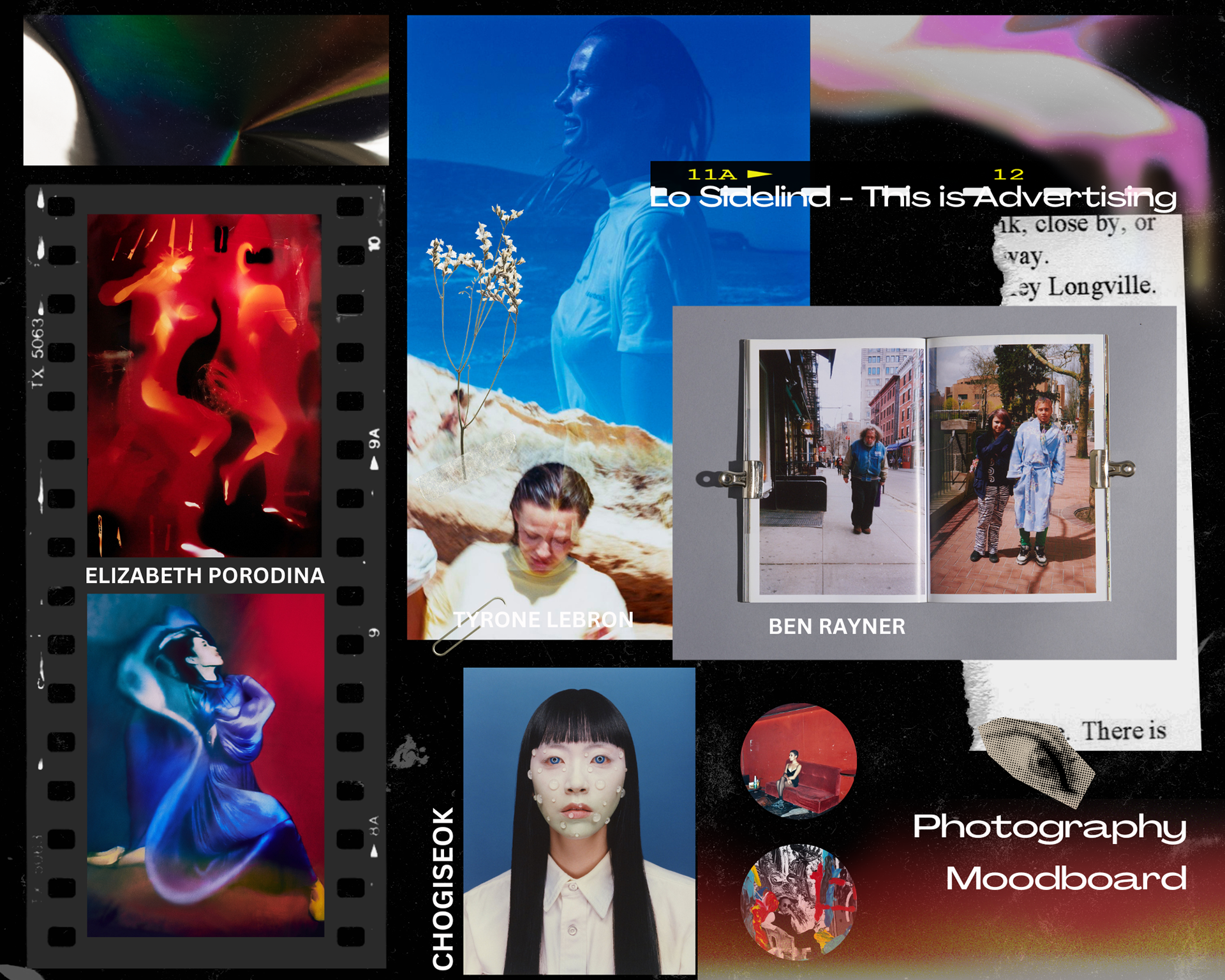
MOODBOARD
I made a mood board after I had gathered some of my inspirations.
INSPIRATION / RESEARCH
This unit I aim to thoroughly conduct research on 5 photographers to establishing what their photographs mean to me personally and what themes are conveyed to me as the viewer.
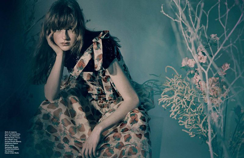
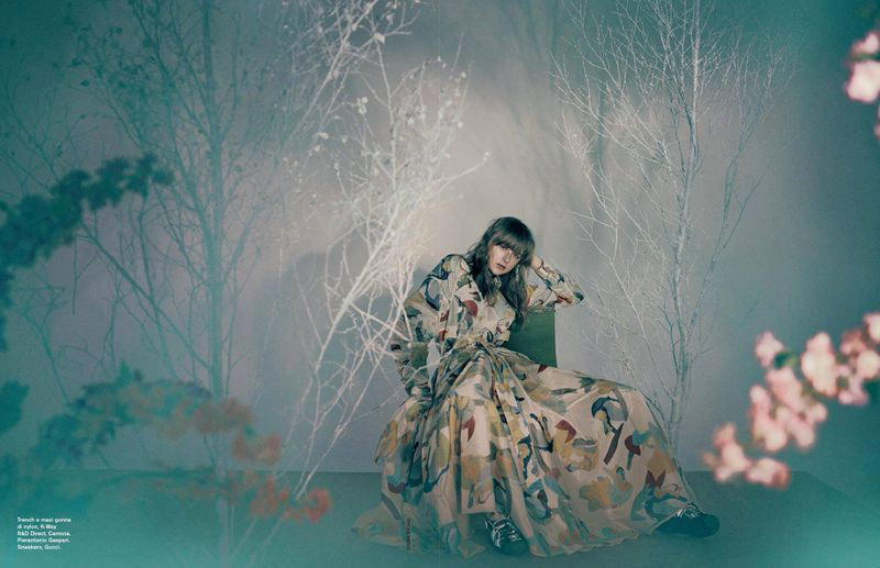
ELIZAVETA PORODINA
SOME OF THEIR WORK
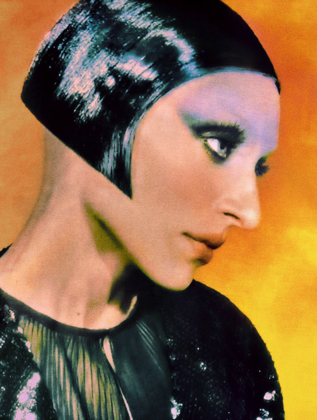
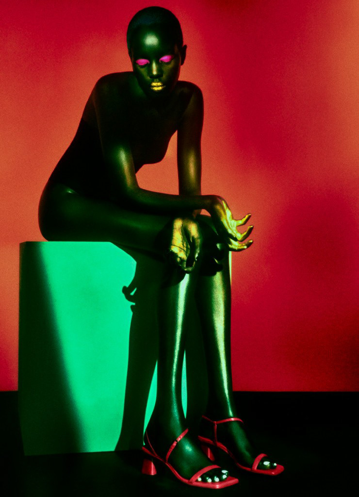
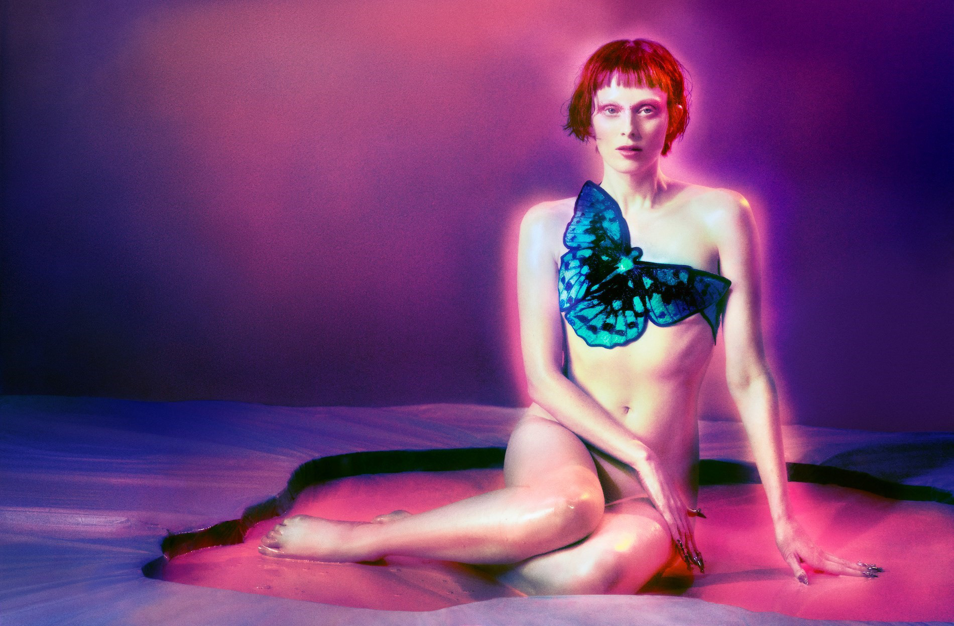
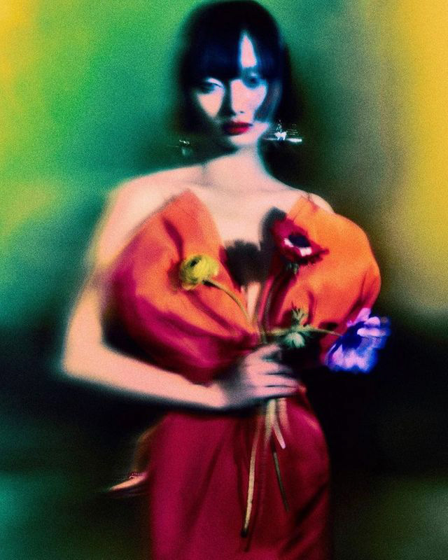
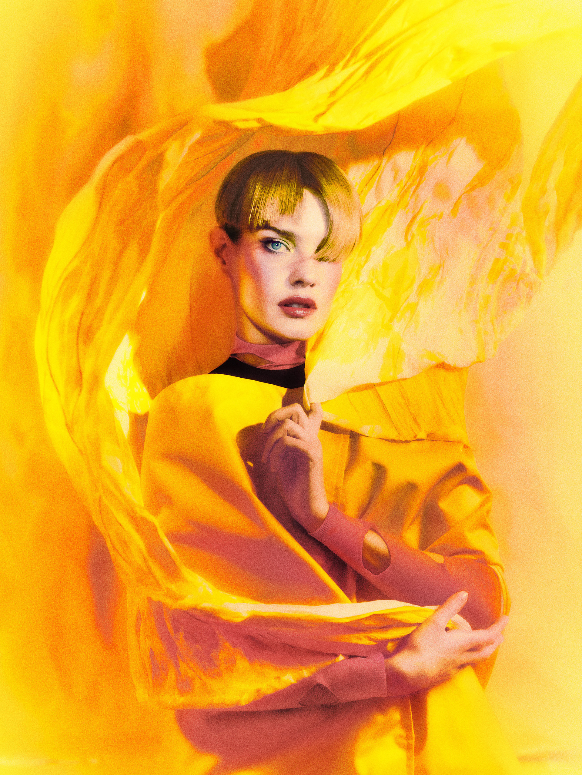
"CAROLINA HERRARA X VANITY FAIR US"


SIXTEEN JOURNAL: WOMANHOOD
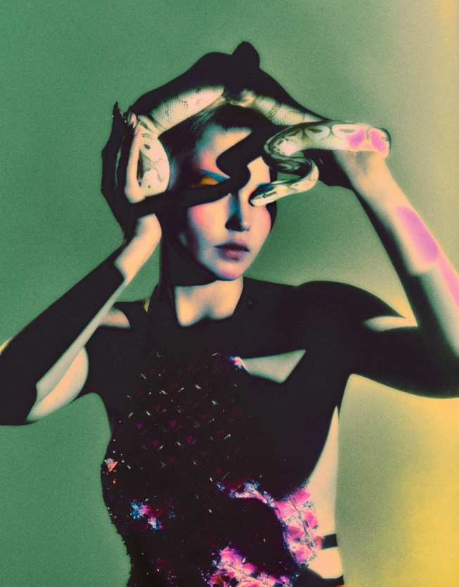
my favourite photo from the collection
SHOOT TO ANALYSE: "SIXTEEN JOURNAL"

REFERENCE PHOTOS FROM SIXTEEN JOURNAL
- A short text about where the photographer or photoshoot is from.
PHOTOGRAPHER: BACKROUND
◉ Elizaveta Porodina grew up studying clinical psychology and spent her early career speaking to young girls and women with eating disorders. While working she noticed herself always illustrating, writing poems or doing something creative. Following this path, she taught herself how to set up and operate lighting equipment in a studio. With this knowledge she begun creating look books for fashion students wanting to showcase their work under the condition that she decides how it's photographed. That was 2011, a year later they received their first paid opportunity.
“When I started working, really working, I knew something wasn’t right,” Porodina said. “I was always painting and illustrating. I was always writing songs.”
PHOTOGRAPHER: CURRENTLY
◉Her unorthodox backround is still apparent in her work. She still uses a digital camera and even her smartphone sometimes. Her photos supposedly hardly undergo any post-production and her unique style is mainly due to complex lighting setups and elaborate set designs. The approach — in her words —
“blur[s] the boundaries between photography and paintings.”.
◉ Her work is the result of a clear creative vision and immaculate technical precision, the latter of which she achieves with the support of her lighting director — and husband — Josef Beyer.
◉ “I think of it as a stage — I need to create a stage where [Porodina] can play and bring her vision to life,” said Beyer, whose father works as a stage technician at German theatre. For one recent production, the duo used over 20 lights to create her signature otherworldly effect. On other projects, Porodina and Beyer rely on just a single light source to achieve the photographer’s vision.
“A lot of the time, the assistants on set will be like, ‘What are you doing? Are you crazy?’ But that’s how we push forward,” Beyer said.
◉ This photoshoot was featured in Sixteen Journals Vol.4 - a fashion magazine published twice a year.
- How does the photographer work? I.E., do they work with fashion or music?
◉ EP mainly focuses on fashion.
- Where is their work featured, or where or who do they work for?
◉ This year [2020], her photographs have featured in The Cut, GQ and multiple international editions of Vogue; she’s worked with celebrities like Chloé Sevigny, Janelle Monae and Grimes.
◉ Her magazine shoots range from a Vogue Spain cover featuring Bella Hadid and a Vogue Italia cover starring Zendaya. A series shot for GQ of Brad Pitt.
◉ Her work has been exhibited in Fotografiska Stockholm and the Foam Museum in Amsterdam, among other museums.
- How is the image made?
◉ Image is shoot in studio digitally and contrary to the article claiming that the photos hardly undergo ANY augmentation, I believe there's been quite a bit of work done in post-production to this specific series. e.g. grain added and outer glow around the subject.
- What camera do you think is used? (35mm, Medium format? What type of lens?)
◉ Digital camera + 50mm prime lense.
- Is it a studio image or shot on location? ◉ Studio
- Was a flash used or natural lighting? ◉ Flash
- Is it a film or a digital image? If so, how is this expressed in the image?
◉ Digital - however hues have been adjusted along with grain. This gives the images a very painterly / film feel.
- How is the image composed? What about the composition makes it striking?
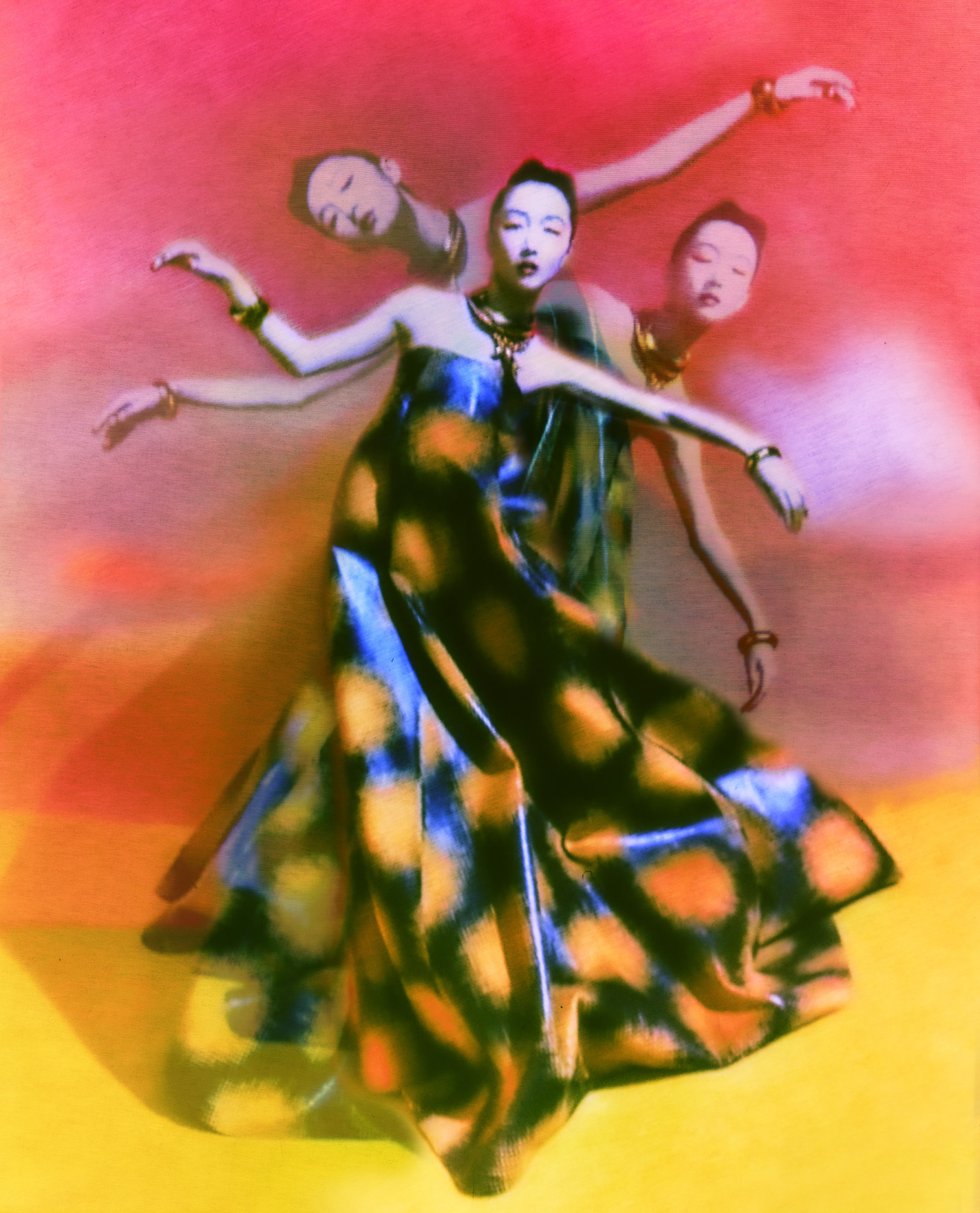
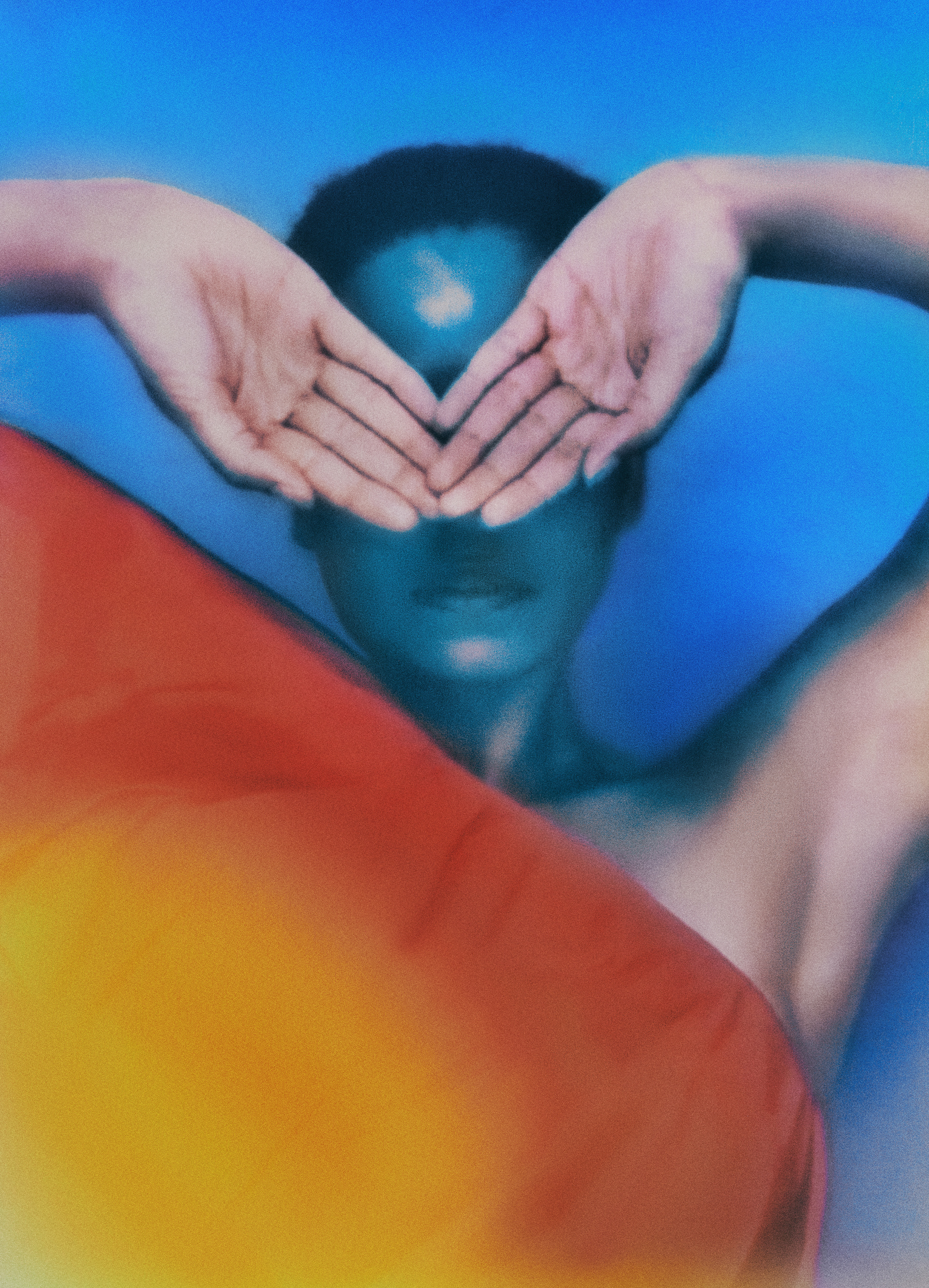
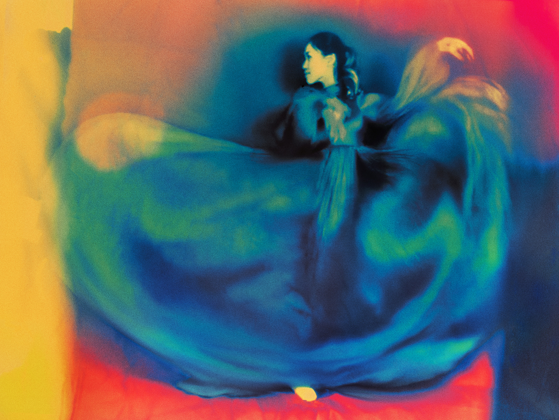
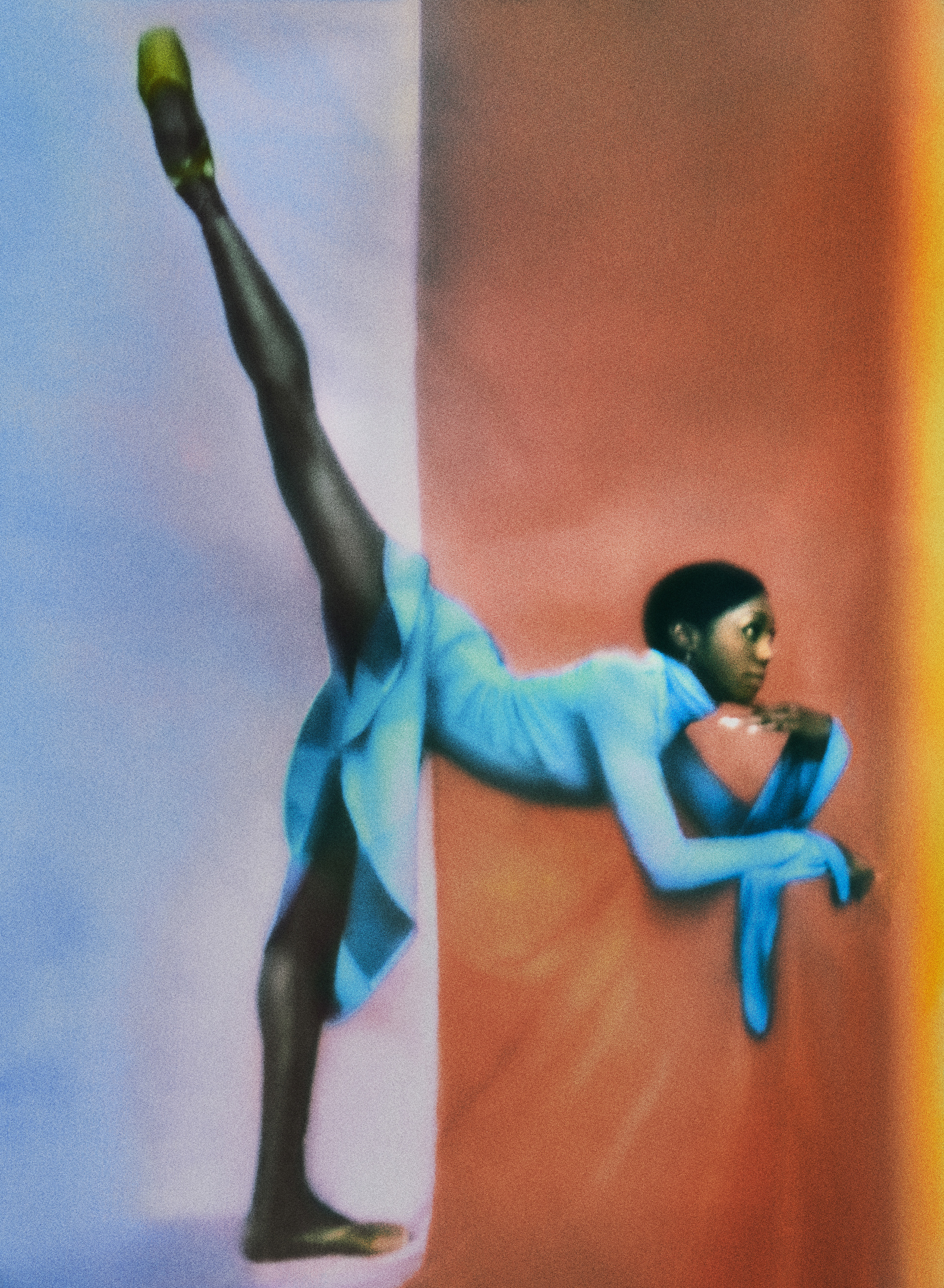
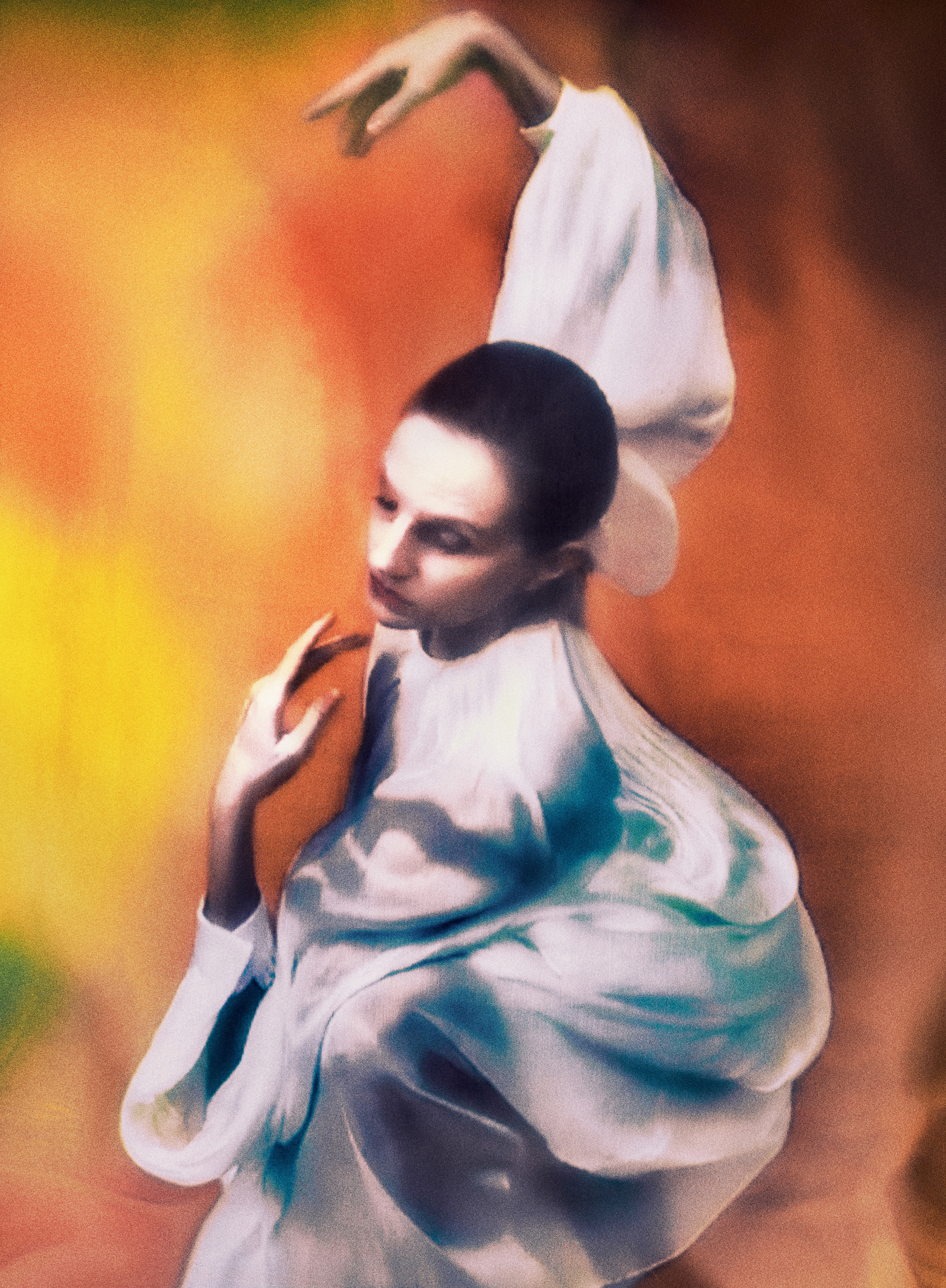
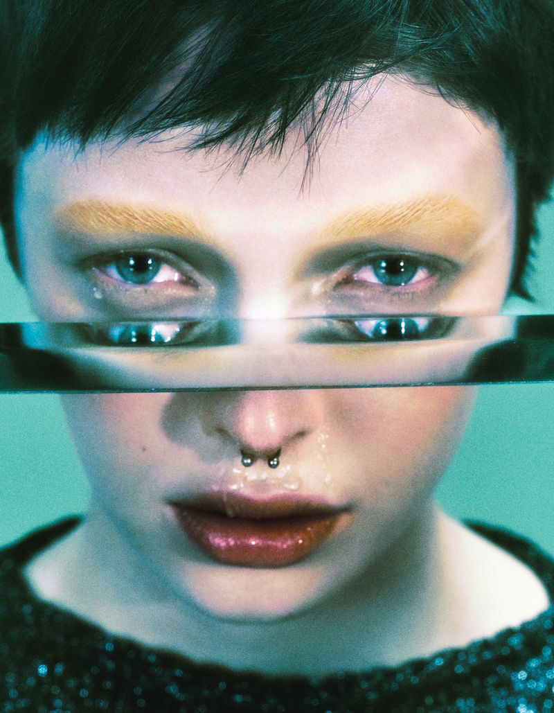
◉ Models are often seen dancing, sometimes leaning on something, laying down or posing with their hard.
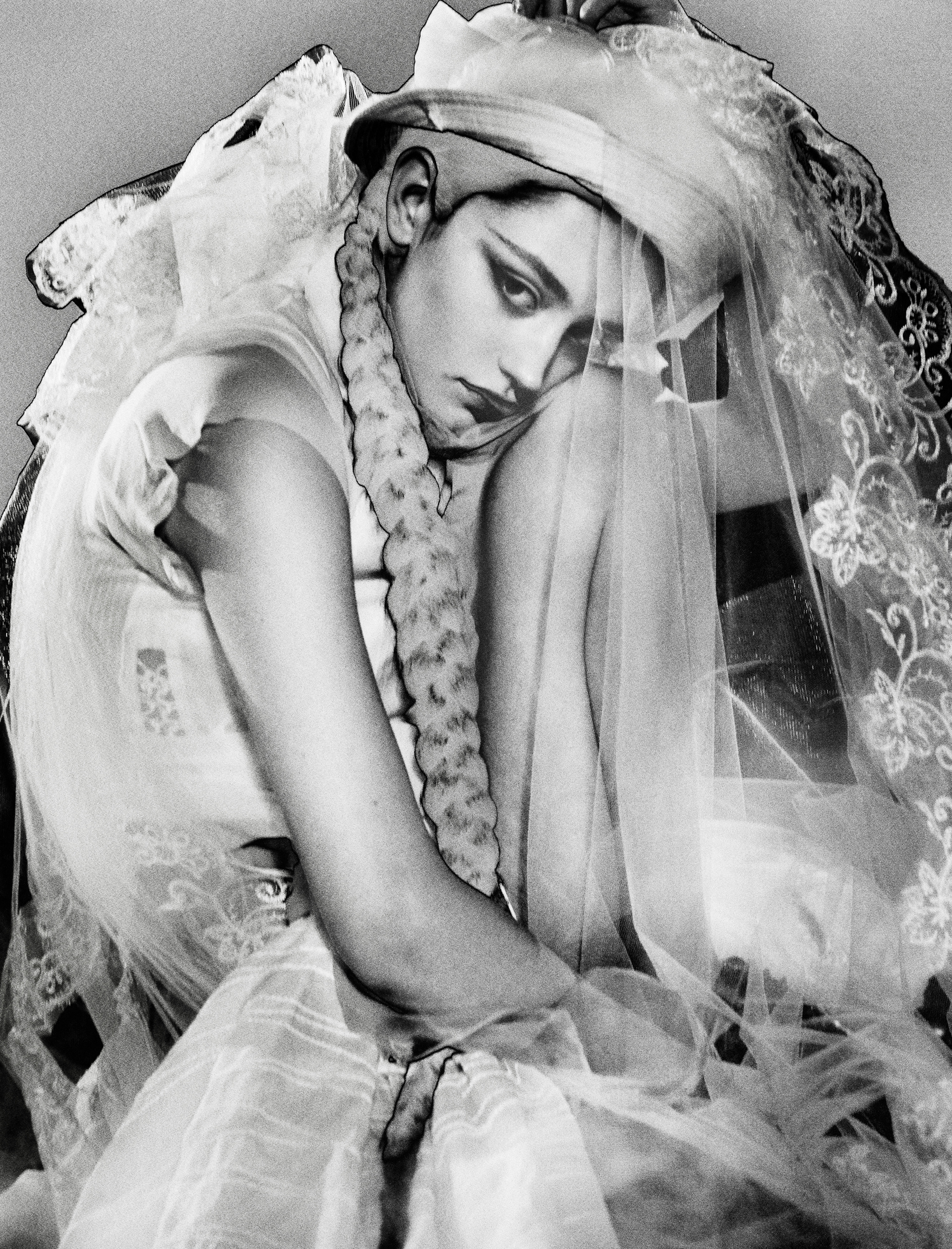
◉ In her photoshoot for sixteen journal a lot of the subjects have their eyes hidden from view. For me, this guides the viewer to look at the body and its unique composition. It dampens the human element and makes the body look like a brush stroke.
7. Is the image very clear, or is it slightly out of focus? How is the image graded?
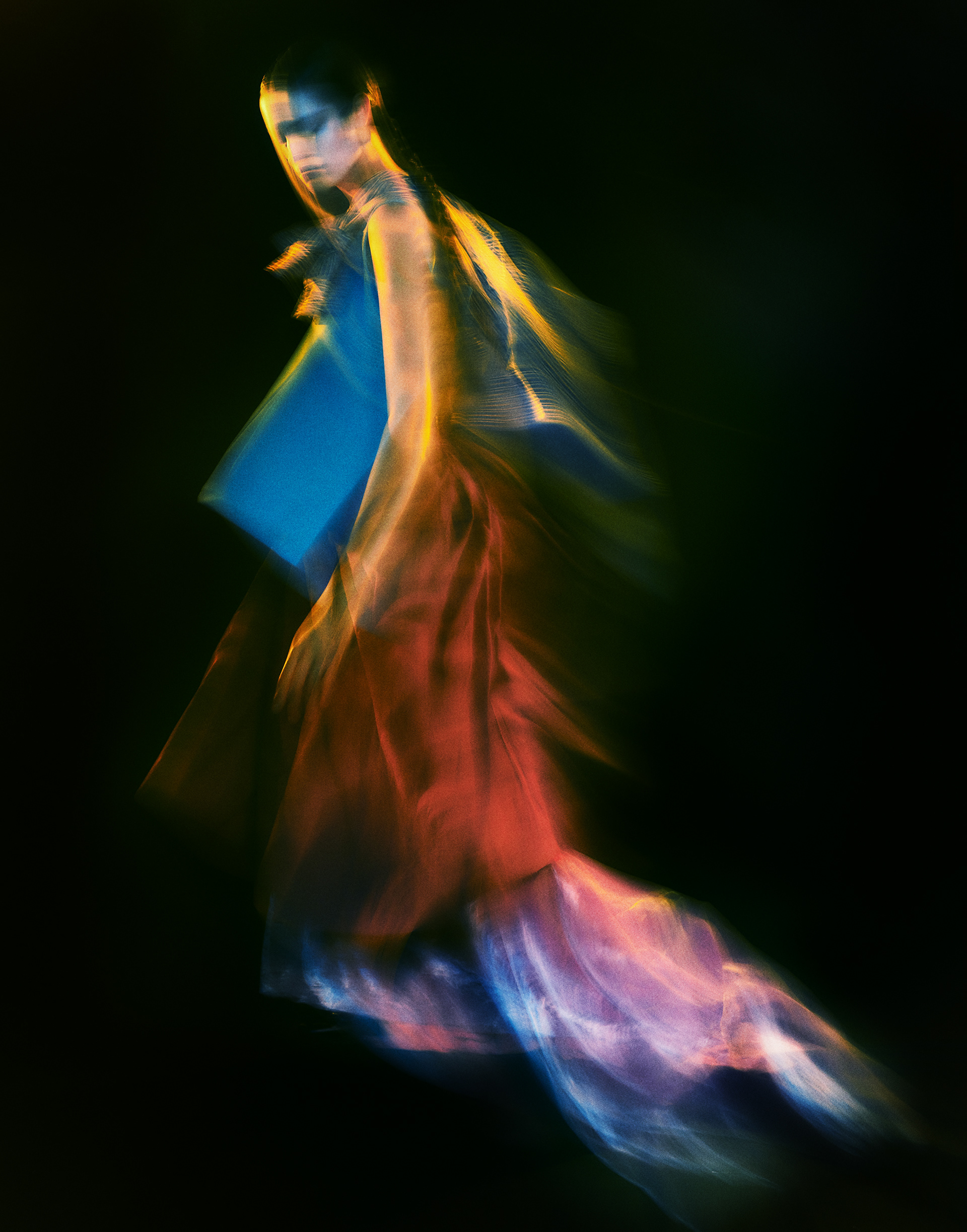
◉ The photos in my reference images are slightly out of focus and the image grading is very vibrant, full of movement and strong in contrast. Whether intentional or not, the out of focus look creates an air of movement and spirit-like energy surrounding the subject.
1. What tones are in the image? (i.e. heavy even-tones? high contrast?)
◉ High contrast with very dark shadows.
◉ Lots of gradients.
2. What sort of colour is it? (i.e., highly saturated or unsaturated? warm or cool tones?)
◉ Pastel colours (green, pink, yellow etc.) - warm feel
◉ Lots of vibrant colours but the saturation isn't too strong.
3. Is the image very clean, or is it edited to appear older?
◉ Lighting has been arranged to make photo appear older along with motion blur (slow shutter speed).
◉ The motion is reminiscent of old film technology where subjects had to sit still for a very long time.
4. Is there any kind of texture to the image that makes it unique?
◉ In the middle photo there is some interesting texture on the jacket which may have been done in post-production. This could also have been done by adding a see-through screen with paint on it to the set.
Self-reflection
1. Talk here about how the image caught your eye and how you will use all of the points above to improve your work.
1. Talk here about how the image caught your eye and how you will use all of the points above to improve your work.
- The image caught my eye mainly because of the lighting and strong shadows. I believe this is mainly due to the model fully facing the light source, allowing them to absorb all the lighting. The unique texture and hues is another takeaway.
★ Subject fully facing lighting source to creative dark shadows.
★ Adjustment to hues / playing with textures.
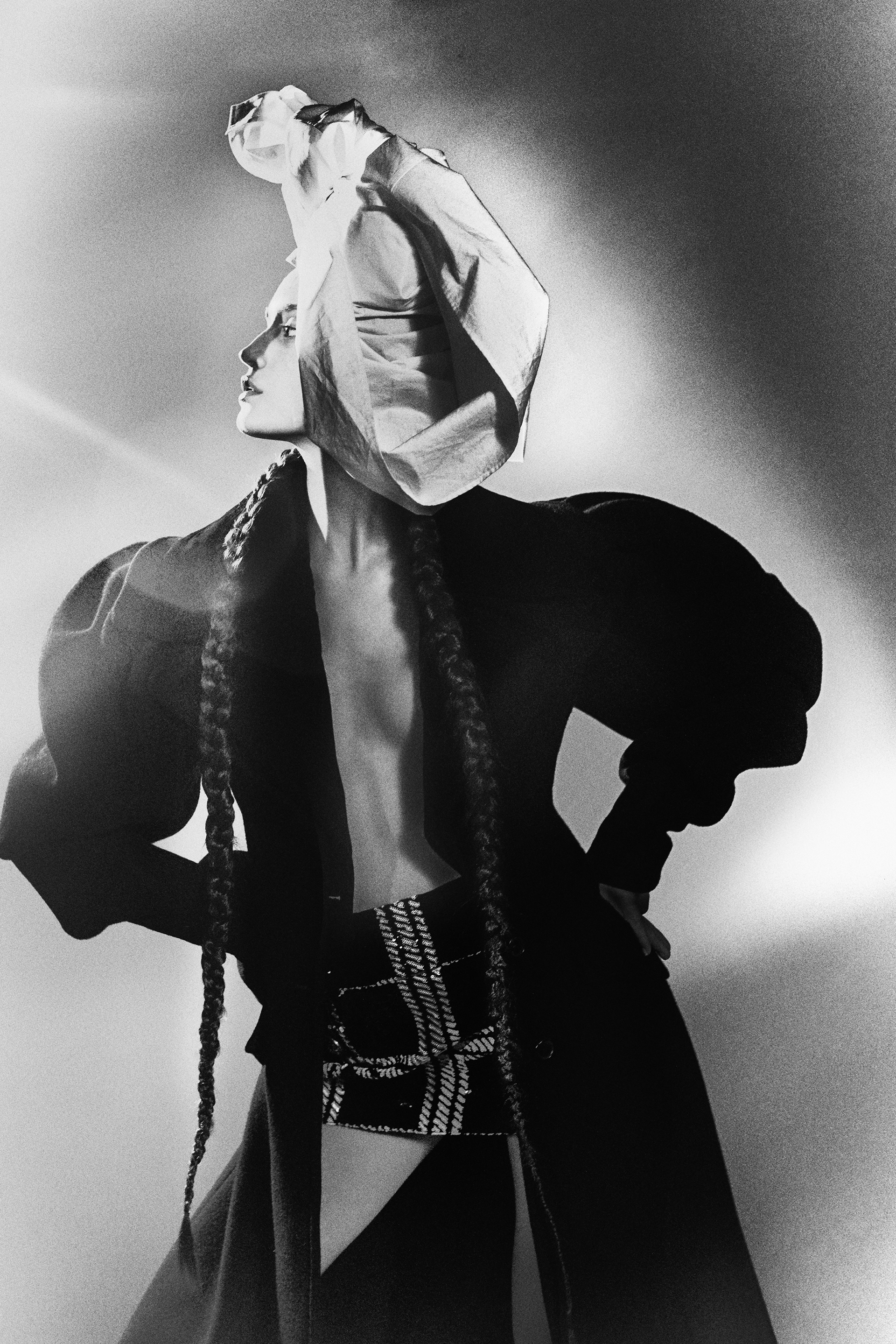
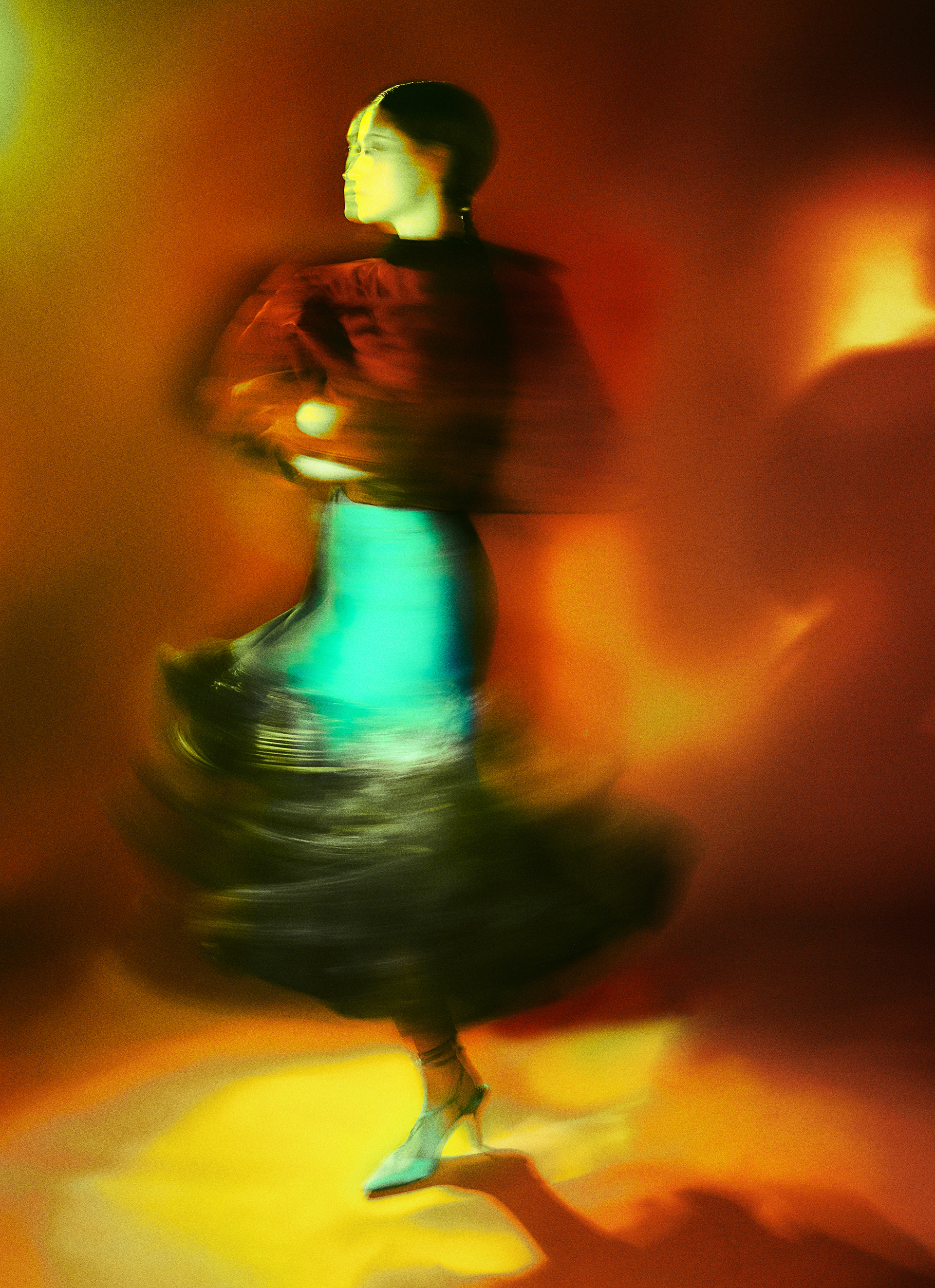
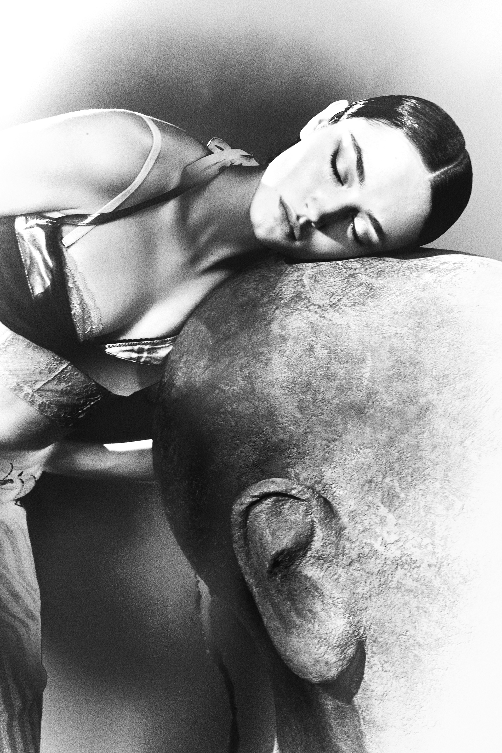
RESULTS
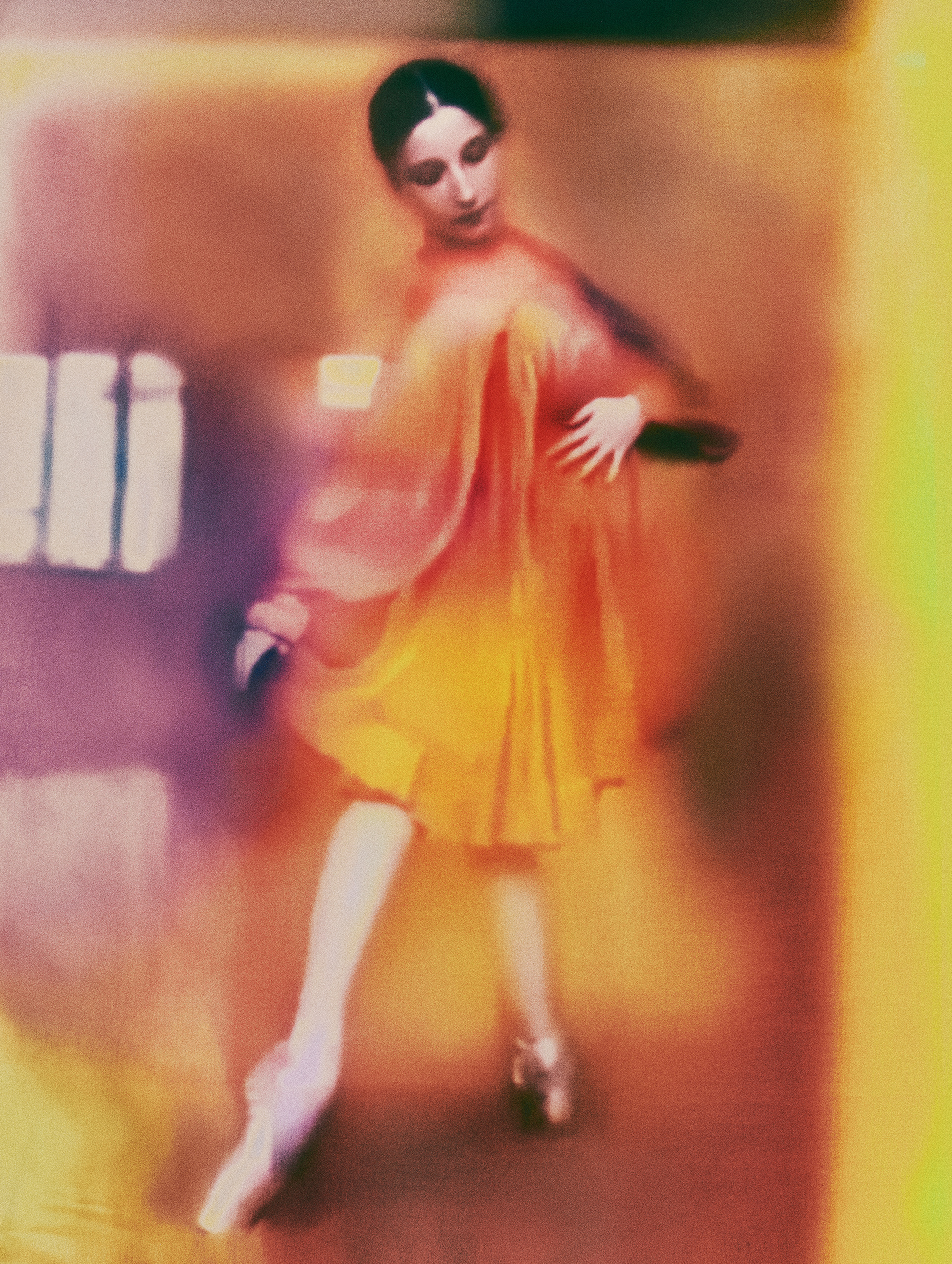
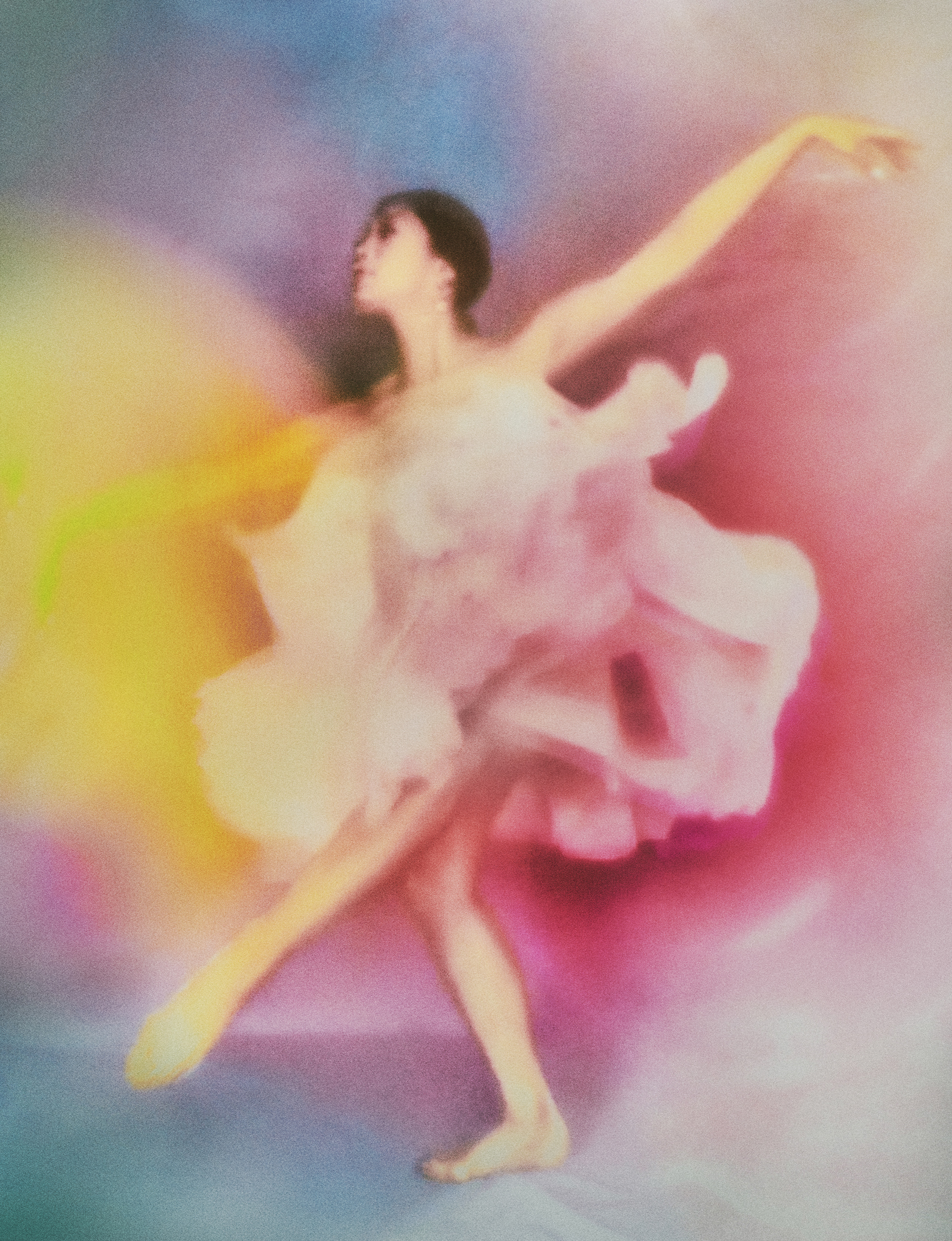
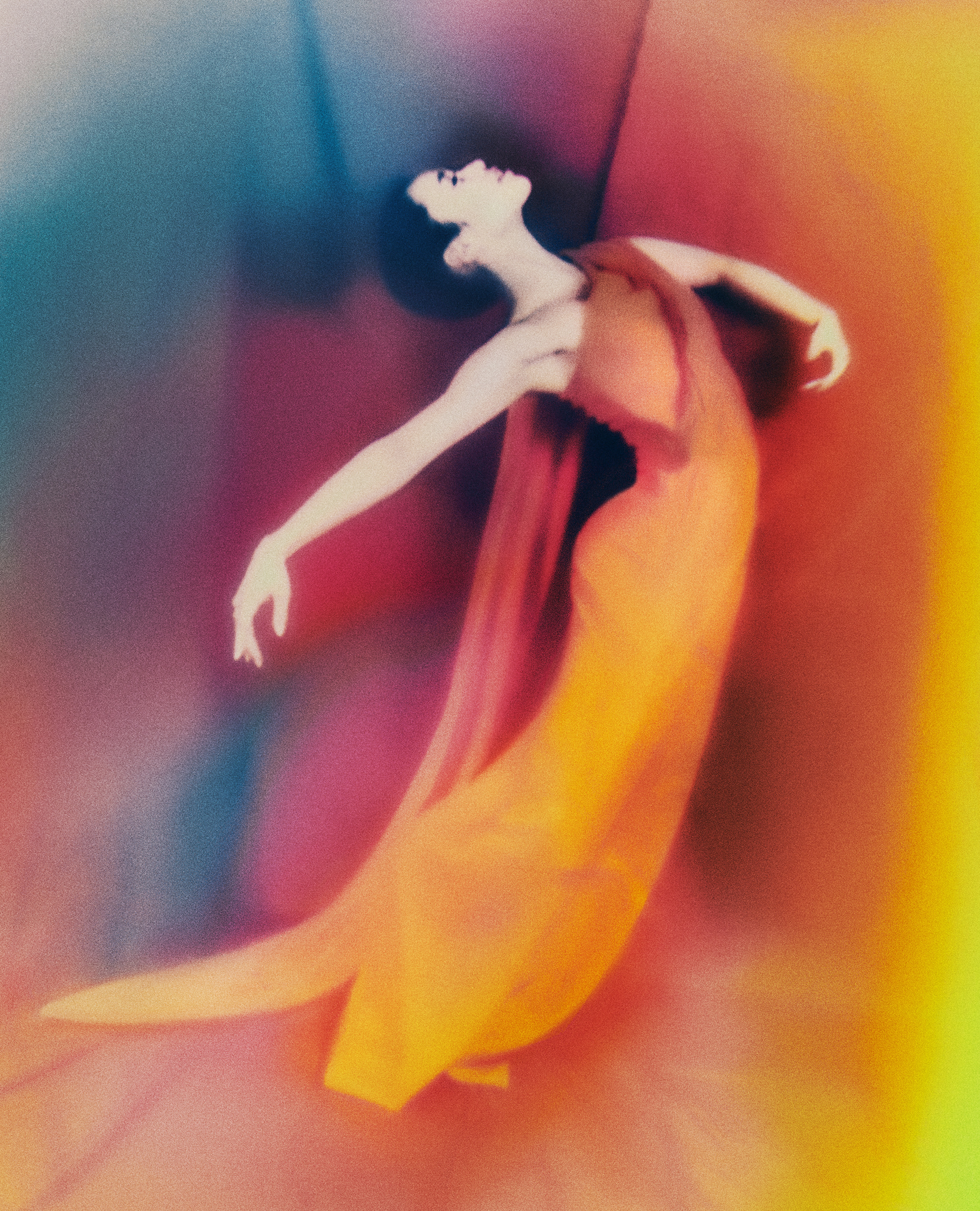
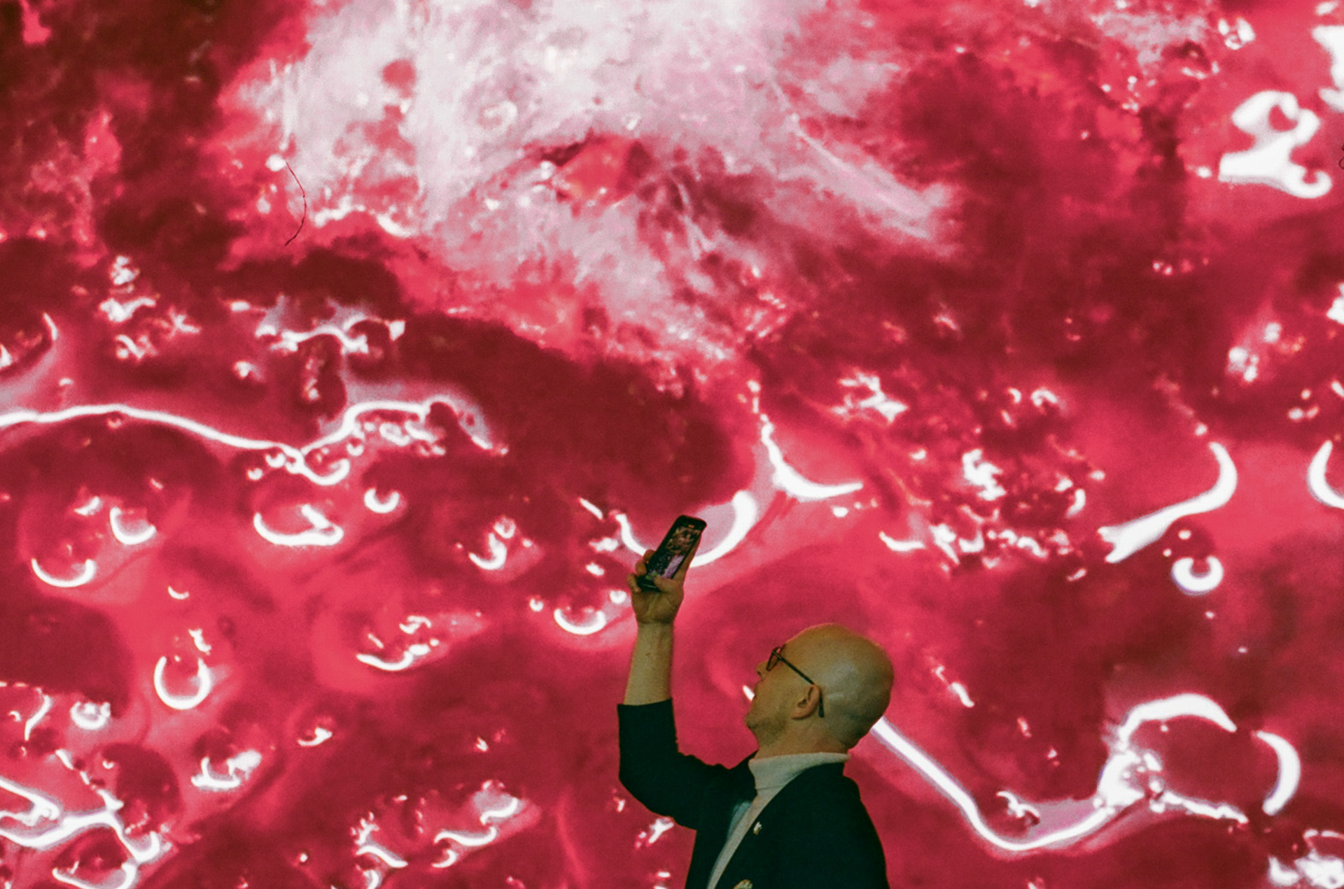
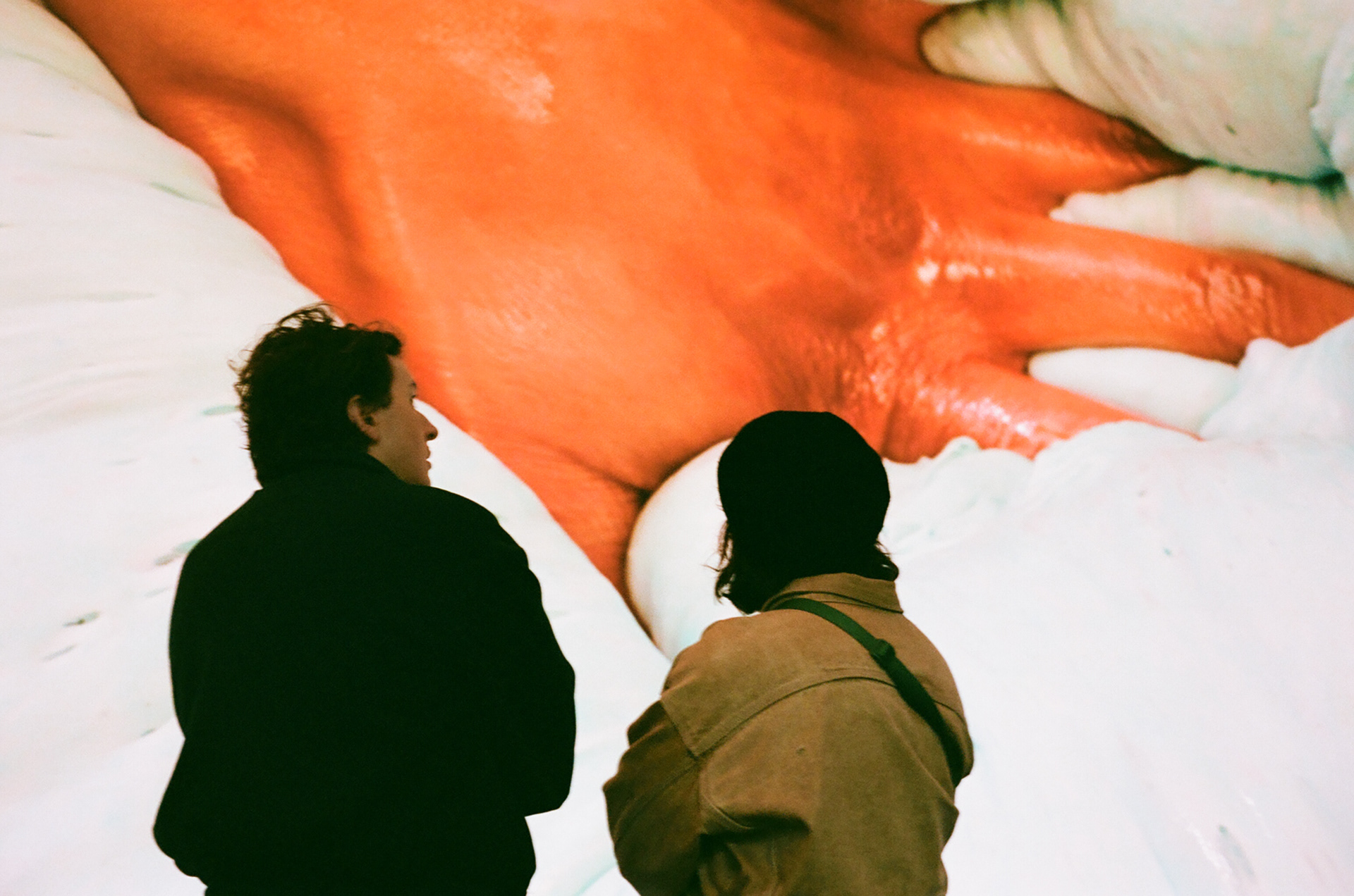
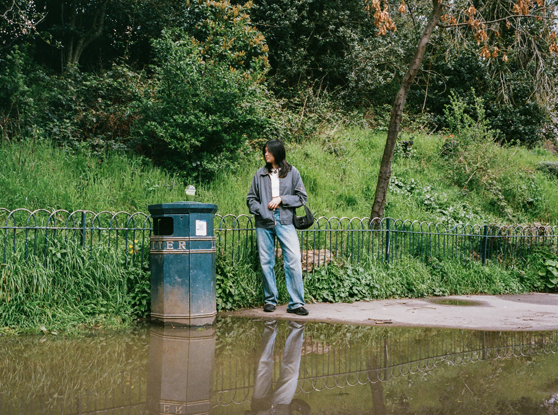
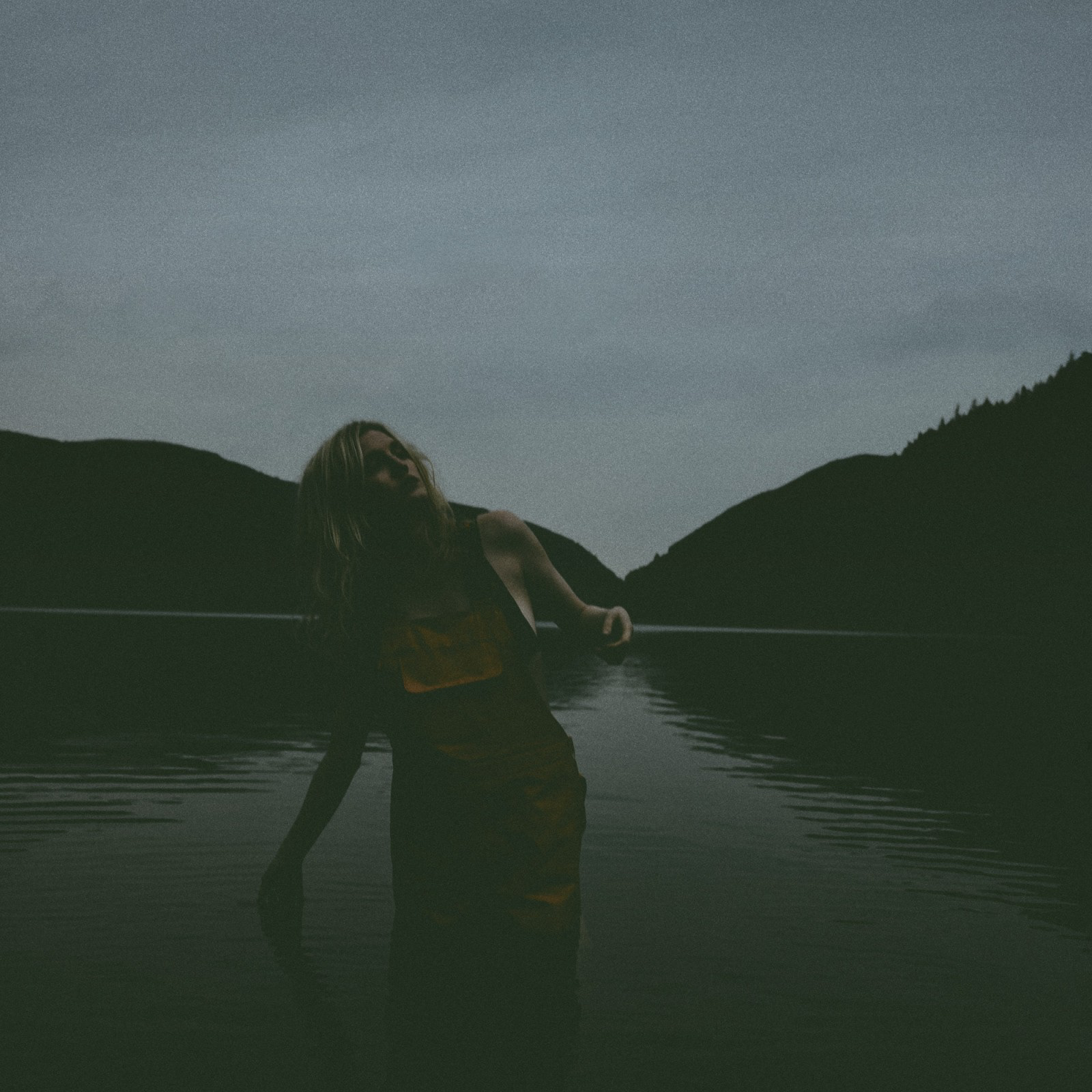
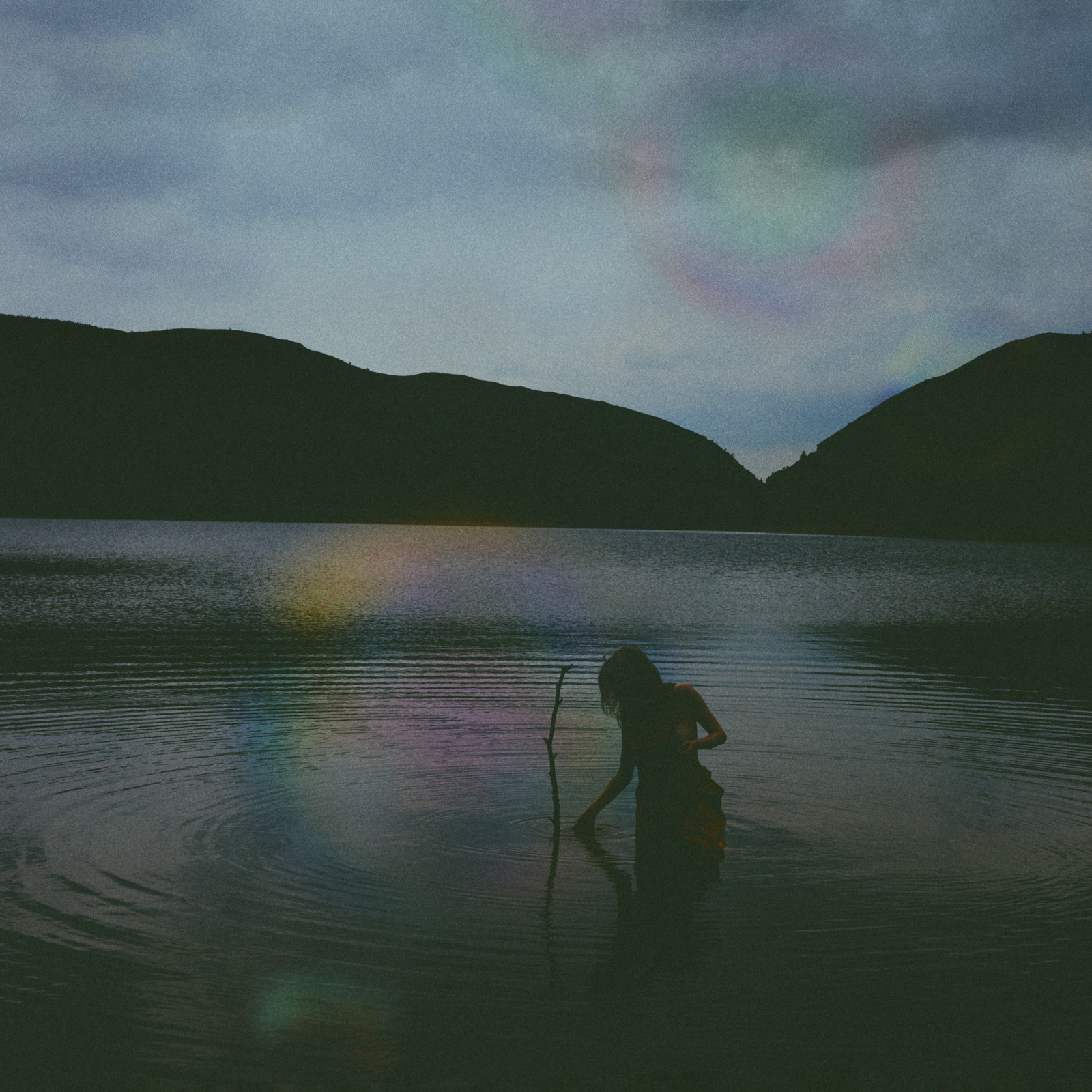
Shot on Portra 400 film at the Barbican and styled/ directed inspired by Elizaveta Porodina.
Two images taken at the large screening display by Tottenham Court on Portra 400 35mm film. I thought it would be really interesting to see how the film would pick up on the largest and highest definition display currently in the world. I think the results produced a very ethereal and dystopian feel, depicting the interconnectivity between man and technology.
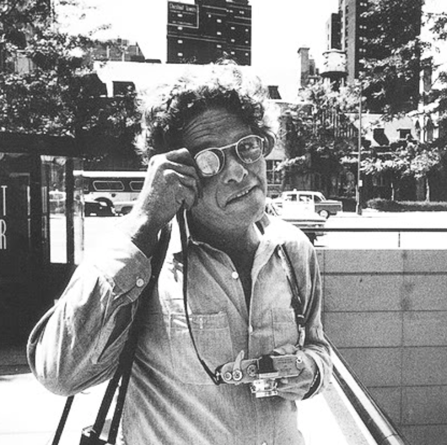
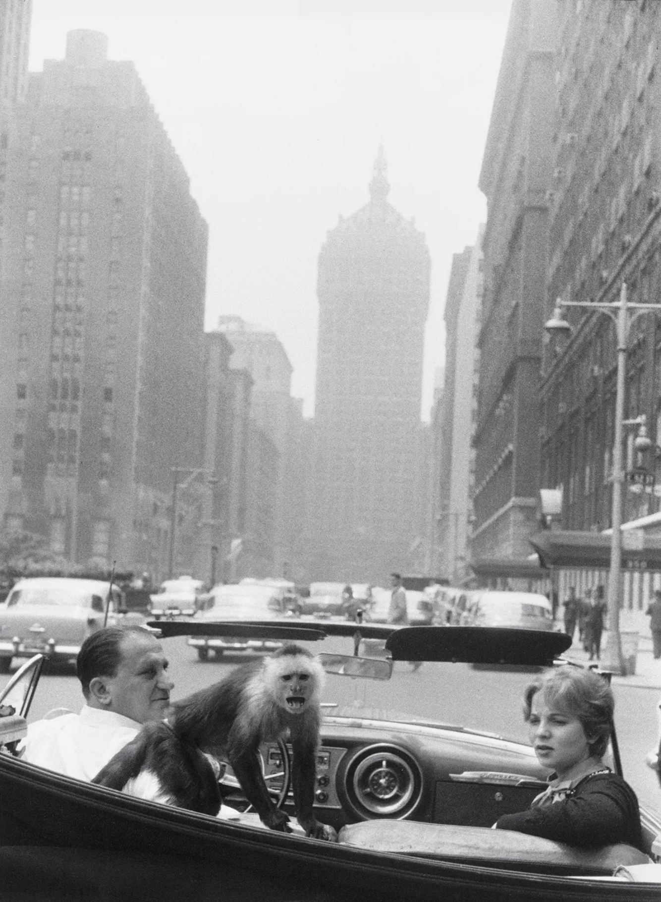
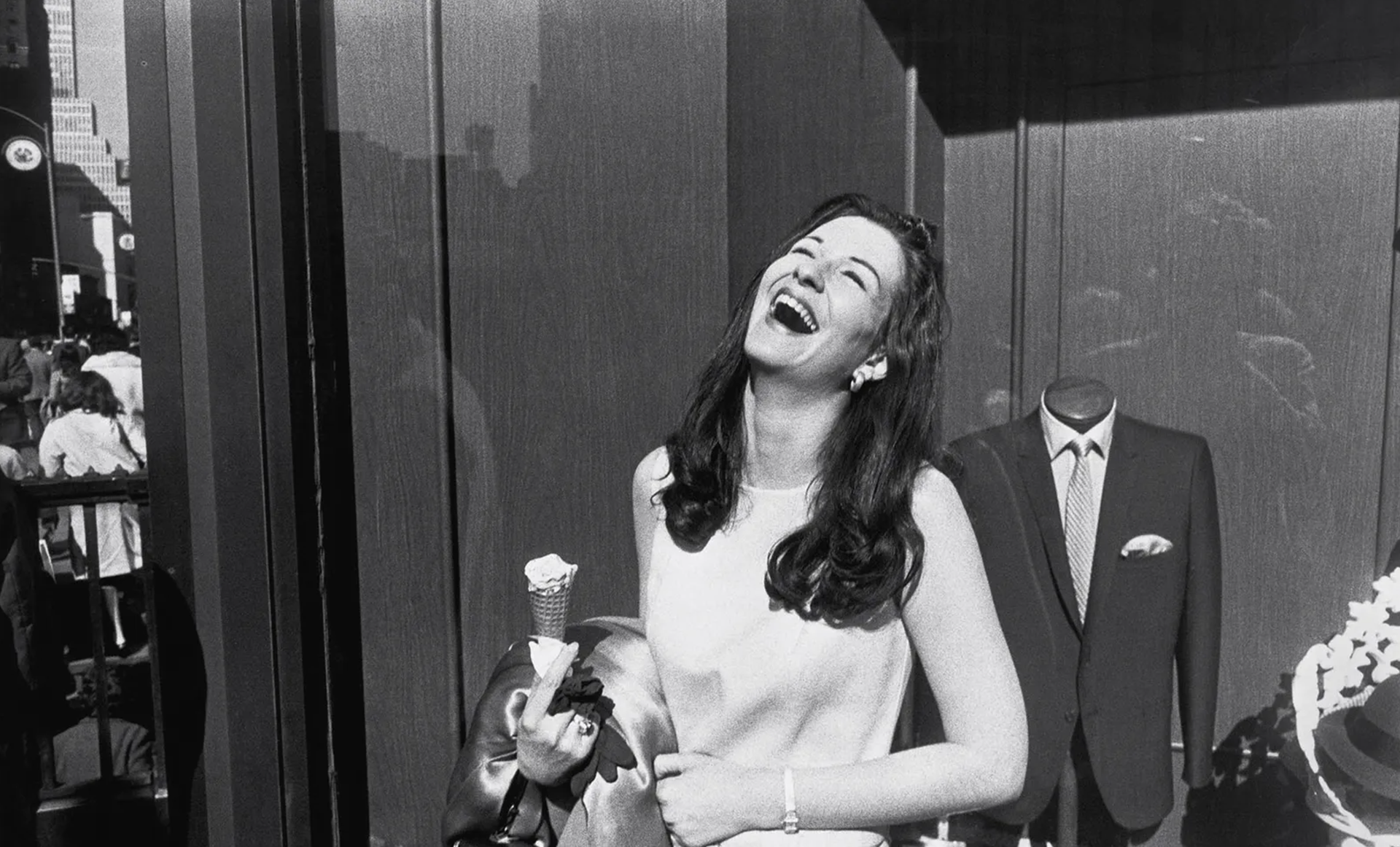
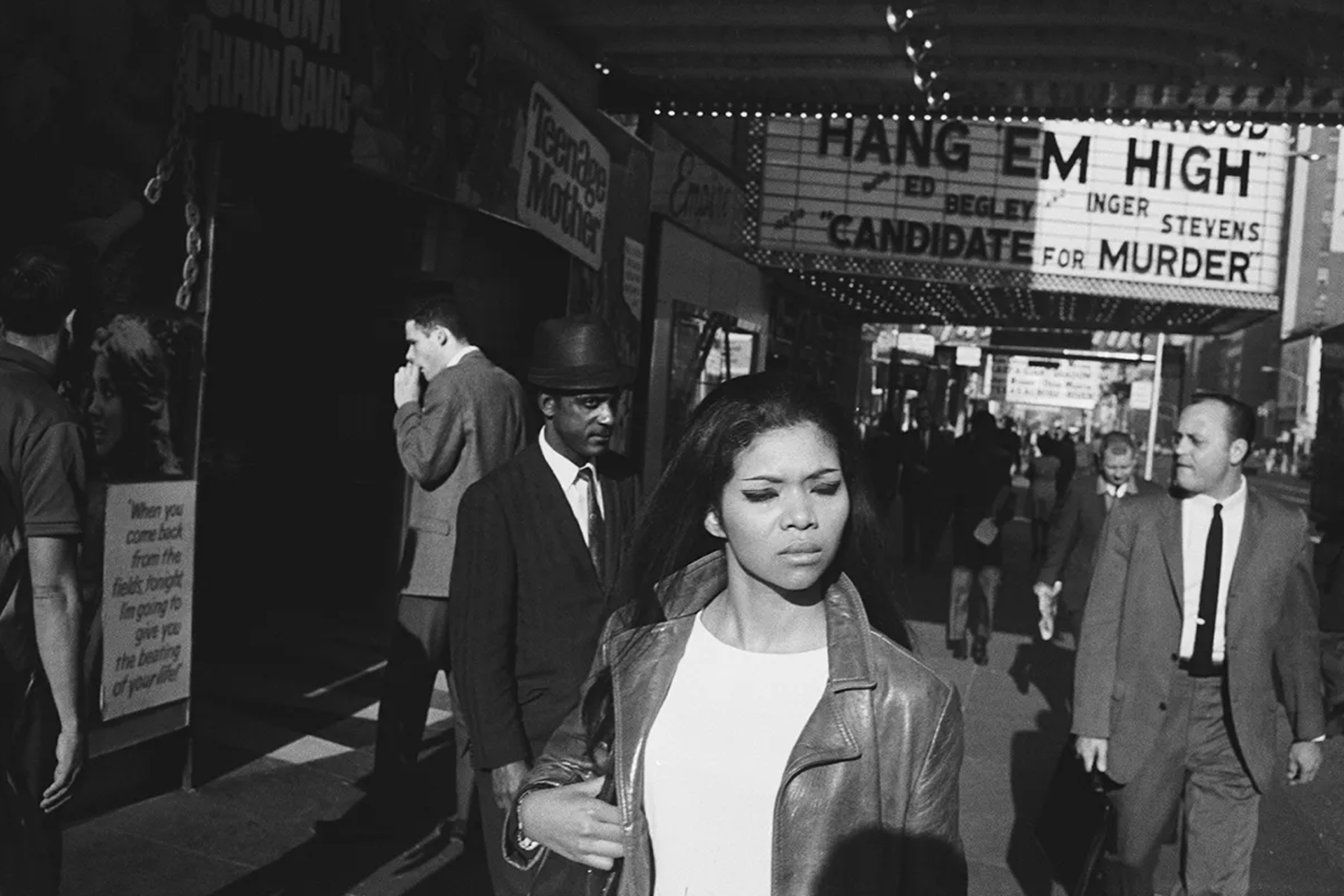
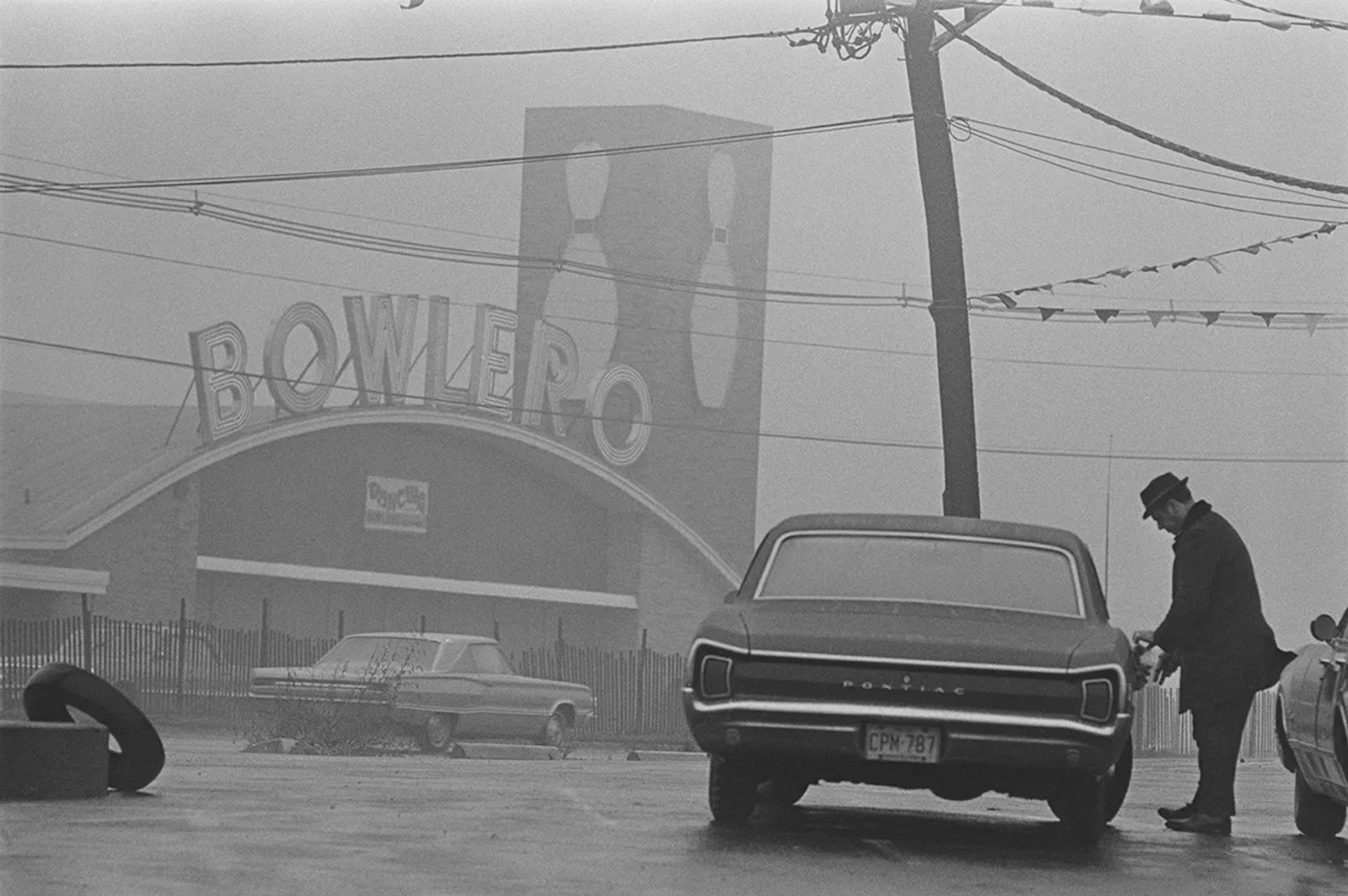
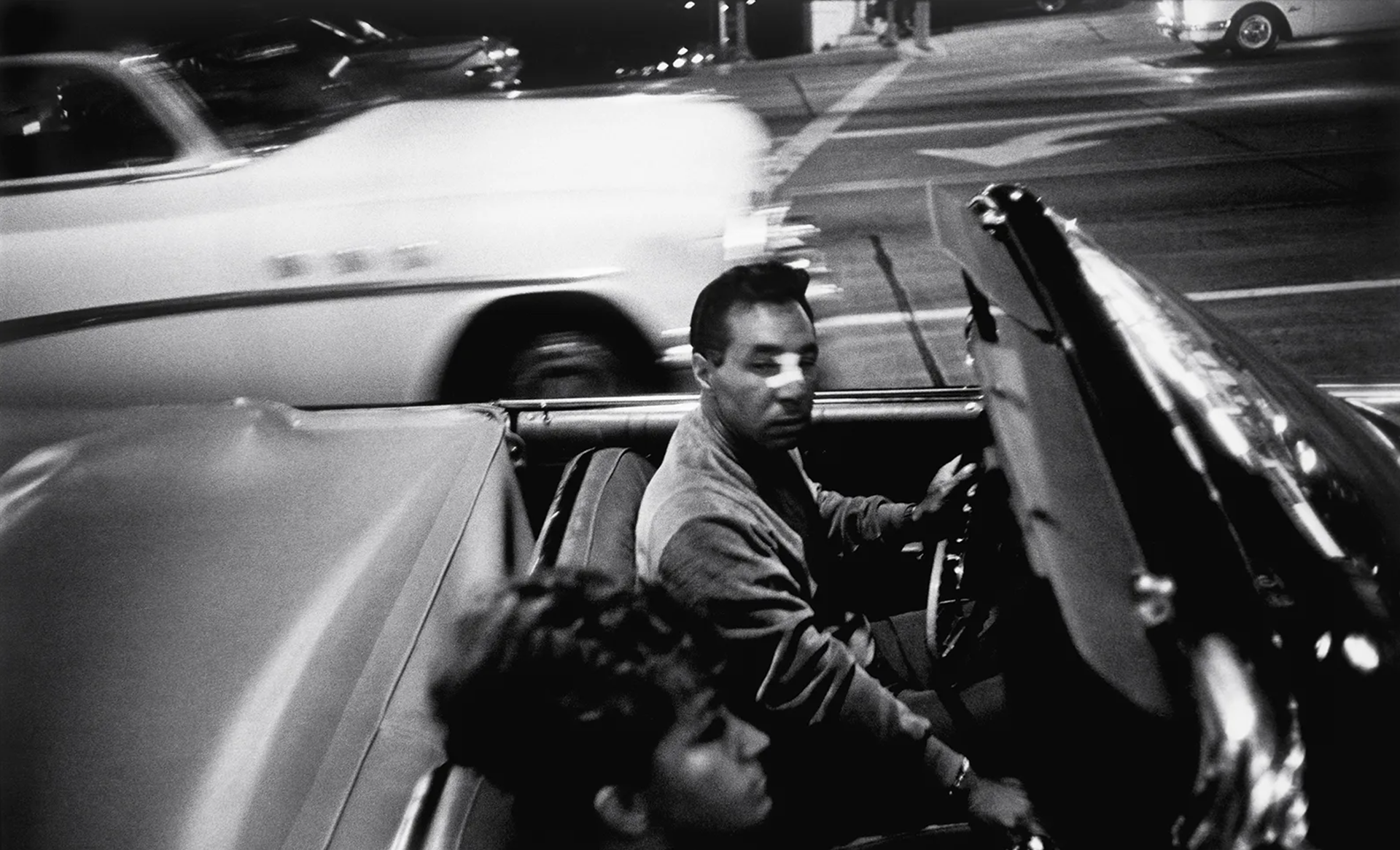
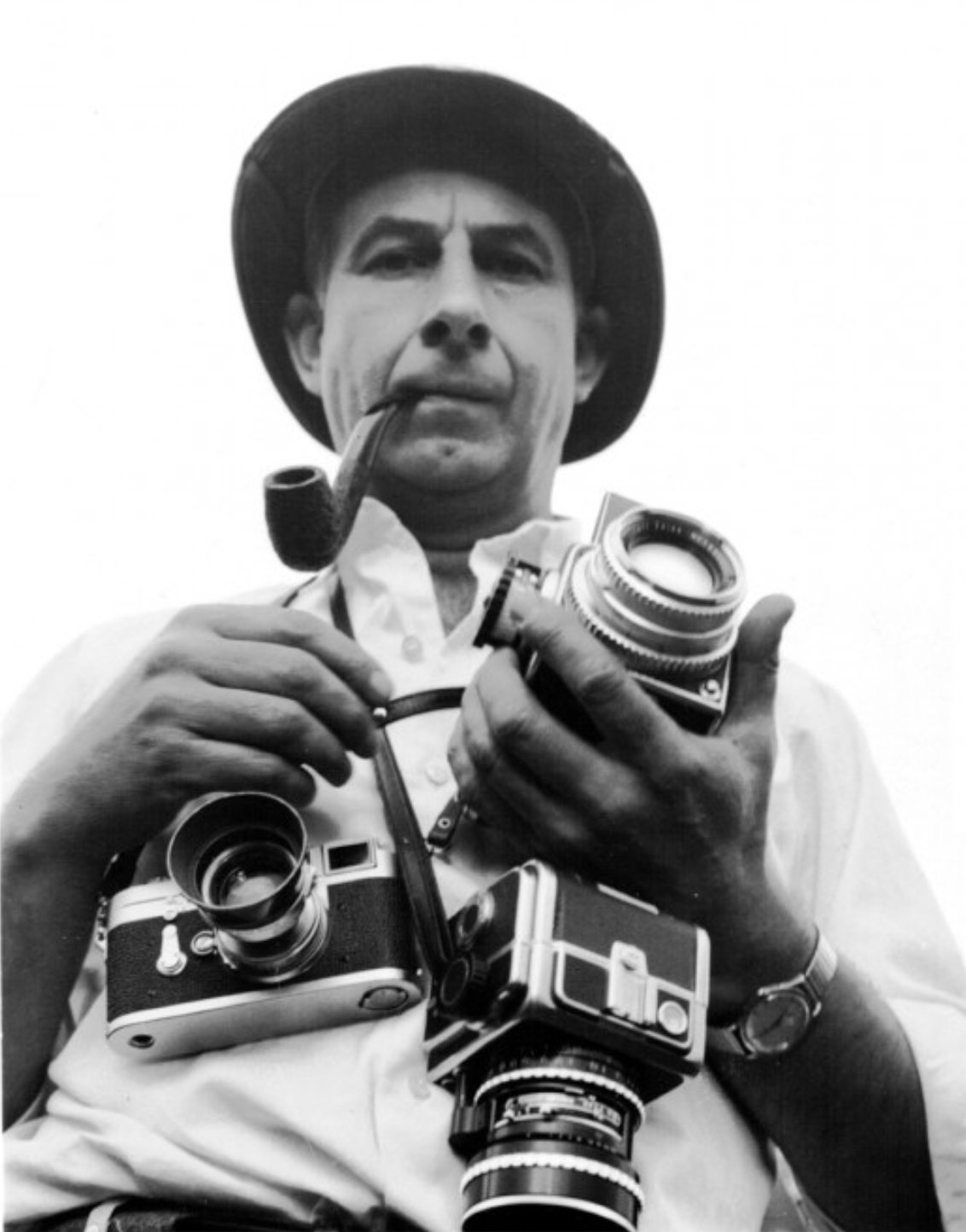
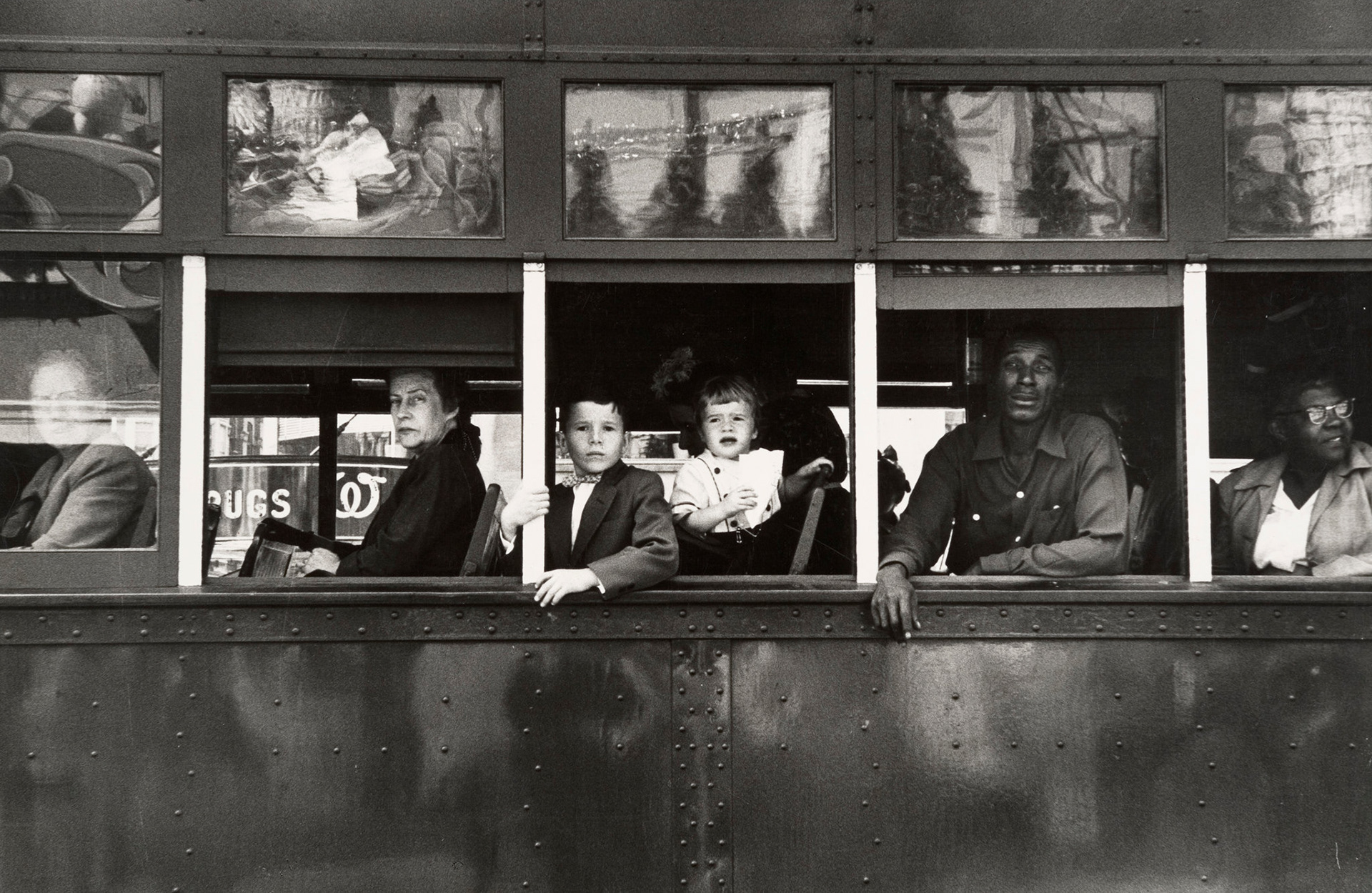
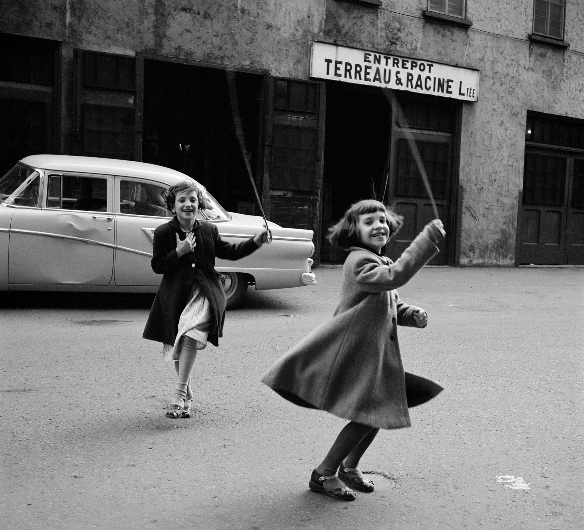
GARRY WINOGRAND
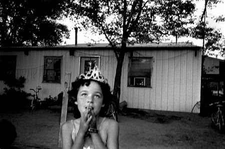
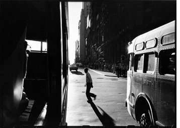
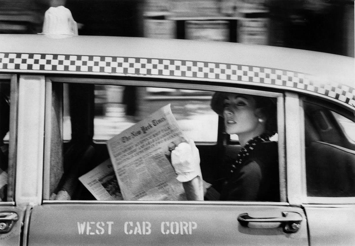
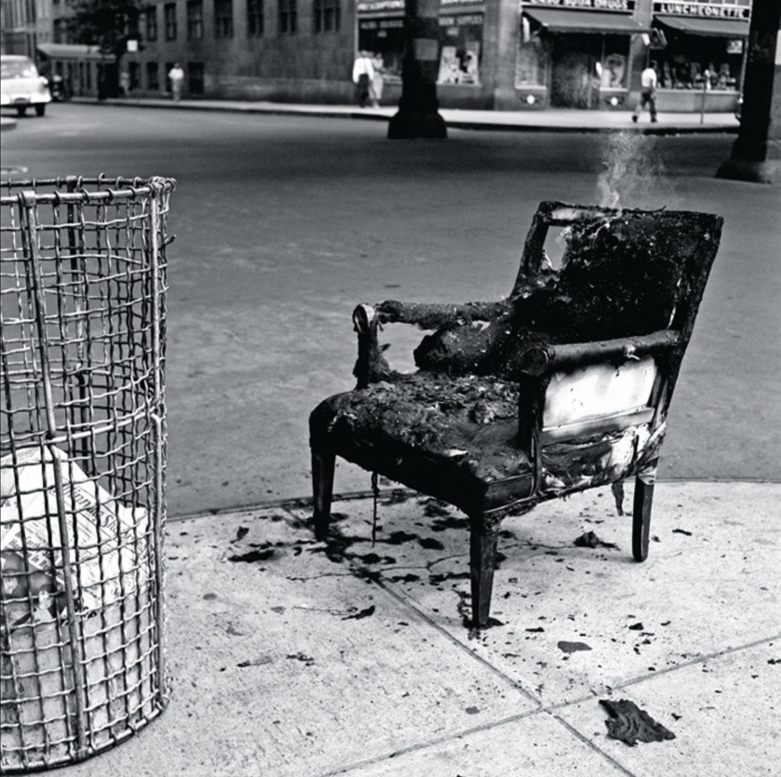
Garry Winogrand, (born January 14, 1928, Bronx, New York, U.S.—died March 19, 1984, Tijuana, Mexico), American street photographer known for his spontaneous images of people in public engaged in everyday life, particularly of New Yorkers during the 1960s. His unusual camera angles, uncanny sense of timing, and ability to capture bizarre and sometimes implausible configurations of people, places, and things made him one of the most influential photographers of his generation. He was extremely prolific, and though he died young, Winogrand created a vast corpus of work that documented society across the United States over the course of three decades.
source: https://www.britannica.com/biography/Garry-Winogrand
◉ Supposedly transformed street photography as art of observation into an act of participation.
◉ Used a 28mm wide-angle lens which allowed him to stand among his subjects as opposed apart from them as most street photographers do. If you look at photos as embodying different energies, perhaps otherwise referred to as themes, Garry played a significant role in shaping this energy. His subjects where participants rather than performers.
◉ Aimed his camera and looked in the viewfinder very quickly to the point where it was hard to tell whether he was taking a photo of you or not. As much as this may have avoided any conflict, it was also a big part of his aesthetic.
◉ He was "stinging his subjects with the camera, and their gaze back was as an expression of their surprise".
- A short text about where the photographer or photoshoot is from.
◉ Garry Winogrand was born in the Bronx, New York and is known for his candid images of everyday life. The images above were taken from his collection and are mostly taken in New York.
- How does the photographer work? I.E., do they work with fashion or music?
◉ Strong focus on street / documentary photography.
- Where is their work featured, or where or who do they work for?
◉ Winogrand died suddenly at age 56.
◉ He left a body of work that was in complete disarray, with about 35,000 prints, 6,600 rolls of film (2,500 rolls of exposed but undeveloped film and 4,100 processed but not reviewed), 45,000 colour transparencies, and about 22,000 contact sheets (nearly 800,000 images).
◉ The first major retrospective of Winogrand’s work in 25 years, held at the San Francisco Museum of Modern Art in 2013, exhibited nearly 100 photos that the photographer himself had never seen.
- How is the image made?
◉ Winogrand took all his photos on film, usually without a tripod.
- What camera do you think is used? (35mm, Medium format? What type of lens?)
◉ Winogrand was known for shooting on a Leica film camera with a 28mm lens.
- Is it a studio image or shot on location? ◉ Location
- Was a flash used or natural lighting? ◉ Natural Lighting
- Is it a film or a digital image? If so, how is this expressed in the image?
◉
- How is the image composed? What about the composition makes it striking?
◉ Alot of Winogrand's images are very chaotic, which I like. For me, it gives the images more life.
◉ "Winogrand did not strive for the classical composition of traditional photography. The tilted-frame technique, as opposed to placing the horizon line parallel to the frame, was Winogrand’s (successful) experiment and subsequently became common practice among street photographers. His style quickly acquired the name “snapshot aesthetic,” a term Winogrand rejected because it implied that his approach was casual and without focus."
7. Is the image very clear, or is it slightly out of focus? How is the image graded?
- It is slightly out of focus.
1. What tones are in the image? (i.e. heavy even-tones? high contrast?)
- High contrast and low contrast for the image of the man standing next to the car.
2. What sort of colour is it? (i.e., highly saturated or unsaturated? warm or cool tones?)
- Black & White
3. Is the image very clean, or is it edited to appear older?
- Clean, already old.
4. Is there any kind of texture to the image that makes it unique?
- The natural texture of the motion in the background is what makes Winogrand's work so unique.
Self-reflection
1. Talk here about how the image caught your eye and how you will use all of the points above to improve your work.
- The image caught my eye because I love candid documentary images which embody the life and era of the time. I think Garry Winogrand does this really well with his signature snapshot technique, which I will aim to replicate in my work.
RESULTS
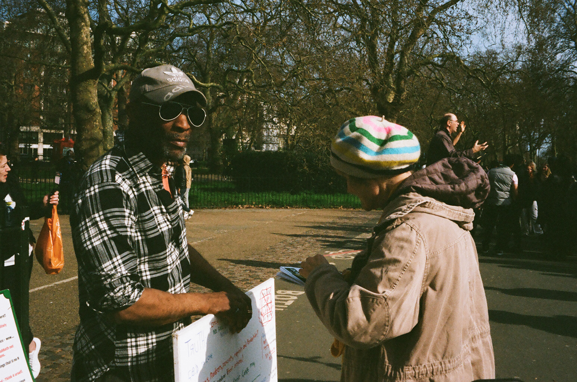
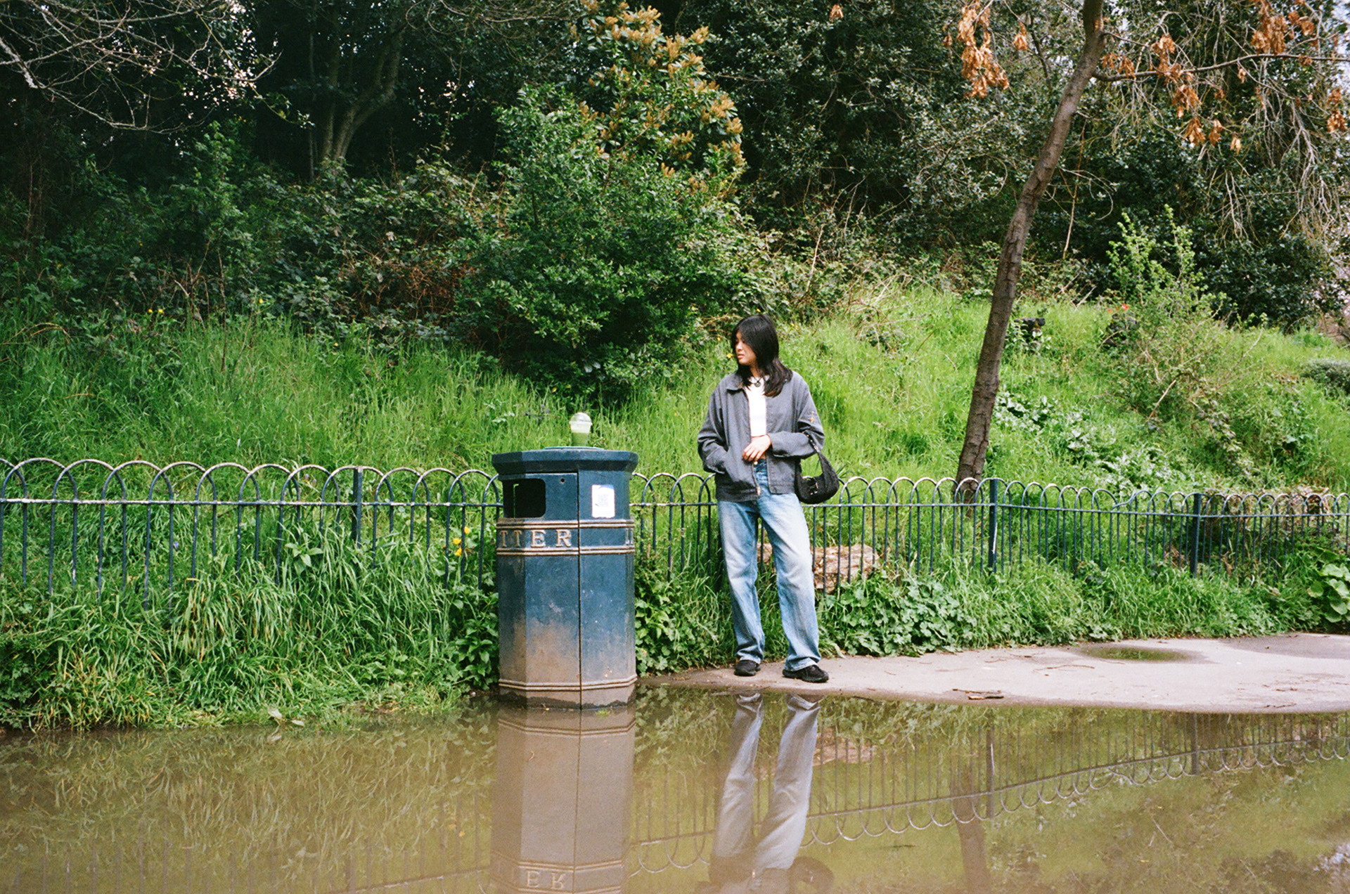
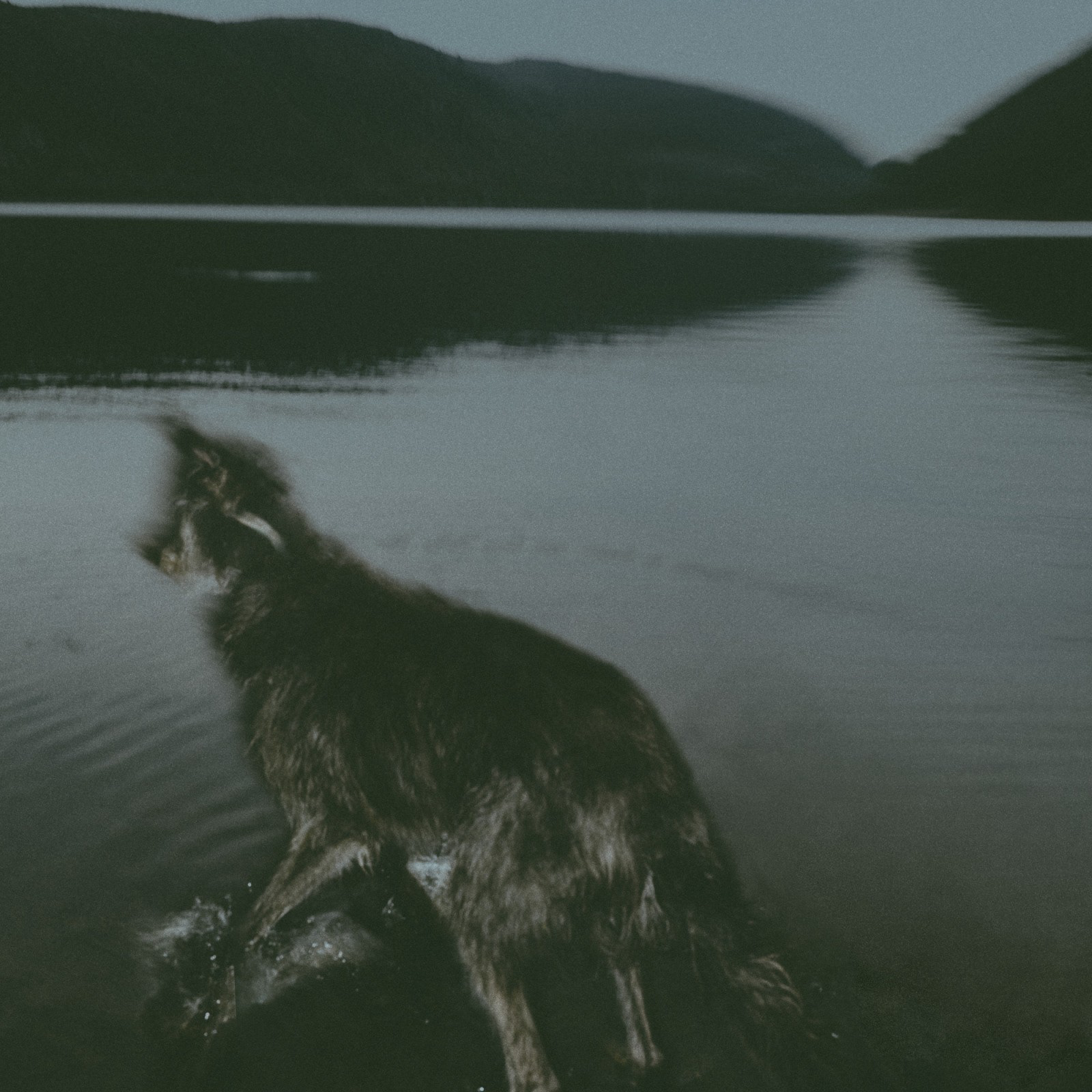
Shot on Portra 400 35mm film at the Speakers Corner near Marble Arch. Inspired by Garry Winogrands snapshot technique.
Shot on Portra 400 35mm film at the Barbican centre. Inspired by Garry Winogrand's snapshot technique.
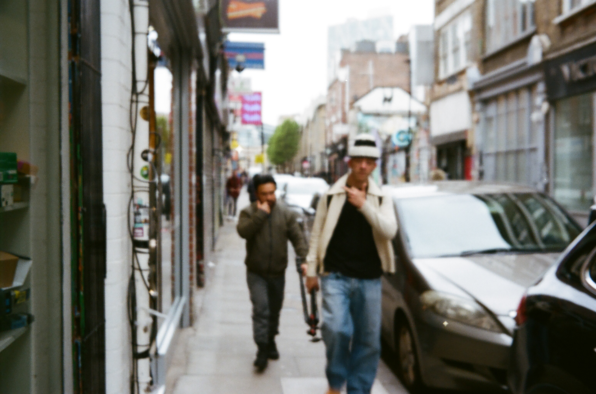
Another one taken in Brick Lane. Experimenting with out of focus.
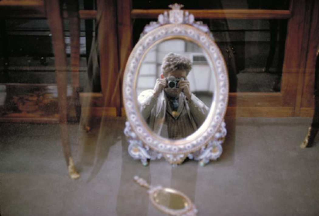
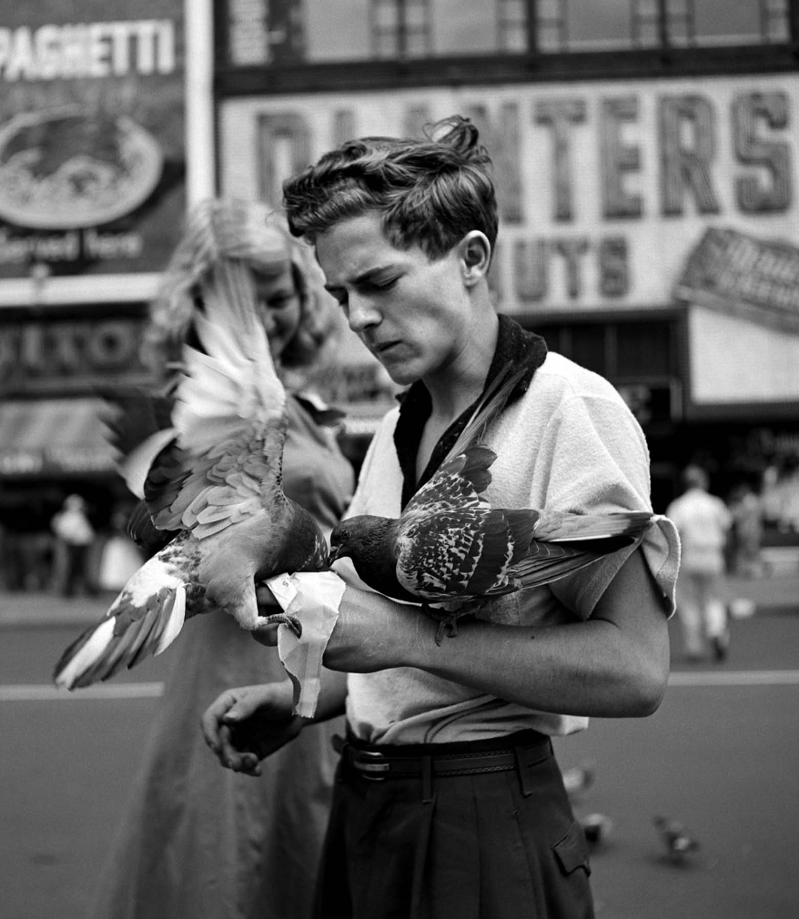
ROBERT FRANK
Robert Frank, (born November 9, 1924, Zürich, Switzerland—died September 9, 2019, Inverness, Nova Scotia, Canada), Swiss American photographer and director who was one of the most influential photographers of the mid-20th century, noted for his ironic renderings of American life.
Frank became a professional industrial photographer at the age of 22 and in the 1940s became a successful fashion photographer for Harper’s Bazaar magazine in Paris. He felt, however, that the scope of the work was too limited. He abandoned fashion photography about 1948 and went to the United States and then to Peru to explore the expressive possibilities of the 35-mm camera.
source: https://www.britannica.com/biography/Robert-Frank
PHOTOS


- A short text about where the photographer or photoshoot is from.
◉ Robert Frank is a Swiss born photography known for his 35mm film work of major cities in the United States and other countries such as Peru.
- How does the photographer work? I.E., do they work with fashion or music?
◉ Strong focus on street / documentary photography.
- Where is their work featured, or where or who do they work for?
◉ His life was chronicled in the documentaries Leaving Home, Coming Home: A Portrait of Robert Frank (2004) and Don’t Blink—Robert Frank (2015).
◉ After photographing in Europe in 1950 and 1953, Frank returned to the United States. Between 1955 and 1956 he drove across the country, taking a number of photographs. Of those, 83 were ultimately published as The Americans (1959), a photographic book.
- How is the image made?
◉ 35mm film photography.
- What camera do you think is used? (35mm, Medium format? What type of lens?)
◉ Nikon LTM lens on a Leica III.
- Is it a studio image or shot on location? ◉ Location
- Was a flash used or natural lighting? ◉ Natural Lighting
- Is it a film or a digital image? If so, how is this expressed in the image?
◉ Film, expressed through grain and motion blue.
- How is the image composed? What about the composition makes it striking?
◉ The way he used imprecise focus, incorporates blur into his work, and used grainy film. I think this gives the images more movement and life.
7. Is the image very clear, or is it slightly out of focus? How is the image graded?
- It is slightly out of focus and blurry with lots of grain.
1. What tones are in the image? (i.e. heavy even-tones? high contrast?)
- High contrast
2. What sort of colour is it? (i.e., highly saturated or unsaturated? warm or cool tones?)
- Black & White.
3. Is the image very clean, or is it edited to appear older?
- Clean.
4. Is there any kind of texture to the image that makes it unique?
- The signature grain of Robert Frank is what made the image unique at the time. I think the modern day equivalent of "overdoing" the grain would be adding printer scanner effects or ripped paper.
Self-reflection
1. Talk here about how the image caught your eye and how you will use all of the points above to improve your work.
- For me, the main things that caught my eye about Robert Franks work is his composition technique and use of 35mm film. As I will be shooting 35mm film for this unit I found his work to be a great source of inspiration. In a lot of his images, he's photographing moving objects such as cars but still capturing the still life within them. I think this creates a great contrast between our own little world and the point of view of the one around us.
RESULTS
Taken on Portra 400 35mm film in Victoria Park.
FINAL EDIT
VIVIAN MAIER
◉ Watched a documentary about her life and work during class on 17/2 which peaked my interest in her work.
◉ A lot of her work was only recognised after she died in 2009 and her work was gathered, restored, printed and published by various collectors.
◉ She took over 150,000 photographs.
◉ Mainly photographed the urban human landscape. Her preferred subjects were children, the poor, the marginalized, and the elderly, some of them aware of her and some not. She also made a number of self-portraits.
◉ Supposedly had a dark side as described by those who knew her - something which may explain how she was drawn to capturing moments which showed a bittersweet side to life and humanity.
- A short text about where the photographer or photoshoot is from.
◉ Vivian Maier was born in New York to a French mother and Austrian father.
◉ She photographed worldwide (China) but her main areas were Chicago, New York and Los Angeles.
◉ Maier's best-known photographs depict street scenes in Chicago and New York during the 1950s and 1960s.
- How does the photographer work? I.E., do they work with fashion or music?
◉ Strong focus on street / documentary photography.
- Where is their work featured, or where or who do they work for?
◉ Vivian never worked for anyone (as a photographer) and was first published on the internet in 2008 by Ron Slatter, a Chicago based collector.
◉ In 2009, these images were then uploaded to Flickr where they gained a lot of popularity, a documentary (Finding Vivian Maier) was then released in 2013 which brought more attention to her name.
◉ Her work is now seen and reference in many galleries and exhibitions.
- How is the image made?
◉ Vivian photographed on 120 film which gave her photographs more details than others of her time due to the large surface area of the film and its ability to capture more light.
◉ The majority of her photos are on black and white film using natural lighting.
- What camera do you think is used? (35mm, Medium format? What type of lens?)
◉ Vivian bought her first camera in 1952 which was a Rolleiflex.
◉ Her cameras of choice were the Rolleiflex 3.5T, Rolleiflex 3.5F, Rolleiflex 2.8C, Rolleiflex Automat among others. She later also used a Leica IIIc rangefinder camera, an Ihagee Exakta, a Zeiss Contarex and other SLR cameras.
◉ In the late 1970s she stopped using a Rolleiflex and resorted to colour transparent Ektachrome film.
- Is it a studio image or shot on location? ◉ Location
- Was a flash used or natural lighting? ◉ Natural Lighting
- Is it a film or a digital image? If so, how is this expressed in the image?
◉ 120mm B&W film and Ektachrome.
◉ Most recognised for her 120mm film photos, this is expressed through vivid detail, less grain and sharp shadows.
- How is the image composed? What about the composition makes it striking?
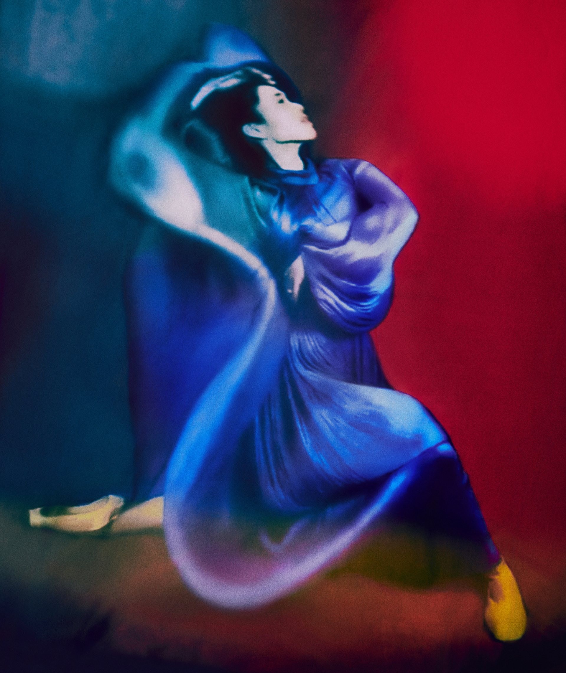
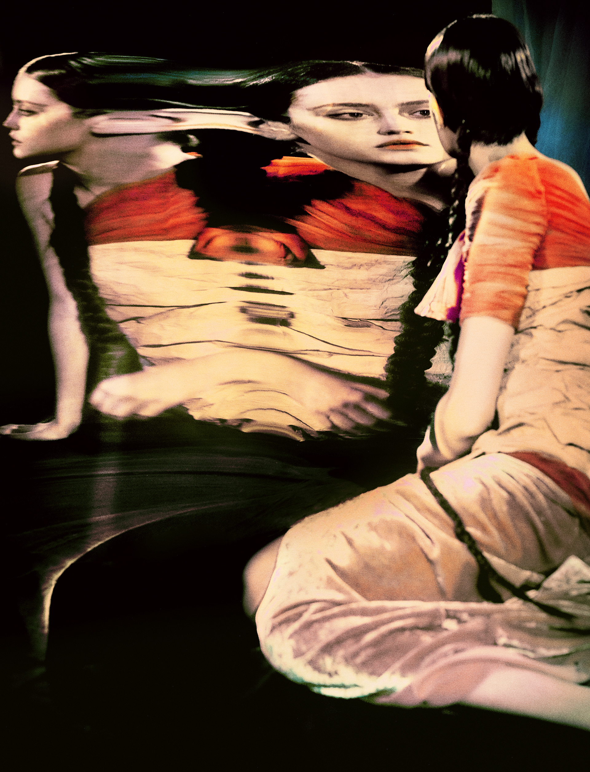
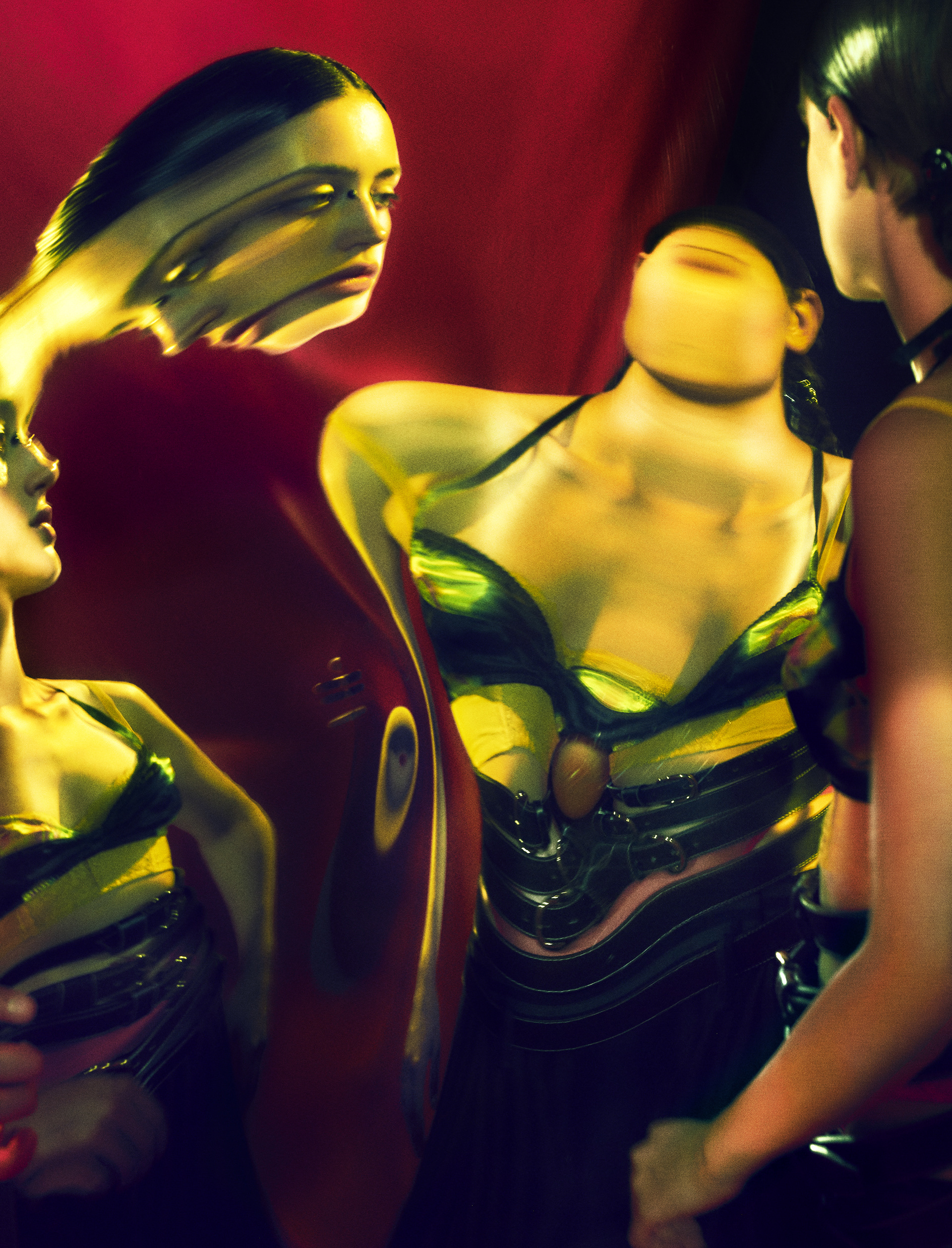
◉Her facing the light from the side adds shadow and more depth behind her, allowing the second alternate persona to smoothly enter from the exposed side.
7. Is the image very clear, or is it slightly out of focus? How is the image graded?
- It is slightly out of focus and blurry which makes it more ambiguous and fine art like.
1. What tones are in the image? (i.e. heavy even-tones? high contrast?)
- High contrast
2. What sort of colour is it? (i.e., highly saturated or unsaturated? warm or cool tones?)
- Blue highlights, green shadows with a dark red background.
3. Is the image very clean, or is it edited to appear older?
- Edited to appear older.
4. Is there any kind of texture to the image that makes it unique?
- The scratches on the background are very irregular and unpredictable.
- The motion blur does not feel like a natural motion.
Self-reflection
1. Talk here about how the image caught your eye and how you will use all of the points above to improve your work.
- The image caught my eye because I am interested in the process of adding fine art to my photography and adding different types of distortion to make the photo either more ambiguous or to emphasise of a message I'm trying to communicate. Elizaveta does the really effectively to the point where the whole photo looks like it's been painted apart from the subject, which is still conveyed very ambiguously.
RESULTS
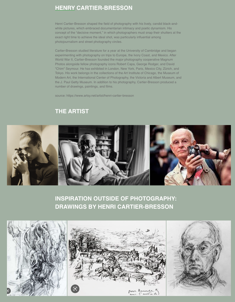
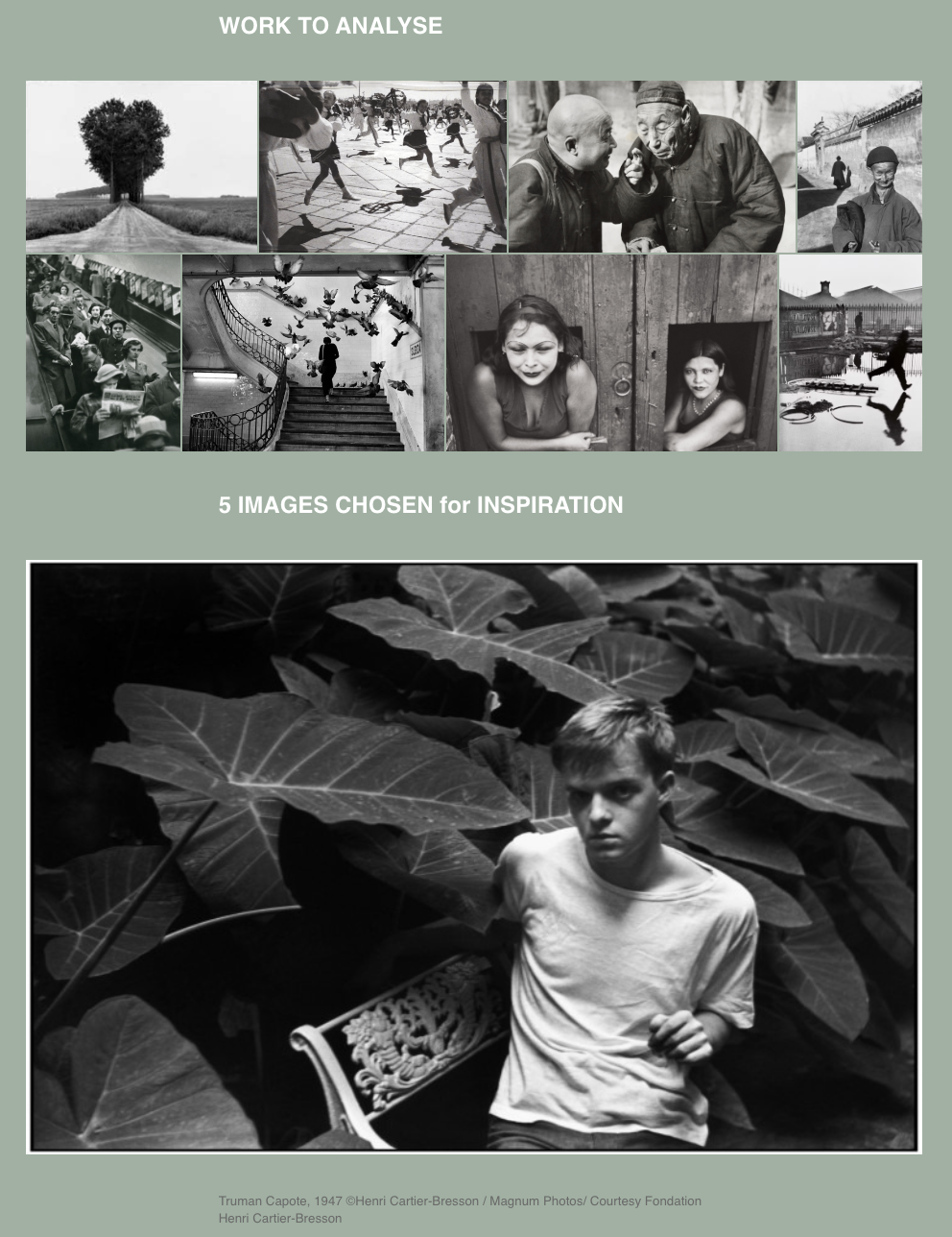
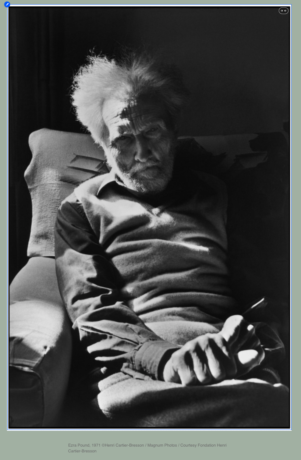
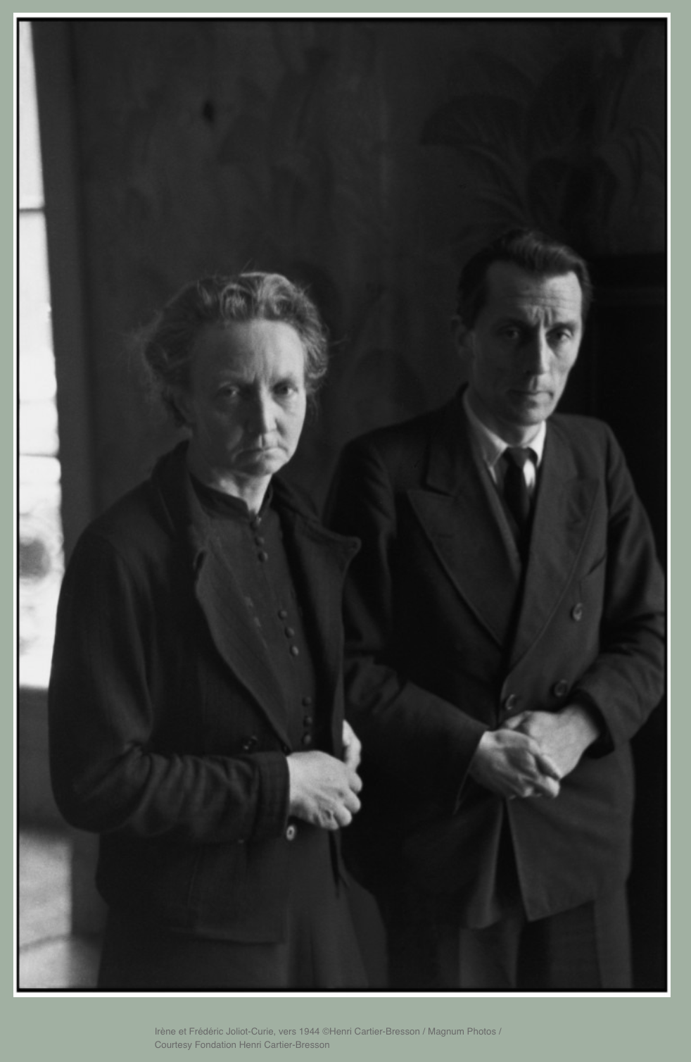
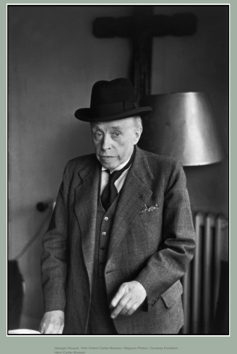
HENRY CARTIER-BRESSON
behance crashed while doing my research, fortunetely, I've learnt to screenshot before reloading the page. I've included the screenshots below.
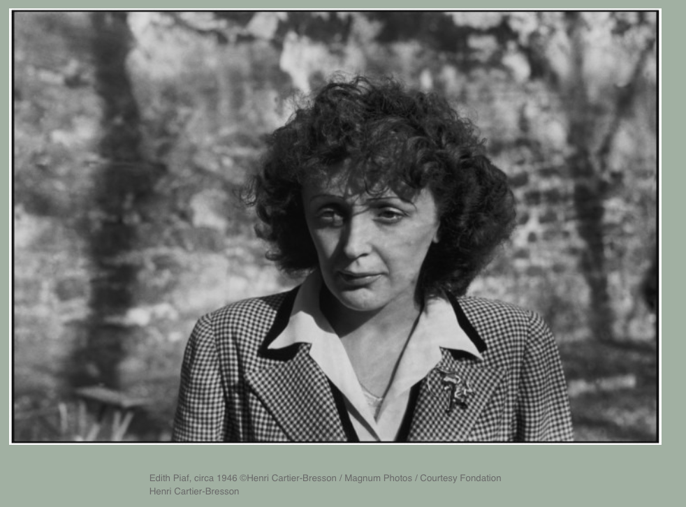
- A short text about where the photographer or photoshoot is from.
◉ Henri Cartier-Bresson is a french
- How does the photographer work? I.E., do they work with fashion or music?
◉ Strong focus on street / documentary photography.
- Where is their work featured, or where or who do they work for?
◉ Vivian never worked for anyone (as a photographer) and was first published on the internet in 2008 by Ron Slatter, a Chicago based collector.
◉ In 2009, these images were then uploaded to Flickr where they gained a lot of popularity, a documentary (Finding Vivian Maier) was then released in 2013 which brought more attention to her name.
◉ Her work is now seen and reference in many galleries and exhibitions.
- How is the image made?
◉ Vivian photographed on 120 film which gave her photographs more details than others of her time due to the large surface area of the film and its ability to capture more light.
◉ The majority of her photos are on black and white film using natural lighting.
- What camera do you think is used? (35mm, Medium format? What type of lens?)
◉ Vivian bought her first camera in 1952 which was a Rolleiflex.
◉ Her cameras of choice were the Rolleiflex 3.5T, Rolleiflex 3.5F, Rolleiflex 2.8C, Rolleiflex Automat among others. She later also used a Leica IIIc rangefinder camera, an Ihagee Exakta, a Zeiss Contarex and other SLR cameras.
◉ In the late 1970s she stopped using a Rolleiflex and resorted to colour transparent Ektachrome film.
- Is it a studio image or shot on location? ◉ Location
- Was a flash used or natural lighting? ◉ Natural Lighting
- Is it a film or a digital image? If so, how is this expressed in the image?
◉ 120mm B&W film and Ektachrome.
◉ Most recognised for her 120mm film photos, this is expressed through vivid detail, less grain and sharp shadows.
- How is the image composed? What about the composition makes it striking?
◉Her facing the light from the side adds shadow and more depth behind her, allowing the second alternate persona to smoothly enter from the exposed side.
7. Is the image very clear, or is it slightly out of focus? How is the image graded?
- It is slightly out of focus and blurry which makes it more ambiguous and fine art like.
1. What tones are in the image? (i.e. heavy even-tones? high contrast?)
- High contrast
2. What sort of colour is it? (i.e., highly saturated or unsaturated? warm or cool tones?)
- Blue highlights, green shadows with a dark red background.
3. Is the image very clean, or is it edited to appear older?
- Edited to appear older.
4. Is there any kind of texture to the image that makes it unique?
- The scratches on the background are very irregular and unpredictable.
- The motion blur does not feel like a natural motion.
Self-reflection
1. Talk here about how the image caught your eye and how you will use all of the points above to improve your work.
- The image caught my eye because I am interested in the process of adding fine art to my photography and adding different types of distortion to make the photo either more ambiguous or to emphasise of a message I'm trying to communicate. Elizaveta does the really effectively to the point where the whole photo looks like it's been painted apart from the subject, which is still conveyed very ambiguously.
RESULTS
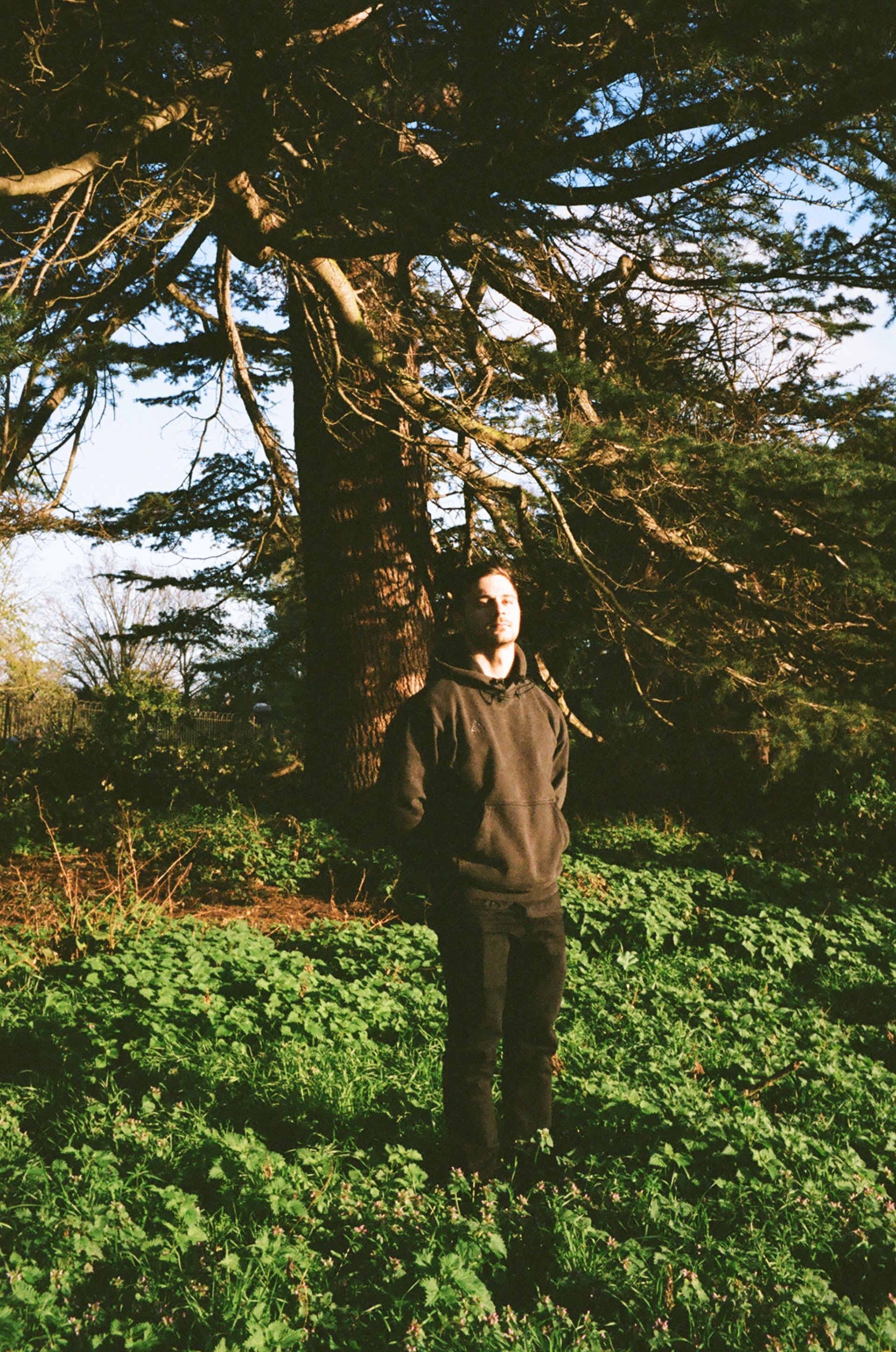
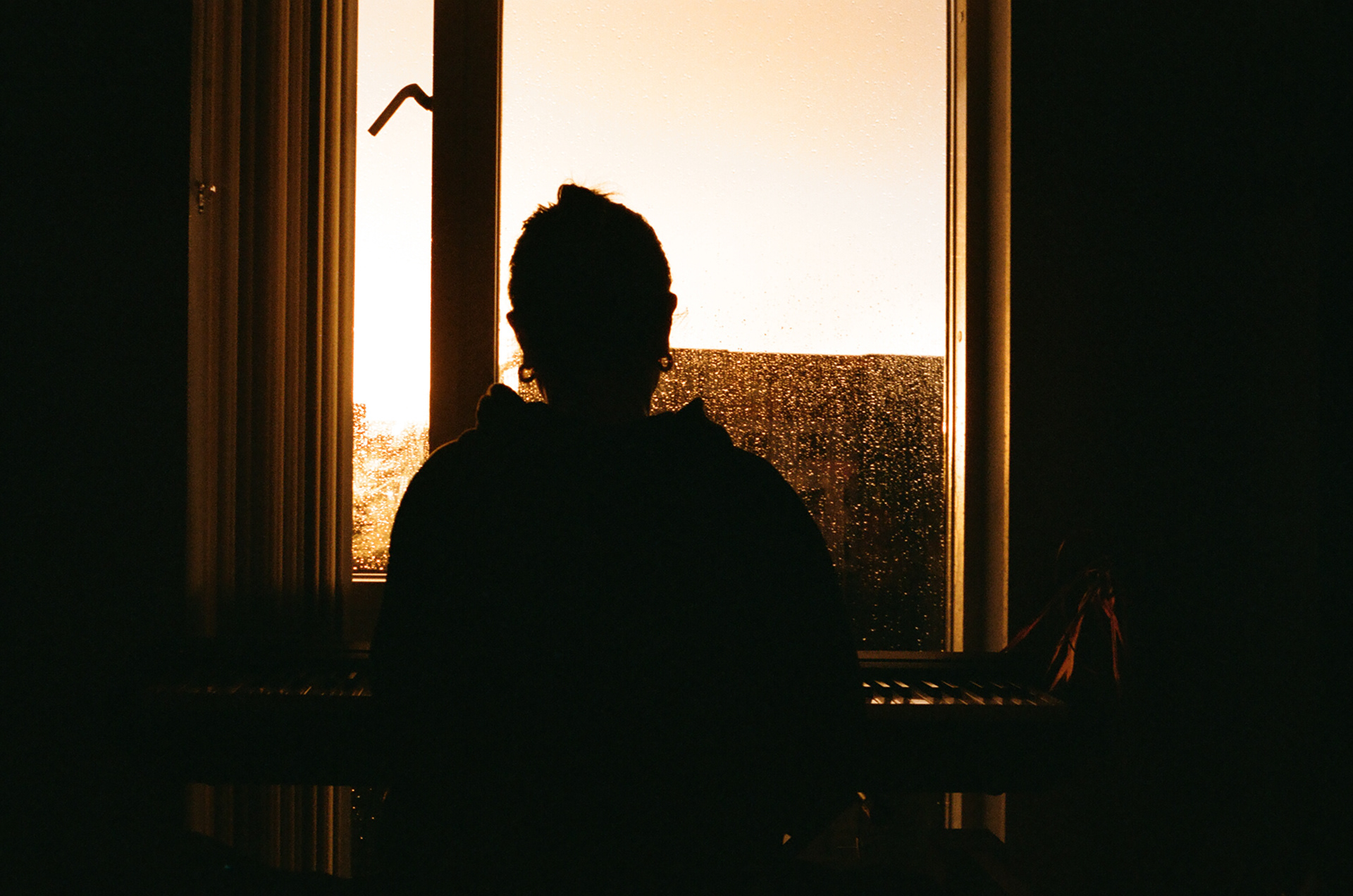
Portrait taken of my twin brother on Portra 400 35mm in Ravenscourt Park in West London. The photo has been turned black and white in editing to replicate the look of Henri Cartier-Bresson.

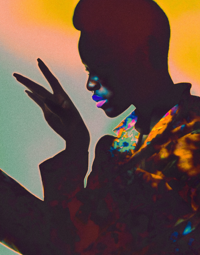
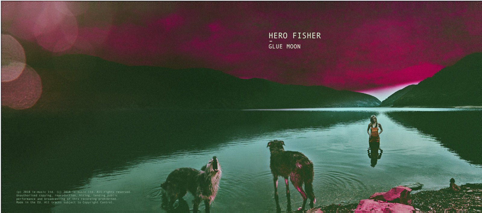
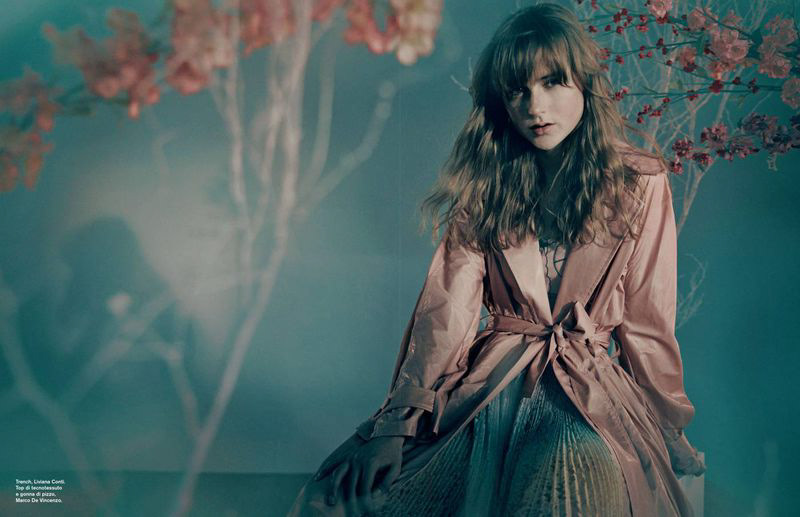
JULIAN BROAD
Album cover shoot for Hero Fisher - Glue Moon. 2018.
I found out about Julian Broad while researching documentary photographers with an abstract style.
Dolce Stil Novo (D Repubblica)

INSPIRATION OUTSIDE OF PHOTOGRAPHY