The Industry
1. A BAD IDEA
I started coming up with two ideas:
1. Street art creates a voice for the people.
2. Homelessness and poverty hides in plain sight.
After discussing the ideas with my peers I decided my first idea was better because photographing homelessness and poverty has ethical challenges which may put my safety at risk.
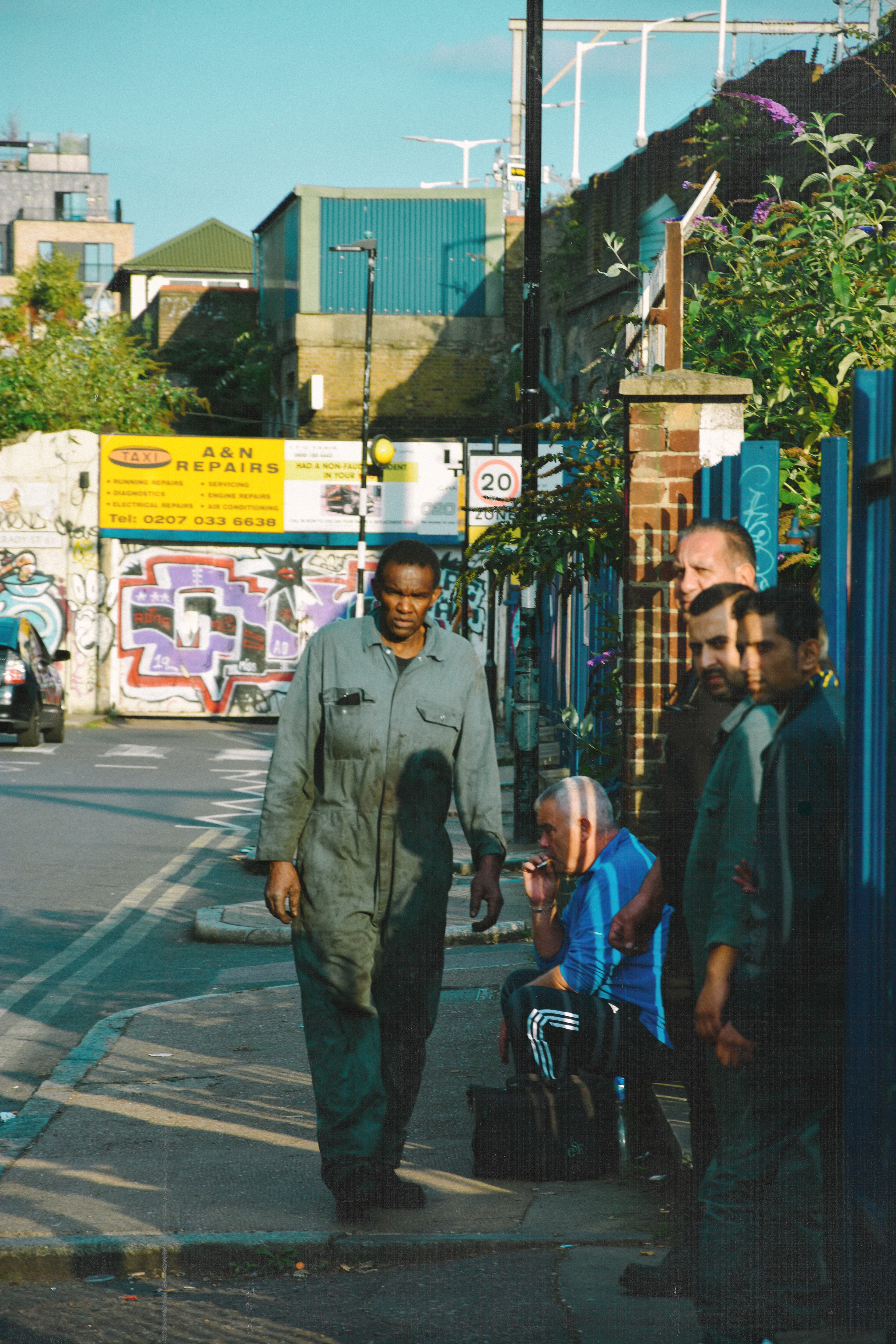
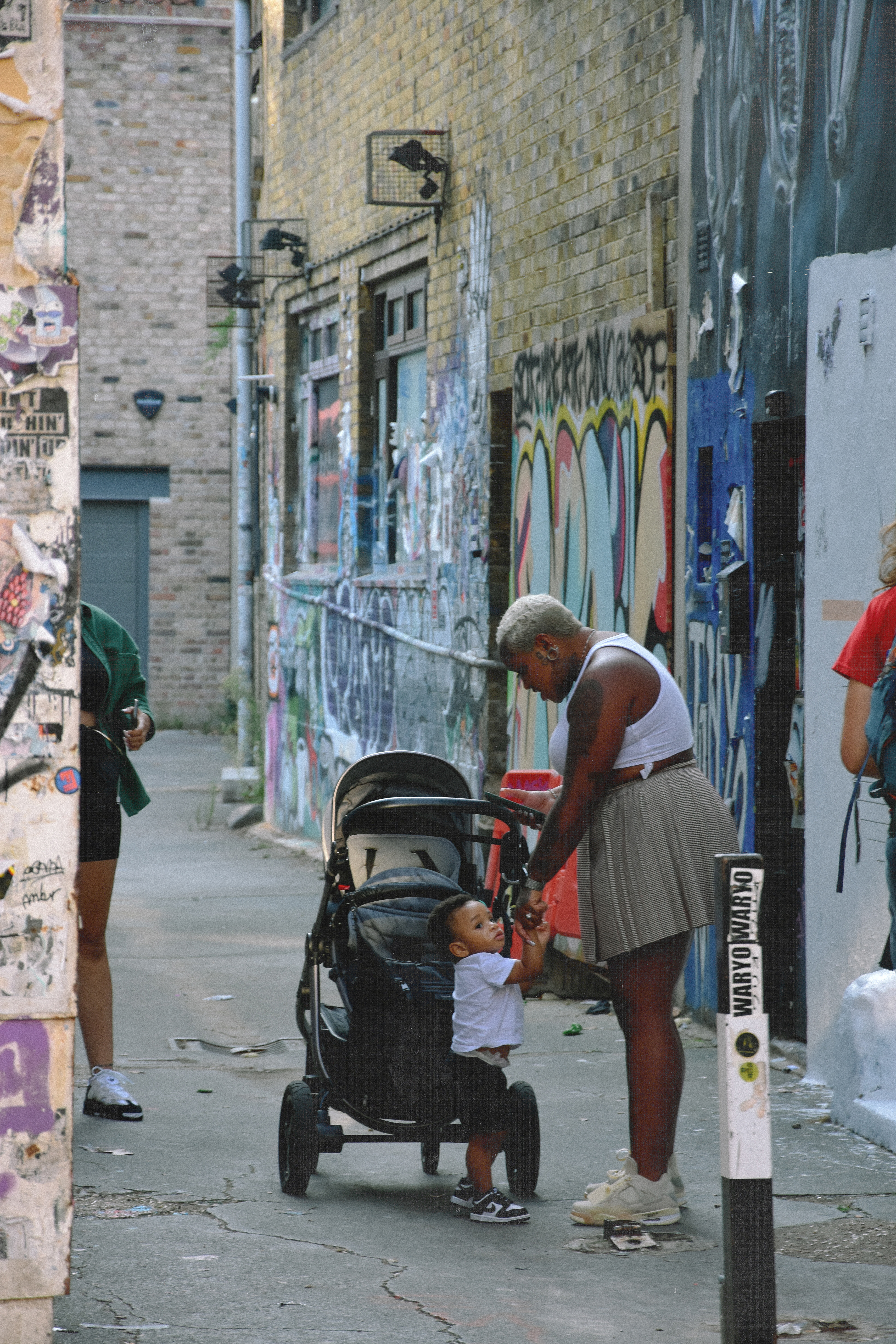
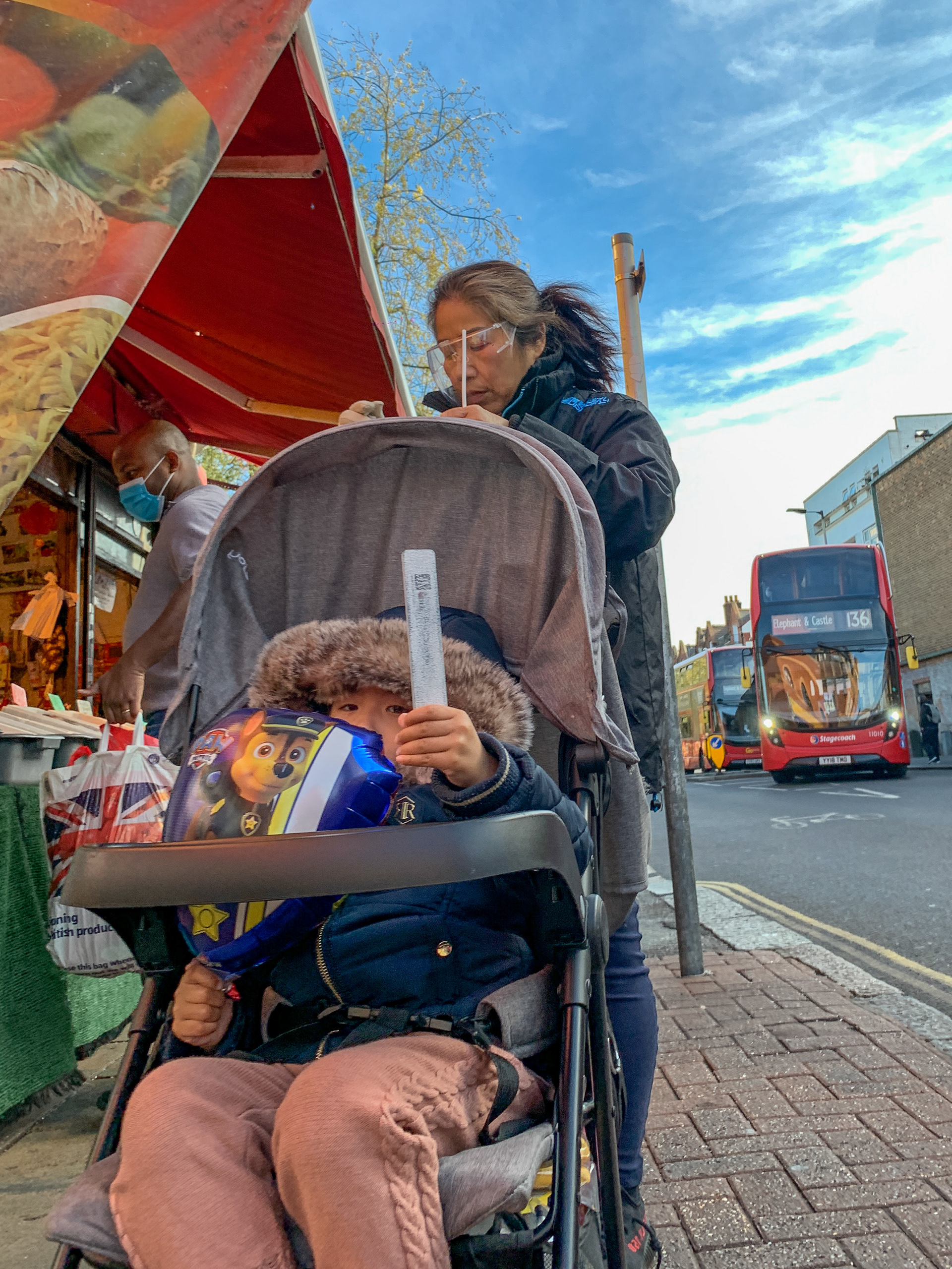
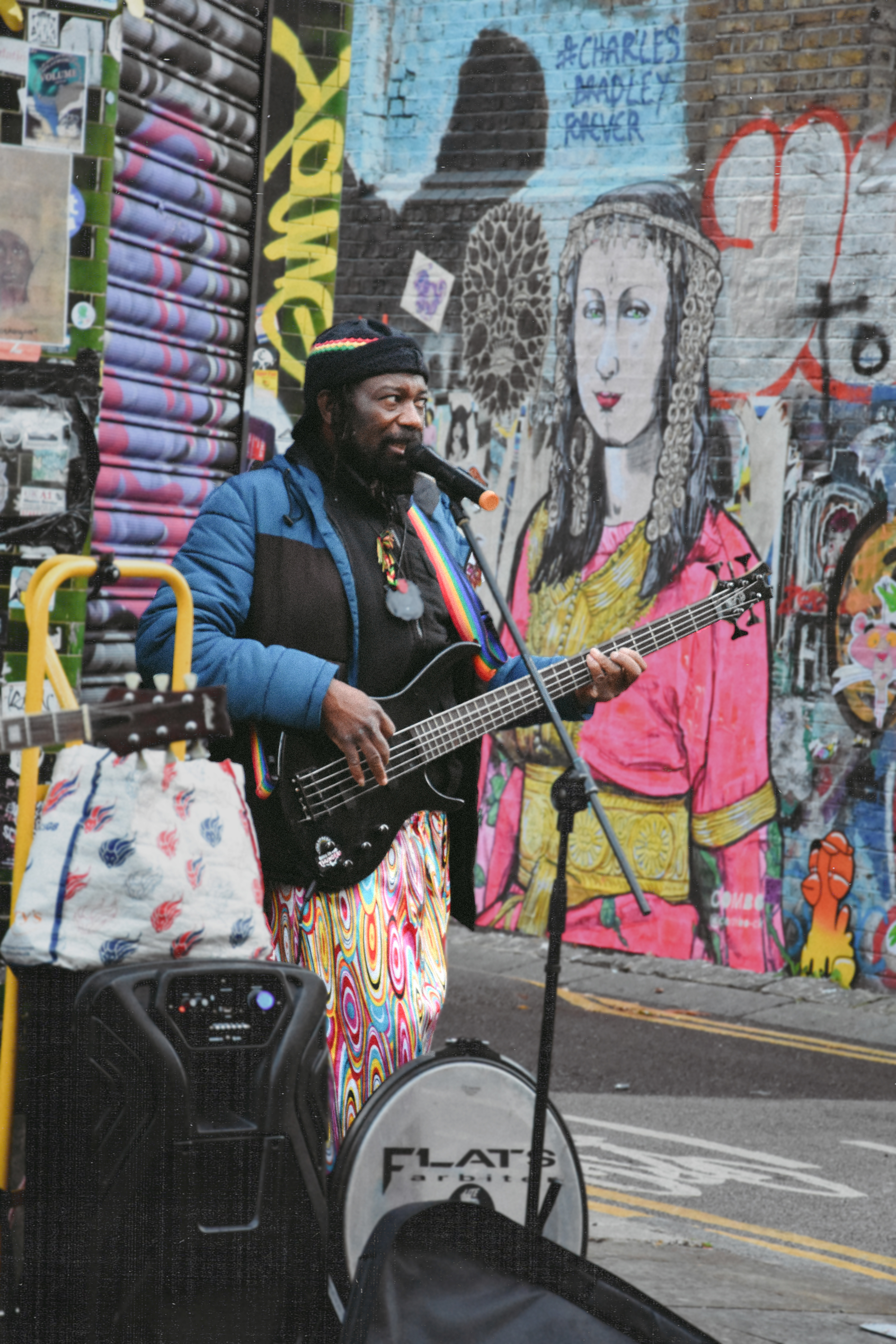
I begun shooting my idea near where I live in Shoreditch. The area is full of street art and turned out to suit my idea well.
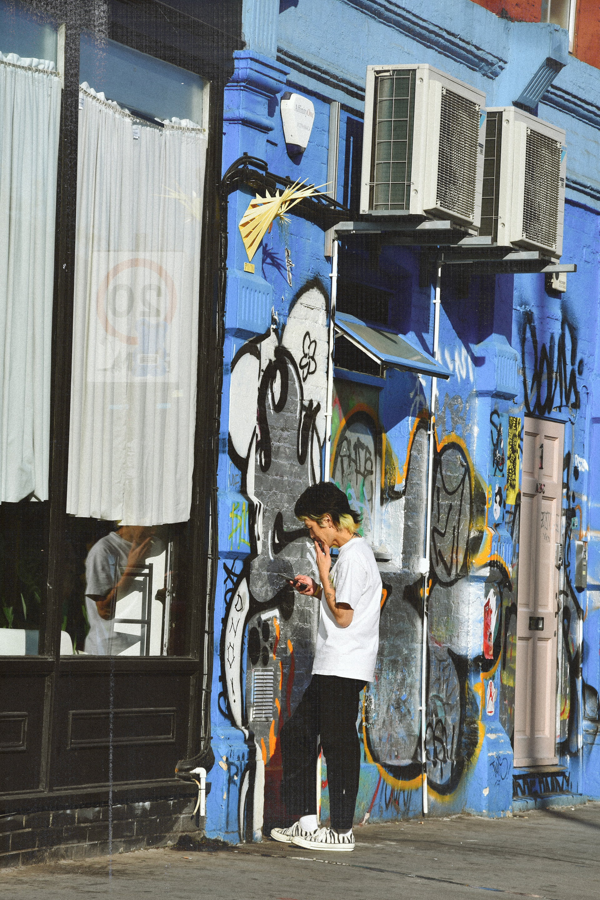

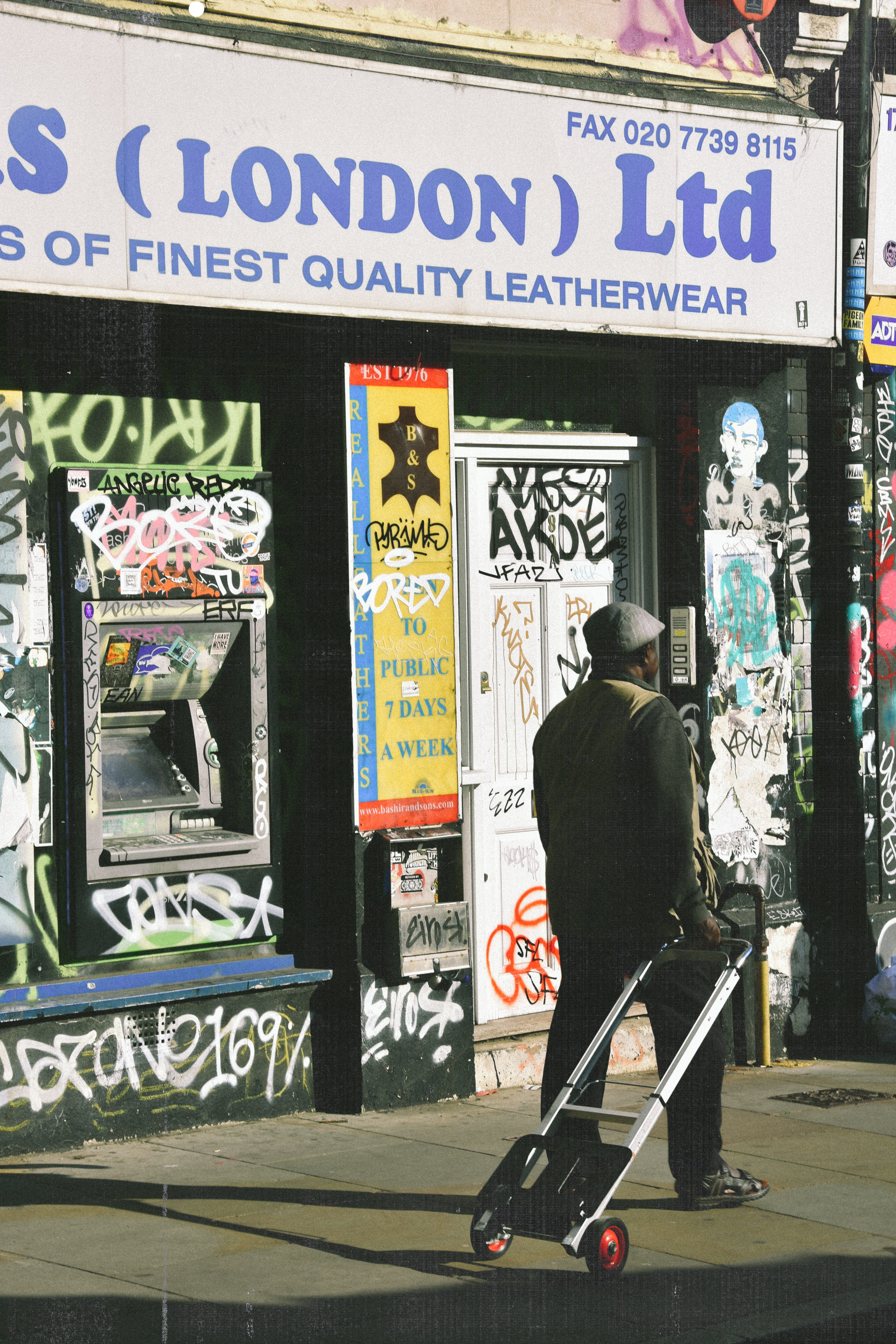
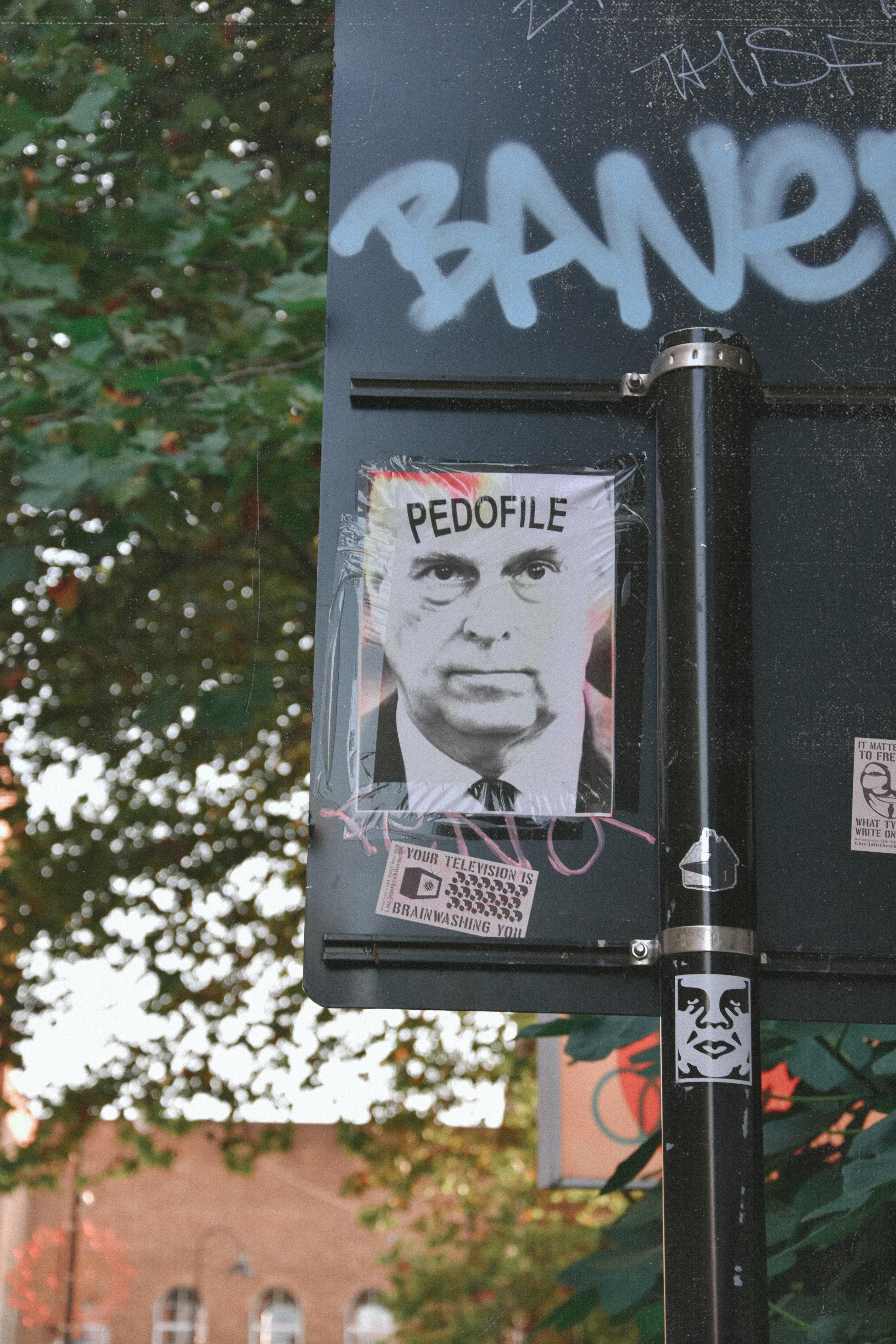
I shot some more photos today surrounding my idea. I met some street artists whilst walking around and talked to them about my idea. They agreed with it but believed it depends on how people use street art and whether the message represents their opinion or a majority opinion.
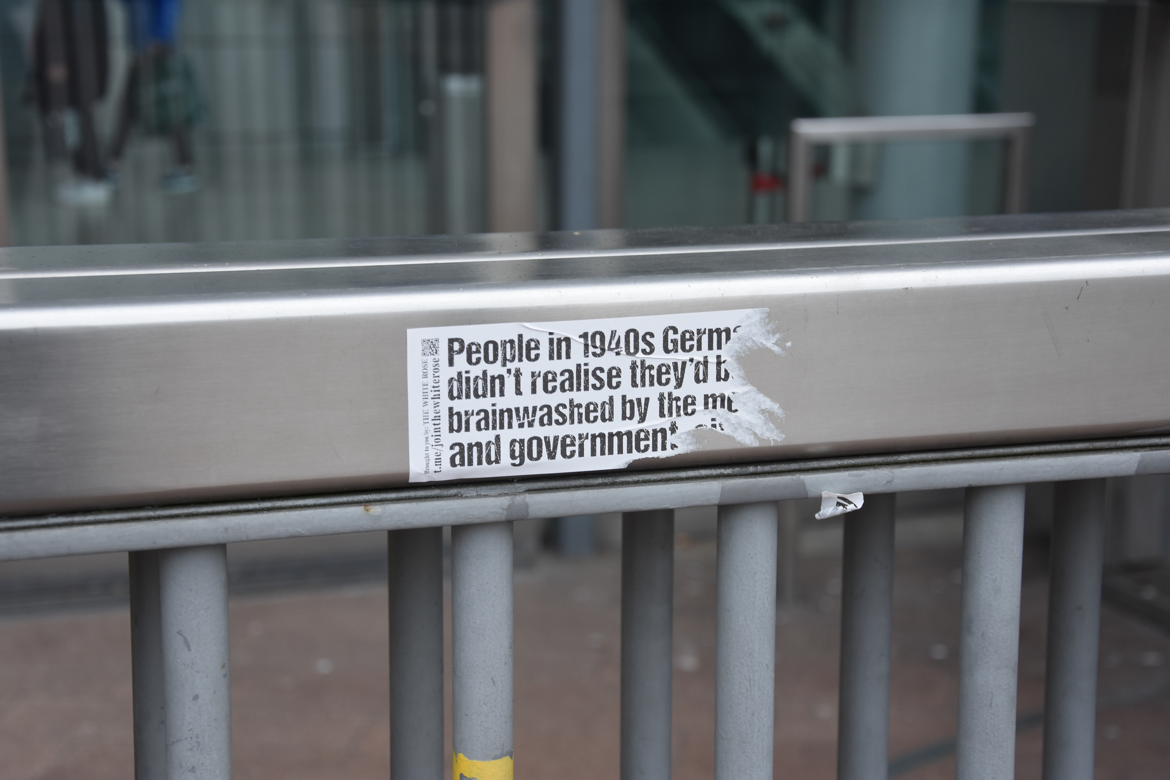
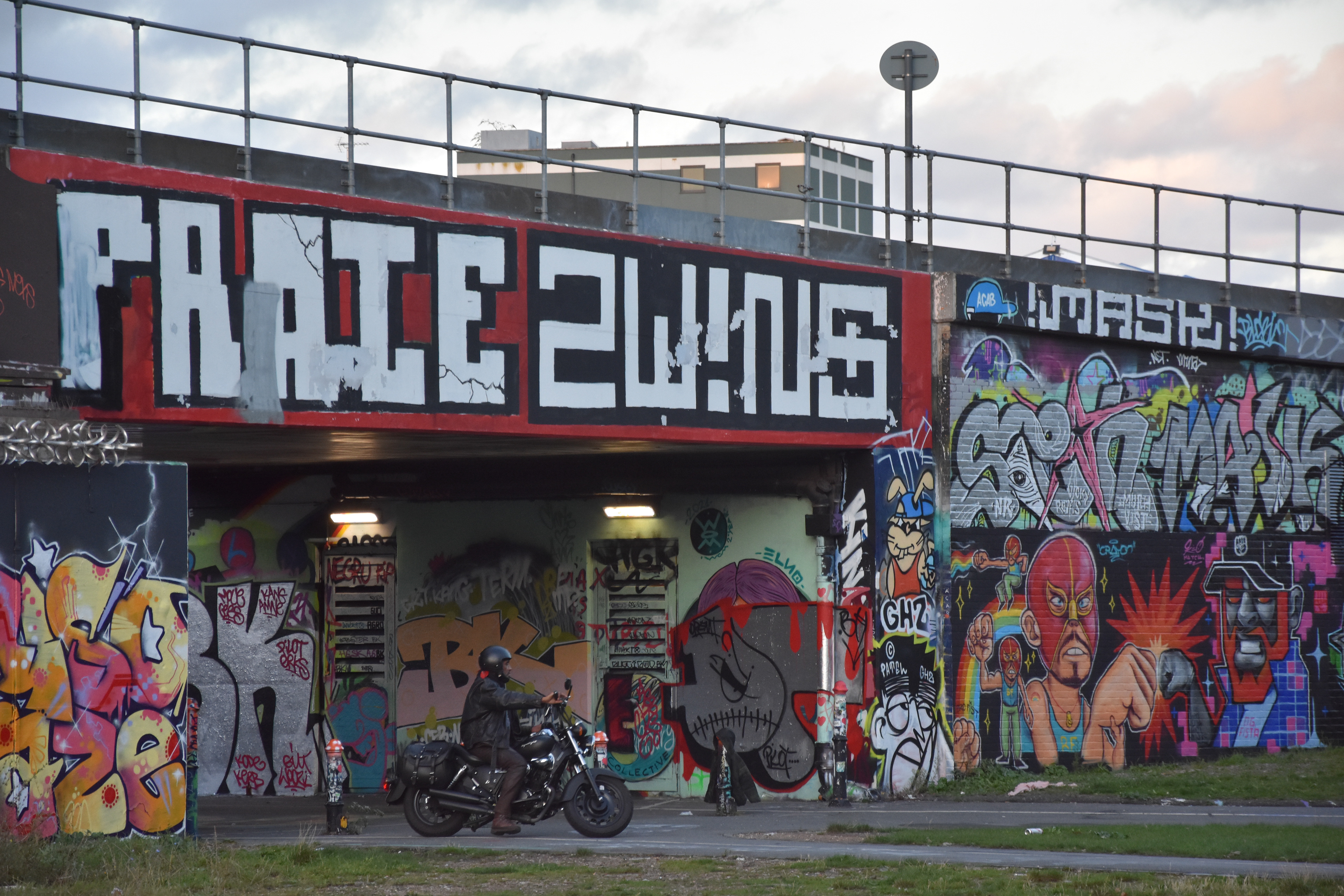
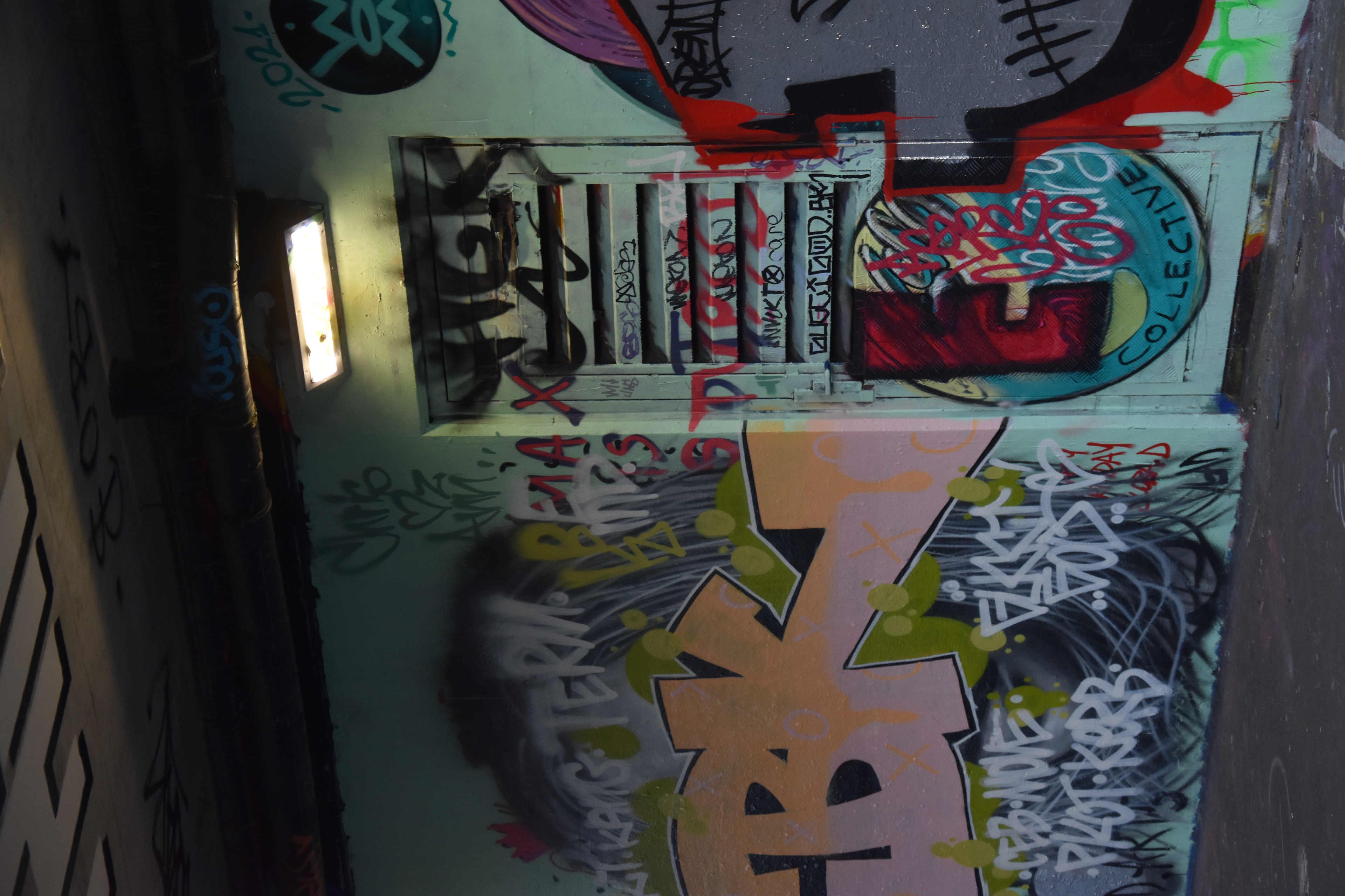
I'm starting to find a difference between what might define street art in terms of providing a voice for the people. A lot of street art involved using style of writing called graffiti to represent their crew whereas some street art is purely to make a message, such as information spreading although it is arguably more effective when both elements are combined.
WWW
I think the idea worked really well for the area that I chose. I also think this is a subject I enjoy shooting and can really develop on.
EBI
To improve on this mini brief I would've done a portrait where I ask for the persons permission.
Inspirations
1. Greg Girard
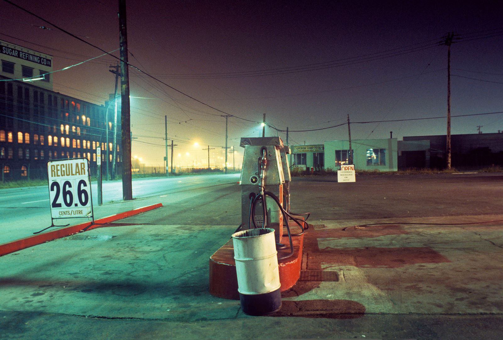
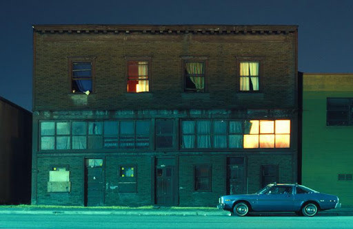
Greg Girard is a Canadian based in Vancouver but is more famous for his street photography work in the Asian region, notably Japan, Thailand and Hong Kong. His work has examined the social and physical transformation in Asia's largest cities for more than three decades.
Greg Girard used Kodachrome film for all his older works which has different pigments than modern day film, which i think captures street scenes in low light conditions very well. I find his work inspiring because of the way he captures light and is able create a strong mood for the viewer.
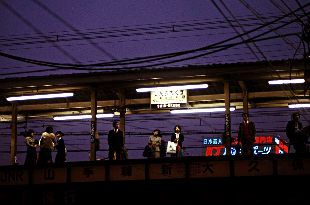
2. Jun Abe
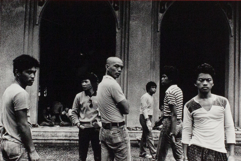
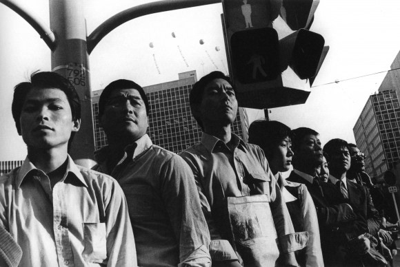
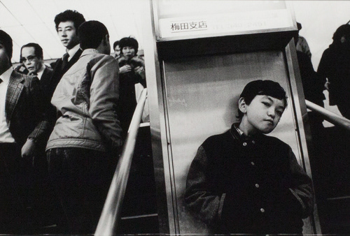
Jun Abe is a Japanese photographer who is famous for his work in the late 70s and early 80s. For me, Jun Abe has a very unique way to compose his photos with often more than one subject. I believe including multiple subjects with only one of them looking into the camera is a concept that Jun Abe uses as well.
I found this approach to street photography inspiring because I often focus on capturing one subject.
2. The Selfie and the Self Portrait
I started this brief by creating a collage of as many of my own selfies I could find in 10 minutes.
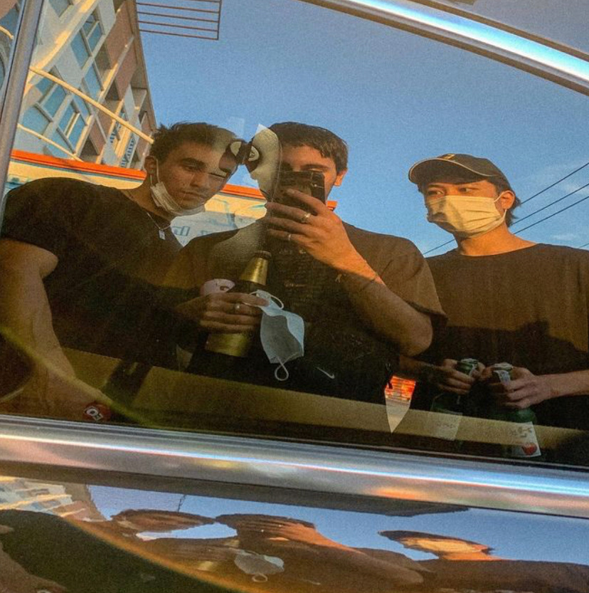
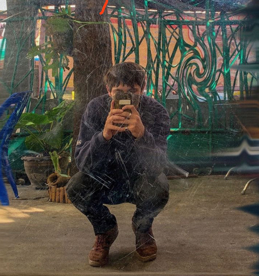
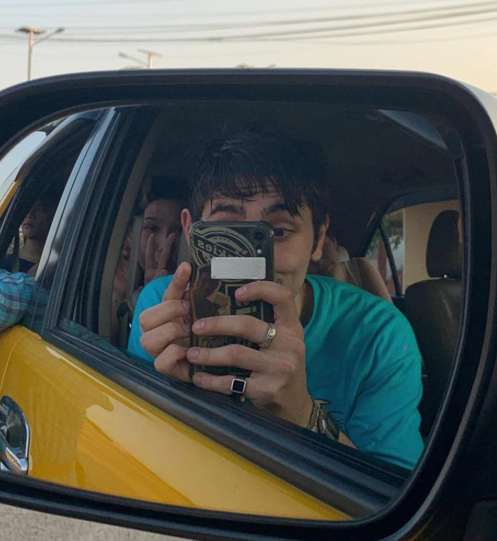


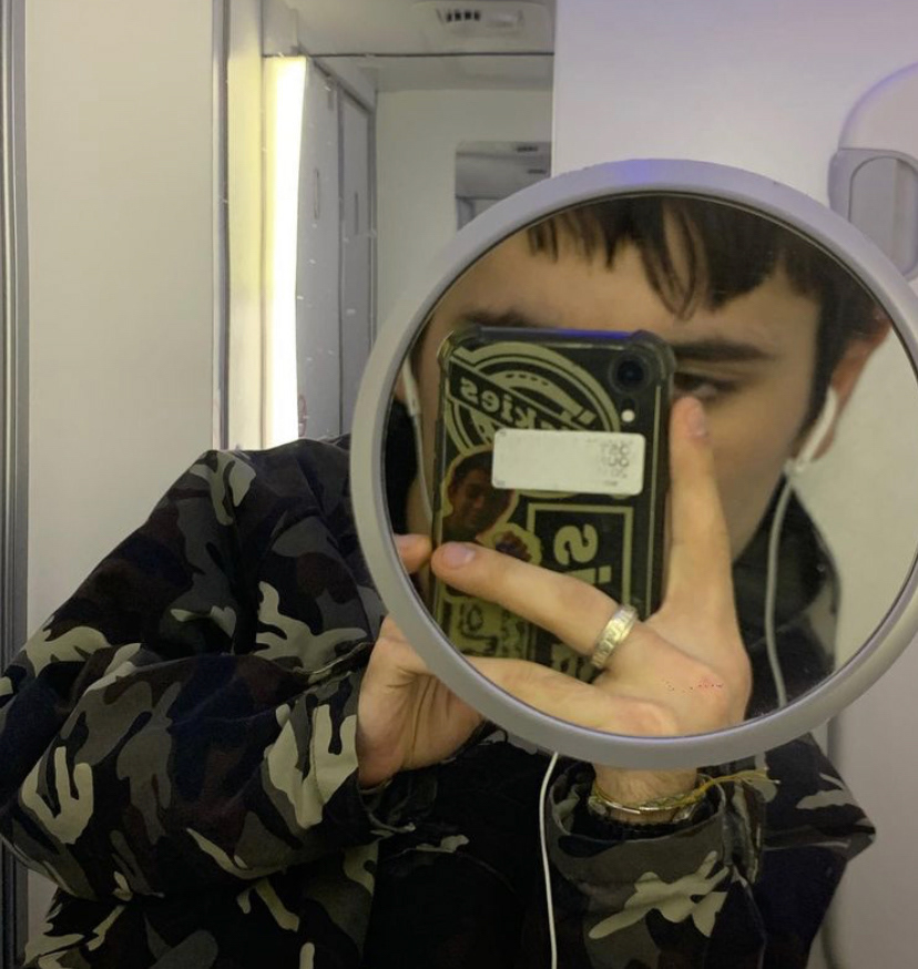
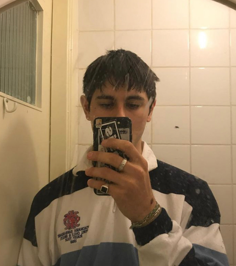

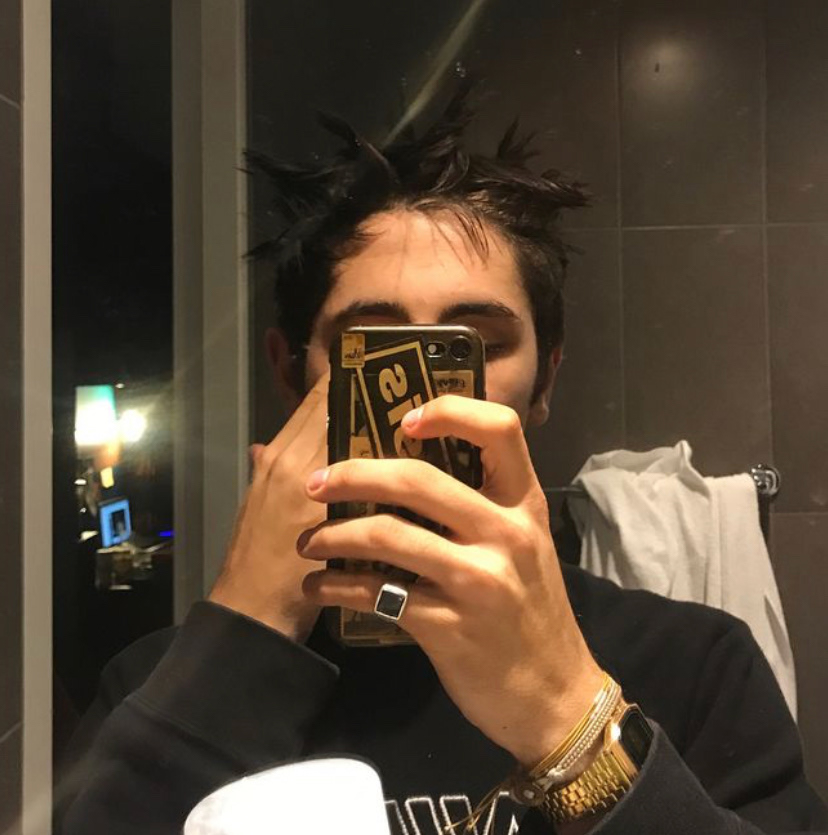
This gave me a sense of how I use the selfie. One recurring theme is the use of a mirror and positioning my phone in front of my face, something I've been gradually moving on from over time.
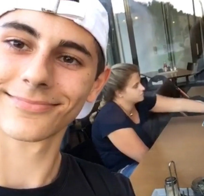
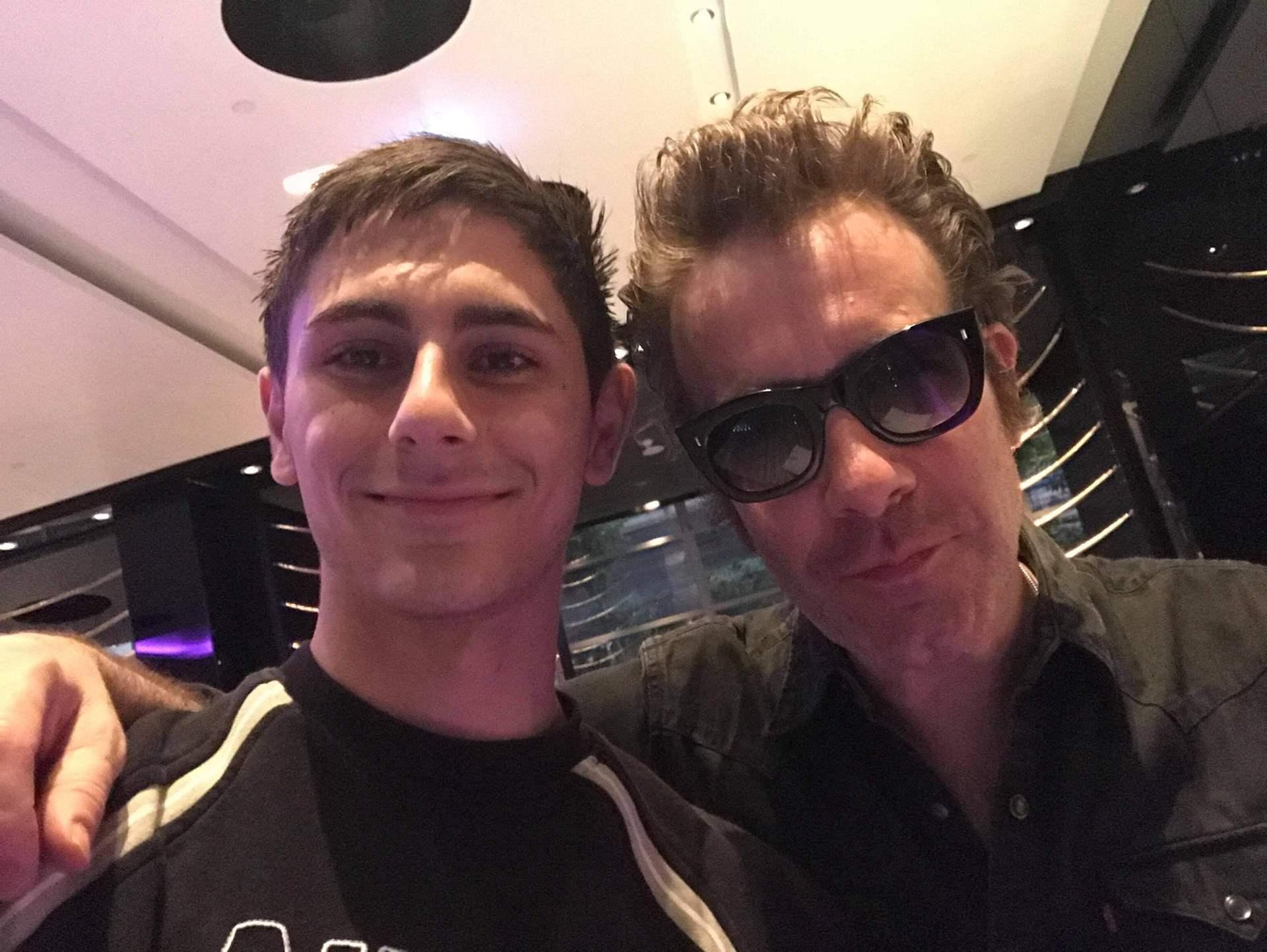
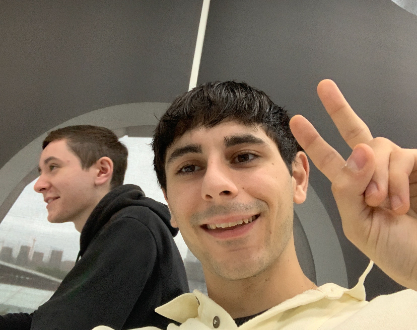
We were also asked to take a selfie to begin with. I took this one with Adam!
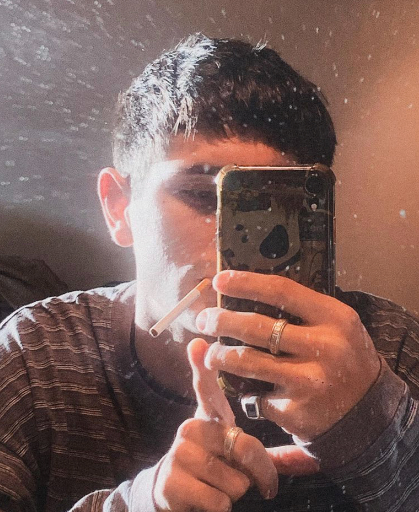
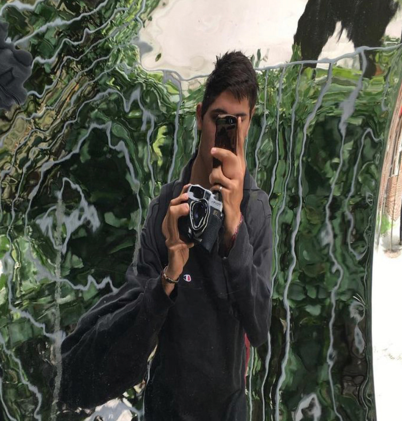
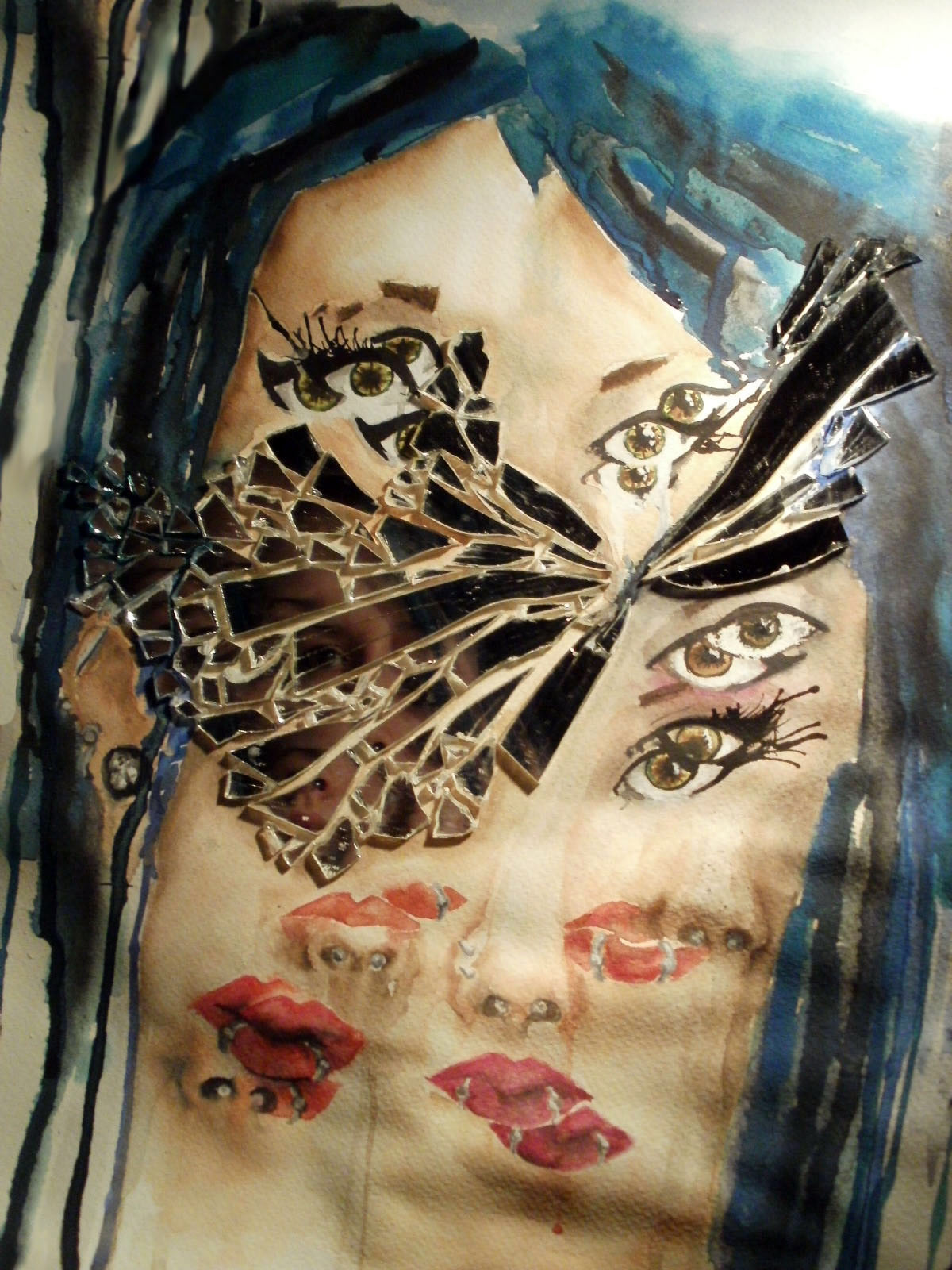
I took some time to reflect on how I would best portray myself using the selfie. I decided I wanted to do a self portrait that reflects the idea of how humans don't possess a core, unchanging self but rather construct multiple often contradicting selves. This constructed character depends on mood, situation, relationships, evaluations and altercasting.
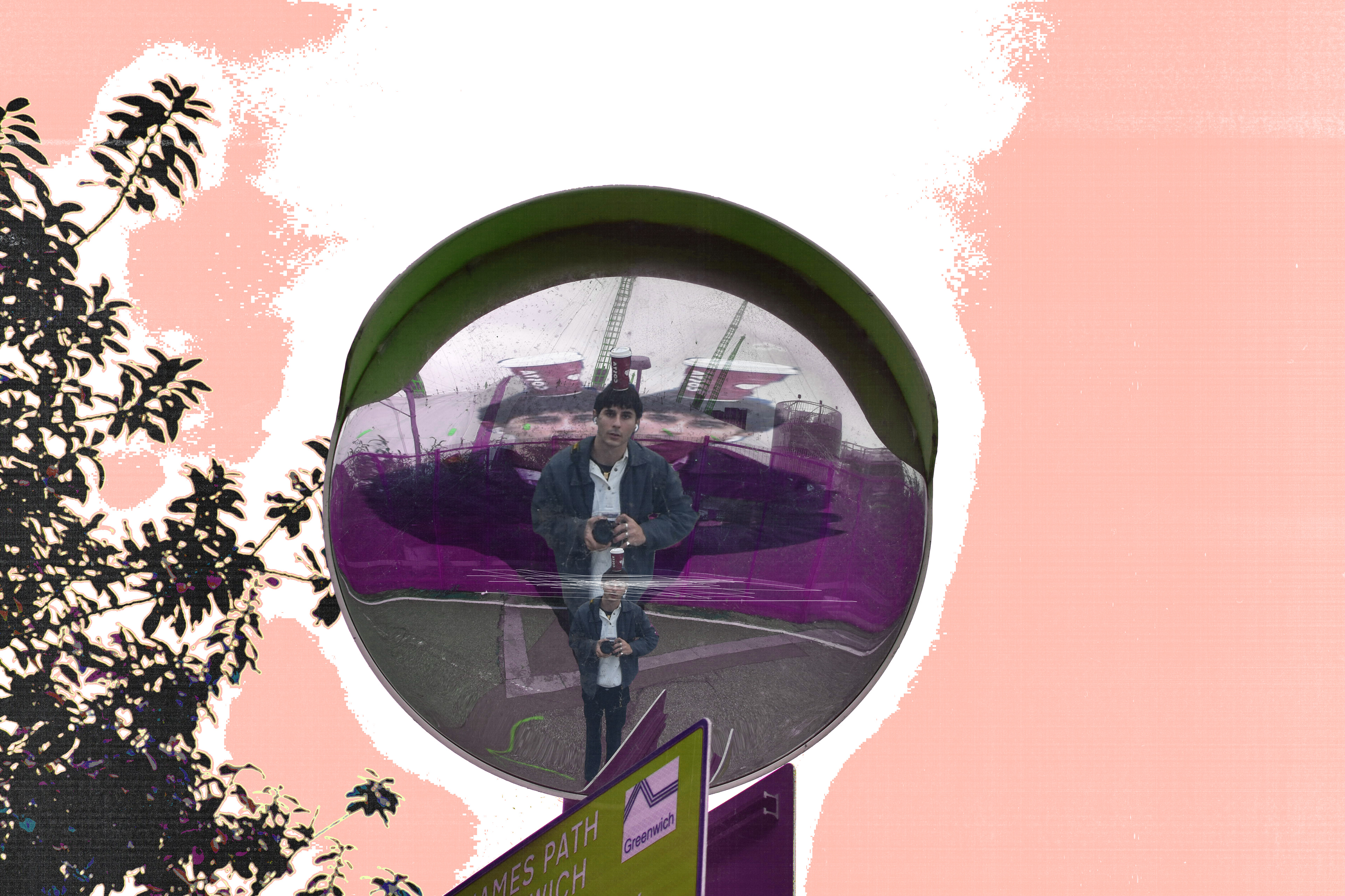
This was my final image for the mini brief. I'm happy with the texture surrounding the mirror and symbolism portrayed inside with a distorted look. To improve I think the greens are a bit too yellow looking which doesn't go well with the other colours. Also better lighting.
19.10.2021
I took some photos this weekend inspired by Jun Abe's black and white style of street photography.
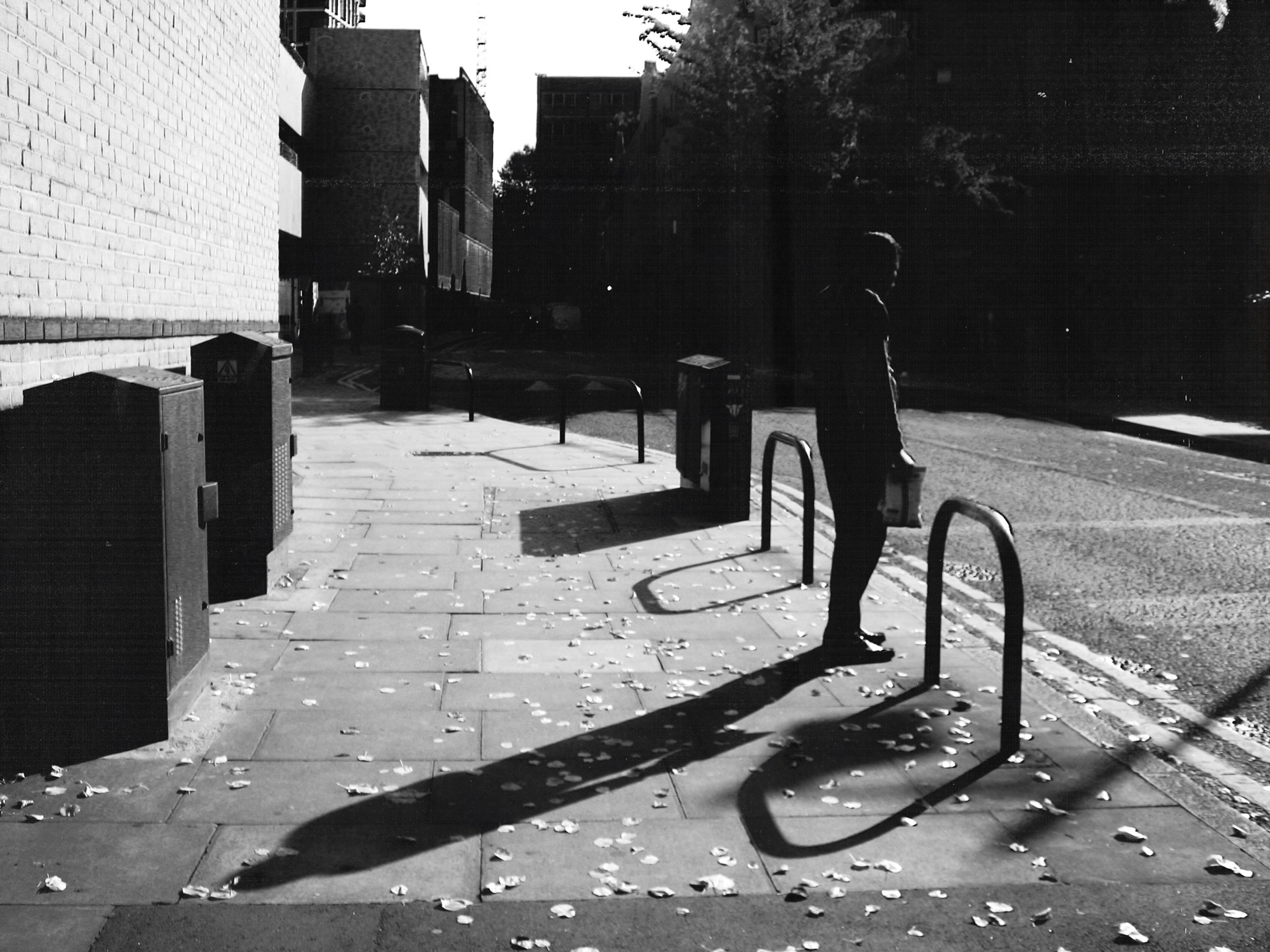
This photo was taken in Whitechapel near the main station. I used a point and shoot camera and edited in photoshop to enhance the black and white contrast.
Own Interpretation
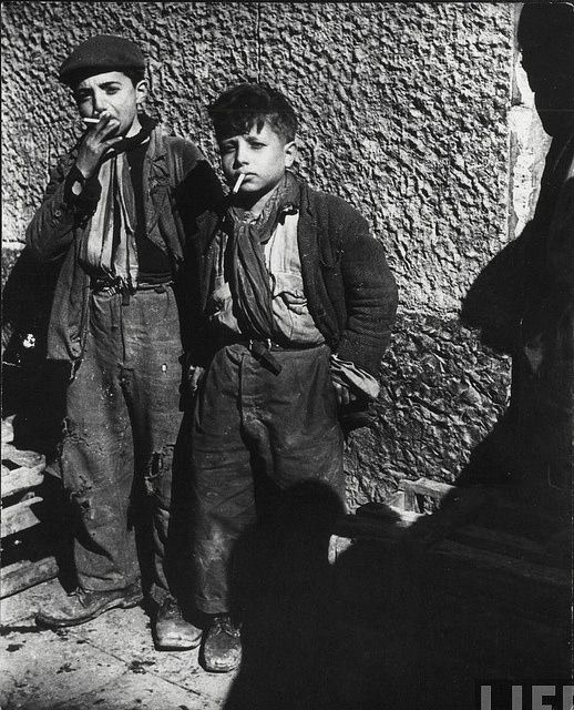
Having attended The Photographer's Gallery last week on Friday me and my peer chose two images (a favourite and least favourite) and went about trying to recreate these images over the weekend.
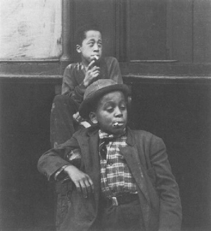
This was our favourite image. We particularly liked the central framing and angle of the boys which enhances the "coolness" of the boy in the front in contrast to the boy in the back who looks like he's about to cough. Both boys looking away from the camera also brings a more candid look to the photo. I tried to keep these aspects in mind while taking my own photo.
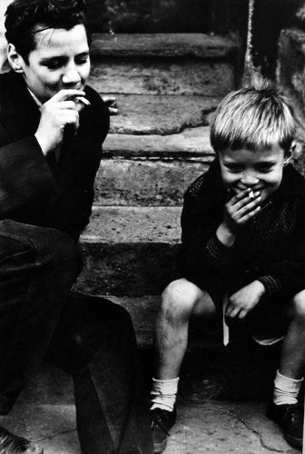
I found these photos online while researching my image and thought they are quite similar.
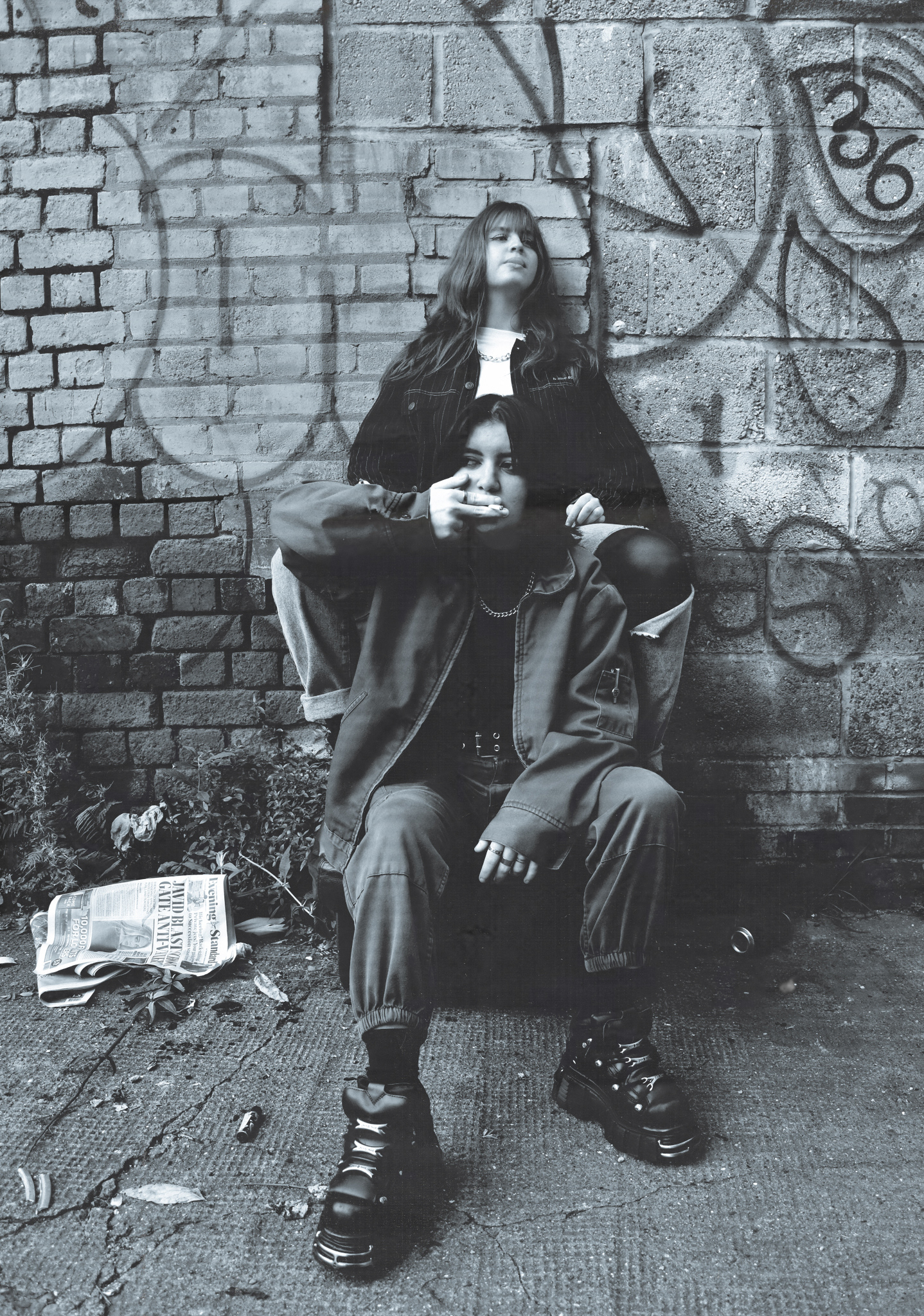
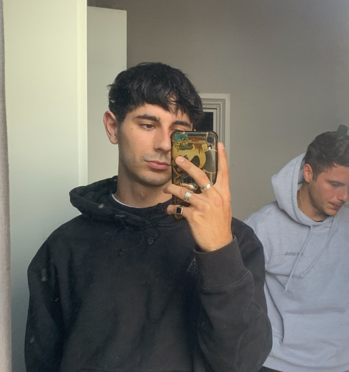
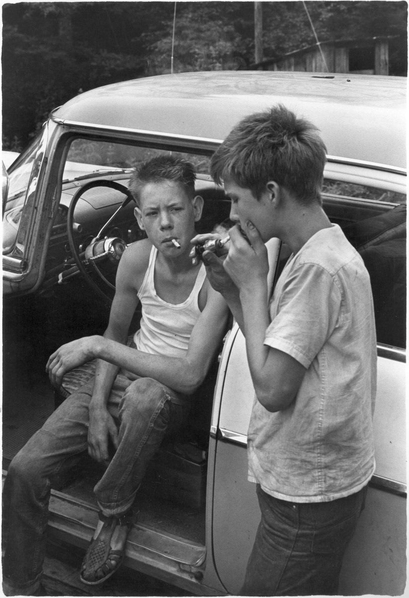
These are the different variations of my image with the one above being the final one. I used my two flatmates to model.
This was the feedback I received from everyone else.
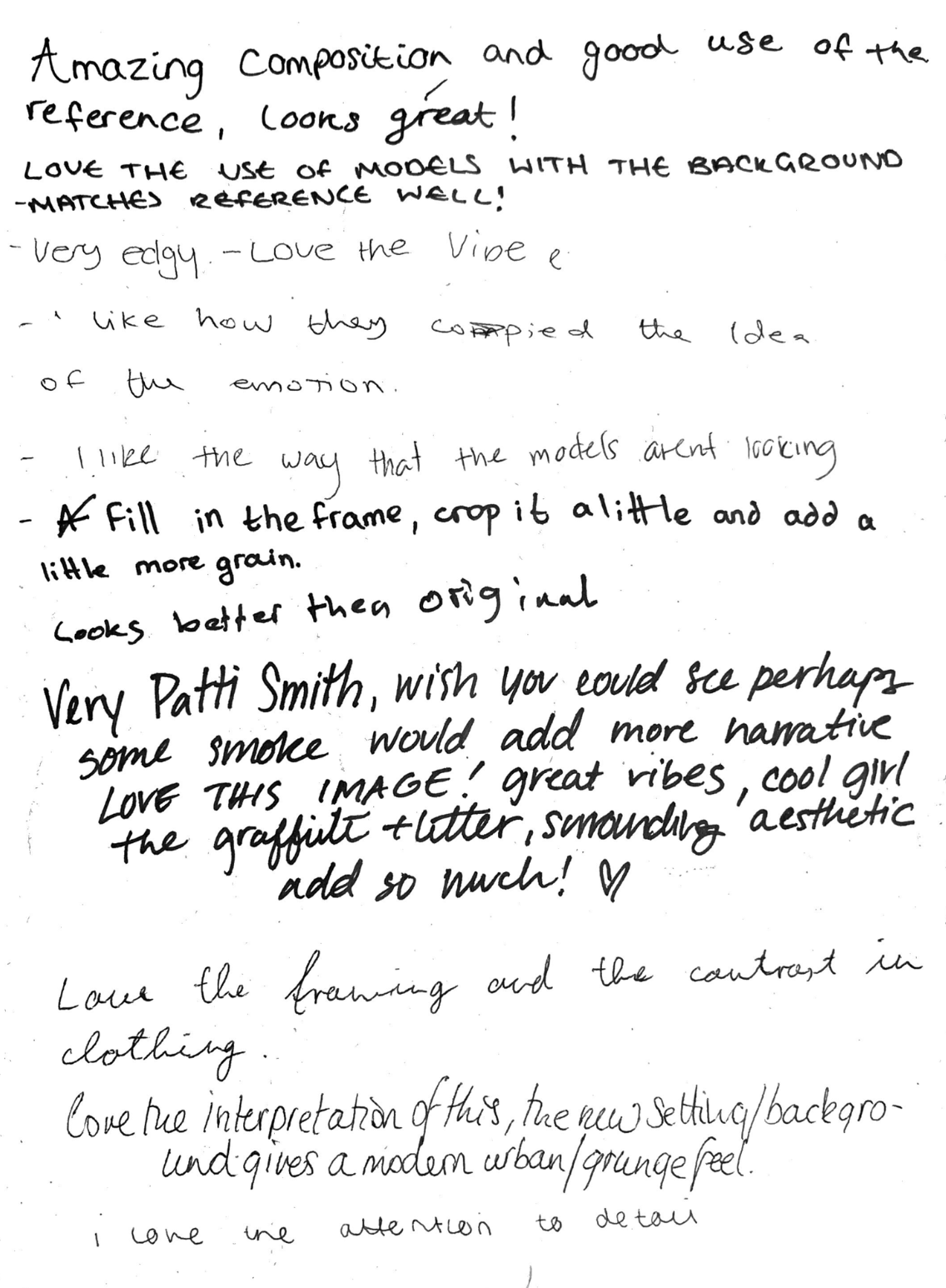
WWW
- Good attention to detail
- Contrast in clothing
- Framing
- Works well in B&W
- Good use of reference
EBI
- Change the contrast to bring attention away from the wall and onto the subject.
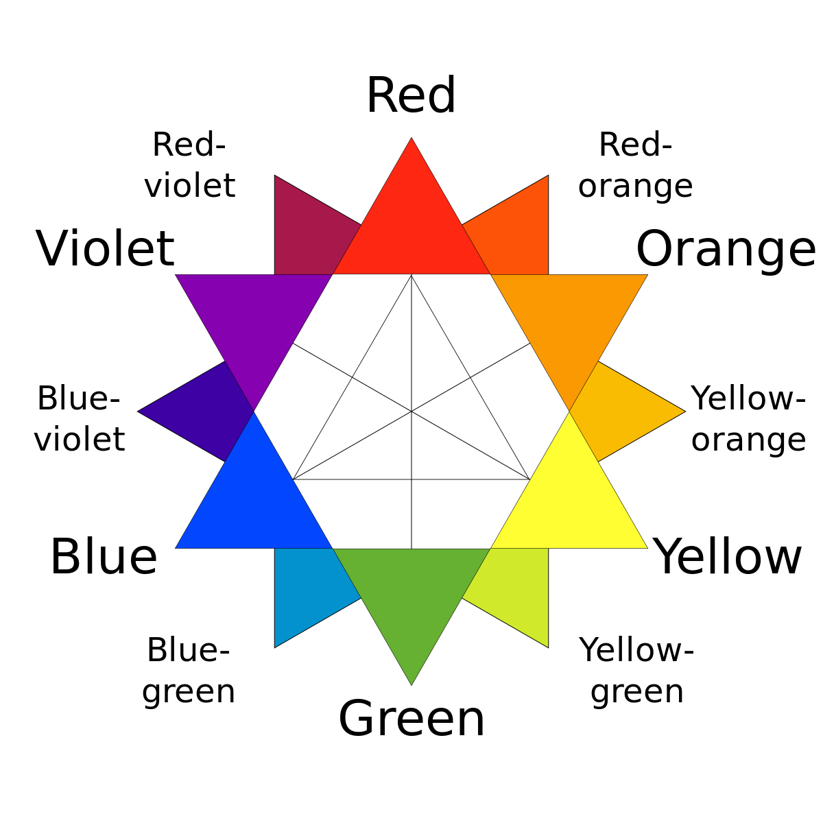
Remember My Blue Cheese Gone Yellow. Red Magenta Blue Cyan Green Yellow.
Street Photography with Nico
Bruce Gilden. Dougie Wallace is a british photographer with a similar style.
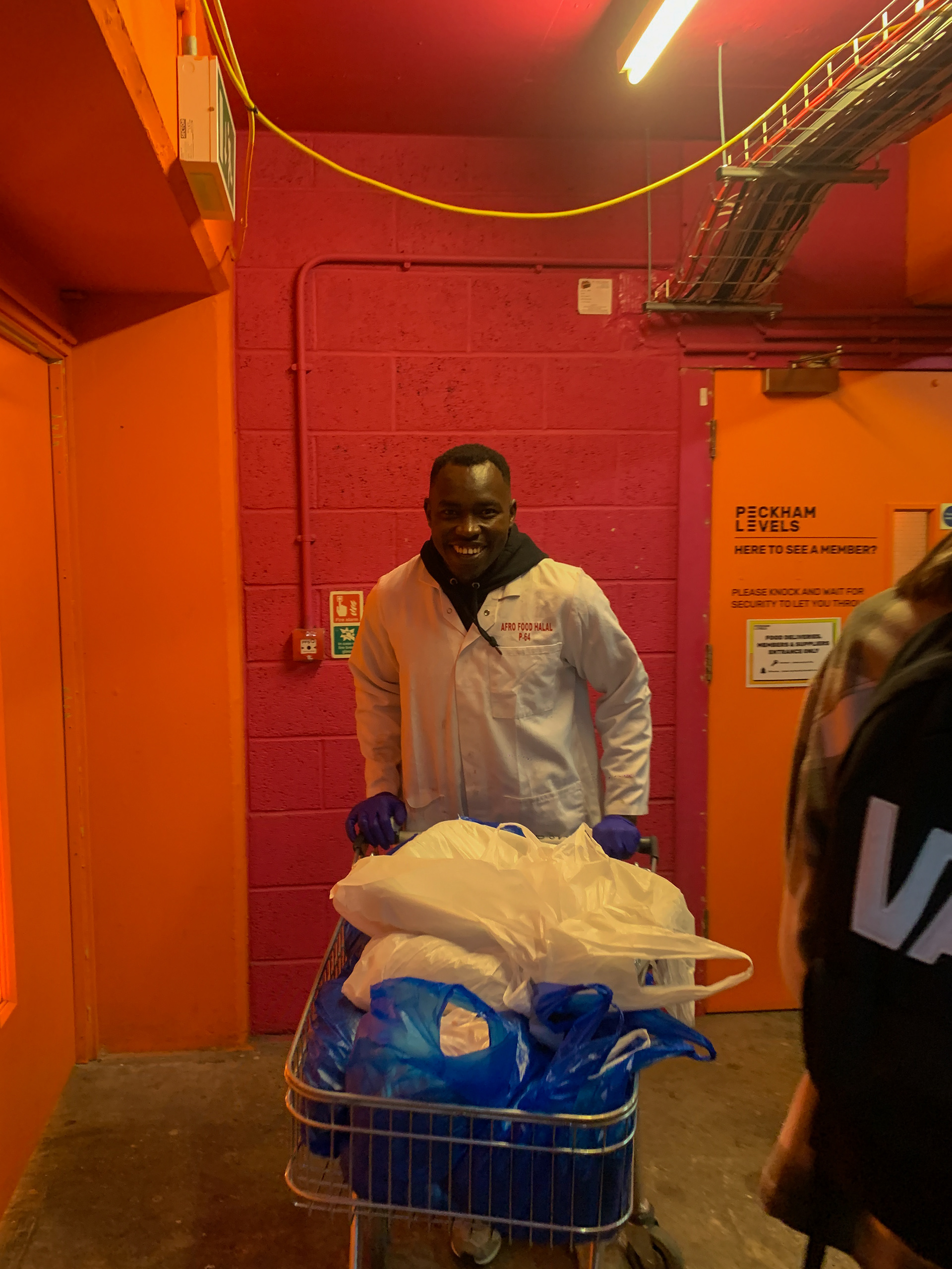
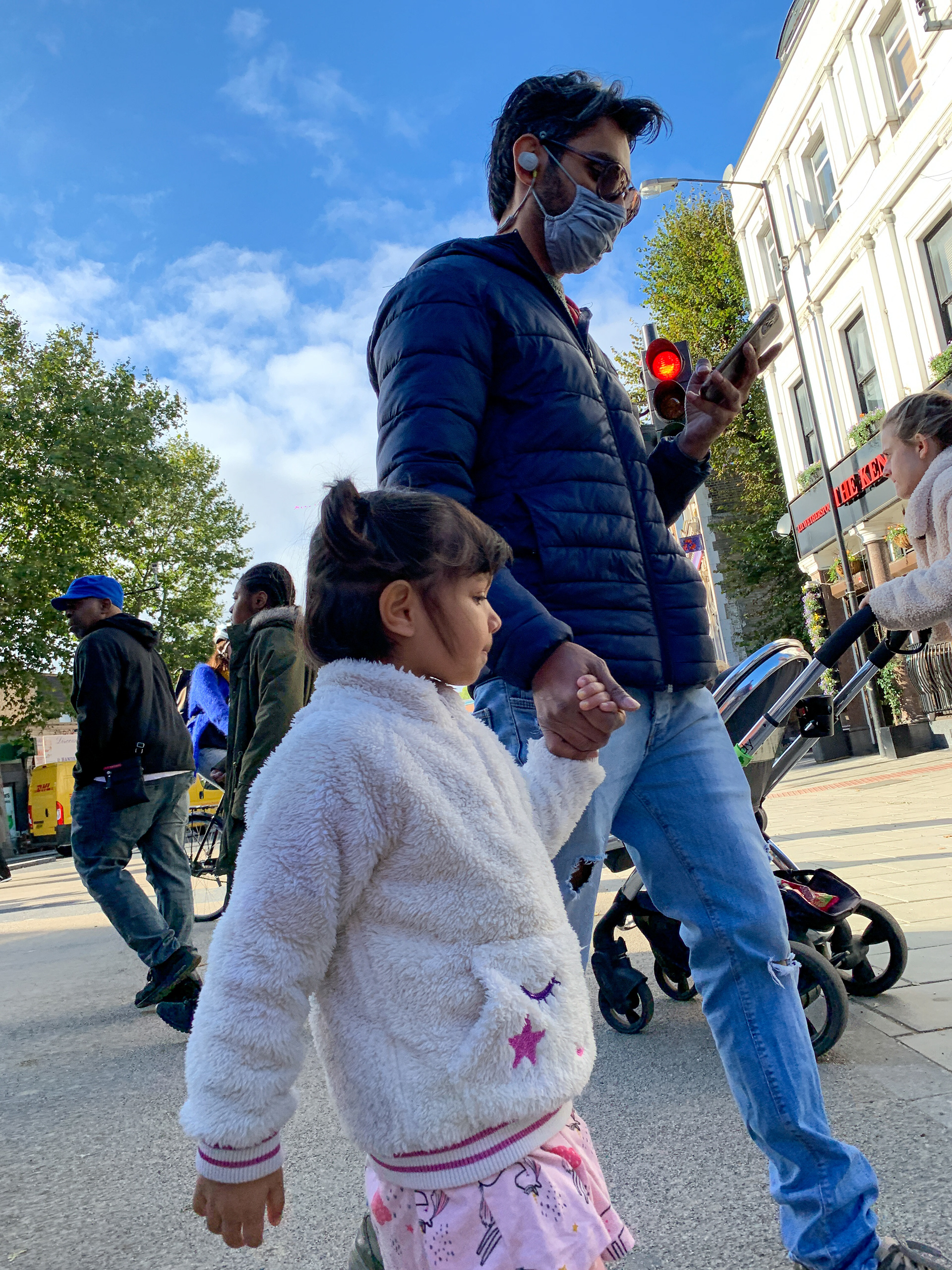
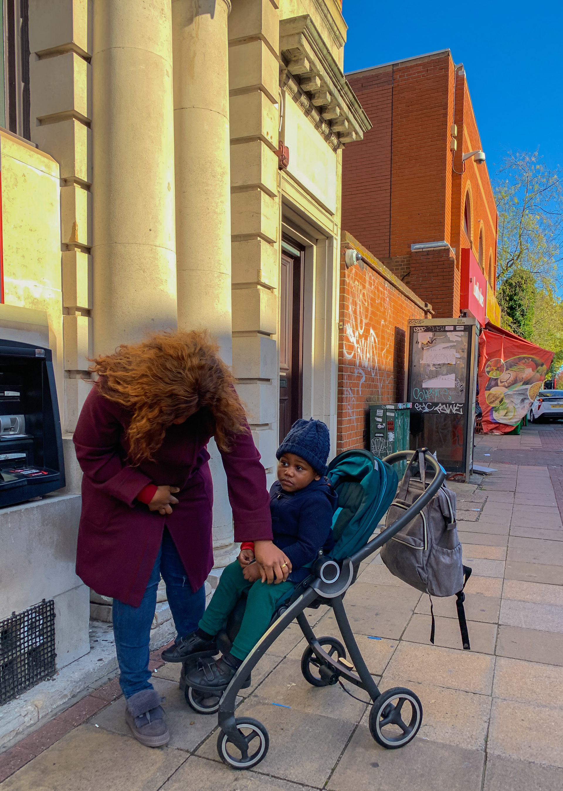
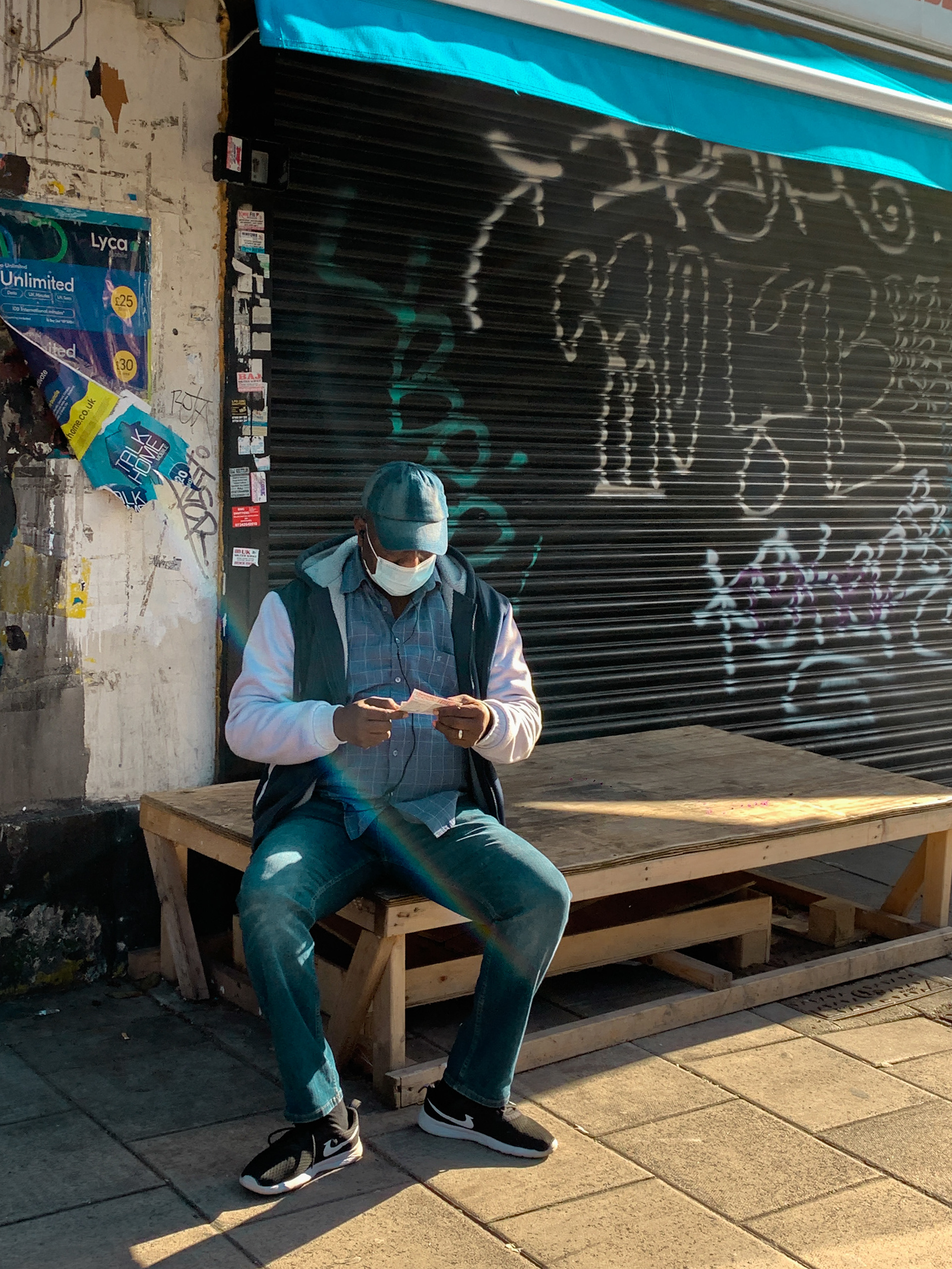
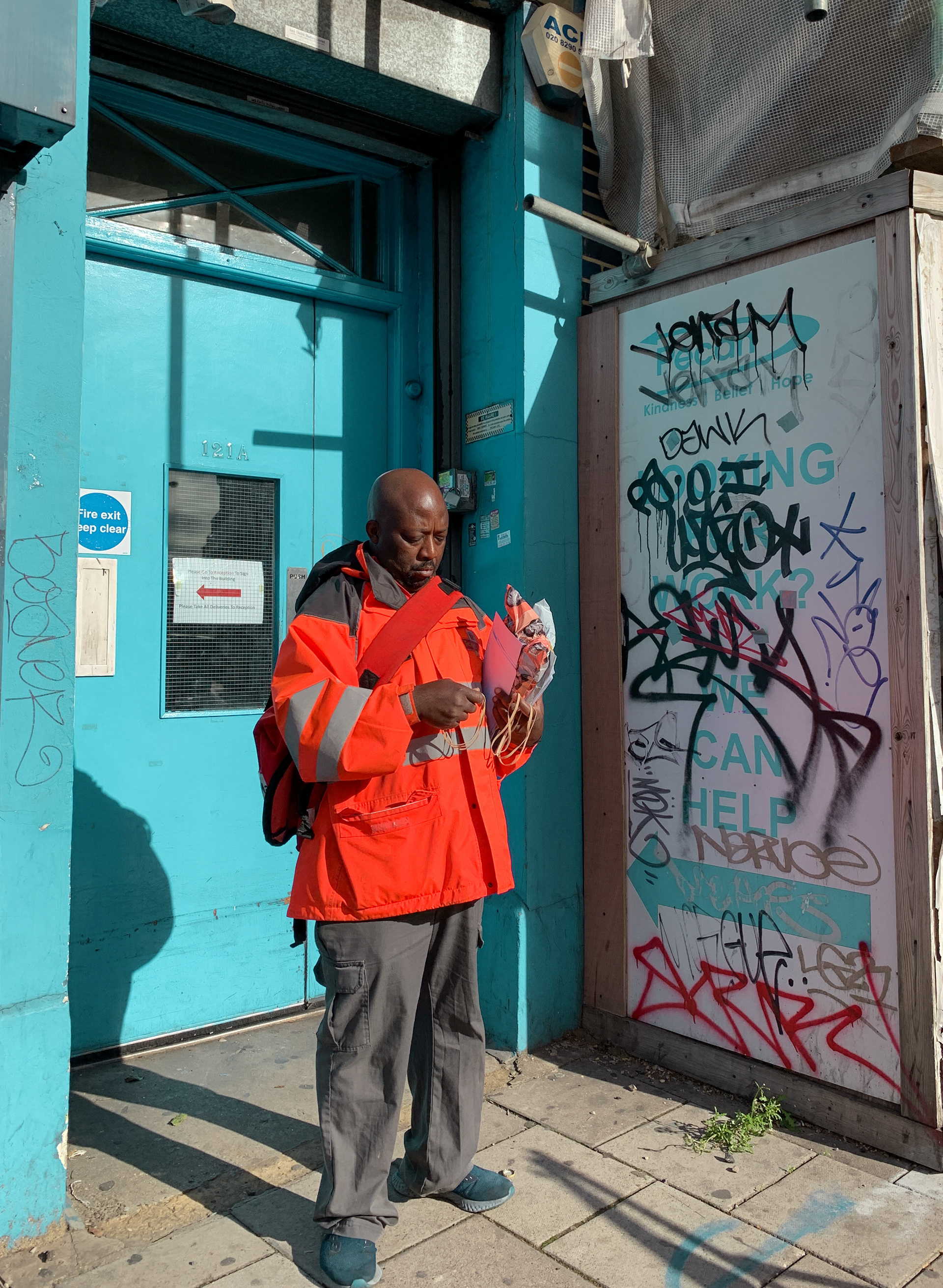
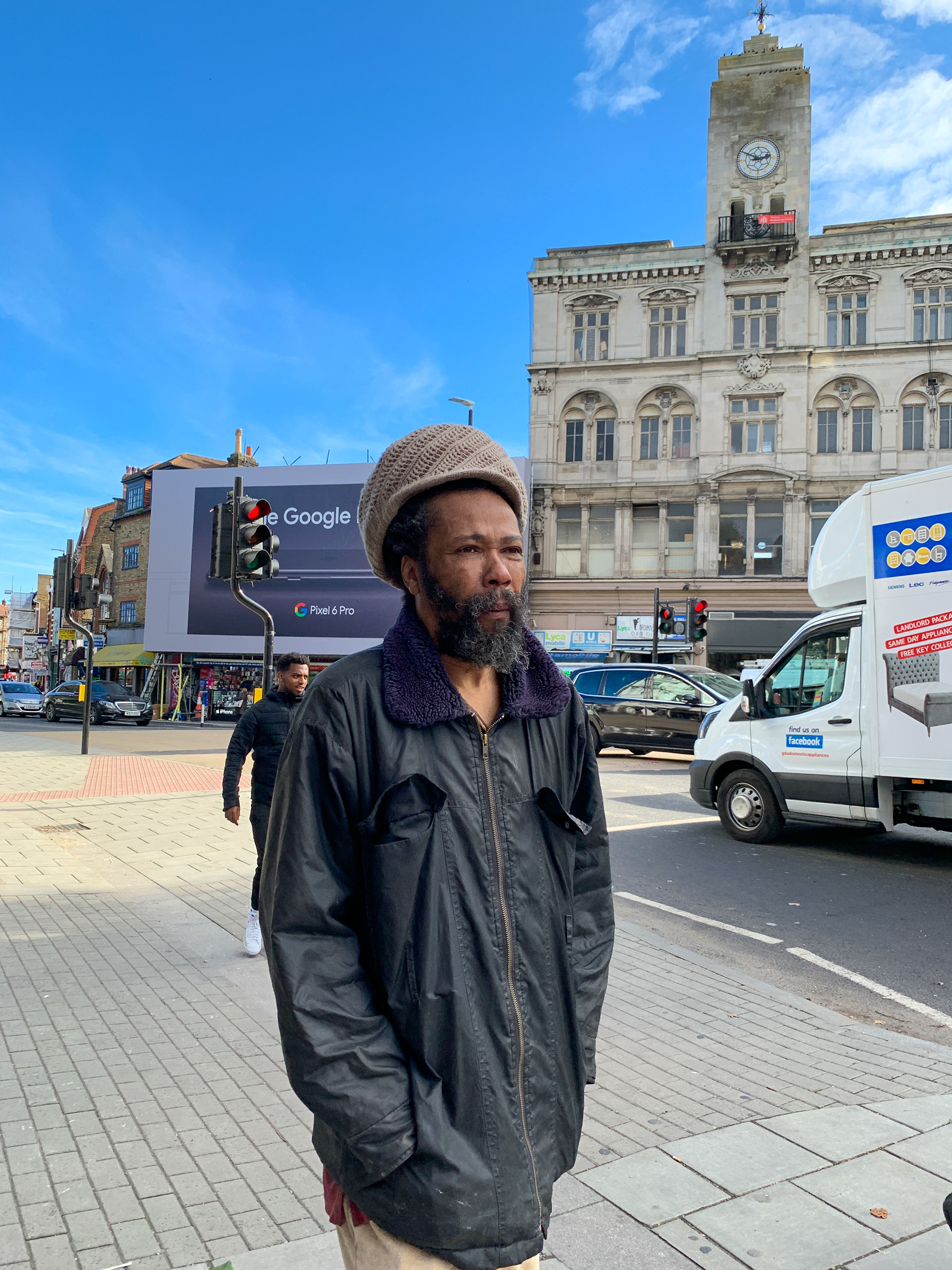
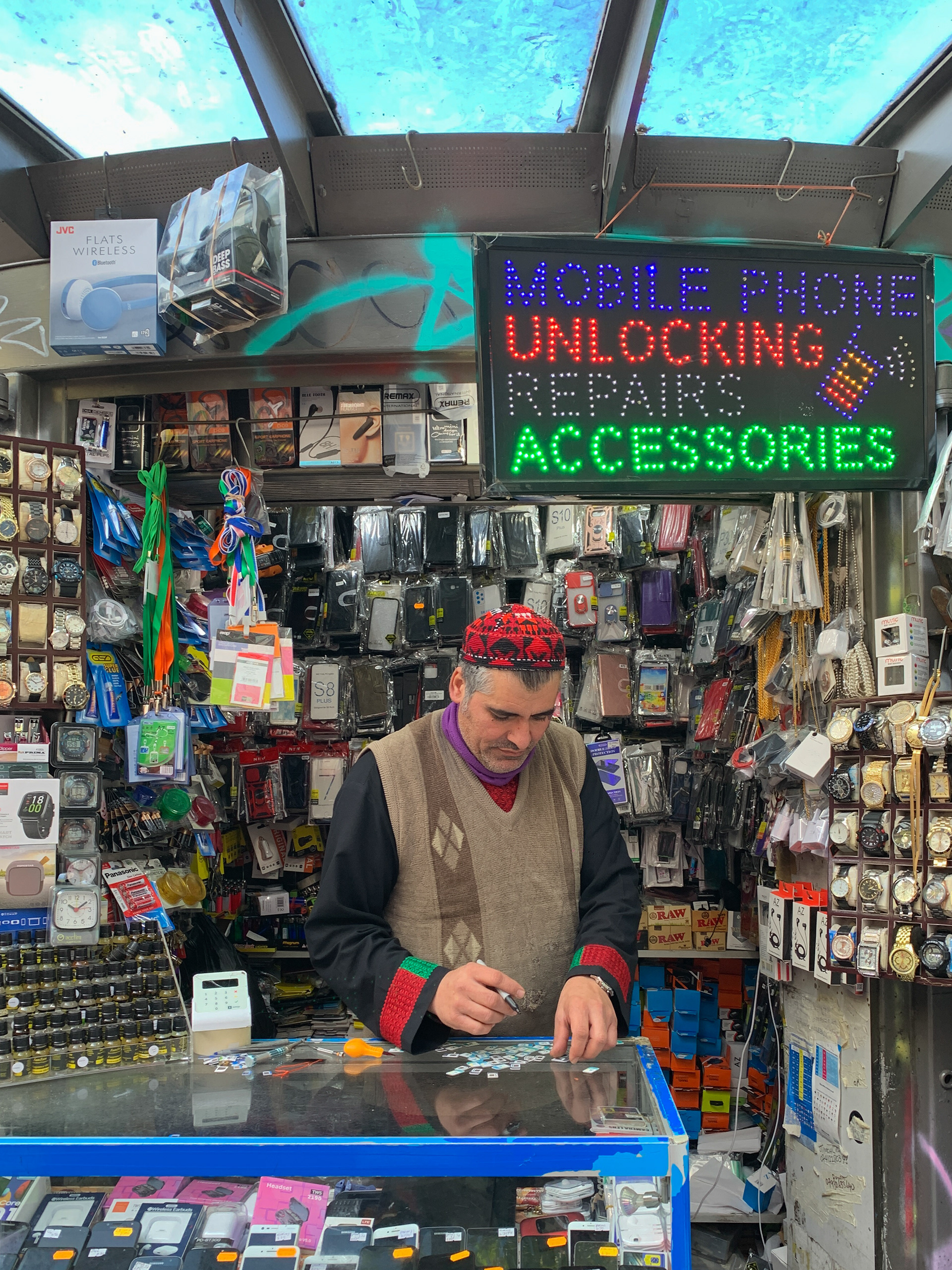
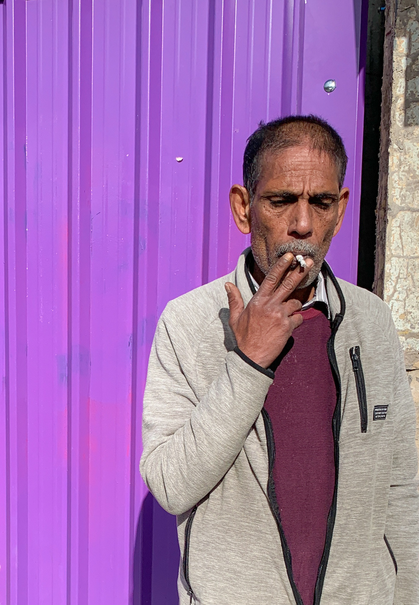
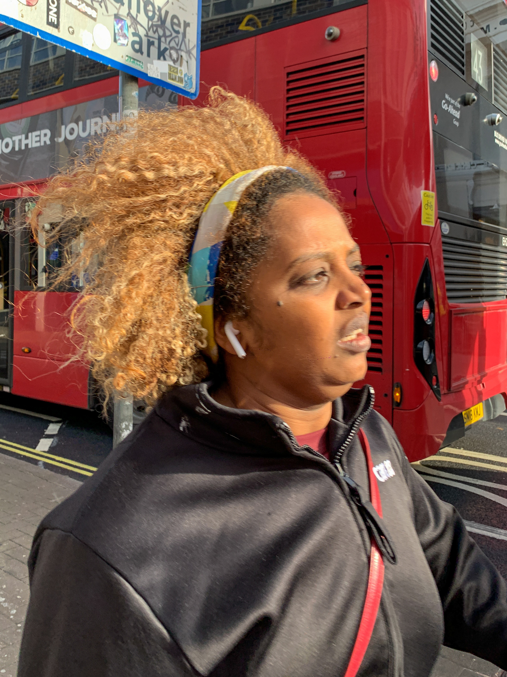
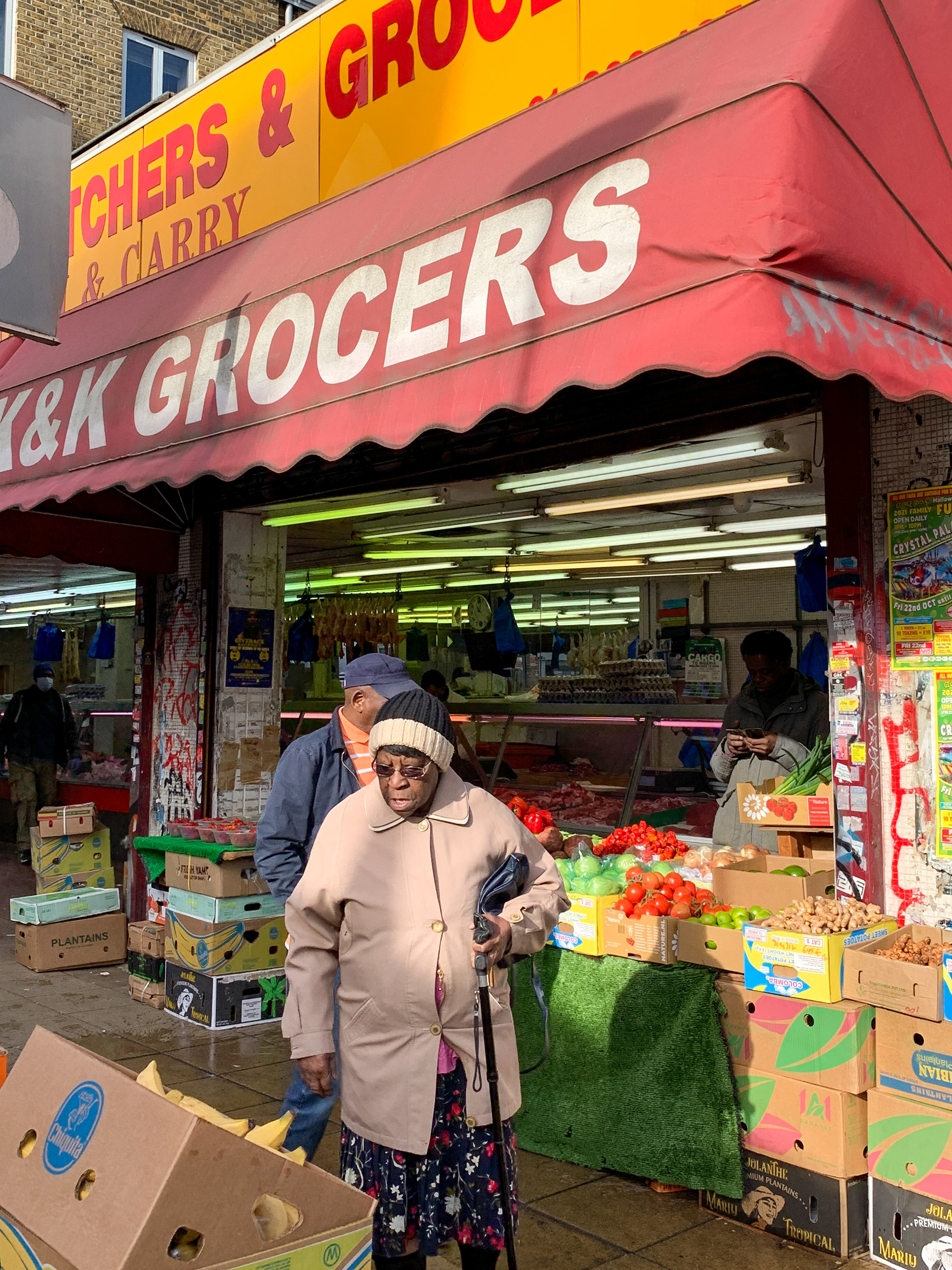
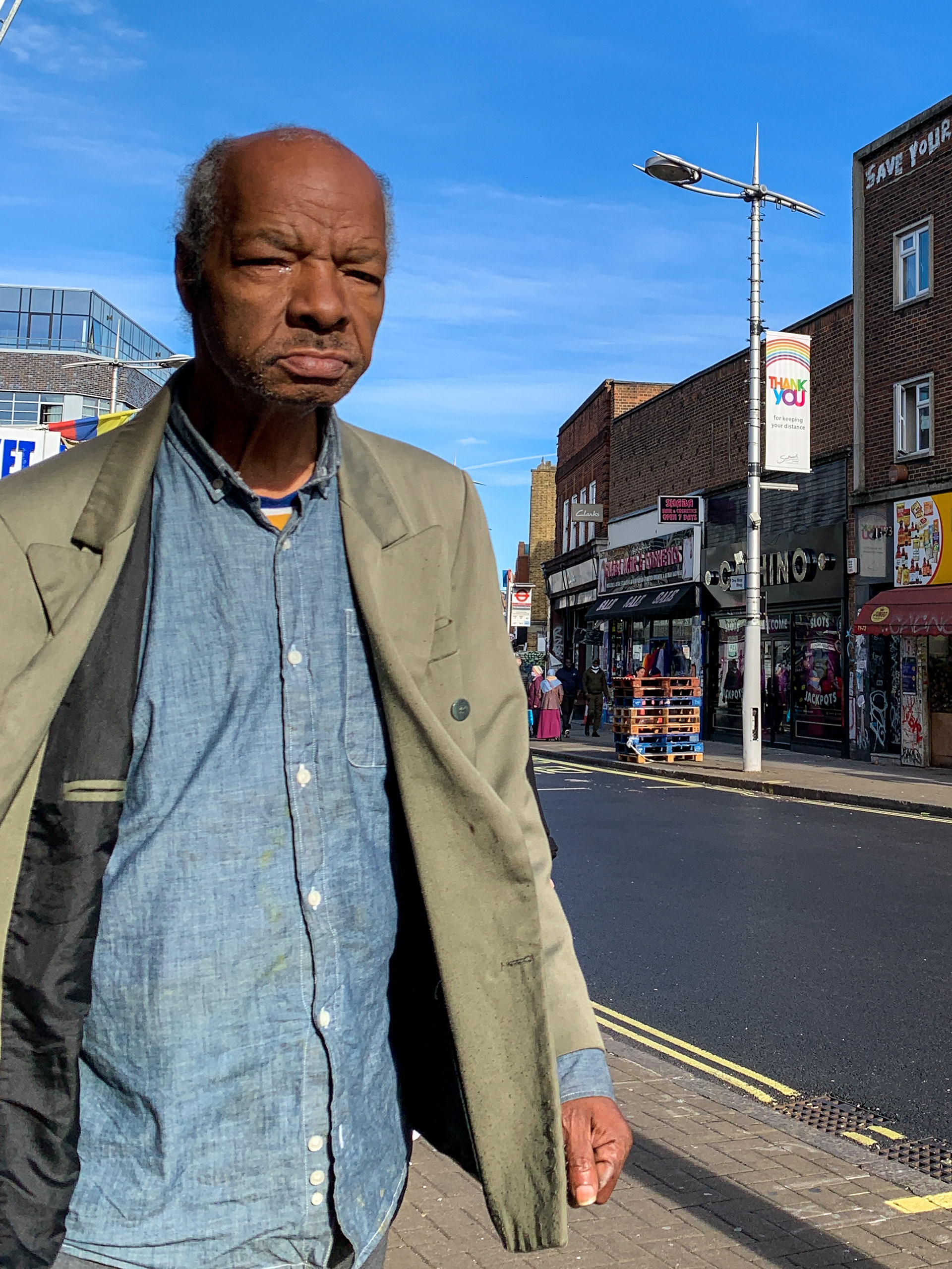
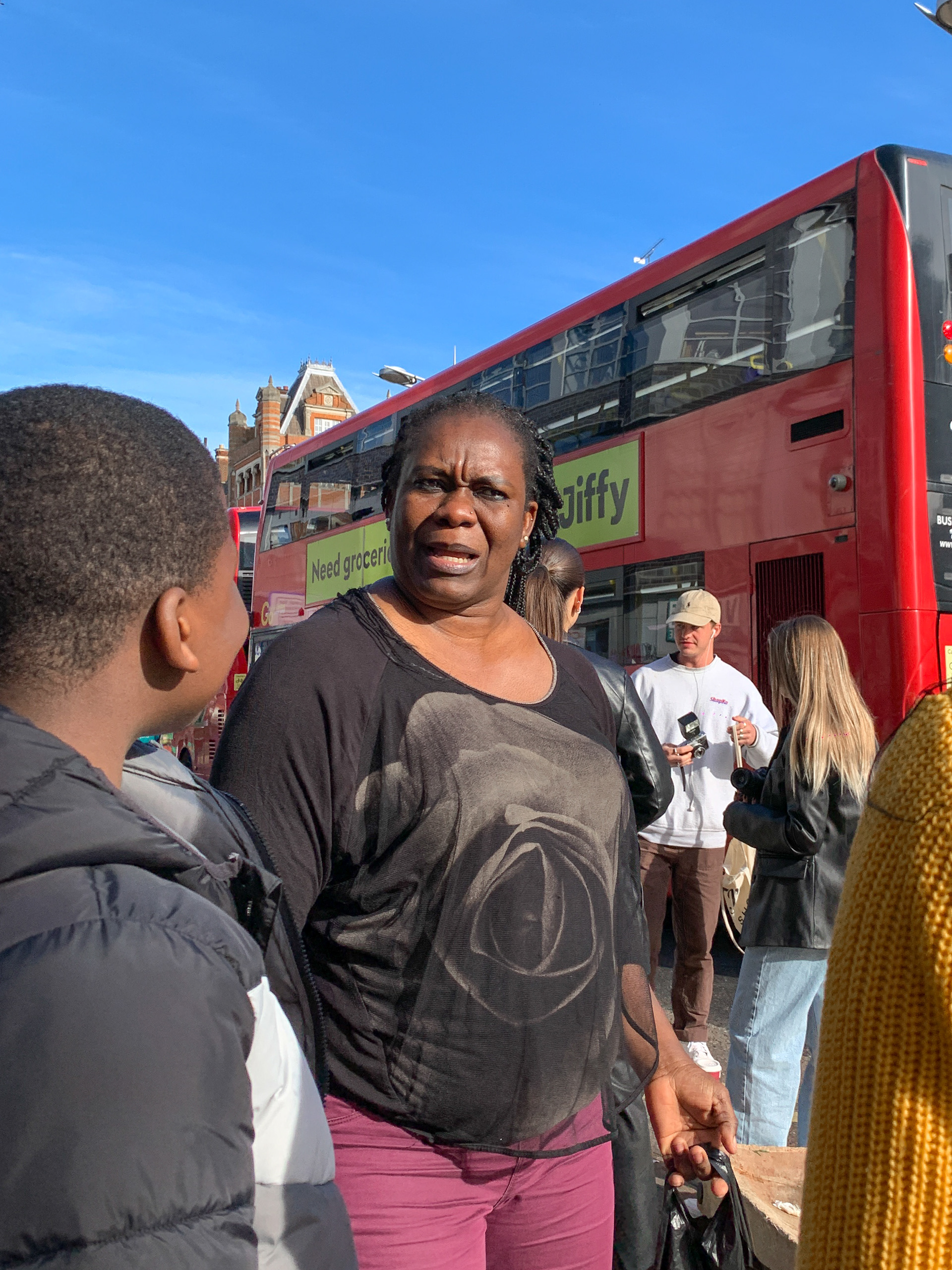
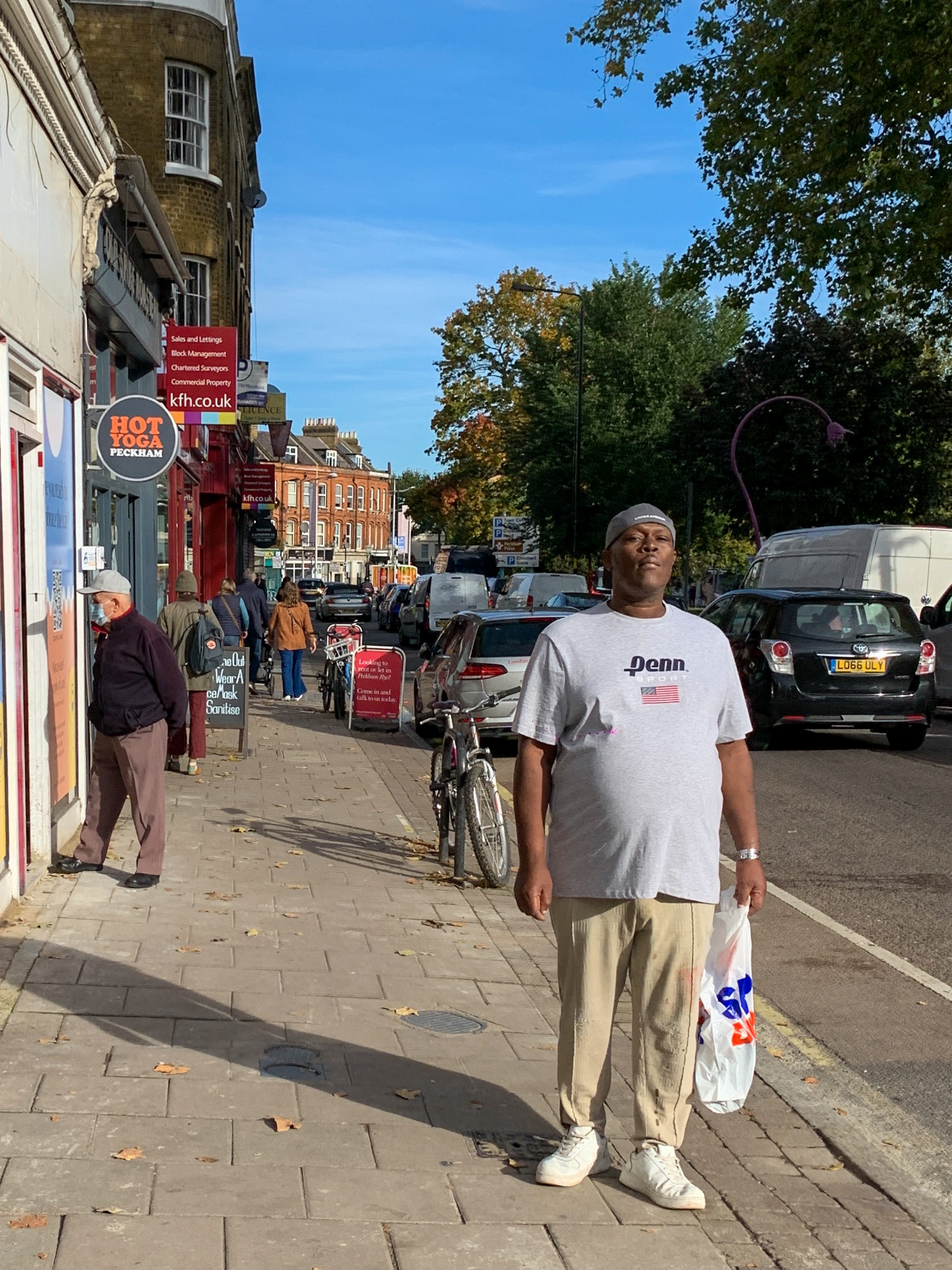
After being shown this video and getting a quick explanation on the ethics of street photography Nico (@nicefroe) took the class on a trip to Peckham, situated in the north of London. We were given the task of taking 5-10 photos with a mix of candid, non-candid and still life. These were some of my favourite photos.
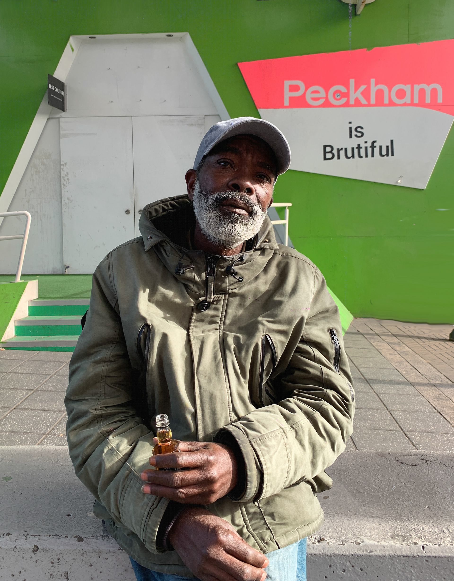

These two photos were taken with permission. I learnt that some people require more context as they're more unfamiliar with the concept of street photography. The man on the left seemed less fashionable than the man on the right which meant it seemed to make less sense to him why I wanted to take a photo. The man on the right just needed a simple "I just think you look really cool" and he went straight into his pose.
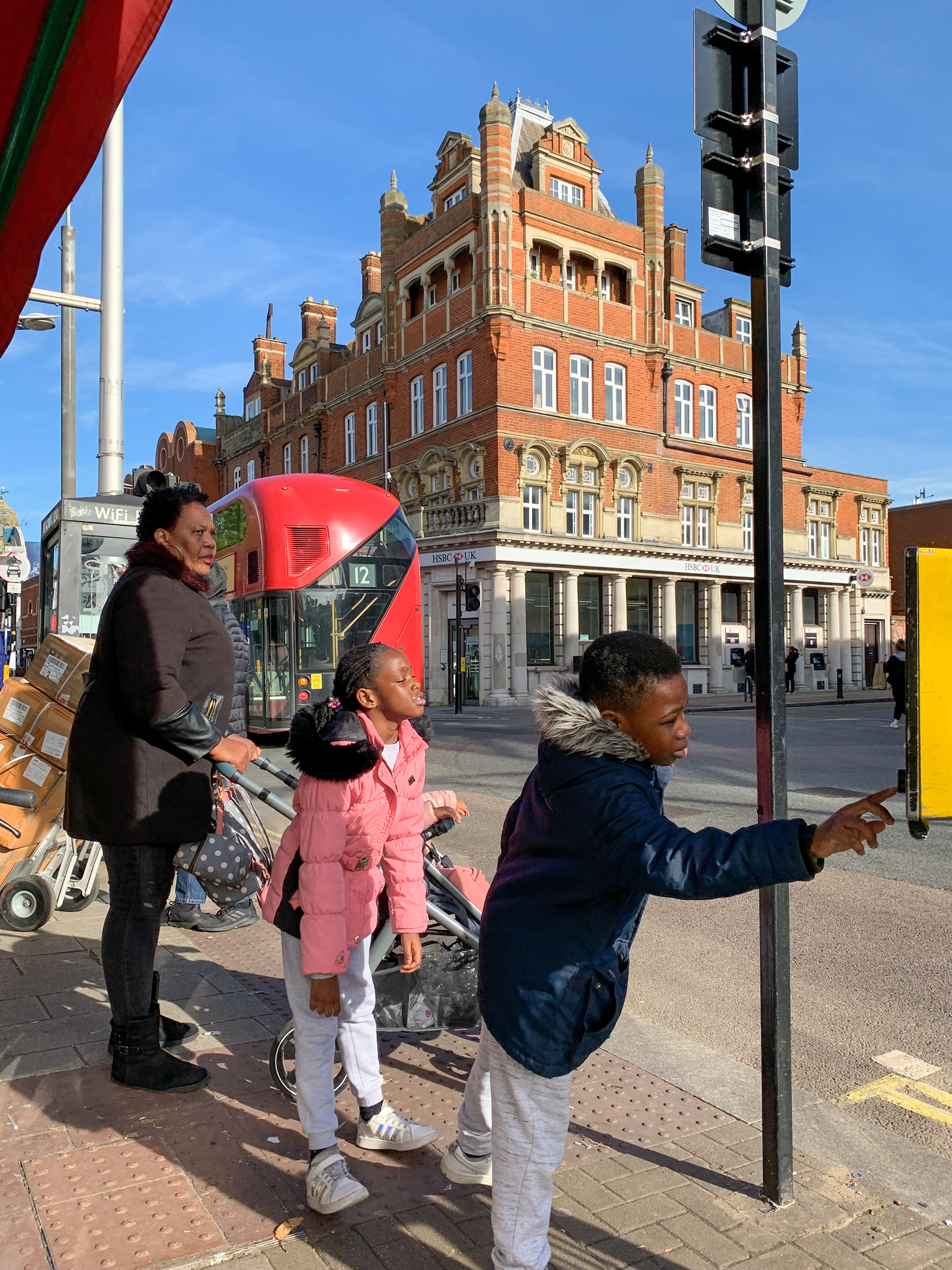
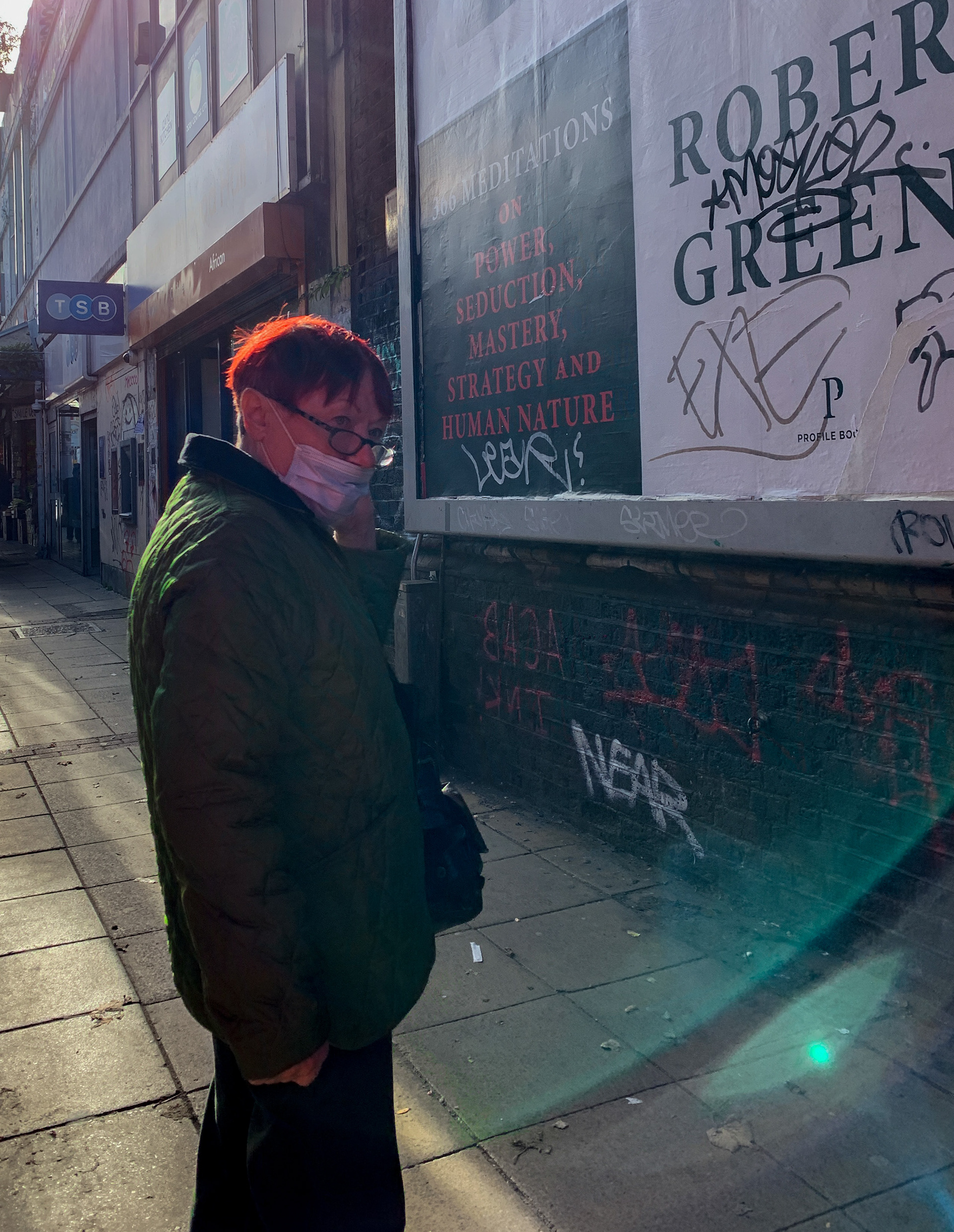
We later uploaded 5-10 of our favourite images on Padlet and gave each other feedback.
4. A Different Perspective
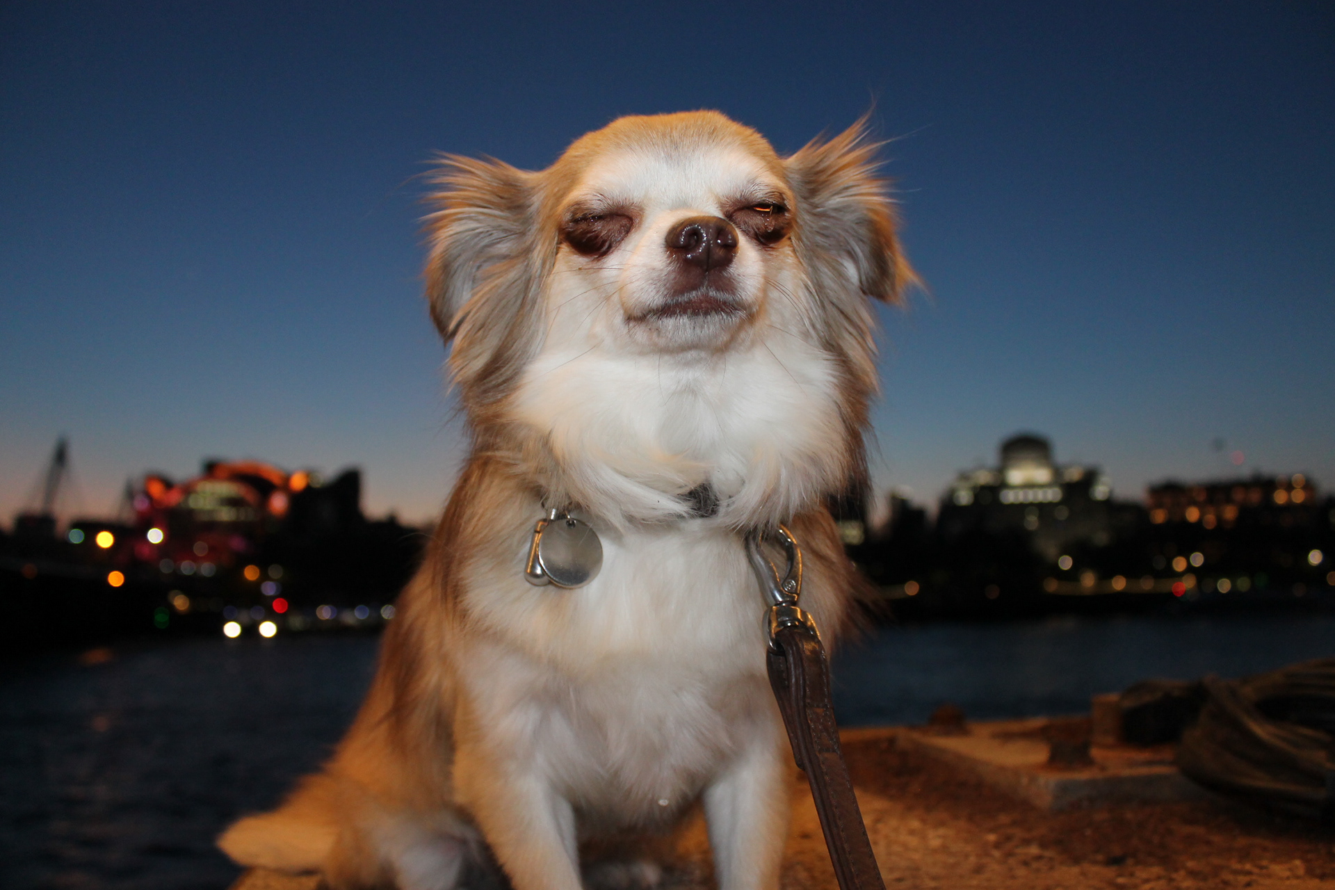

I took these two photos of my flatmates Chihuahua (Gizmo) using a Nikon DSLR camera and the built-in flash. The sun was just setting and I really like the lighting and the way it glorifies Gizmo. Gizmo is a very proud dog as you can see in the first stance but he's also very easily distracted which is his weakness (shown in the second photo).
To improve I think I should have chosen better framing for the second photo.
5. Half Truths
These were my final images.

I'm happy with how this series turned out and found it interesting to switch around our texts to reinterpret the meaning.
Brief: Blue
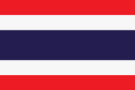
When thinking of what blue means to me personally I felt like I had to look to my various cultural influences. In Thailand, where I lived for 12 years, the blue in the flag symbolises the monarchy which rules the country, the red symbolises the people and the blood shed in the name of independence while the white represents purity and buddhism. When Thailand entered lockdown the people suffered greatly due to a decline in tourism which is one of the main sources of income for the economy. Many people grew desperate and looking to the ruling class to handle the situation. Instead, Thai rulers attempted to solve the decline in western tourism by offering cheap flights from China into Thailand and flying new tourists in at a rapid rate. They also received criticism for purchasing multiple expensive water spraying jets to use against peaceful protests and attempting to buy a jet. The Thai Army also went about spraying disinfectant in very random locations; a forest and the streets which seemed to do nothing to prevent the spread of Covid. Instead, it eventually became clear for the people that they were being lied to and everything was just a PR stunt to maintain Thailand's reputation to the outside world. Evidently, there were very few Covid cases recorded in Thailand despite the first covid case outside of China being recorded in Bangkok.
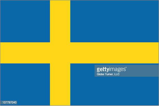
On the other hand, being Swedish, the blue in the Swedish flag symbolises justice, loyalty, truth, vigilance and perseverance. Which is a big contrast from what the monarchy symbolises in Thailand.
Keeping these ideas of justice and the contrast between the lives of the privileged and unprivileged I was very inspired by the Tall man (2010) exhibition by Vernon Ah Kee. The exhibition features 4 different camera angles to depict the ongoing effects of colonisation in contemporary Australia. It depicts events from 26 November 2004, when simmering tensions erupted on Palm Island, an island off the coast of Queensland after an aboriginal man was killed in custody.
I couldn't find the full video but this news reportage features clips of it.
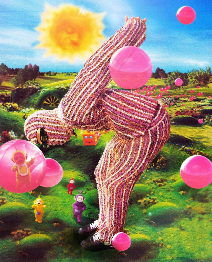
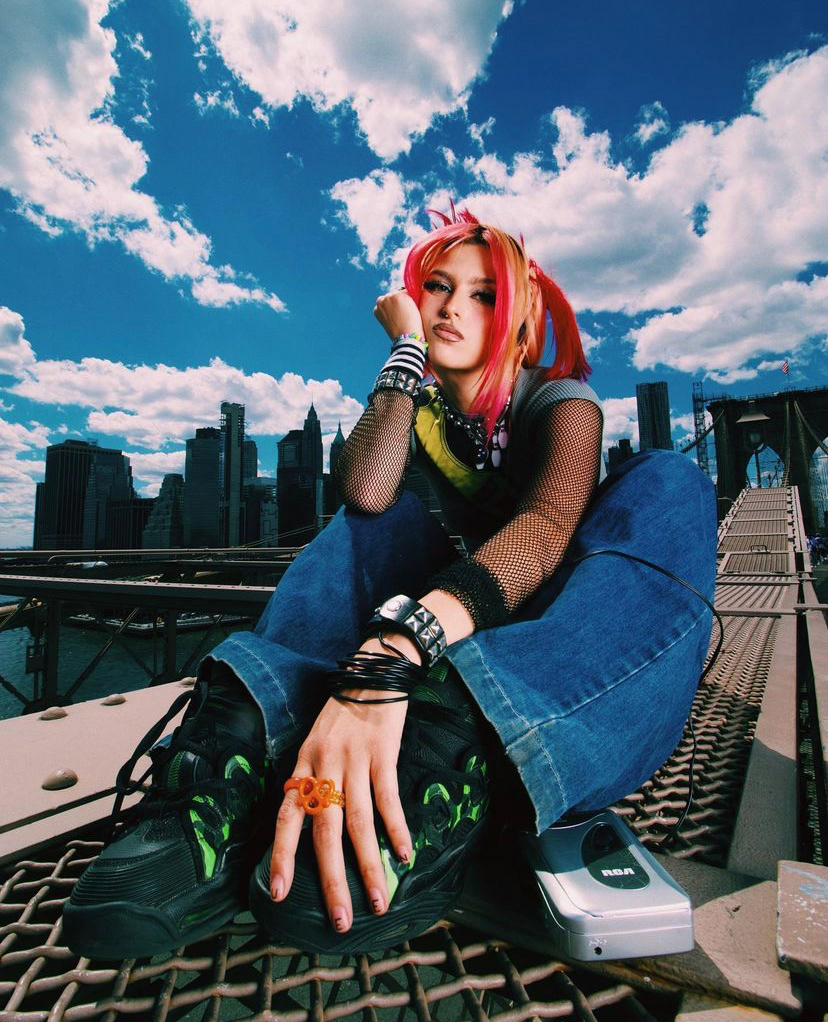
Mood board for the shoot.


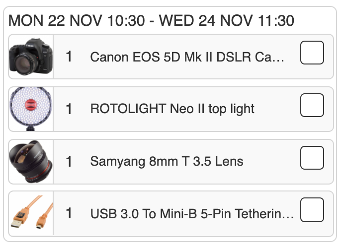
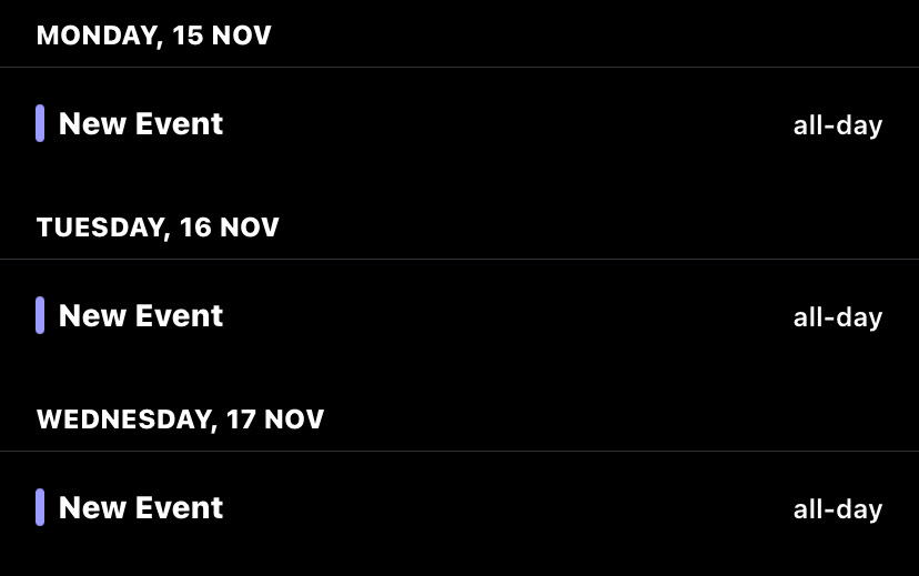
I have had to move adapt my idea because the equipment I needed wasn't available until November 22 and my model is only free between Monday and Wednesday November 15 and 22.
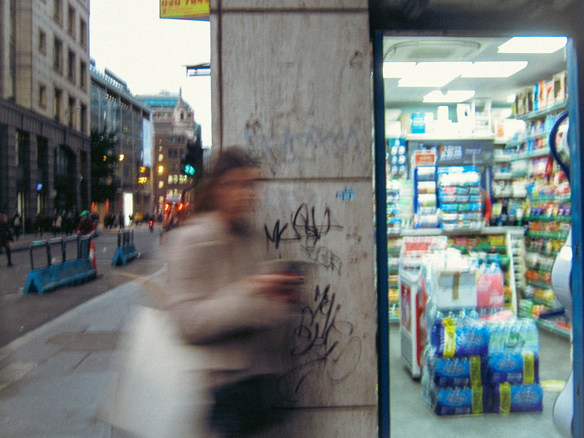
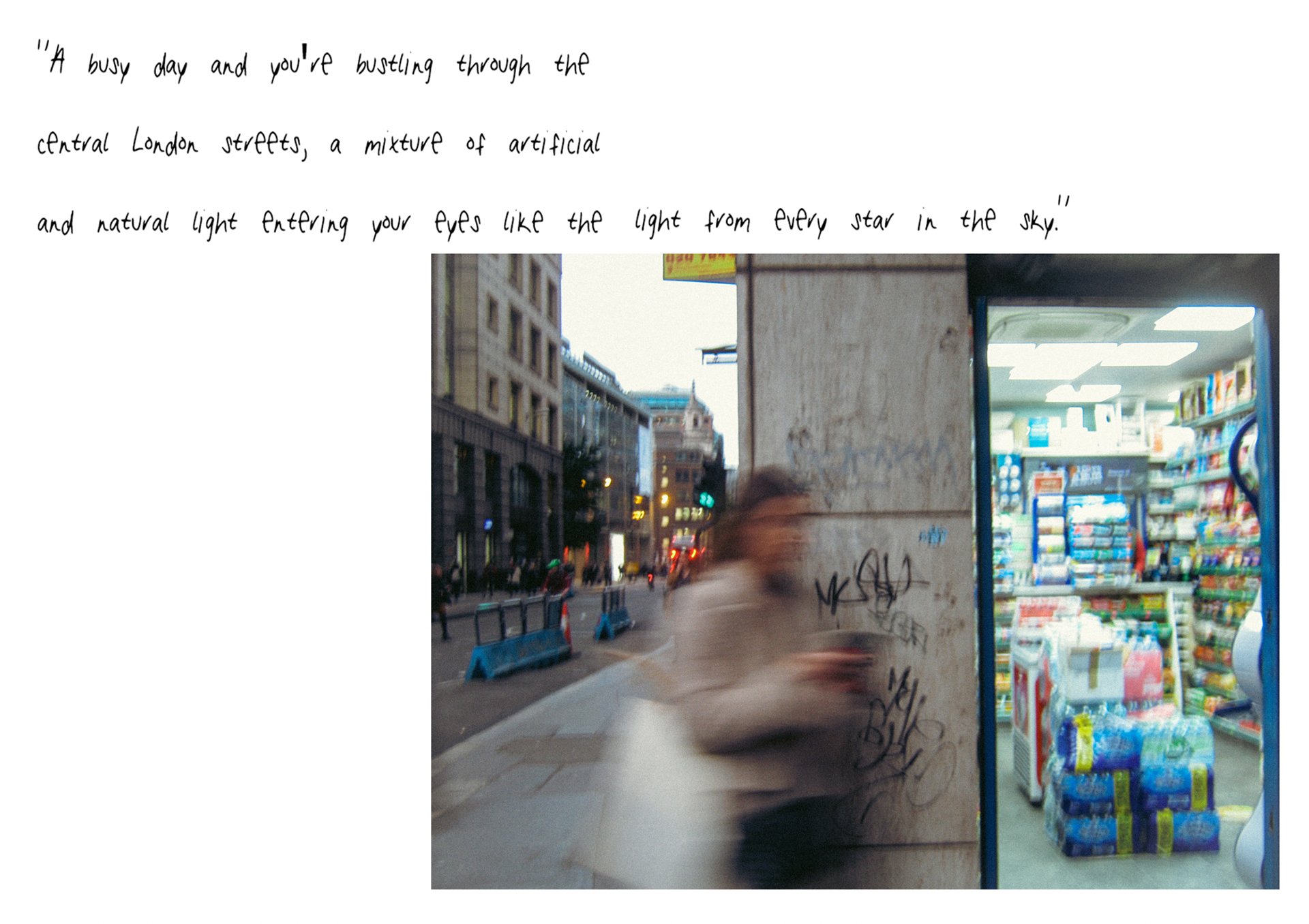
I decided to shoot some more street photography in order to develop my idea further.
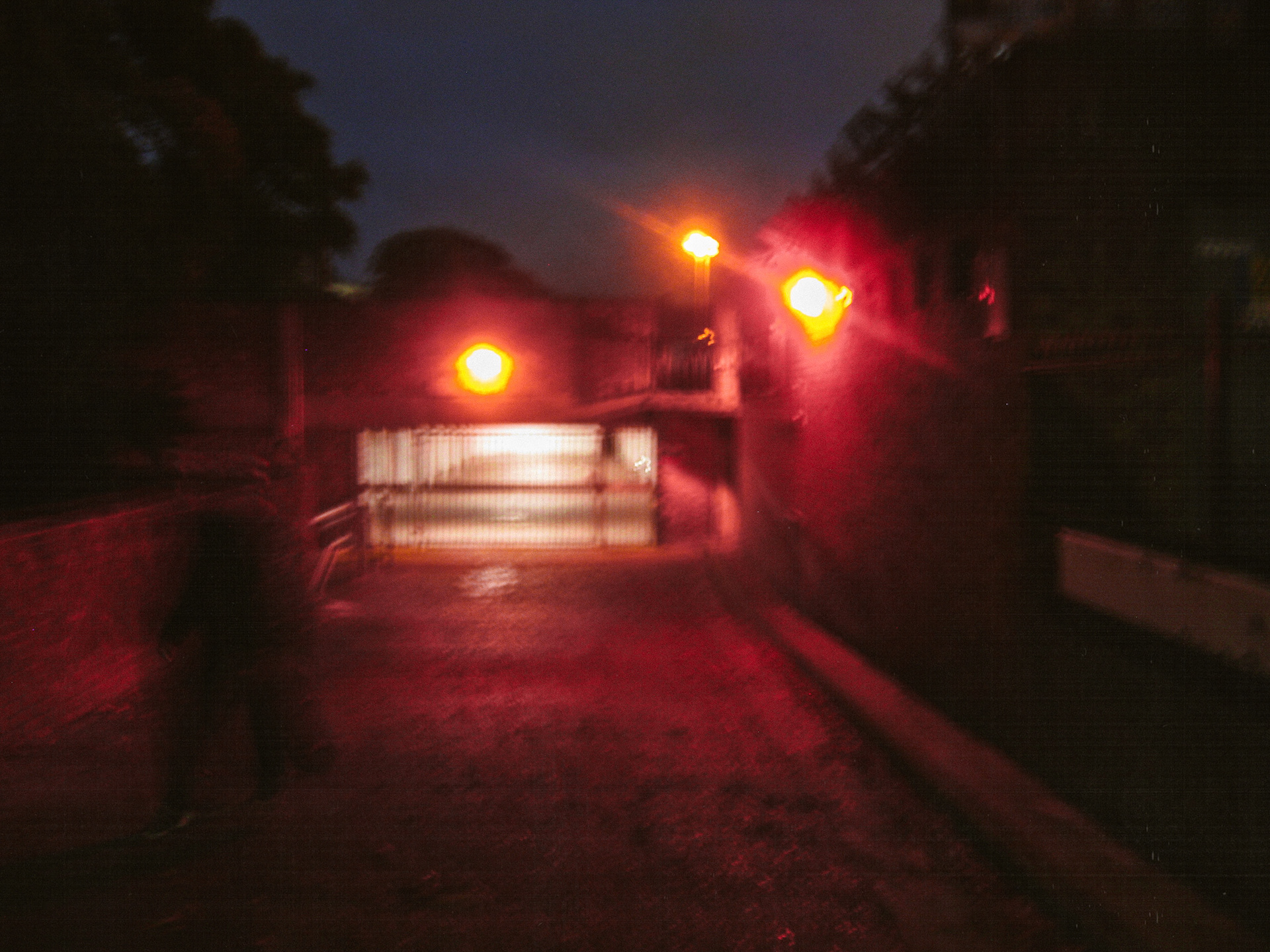
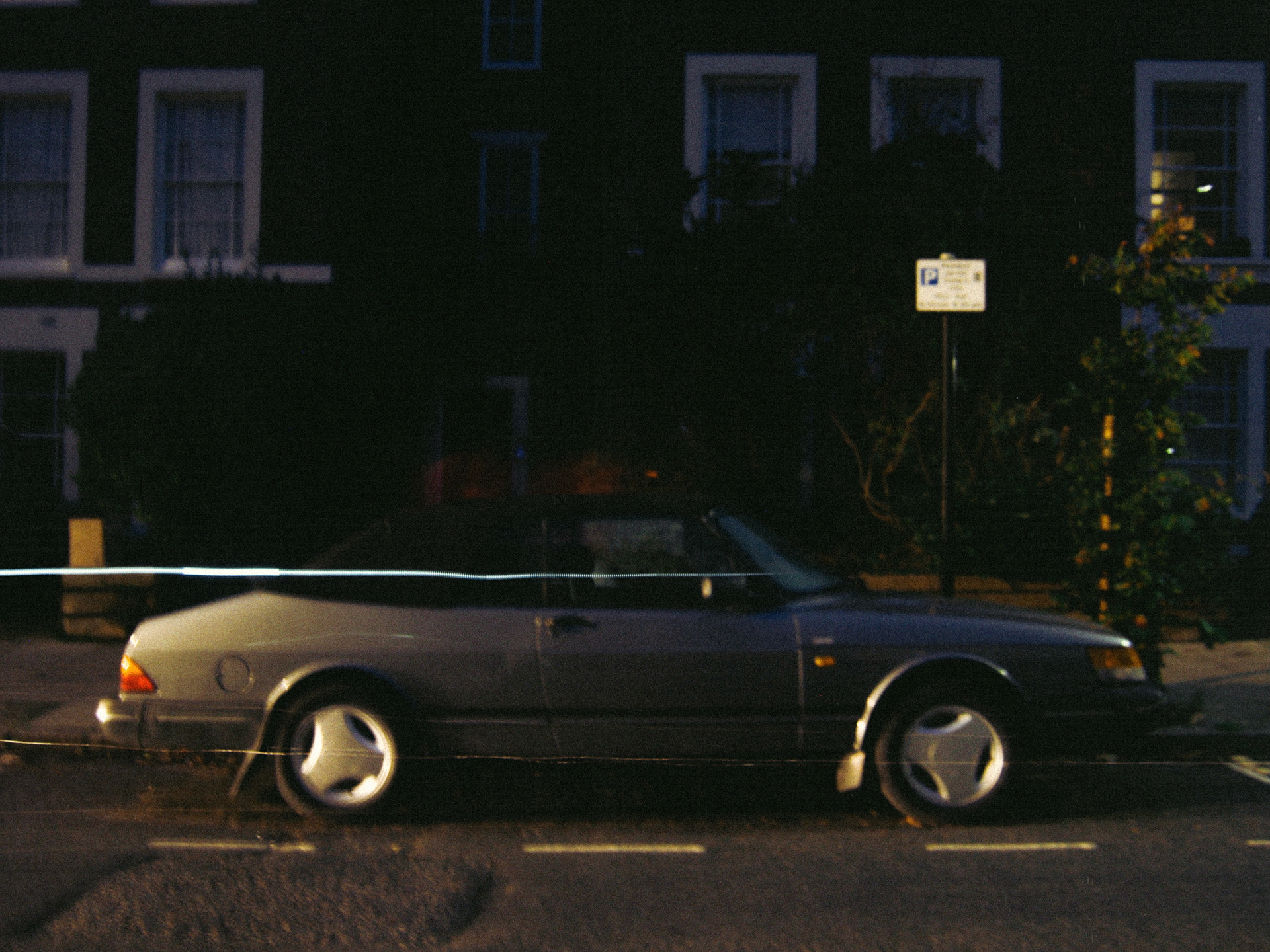
I took these photos on a point and shoot camera set at ISO 80. I found using low ISO in dark conditions creates a very dreamy atmosphere. I decided I want to experiment with this in my photoshoot by doing cross layering the normal images with blurry ones.
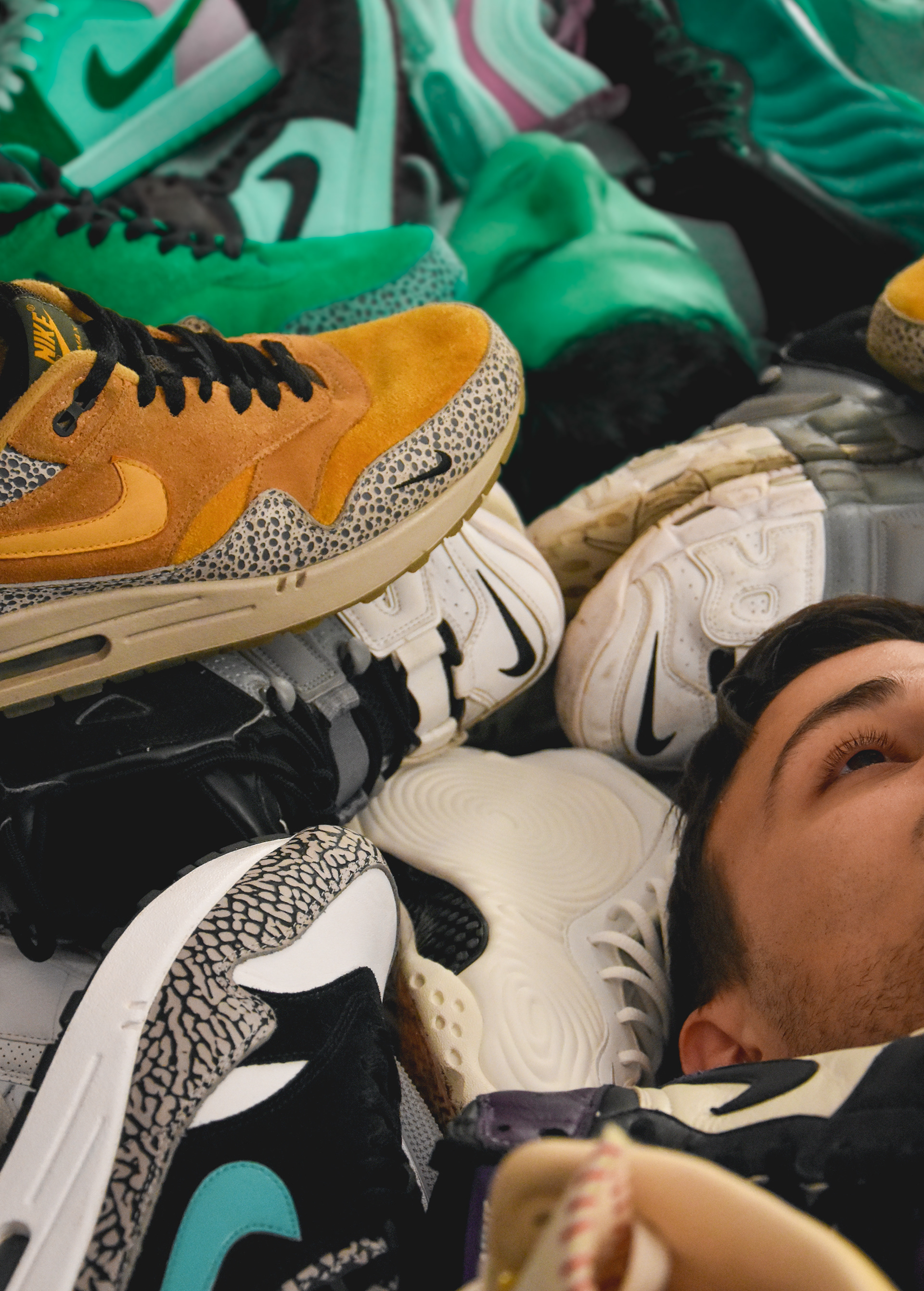
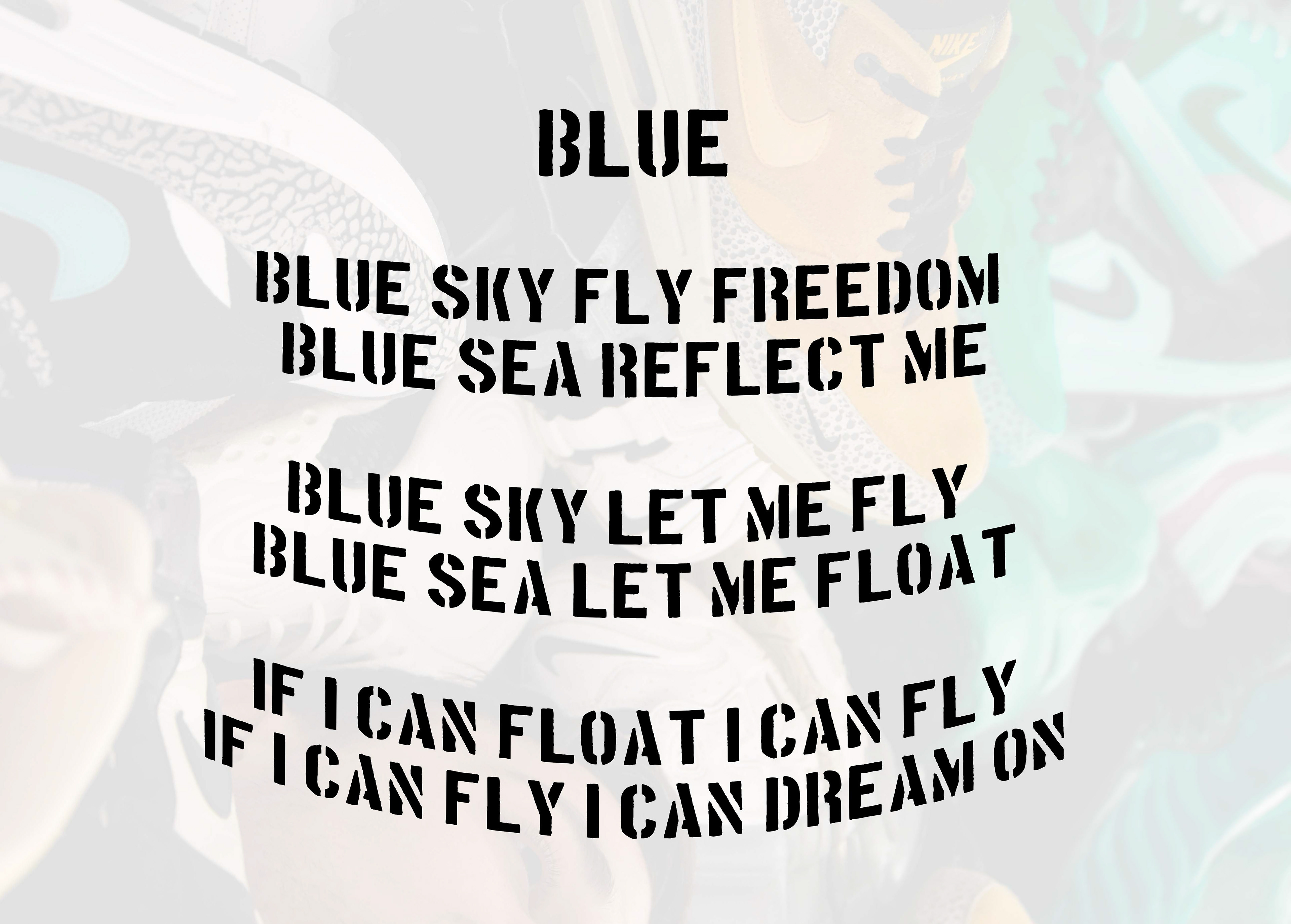
I took my final image in a studio I set up in my room using a mirror and a bunch of shoes. The shoes is my brothers shoe collect which is a big part of what he uses to express himself. This link with my initial ideas of sky symbolising freedom and sea symbolising reflection and identity which when combined mean freedom in expressing your identity.
I wrote a poem to go along with this concept.