Week 1 12/1/2022
There will be a total of 3 tasks for this unit.
Task 1. Sport: find a team or activity and photograph it on location or in studio.
Task 2. Product: shoot product linked to your sports team.
Task 3. Fashion: shot a fashion brief in the studio using a creative team.
Workbook advice:
- Post more references
Full Unit Brief: https://files.rave.aula.education/4a9310cca5482b88945abf85c860de33mini_briefs_unit_brief___dgp21106___ay_21_22.pdf
SPORT PHOTOGRAPHY
Task 1 Brainstorming
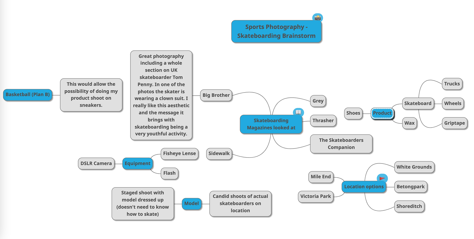
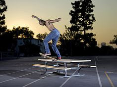
How many options and approaches can you think of considering sports photography? Sport and wellness, injury, sports fashion, live action, team/individual photos, press, training. My initial thought is to do Skateboarding, especially as it's entered the olympics and been recognised as an official sport. London is also a great area for this.
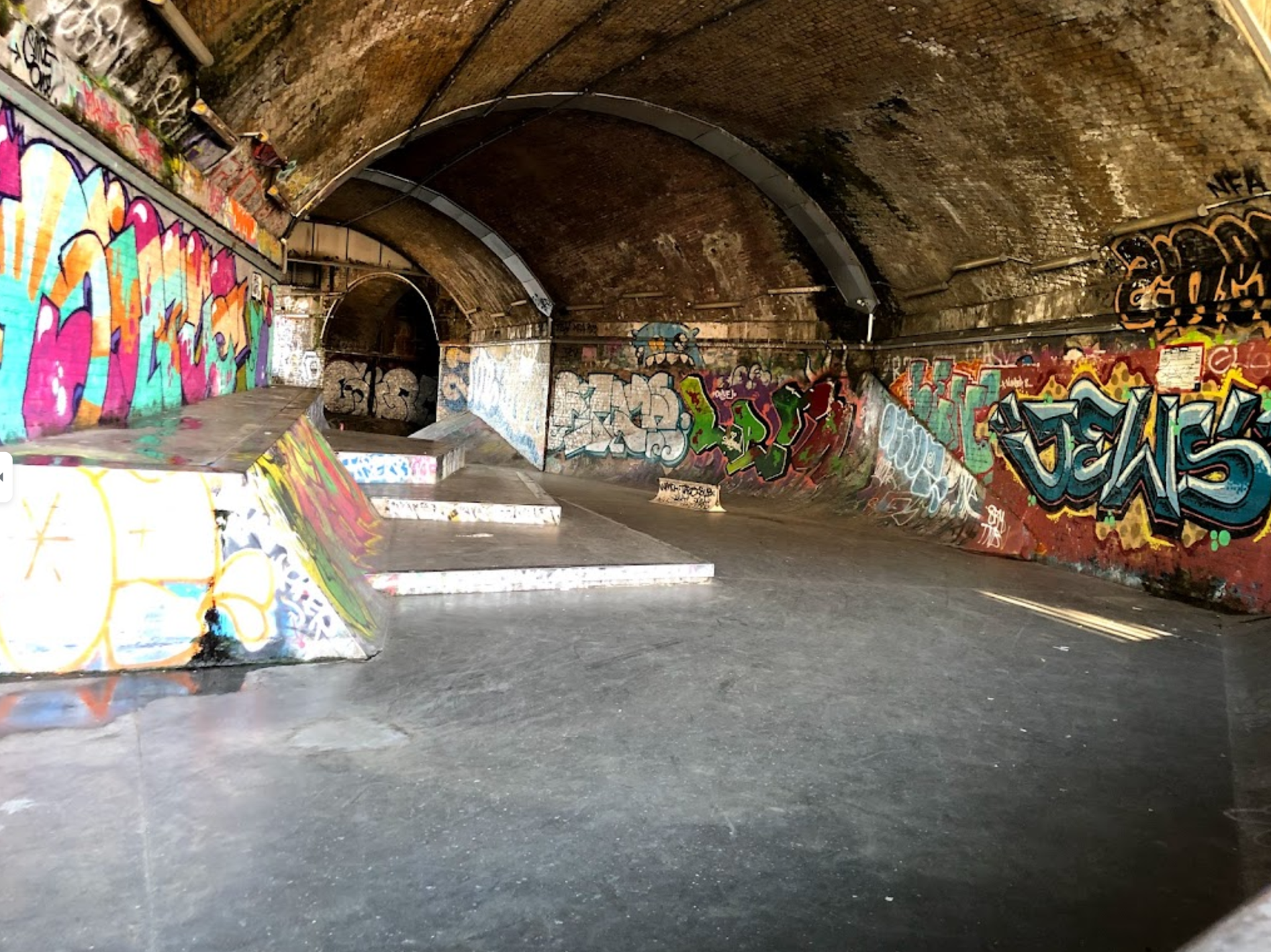
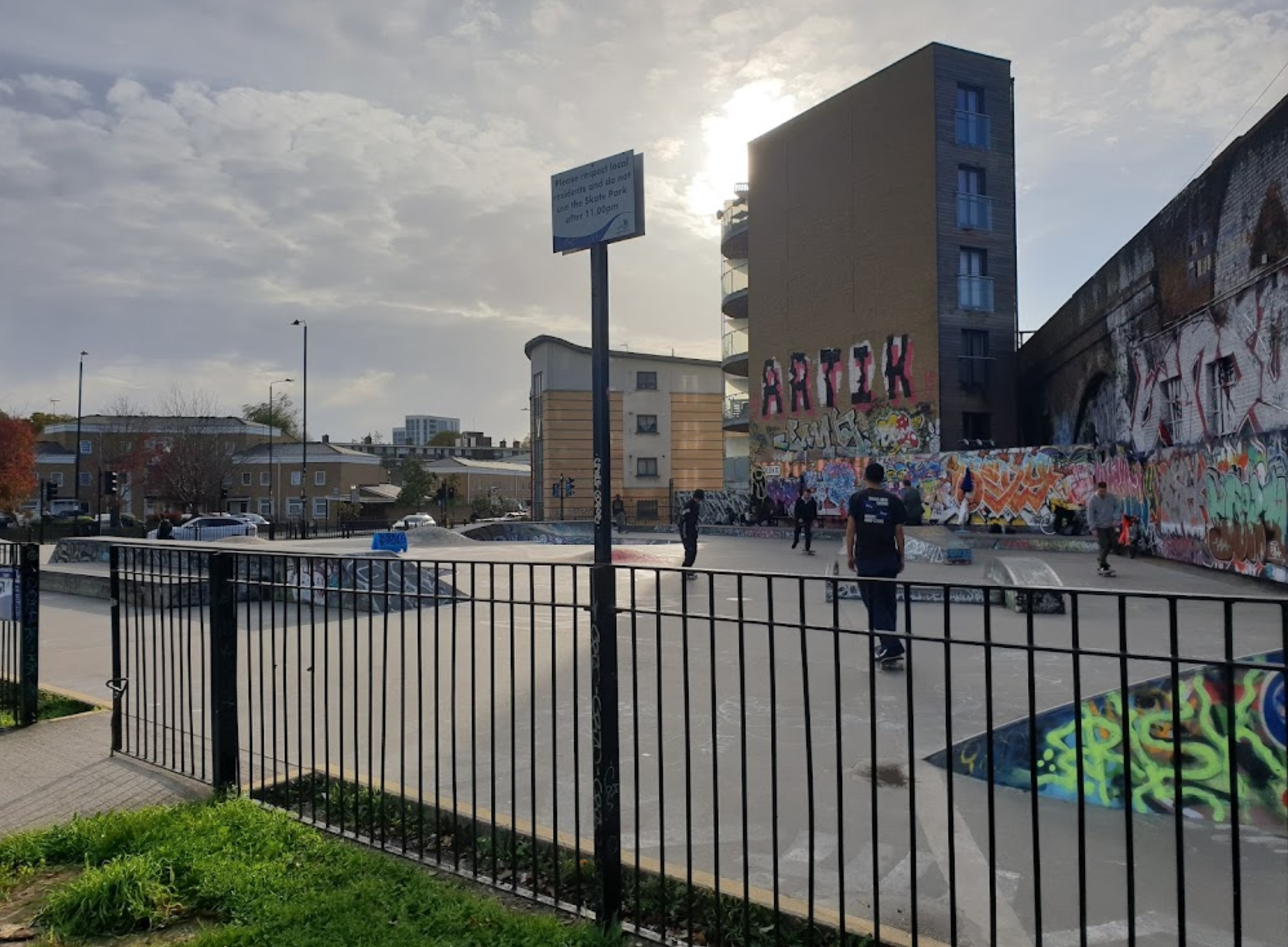
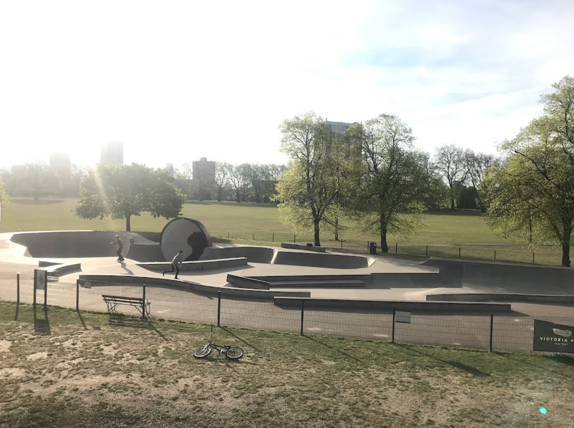
The 4 nearest skateparks to where I live (found using Google Maps)
1. White Grounds 2. Mile End 3. Victoria Park 4. Betongpark
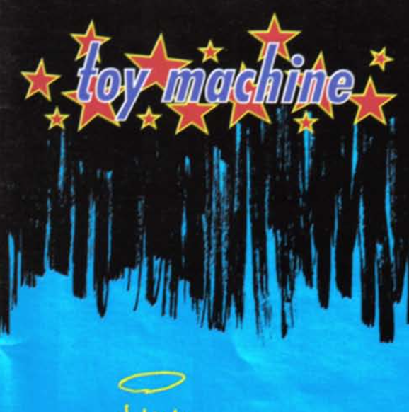
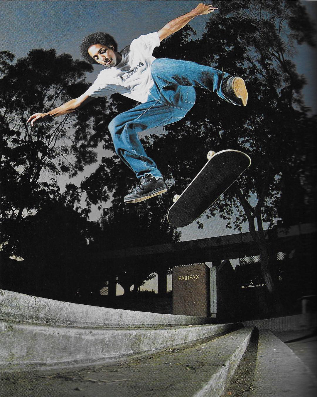
Some of the most popular skateboarding magazines in London include Thrasher, The Skateboarders Companion, Vague, Sidewalk and Grey. I managed to browse further and download scans of various skateboarding magazines editions. I decided to create a moodboard based on what I found inspirational.
In order to meet the deadline I've devised set dates to mediate my workload. I have exactly 4 weeks to finish the task.
Week 1
12/1/2022 - Introduction to task and initial planning.
Decided on skateboarding as main concept with basketball as a backup.
Moodboard created.
Looked a 4 different locations.
Skateboarding magazines downloaded.
Decided what equipment needs to rented.
!! Continue looking for inspiration and think about who you can reach out to for modelling.
Week 2
Decided to focus on the lifestyle of skating surrounding the sport
Decided on a model, contacted and confirmed
Don't forget to complete model release form.
Book equipment and shoot on the weekend.
Week 3
Week 4
12-13/2/2022 - Final hand-ins:
- Seven images that best describe your chosen sport and team
- Final Raw and edited JPG images from your final selection
- Section One in your Digital Workbook that relates to the process of research and practice for this first element of the unit
Week 2 19/1/2022
Photography can be very ambiguous in an artistic context but when communicating a message, ambiguity can be avoided through the use of text, sequence, impact (how they transcend).
Mindmap (from week 1)
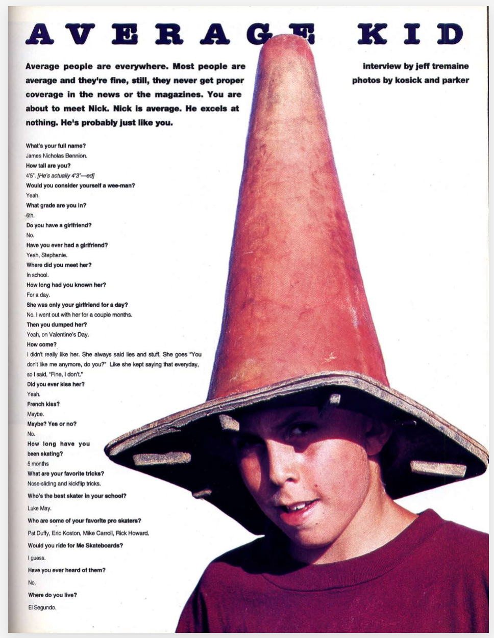
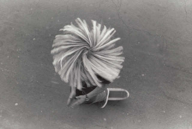
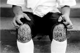
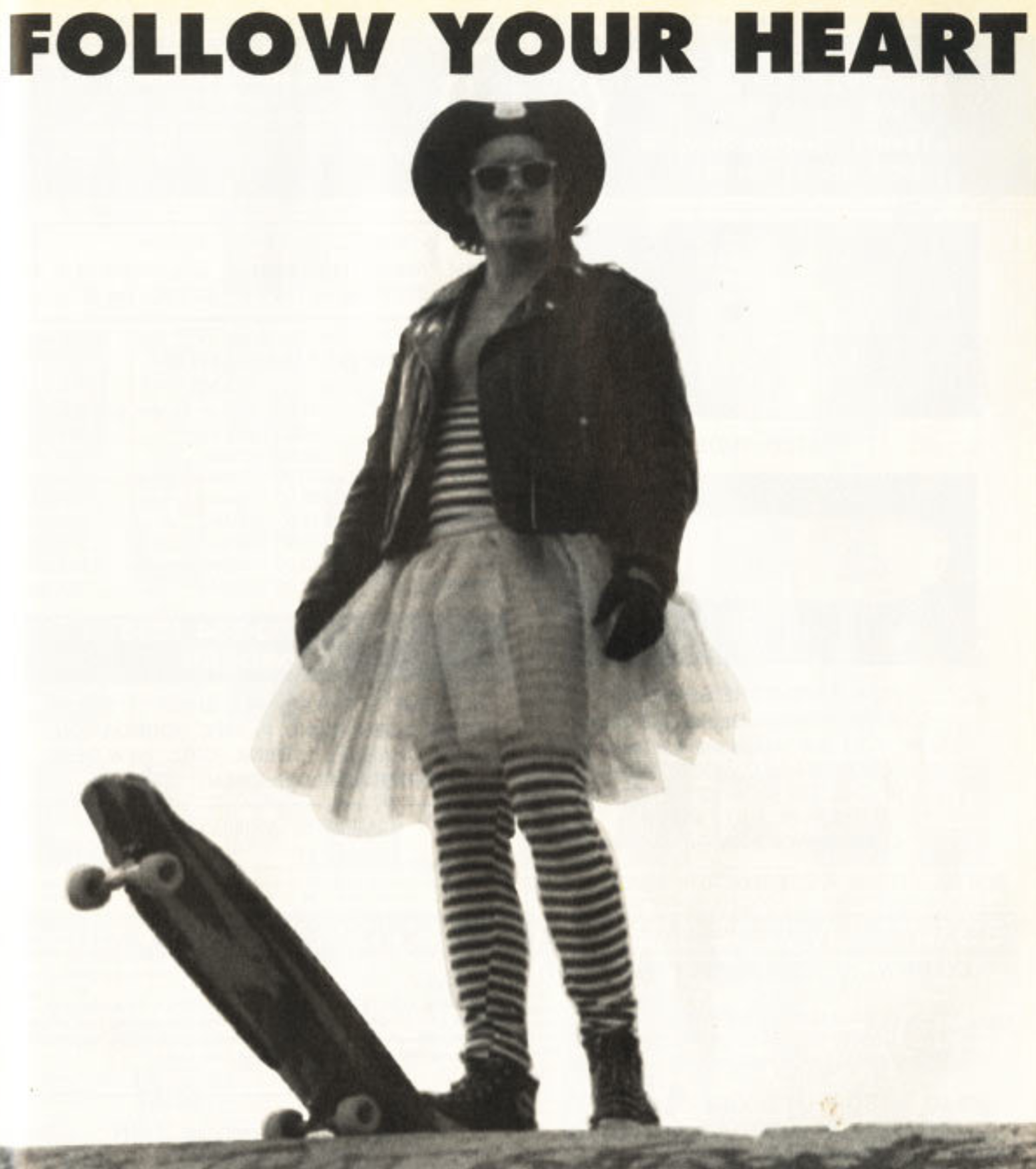
Moodboard with more ambiguous aspects of the skating lifestyle. I found one aspect to be childlike humour (pressing face against window, wearing a cone or wearing a silly outfit).


I thought I would analyse some of these images more individually and pick out aspects which appeal to me artistically.
I really like the idea of the hand inserted here, an idea I might use.
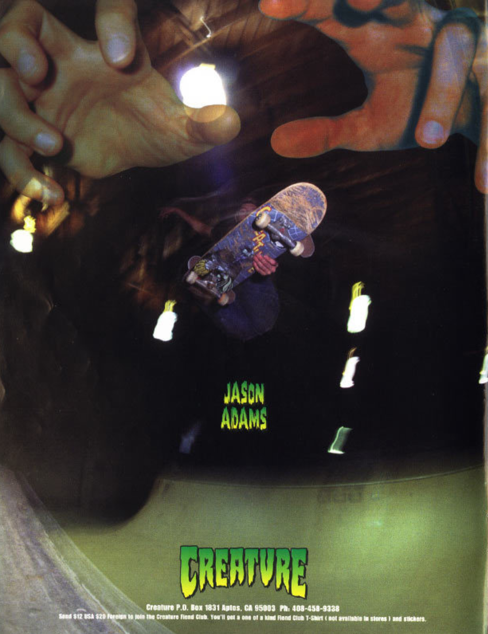
PHOTOGRAPHER INSPIRATION - Craig Stecyk
Craig Stecyk started off photographing skateboarding culture in the 70s at the beginning of the movement and has now established himself as one of the most influential skateboarding photographers.
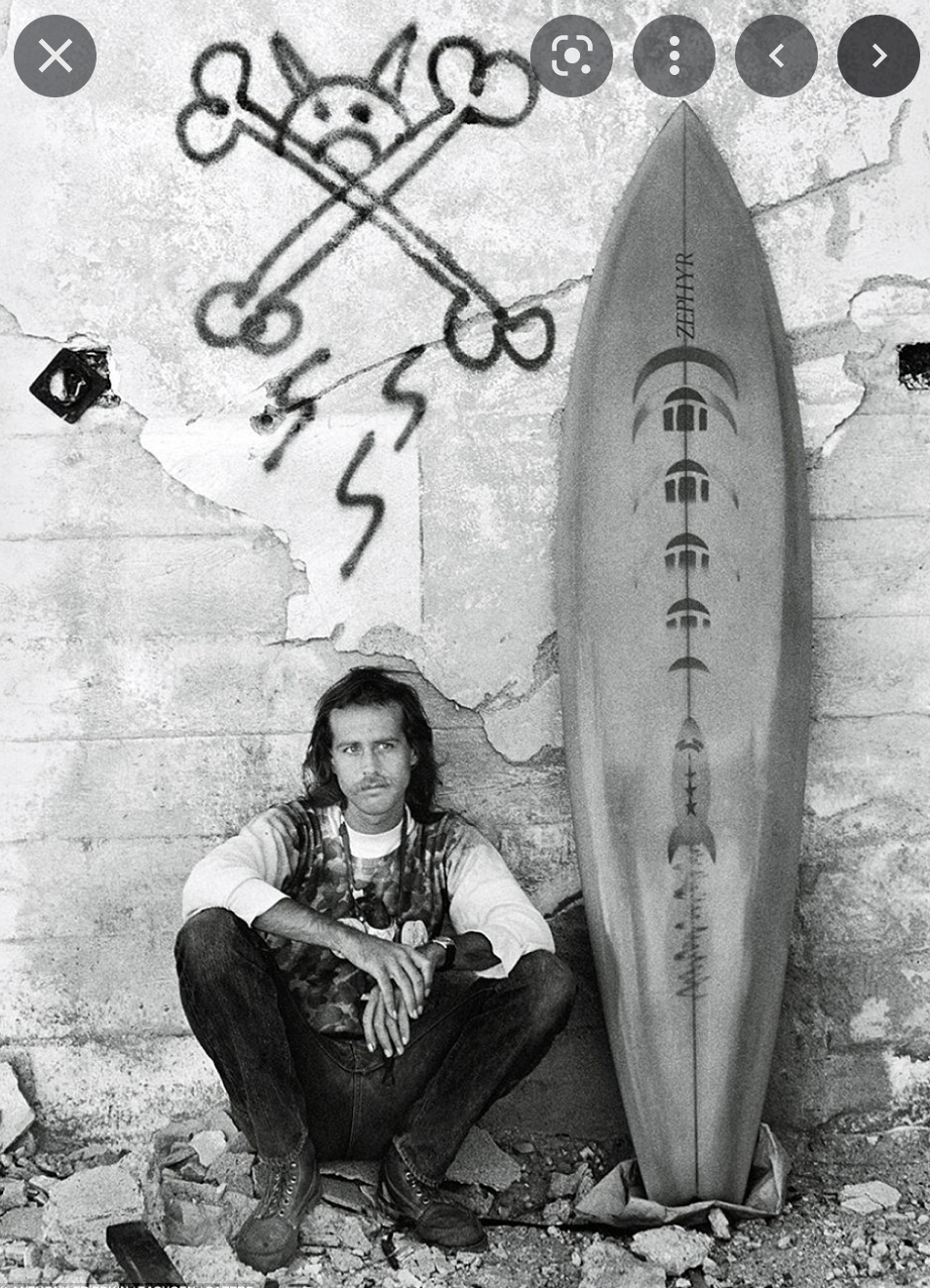
His photography for me encapsulates the free spirit of skateboarding and it's clear to see how influential his work has been on modern skateboard photography.

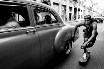
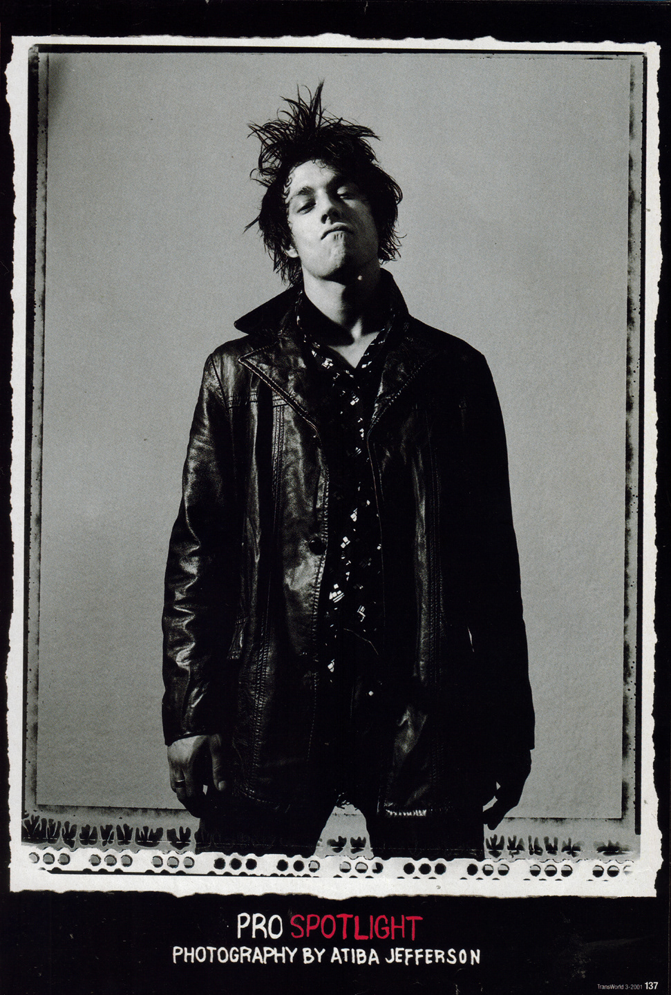
PHOTOGRAPHER INSPIRATION - Atiba Jefferson
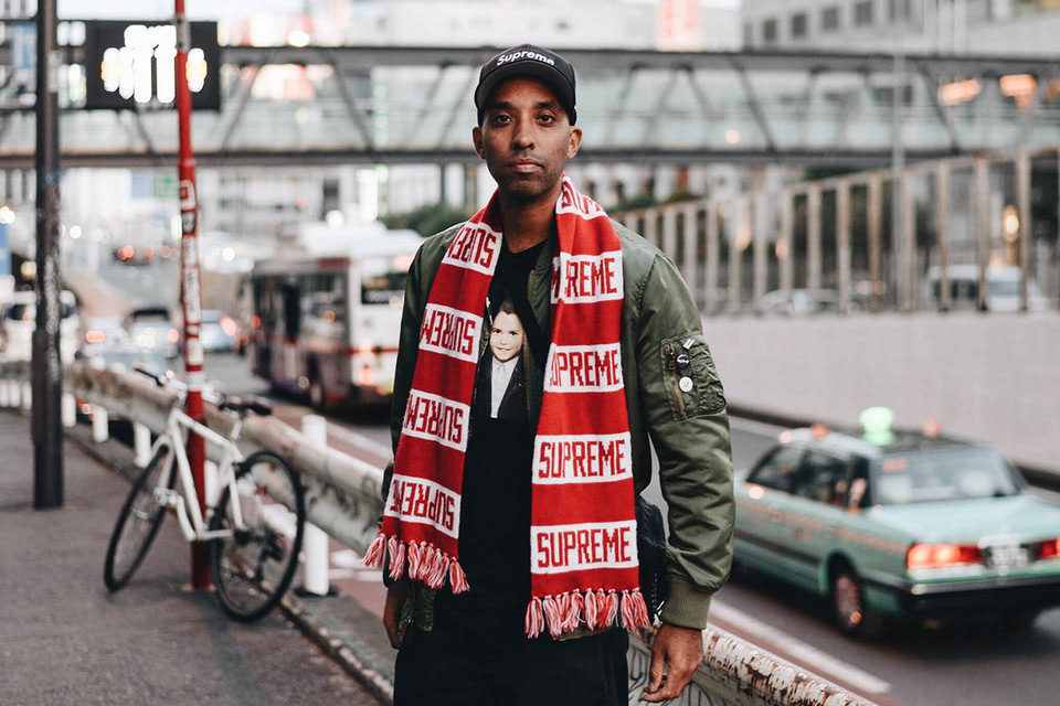
Atiba is arguably the most established and recognised skateboarding photographer of modern times. His photography has been featured in Thrasher and multiple other magazines.
‘I’m a skater, that’s what I do. For me, to be lucky enough to see the best skating is a dream job. It’s not even work because I just get to enjoy myself. Skating is always going to be number one’
After looking through his photos I found he seems to approach skateboarding from two perspectives; sport and documentary. I found it inspiring the way he makes these two merge together and feel the same.
MORE INSPIRATION
I read a very interesting article in The Guardian on the evolution of skateboard photography.
https://www.theguardian.com/artanddesign/gallery/2018/jul/11/against-grain-face-plants-and-vert-ramping-the-evolution-of-skateboarding-photography-in-pictures
Week 3 26/1/2022
Sports photography lecture with Ben.
"Sports photography isn't just about capturing the moment, it's capturing everything around it as well."
It's a very tough industry, highly competitive. For sports photography, preparation is key.
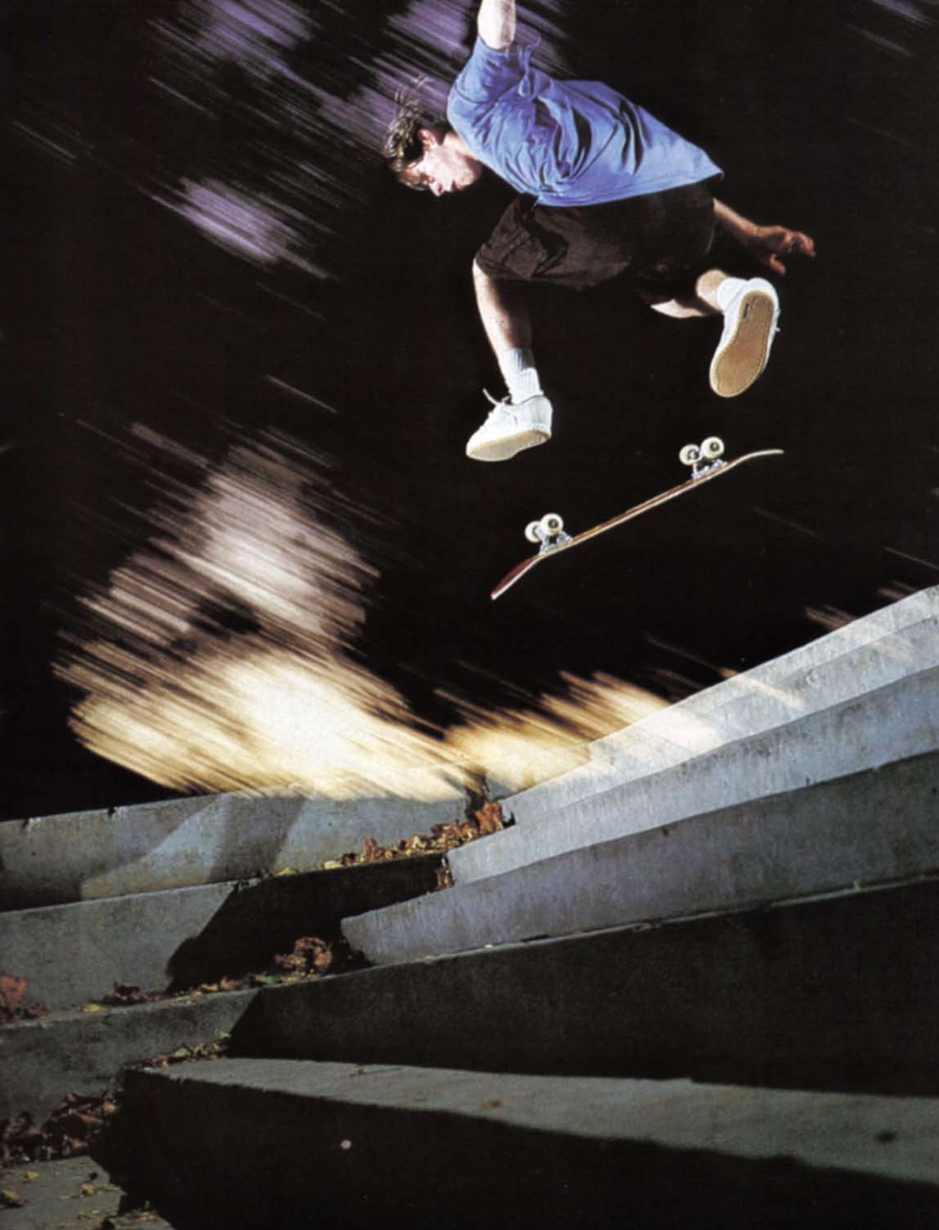
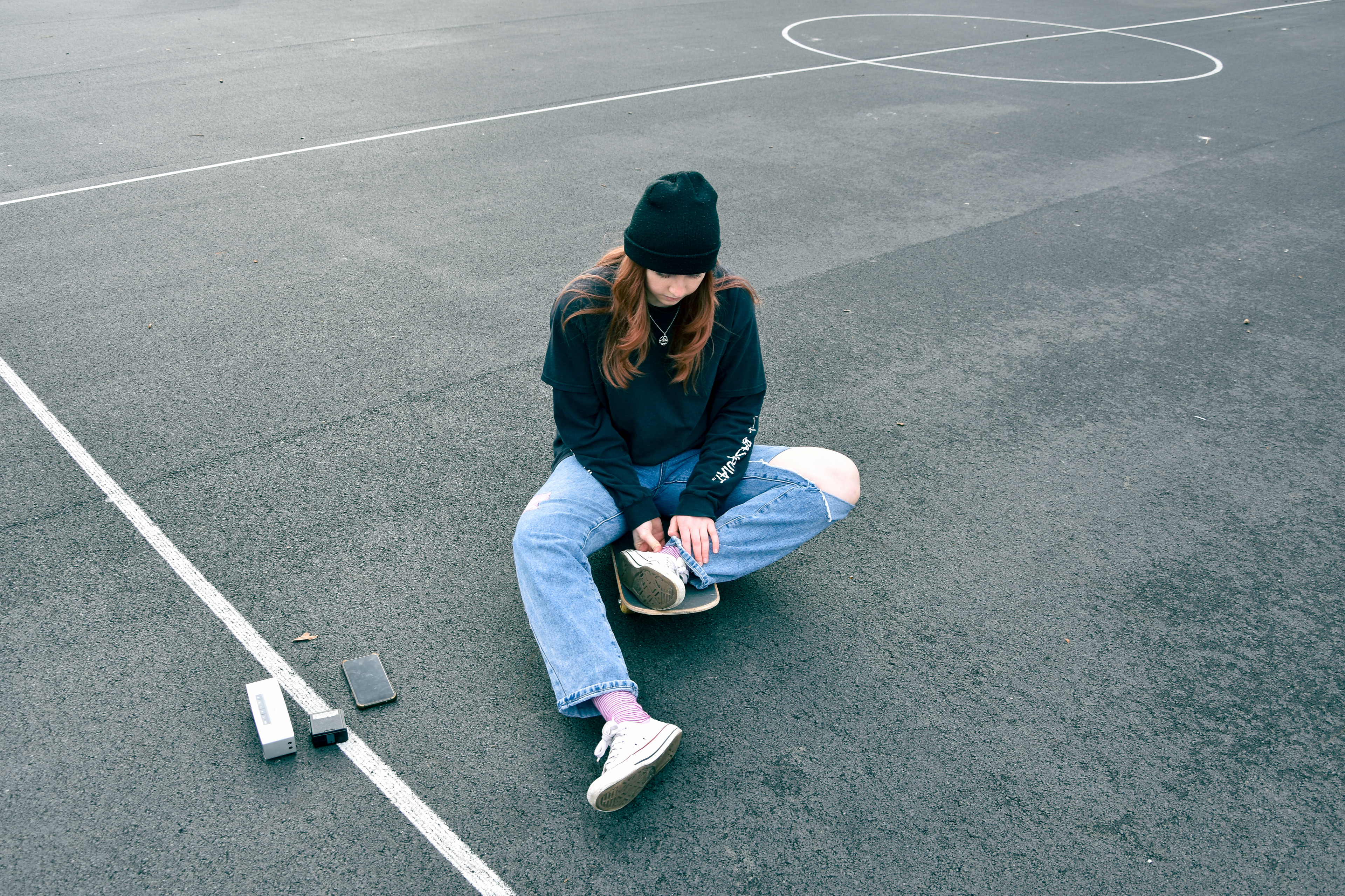
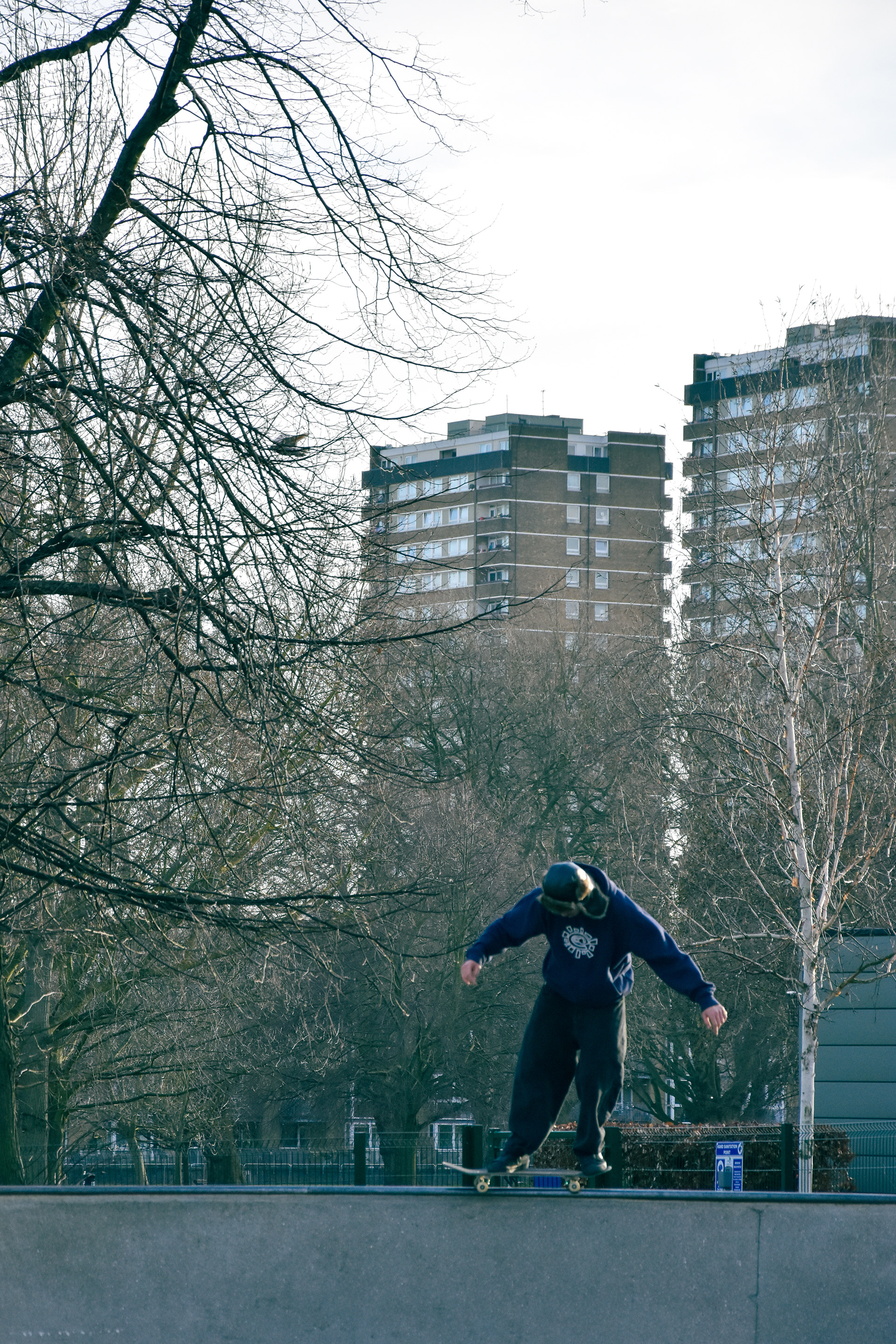
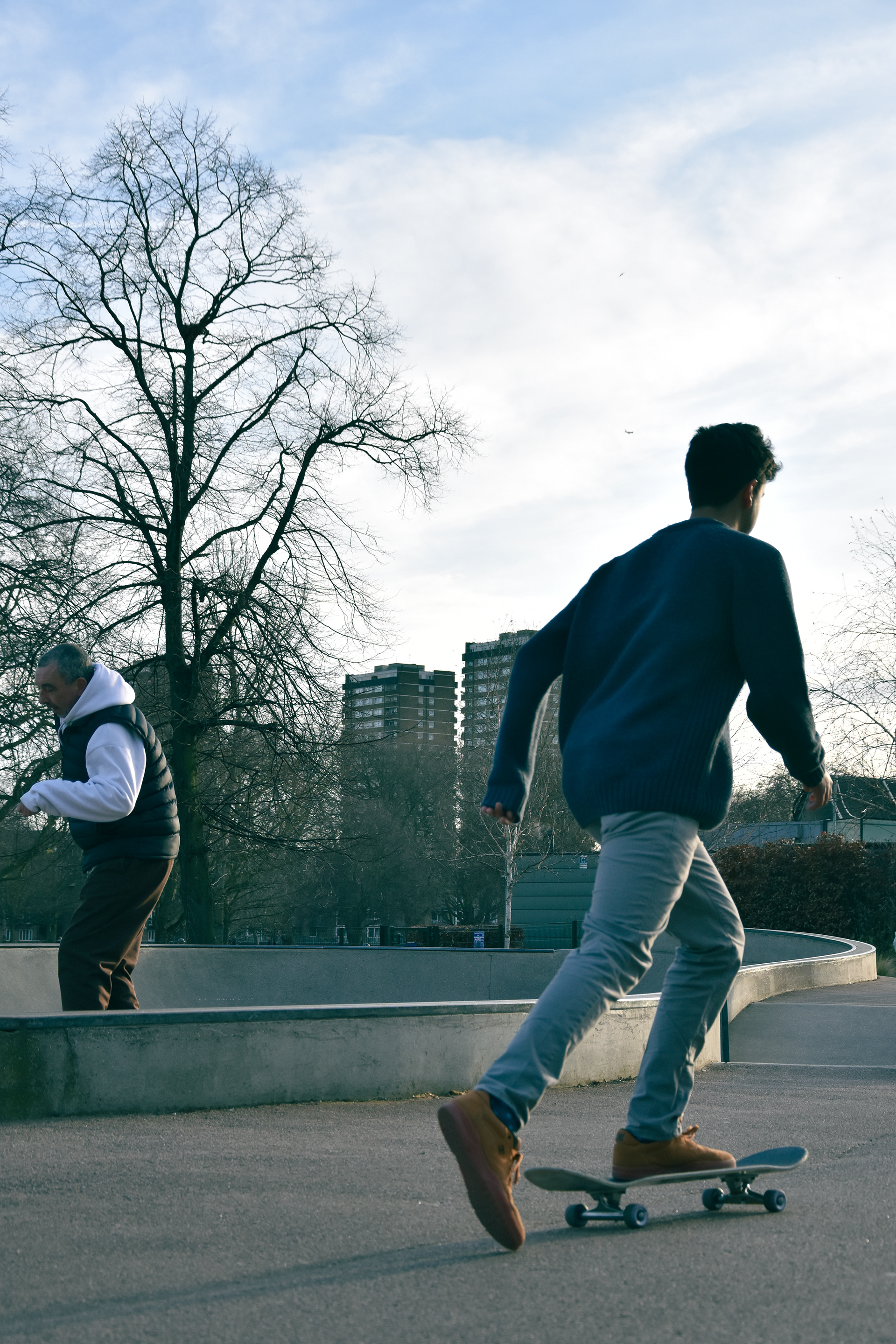
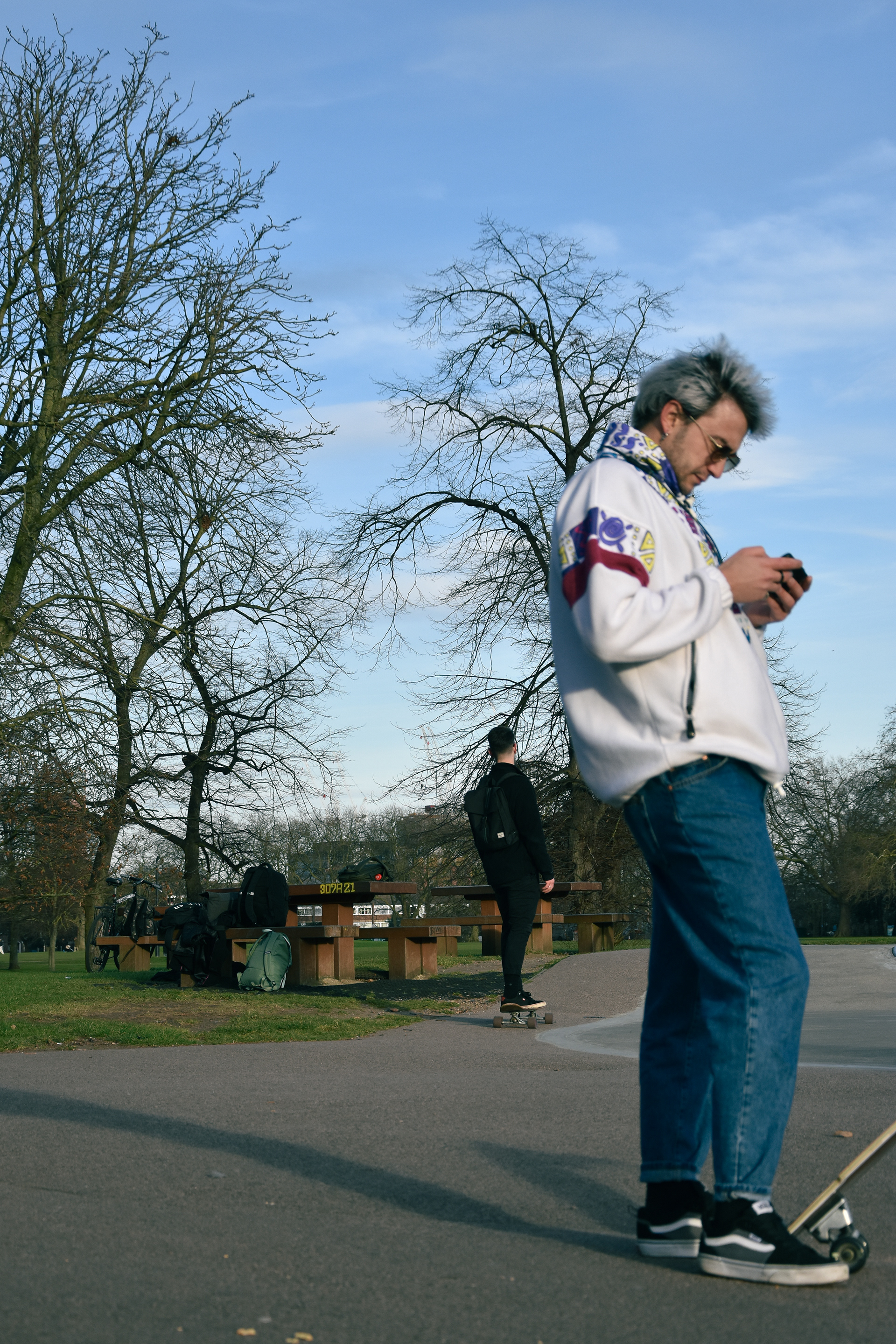
SPORTS SHOOT
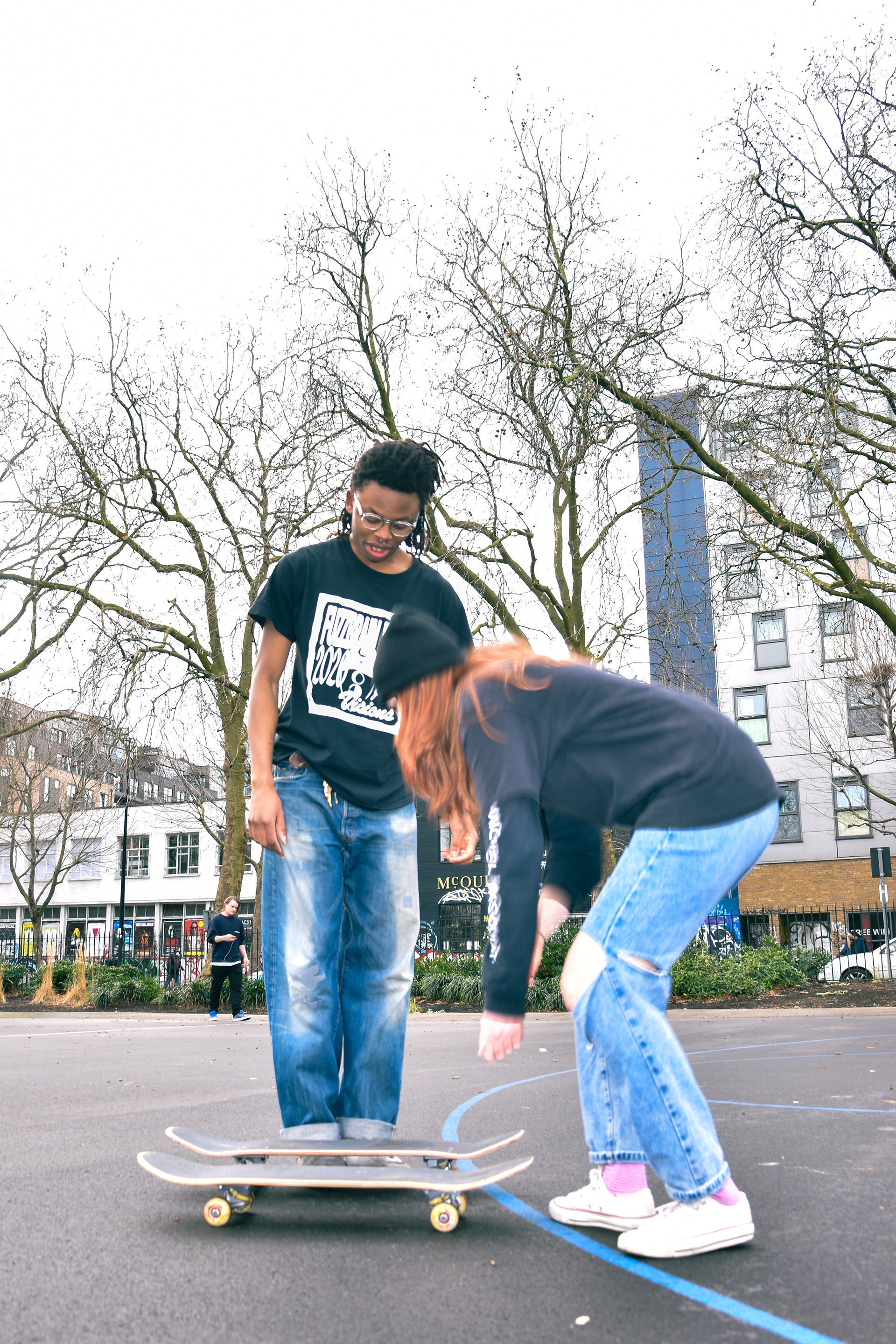
Below are three photos I decided not to include for the following reasons:
1. Lack of focus on skateboarding and the angle is not very interesting.
2. Subject is out of frame, at the time I was shooting using the screen over viewfinder because I needed to put the camera down low. For some reason this prevented me from shooting at burst, a problem I didn't understand until I got back home later.
3. Overexposed and blurry, another problem I was having when not using the viewfinder.
I believe these problems were caused by the viewfinder and the camera's automatic settings messing the photo up. That's why I did a meter reading for my second shoot in Victoria Park, for that I decided to shoot at 1/125 and f/5.6. This produced much greater results.
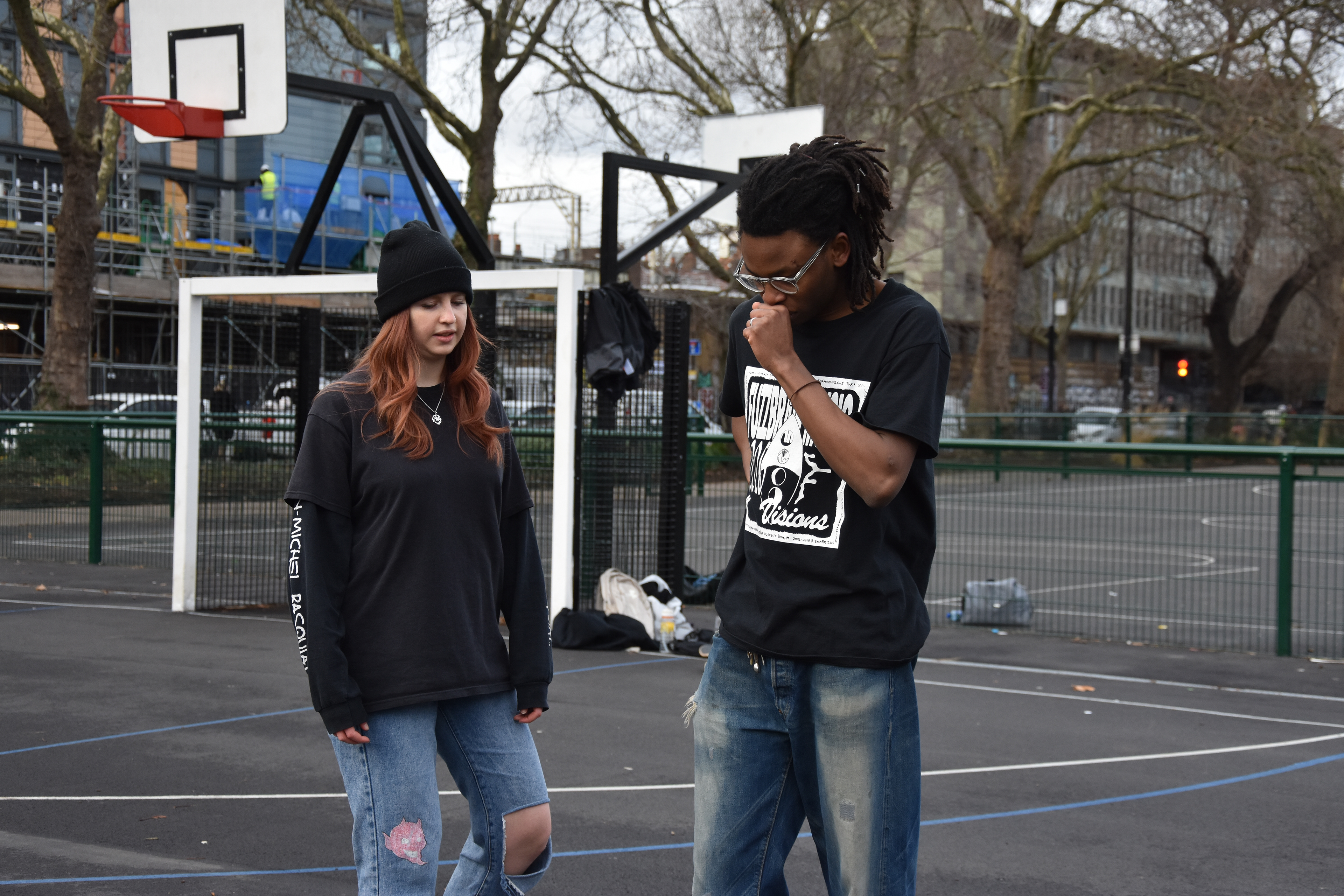
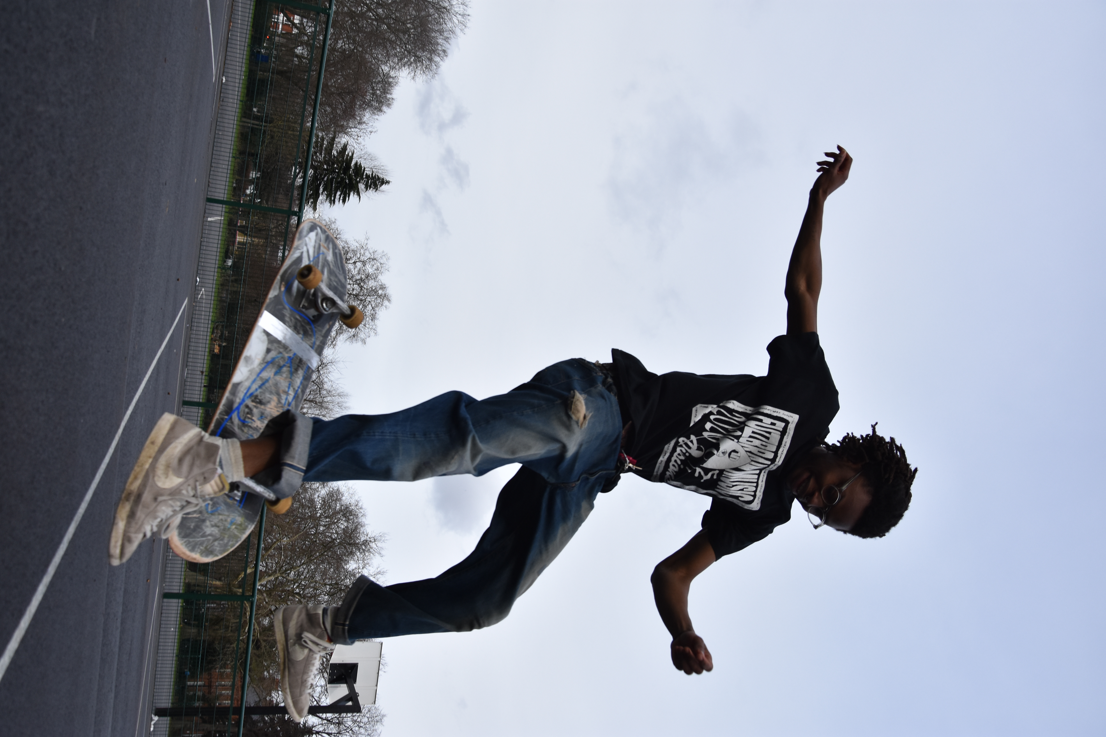
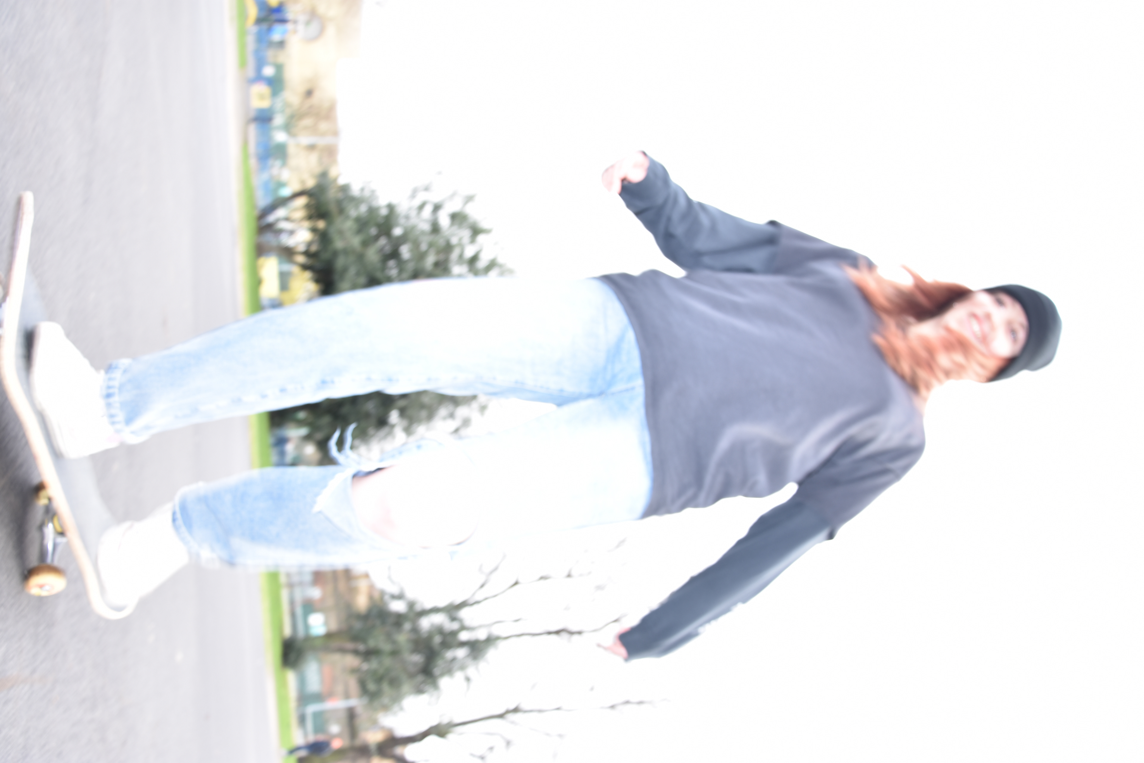
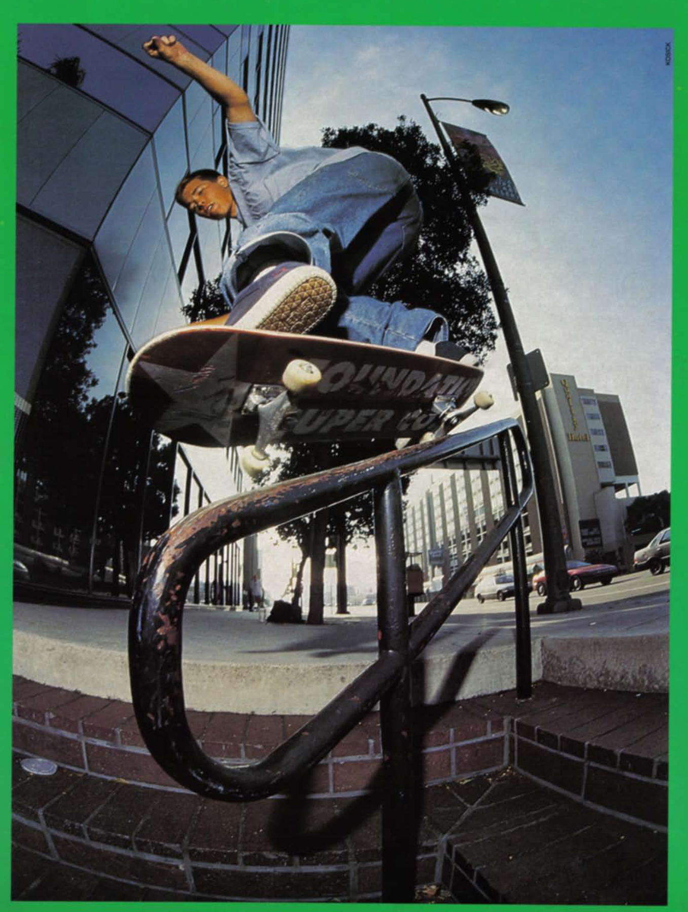
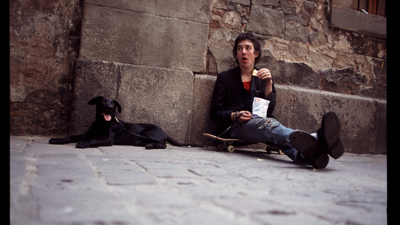
These are my final images for the sports brief. They were taken in Victoria Park and the Bethnal Green basketball court. These have all be retouched in Lightroom where I also added a cyan tint to the shadows to make them all go together.
A friendly couple I found in Bethnal Green and asked if I could photograph. This was the only photo from my first shoot that I went with, even though it was overexposed I just liked the composition and style of it too much.
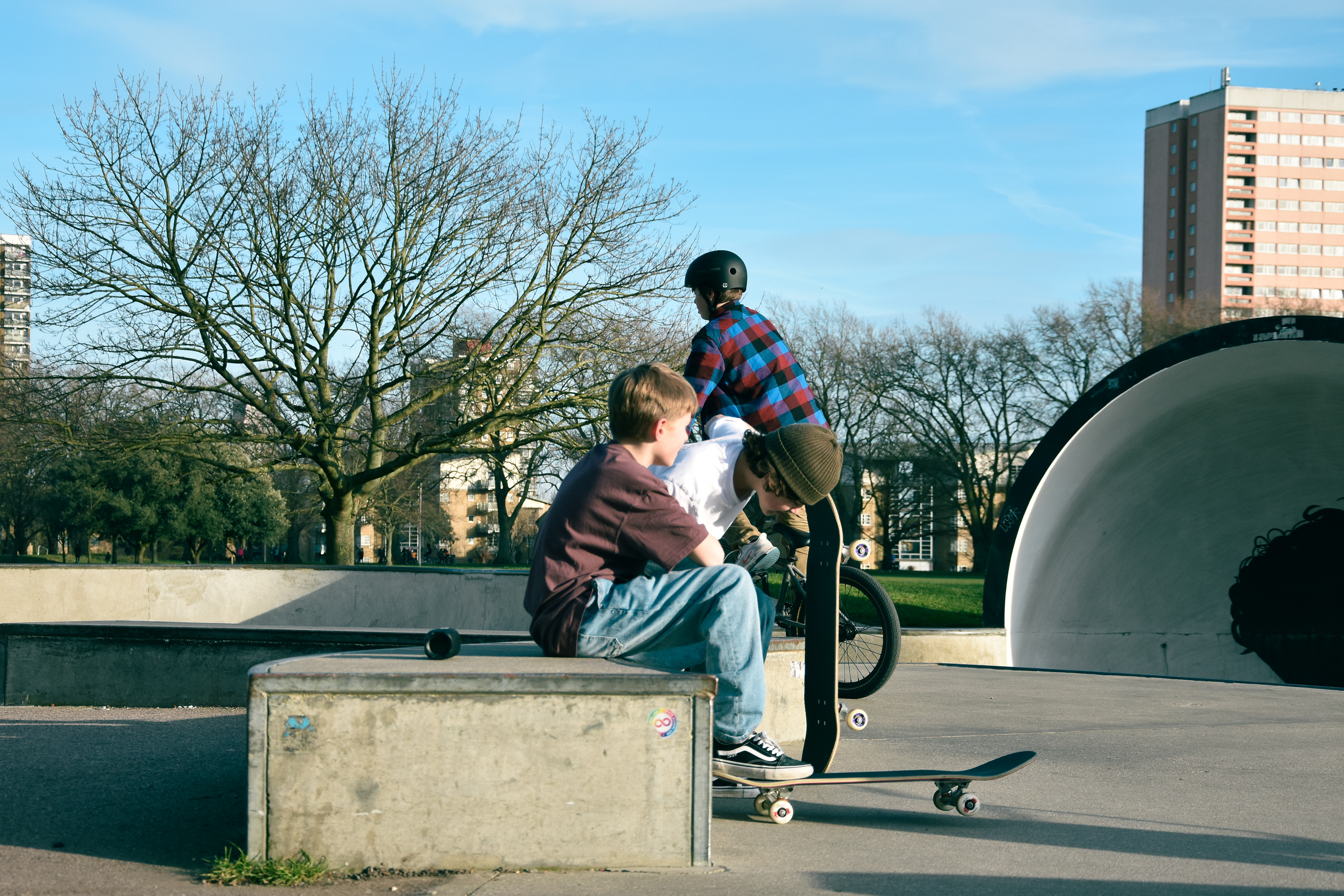
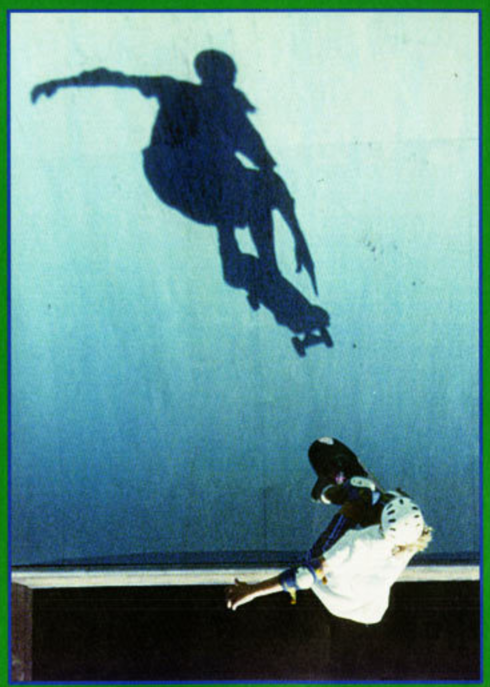
This was my favourite photo because it encapsulates the comradery of sports and the converging contrast of man made concrete structures and nature. I also think this image works well next to the bottom one...
...because skateboarding is essentially an individual sport even though there's a idealised vision of comradery. This photo encapsulates the more individualistic aspect of skateboarding which involves more introspection and familiarising yourself with the environment around you. Riding around you automatically become more observant; paying attention to traffic, looking out for cracks in the road, small rocks, bicycles, motorbikes, and pedestrians - external factors. On the other hand, you're constantly focused on your foot placement, balance, hand movement, breathing etc. - internal factors. I became fascinated with conveying this idea - how the skateboarding is an unconventional tool for connecting ourselves with the environment around us. This became my guiding concept.
This photo has elements of nature and man made structures, elements which skateboarding embody in their construction.
This image conveys the same elements except more emphasis is placed on the nature aspect.
I'm not entirely satisfied with these photos because I wanted to get in on the action more, something I will try to work on next time I approach sports photography. Apart from that, I'm happy with the way the all flow together with their composition and lighting. I think there are some similarities to Atiba Jefferson in the convergence of sport and documentary photography. Only adjustment I might make for the final is increasing the luminance of the blues in the first photo to match the others.
ADVERTISING PHOTOGRAPHY
STILL LIFE REFERENCES
Still life photography is a genre of photography used for the depiction of inanimate subject matter, typically a small group of objects.
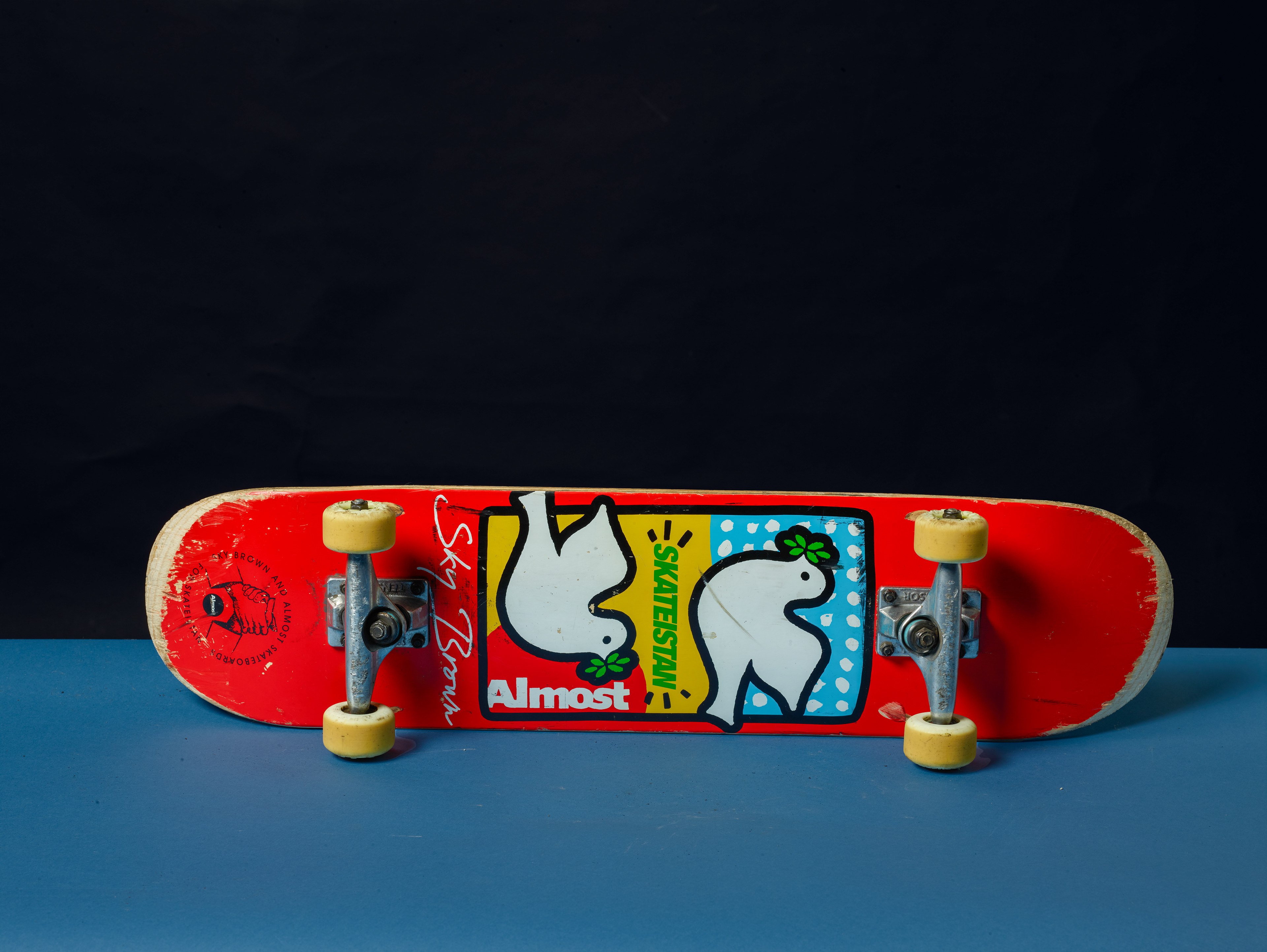
I started with a mood-board surrounding what product involved in skateboarding I would choose.
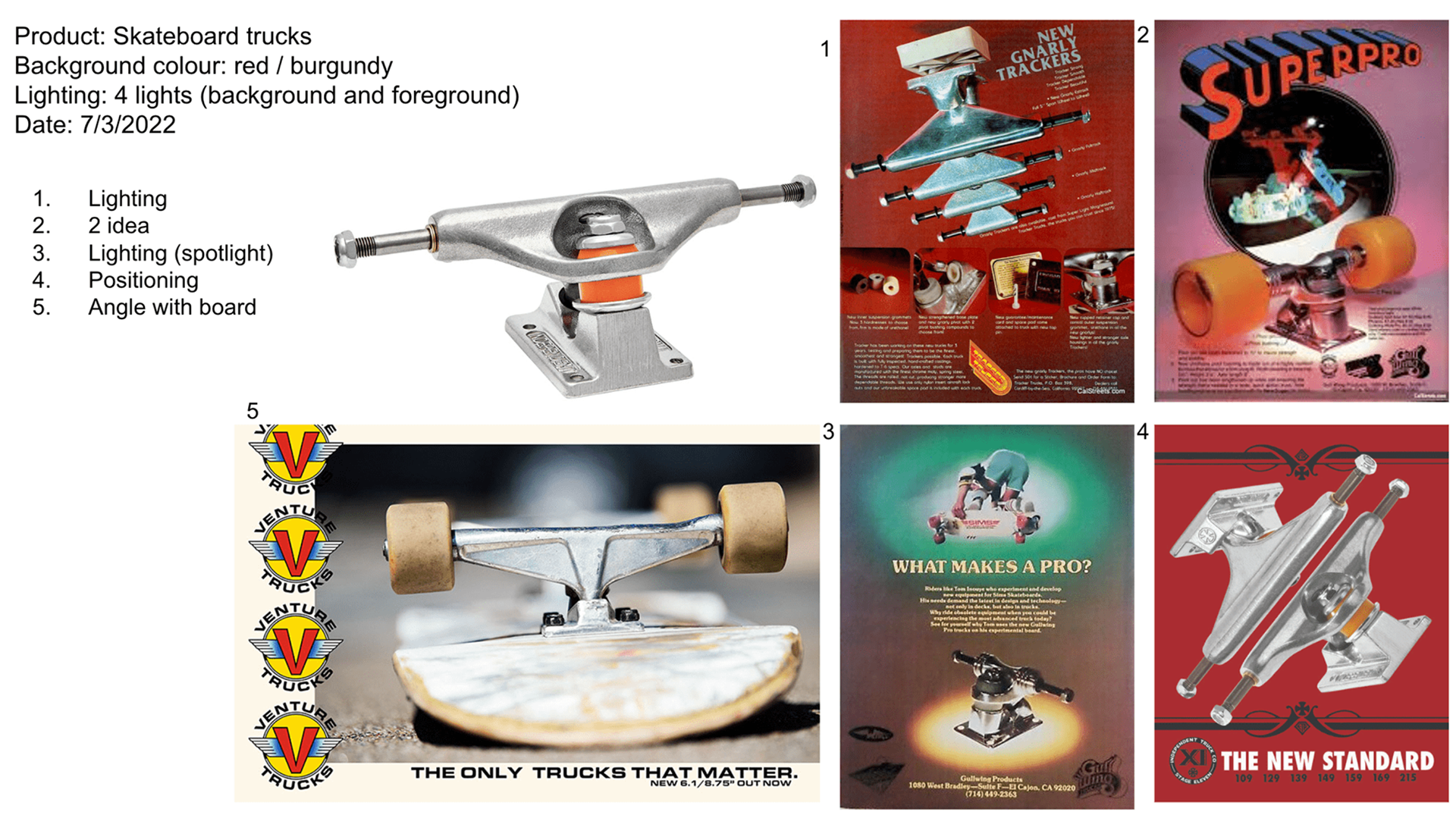
I created a mood board in order to organise my ideas for my advertising shoot. I decided will be using skateboard trucks with a metallic surface, similar to the surface of the underwater camera case we used last week in our practise shoot.
After deciding trucks would be too much of a niche within a niche, I shifted my focus on the skateboard as a whole.
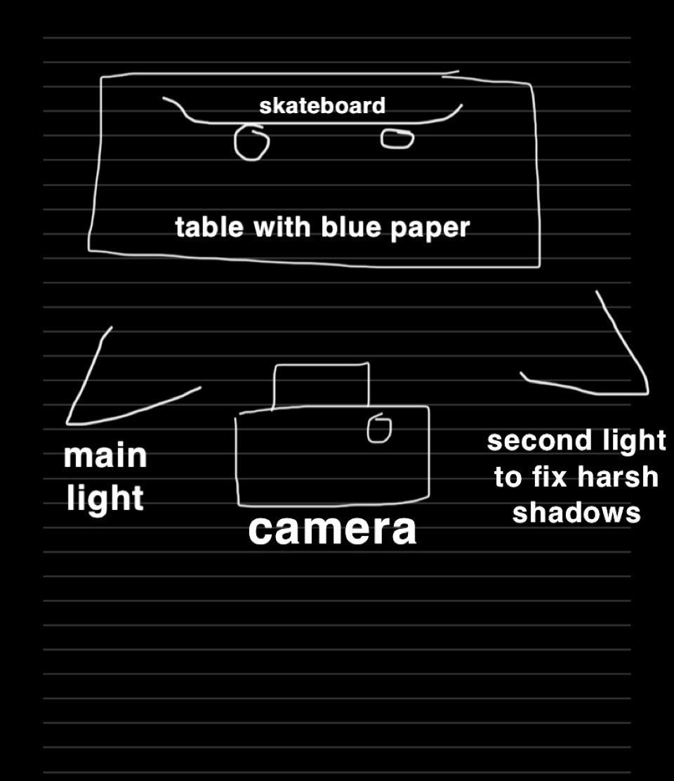
I decided to make diagram to plan my shoot. Not the most aesthetically pleasing diagram (sorry)
I like the positioning of the skateboard in this image, I will be using a string tied something in the studio or get one of my assistants to help me hold it.
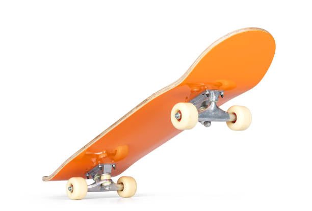
Further reference for positioning of skateboard. The top right ended up being my go to.

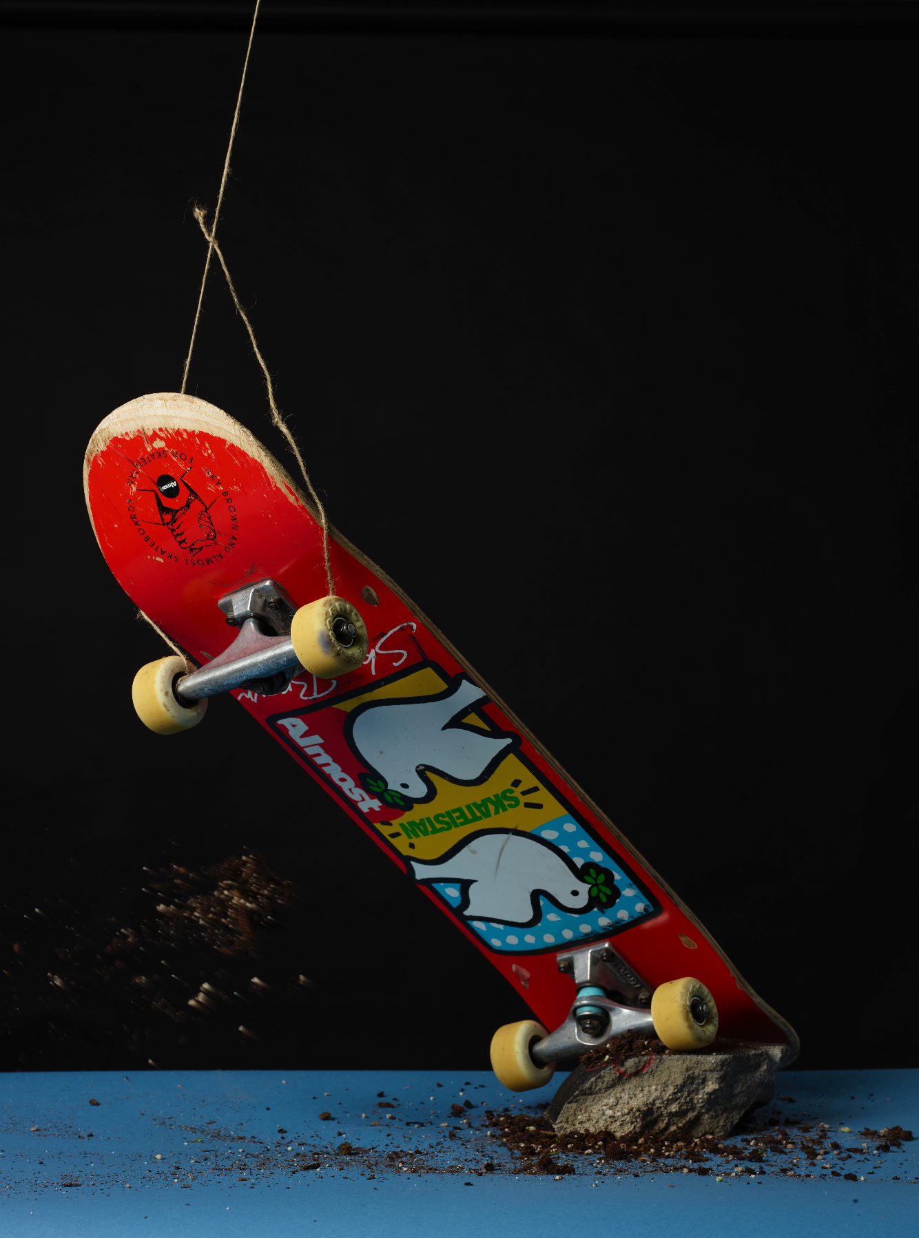
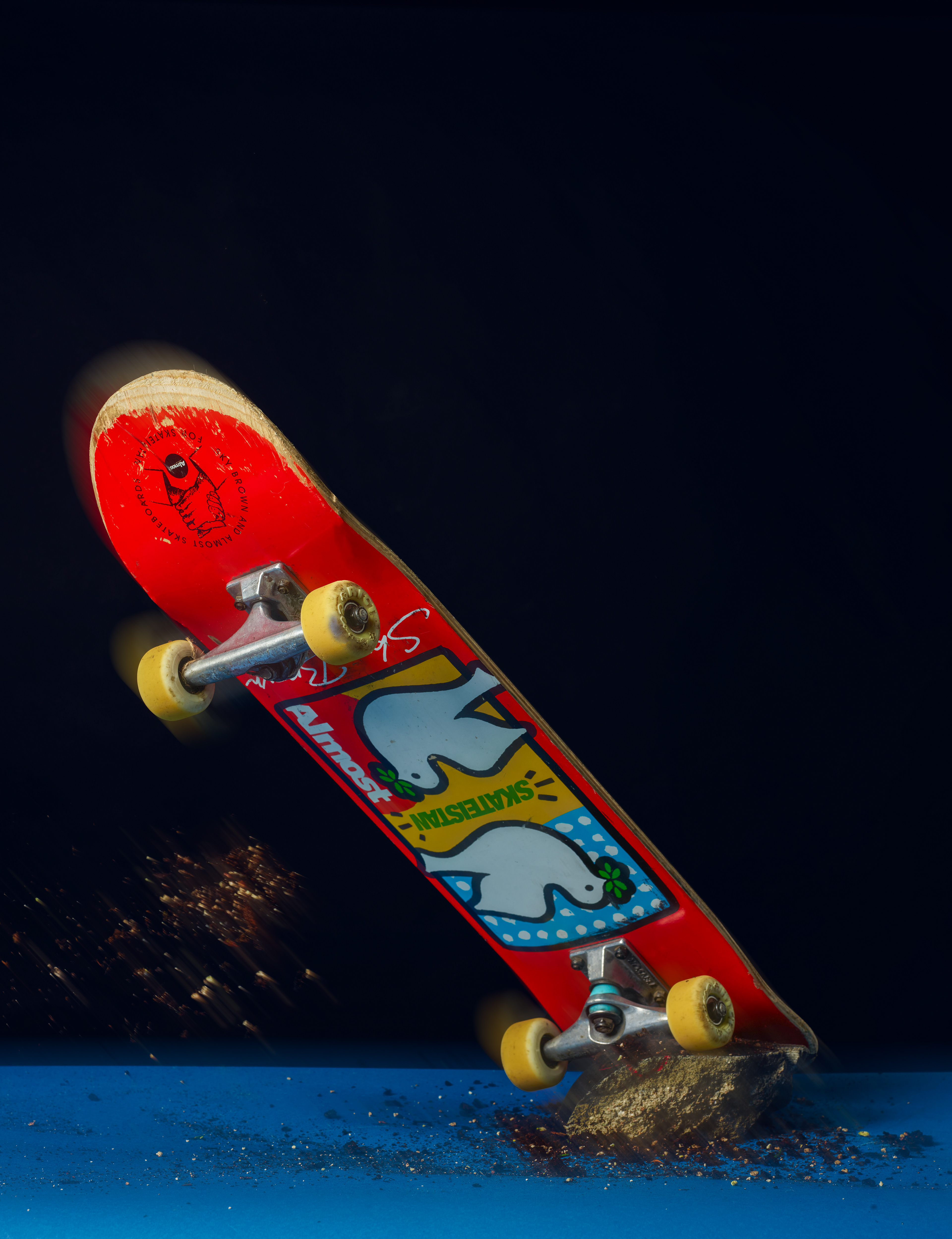
Below is one of the unedited shots showing the string used to hold it up and the dirt we threw from the side. It took multiple attempts to capture it at the right time but I'm very happy with the final result.
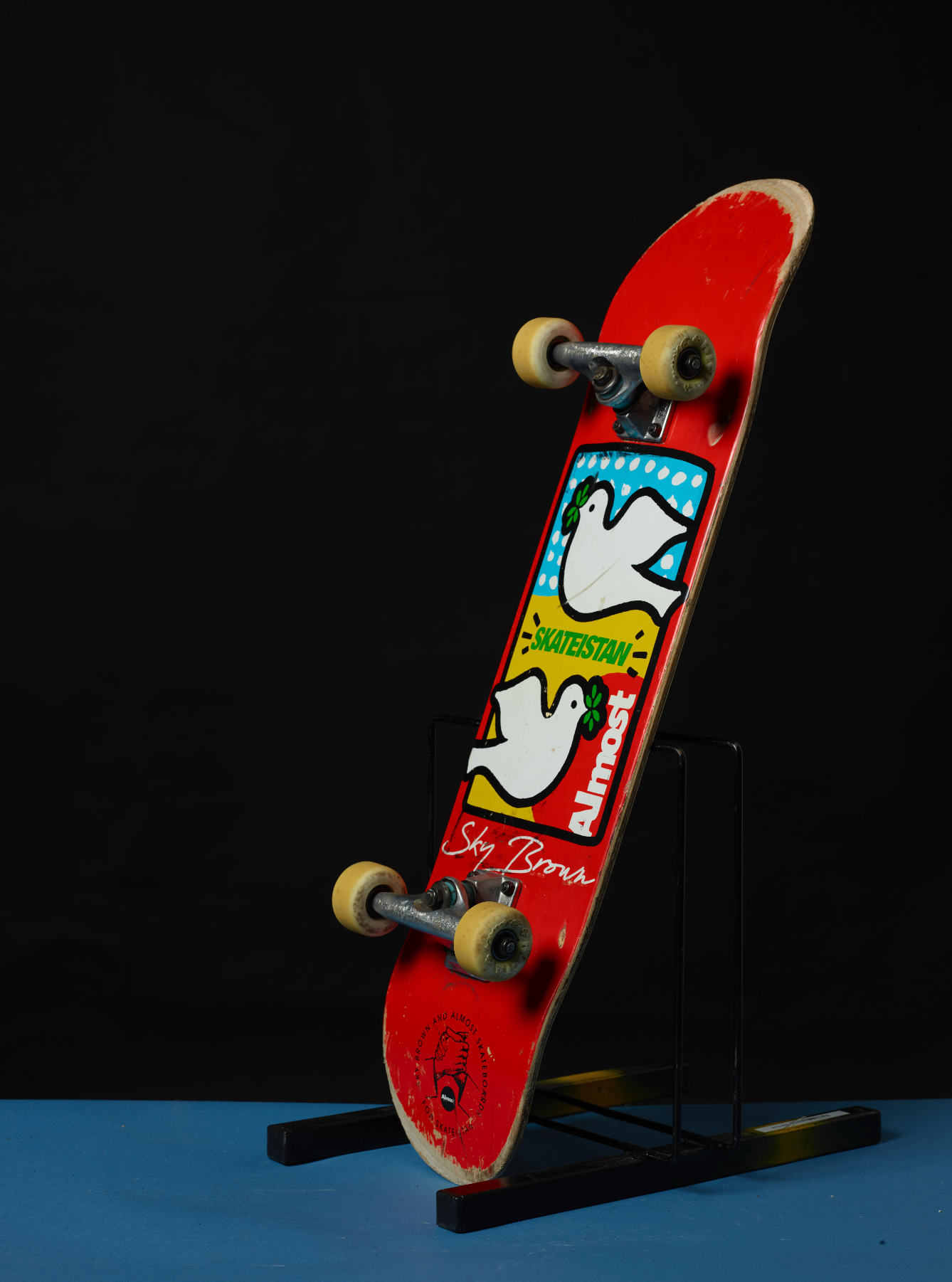
I also used other equipment I could find around the studio to display the skateboard from different angles.
Below is my favourite image (unedited) from the advertising shoot. For this shoot I used two lights, a table with coloured paper, a stone and dirt which we collected outside.
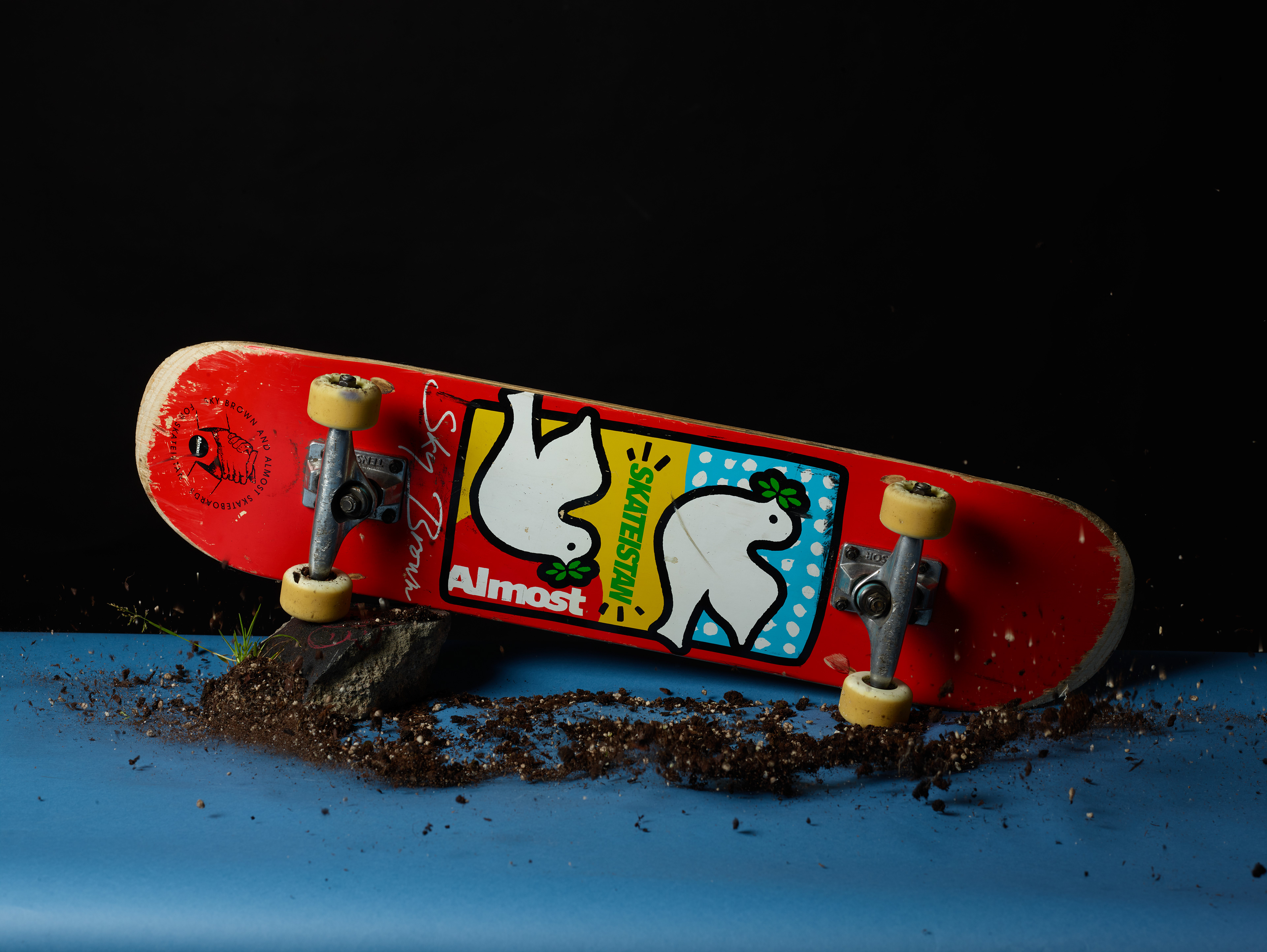
I used dirt laid on the table and hit the table while pressing the shutter to create a motion blur

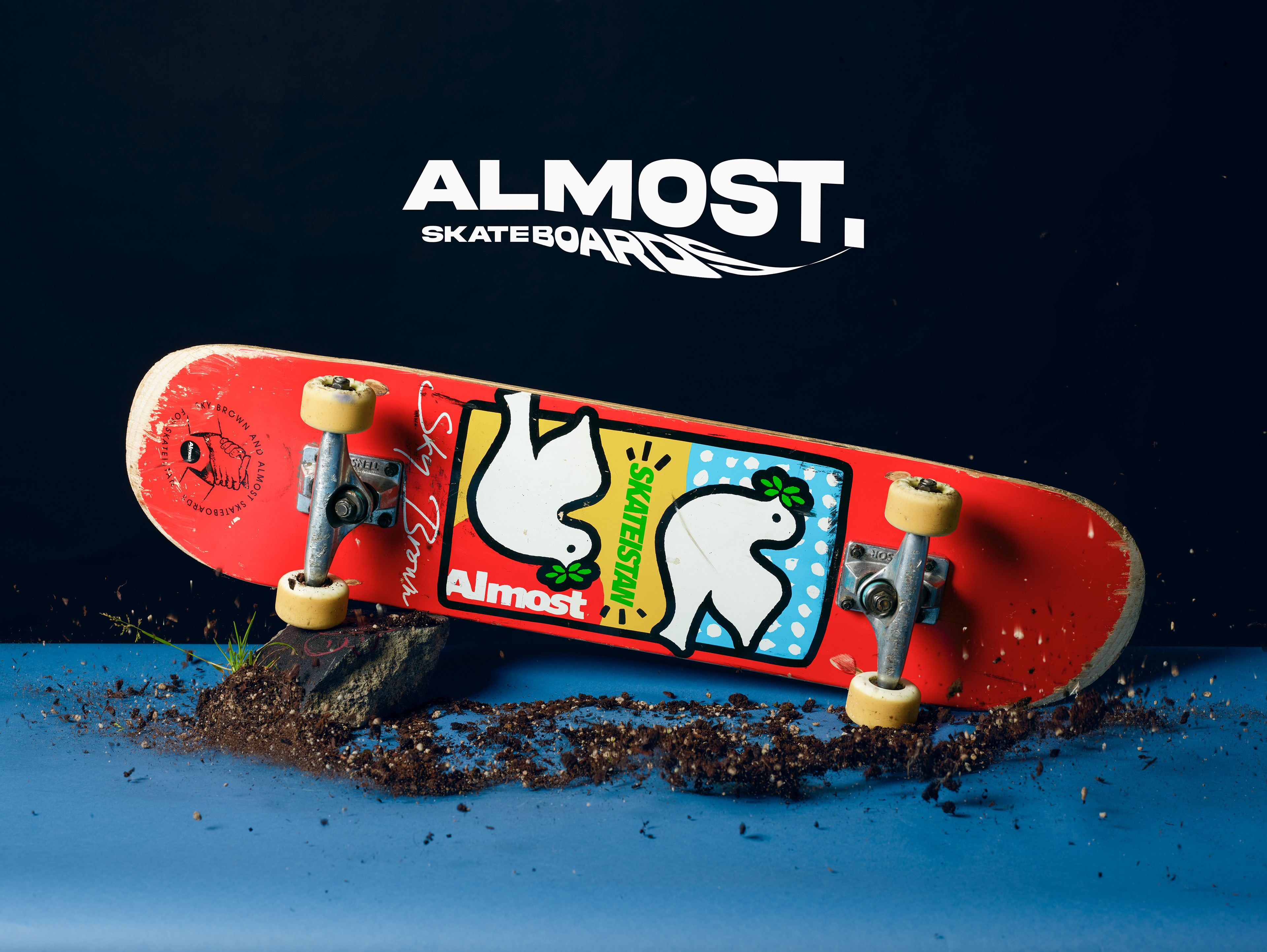
These are my final edited images. I noticed the board is slightly out of focus on the third photo but other than that I'm very happy with the overall look. The fourth photo looks slightly more exposed than the other ones. To improve I want all images to flow together better and have a unison look.
FASHION PHOTOGRAPHY
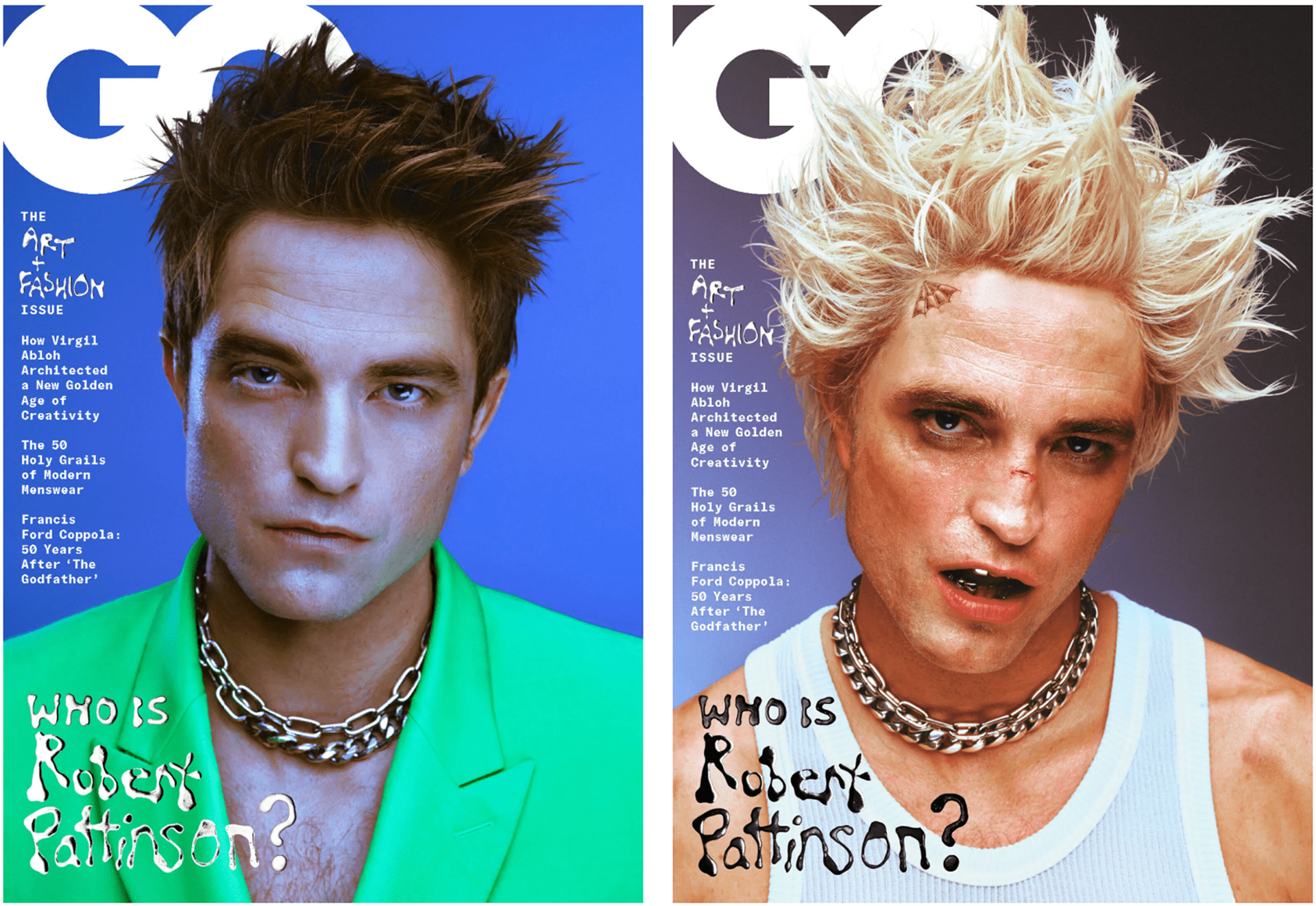
Inspiration & test shoot 1 - Jack Bridgeland GQ cover shoot of Robert Pattinson. We analysed these during class and found there are strong magenta tones, over exposure / highlights and lots of texturing done to recreate the look of film. The lighting setup looked to be Rembrandt style with a light-box on the background to create a gradient.
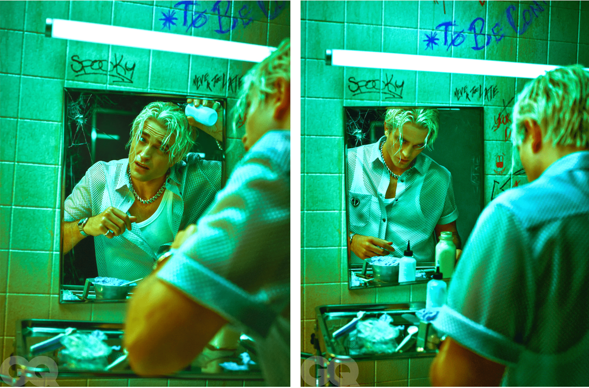
This example has much better lighting than the previous ones.
These two are both composed very nicely and are easier reference points as they're clearly shot in a studio.
Test shoot and edit 1
Here is the setup I used for my shoot. I used a boomer/crane light with a round softbox aimed at the model (Rembrandt style) + lightbox with a blue screen aimed at backdrop + reflector placed under the model. I was shooting with a Canon 5D Mark II.
Below is the raw unedited file. I decided to go with this one because the expression on Rory's face looks very natural. The focus is sharp and it's perfectly exposed.
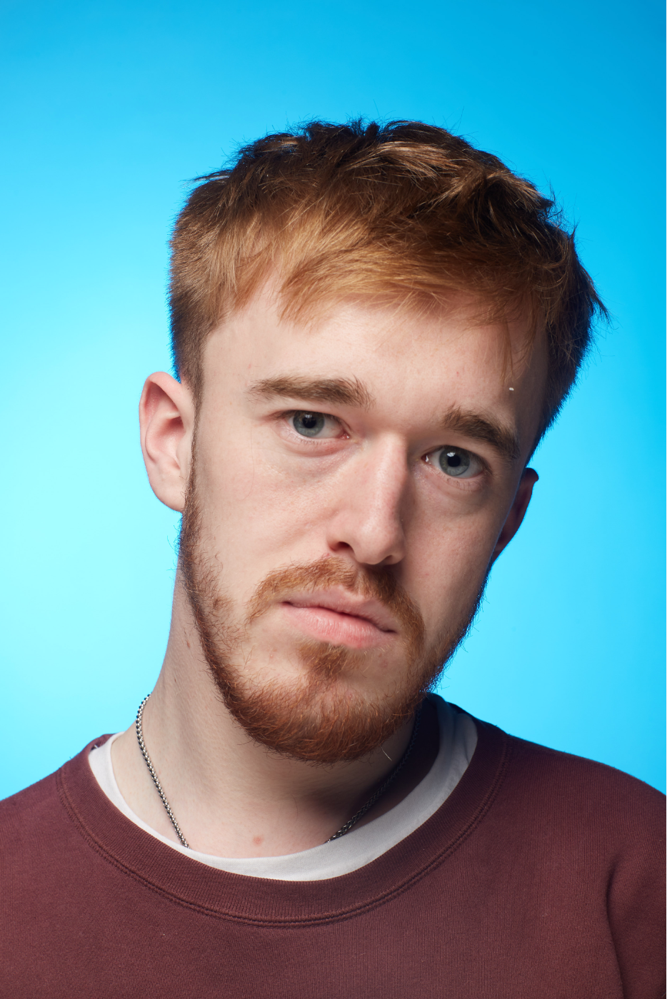
The achieve my desired result I separate the subject from the background, added magenta tint on subject, increased highlights and exposure, removed any spots using the healing brush, increased brightness on pupils, added a scanned texture overlay, added noise, gaussian blur on background and blended a scar onto the nose.

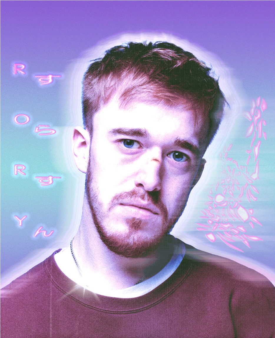
I came back to my edit a few days later with a fresh mind and replaced the background with a gradient which matches the magenta tint better. I did some graphic design work surrounding the subject which I blended using various blending options. I added an outer glow to the subject along with selective motion blurs (shoulders, right side of head and behind the subject). I also saved the file as a GIF in other to create a dithered effect. Overall, I'm very happy with this edit.
Inspiration & test shoot 2
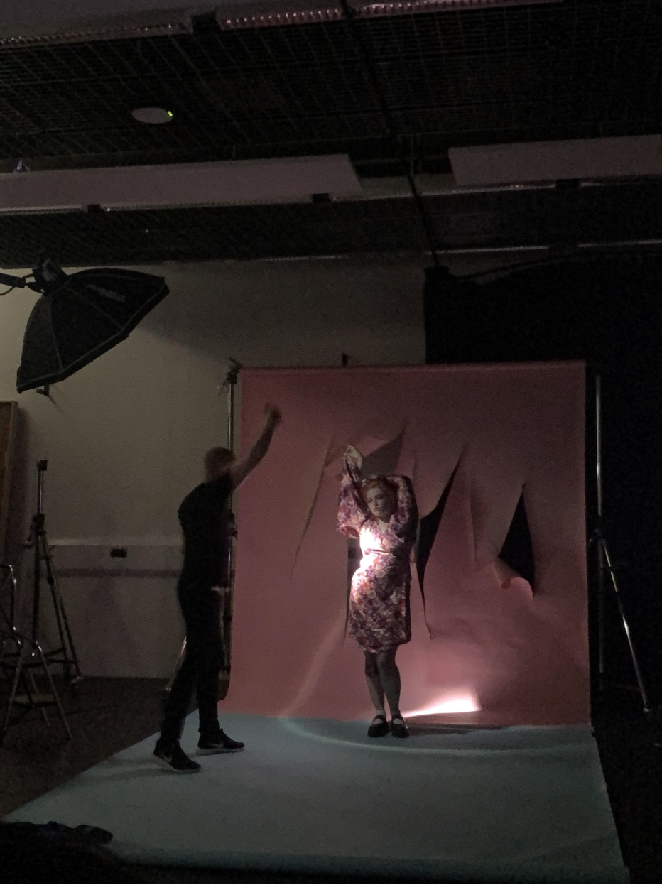
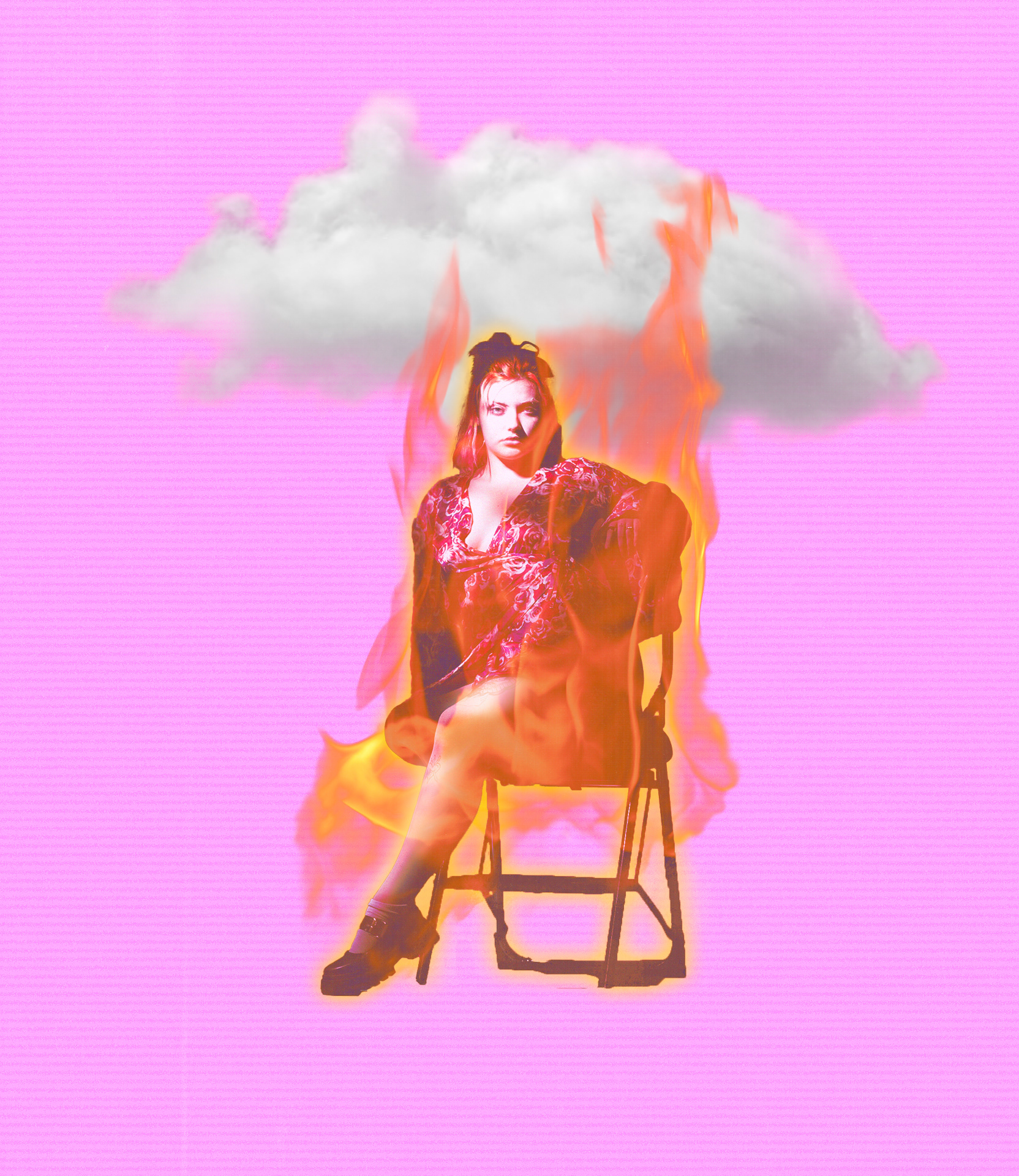
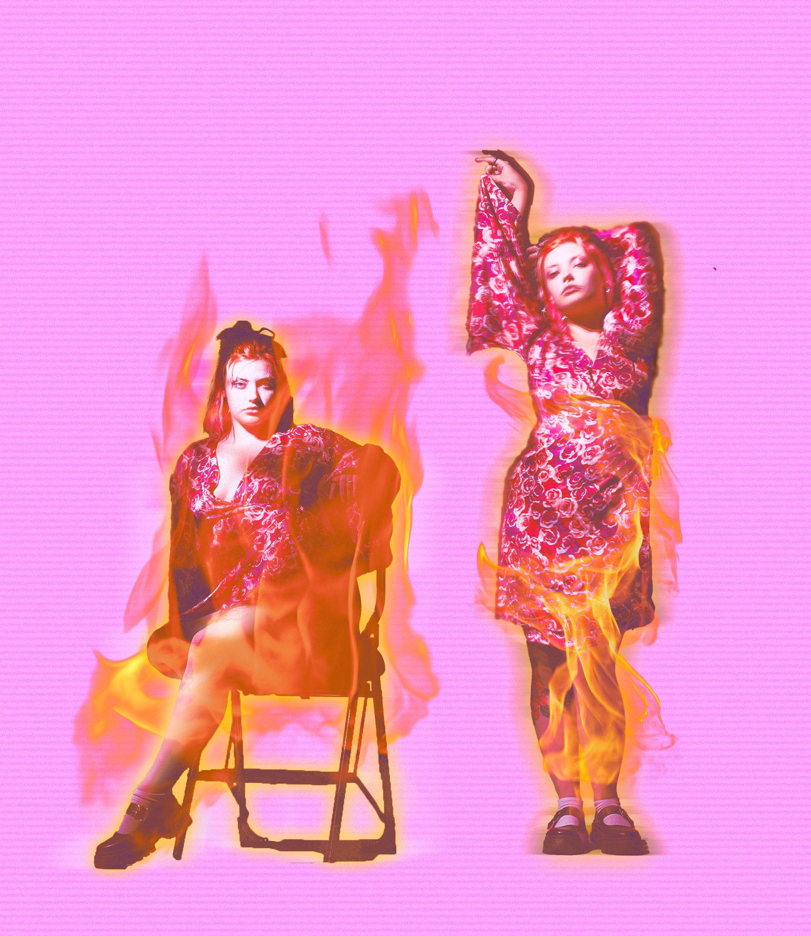
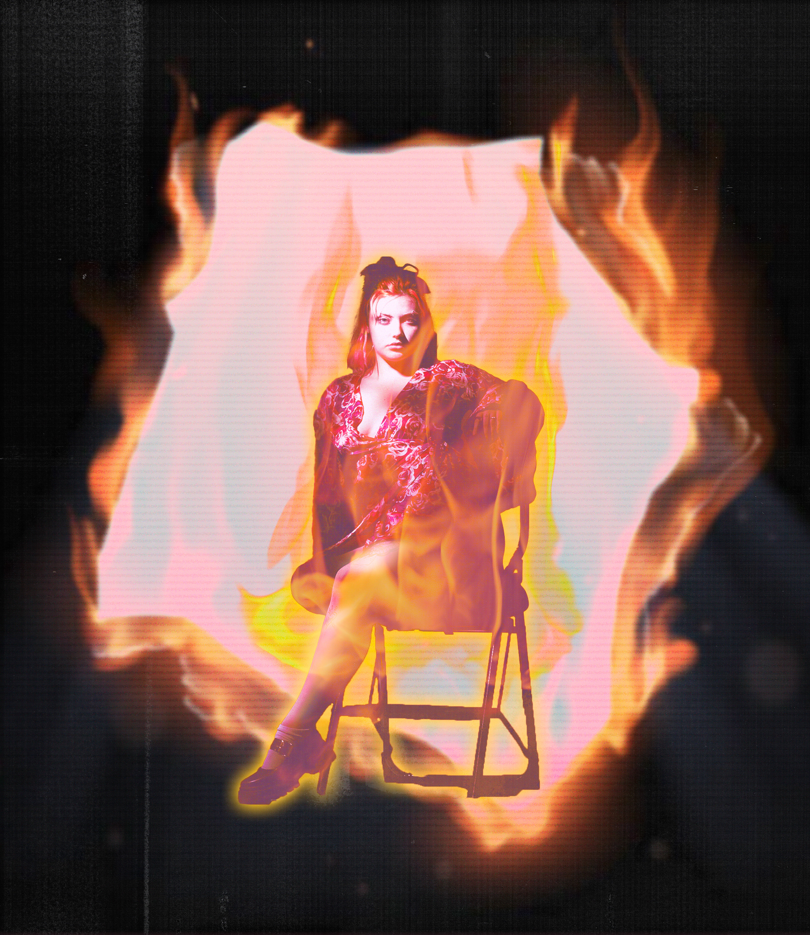
For this shoot we experimented with a flashlight to create a dreamy atmosphere. Lily was modeling while Reuby was taking the photos. I asked Lily for the photos so I could practise my post production skills.
Here are two raw files from the shoot. The exposure on the second photo is much better than the first so I decided to edit that one first. Below are some other photos in their first stage of post production using Lightroom.
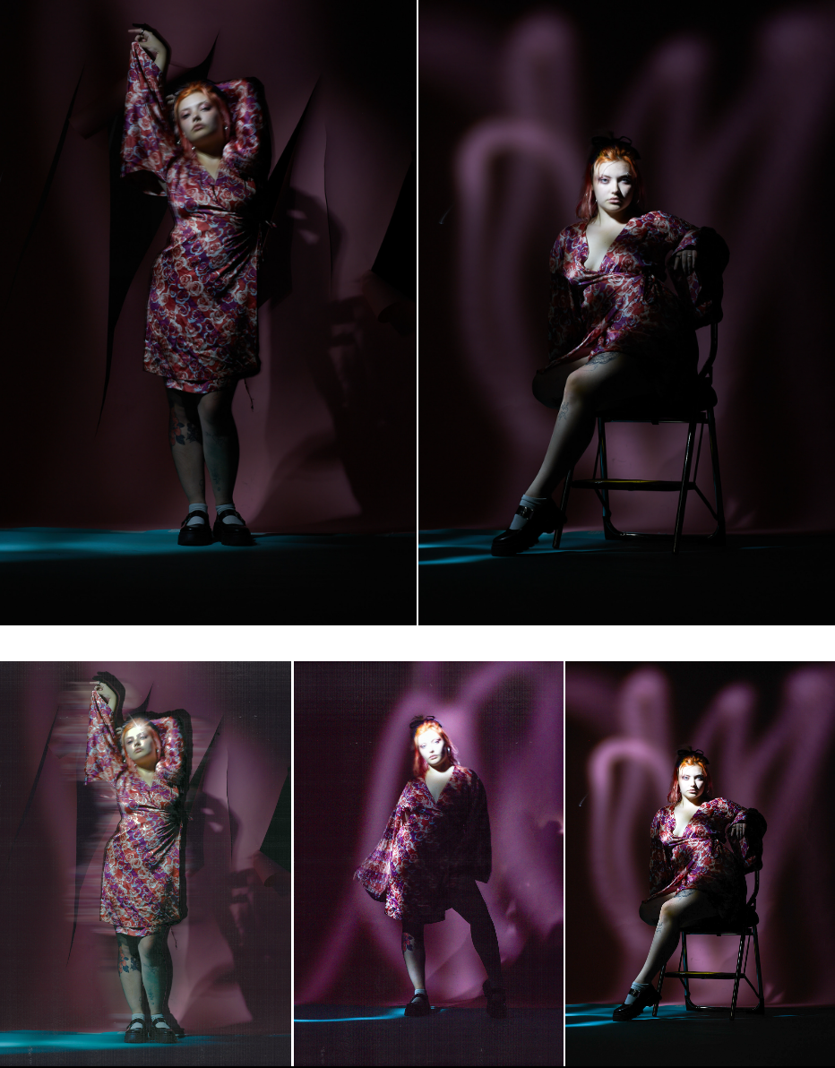
These are my edits in their final stage of post production. I played around a lot with the fire to try blend it correctly and I'm happy with the results. The RAW photos were overexposed but I think that adds to the effect of the model being on fire.
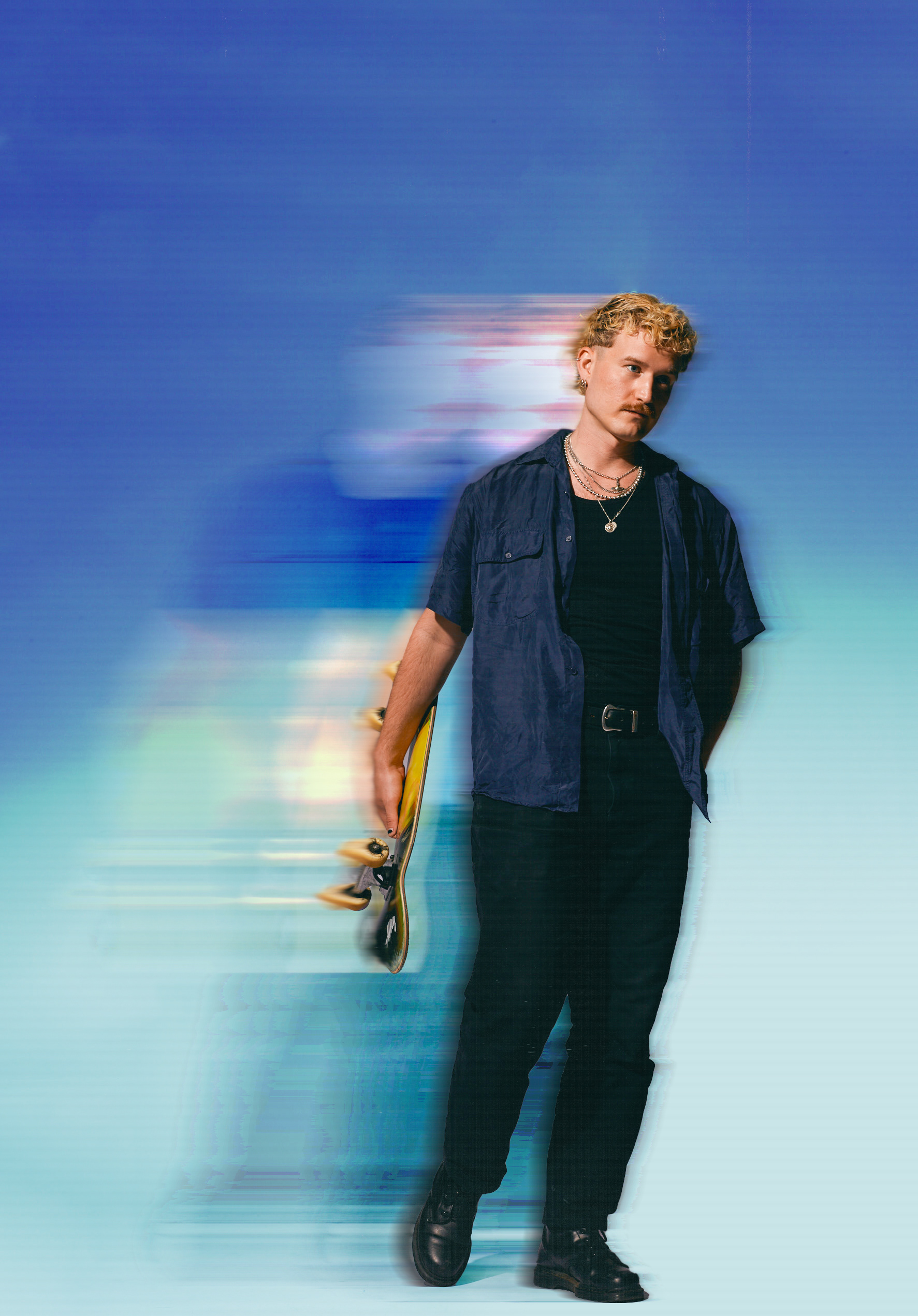
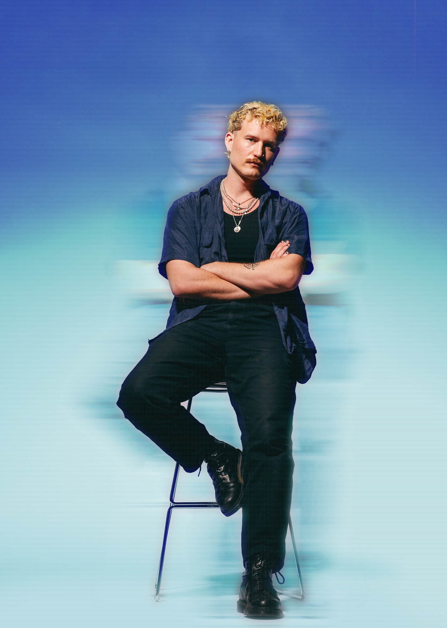
Final shoot, inspirations and edits
INSPIRATION 1 - Ali Boulala
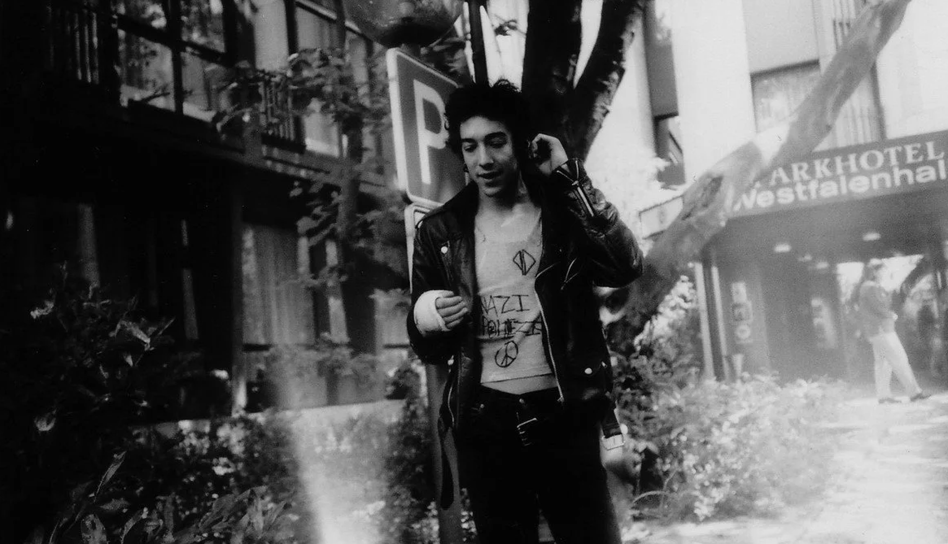
I recently watched a documentary called The Scars of Ali Boulala which follows the story of a Swedish skateboarder who went pro and moved to the US at age 16. I was very inspired by the story for many reasons, one of them being his many fashion styles. According to the documentary, Ali Boulala just showed up with a full punk outfit one day and it made him stand out because most skaters would usually adhere to a uniform style. Ali Boulala broke this patterns and inspired many other to do the same.
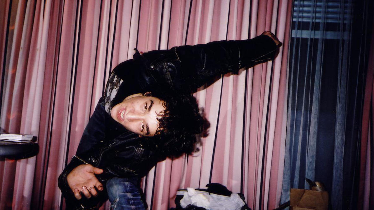
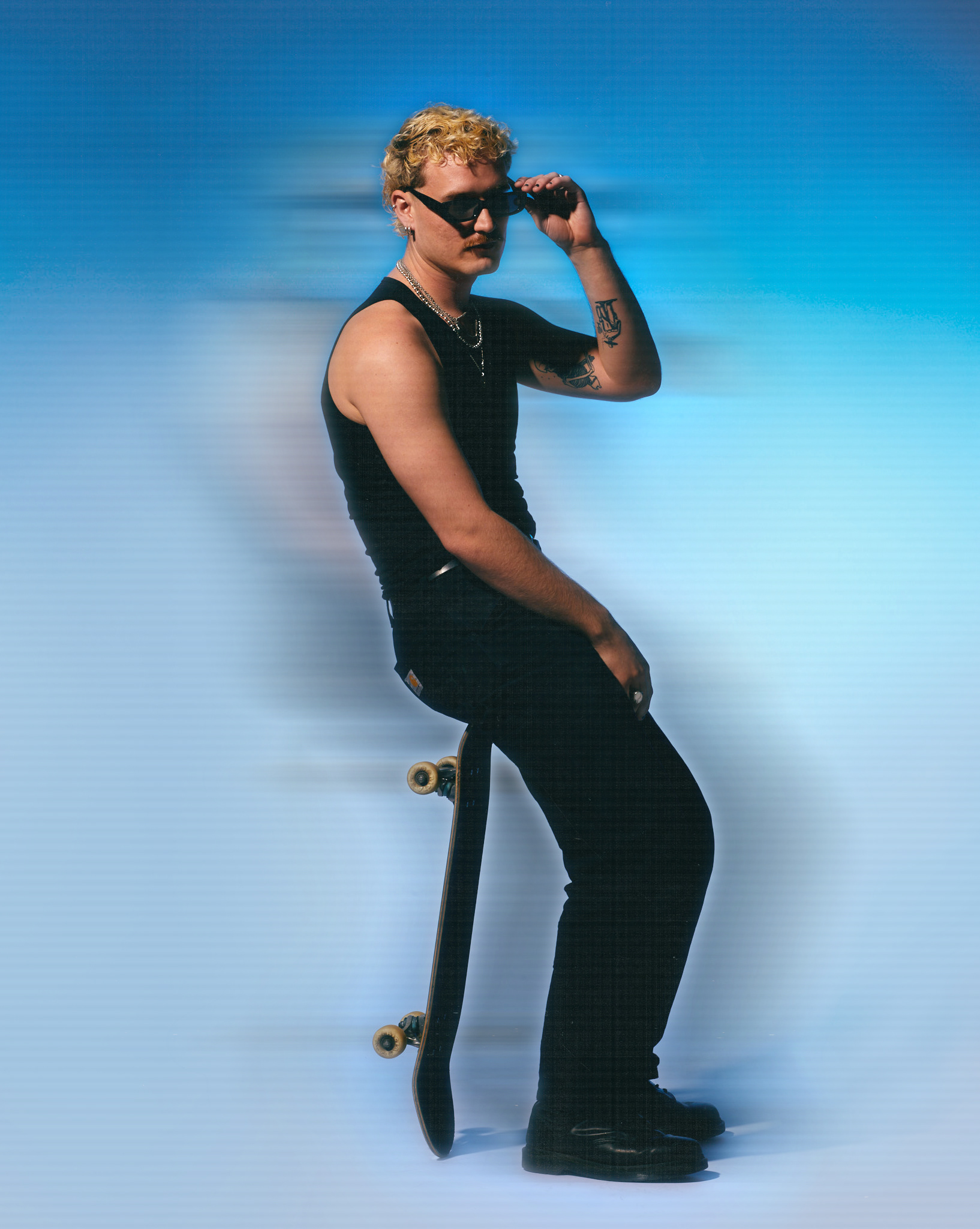
For the final image below the model is wearing black clothing, chains and leather boots, inspired by the style of Ali Boulala. I'm not too happy with the texture on the clothes because it's completely black and you can't really see what he's wearing. Michelle told me this should've had an adjustment layer, something I will add next time.
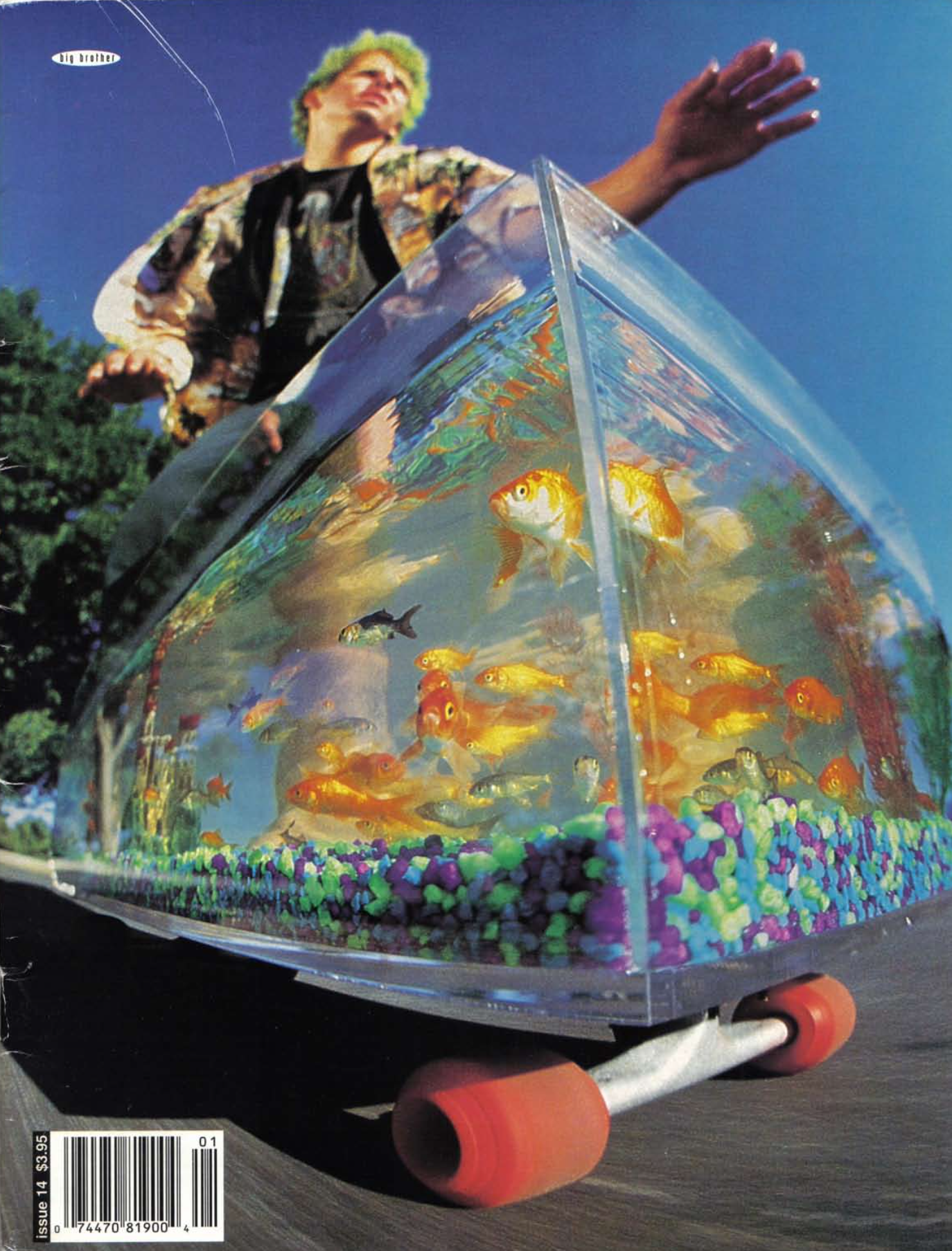
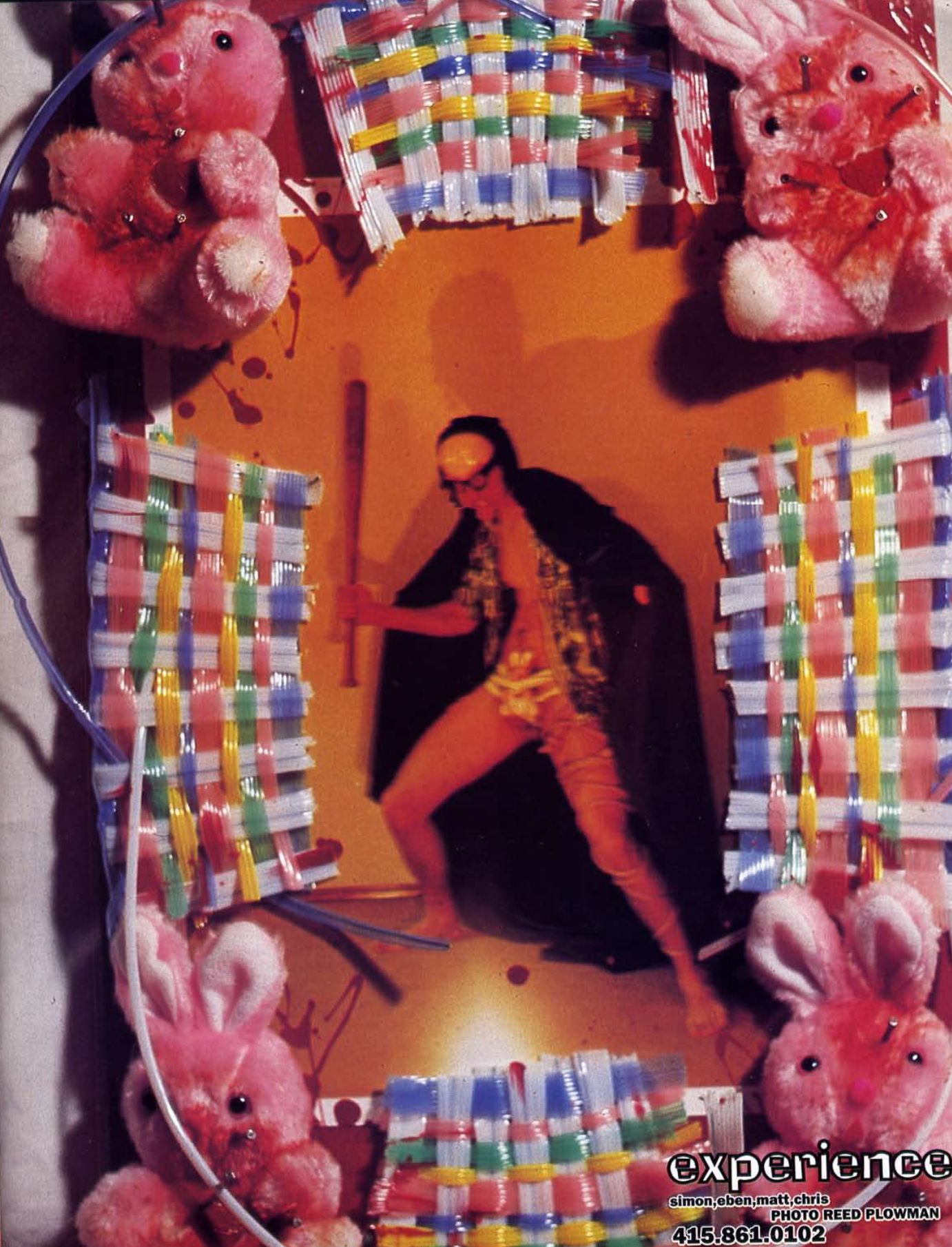
INSPIRATION 2 - Big Brother Magazine
Another source of inspiration was this writing featured in Big Brother magazine 1994 which I found very interesting, I decided to reword it for one of my final images. I also found lots of other inspiration from this magazine which was only active in the 90s.
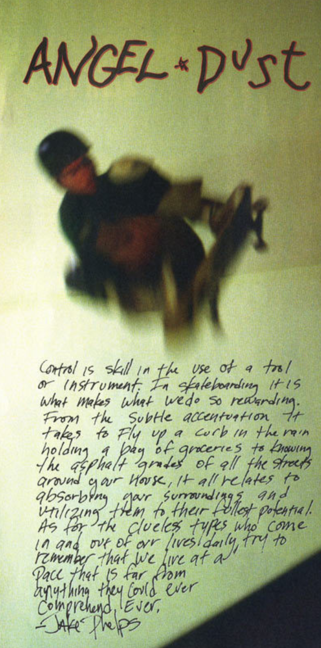
This was my final edit inspired by the design / writing above. Michele told me this was editing style turned the photo into "trash" which I can understood from a photographic perspective, however I wasn't too sure what to change after this feedback because I still wanted to stick to my inspiration and personally found it aesthetically pleasing and up to date with current trends. I decided to include a combination of clean edits and "trash" ones.
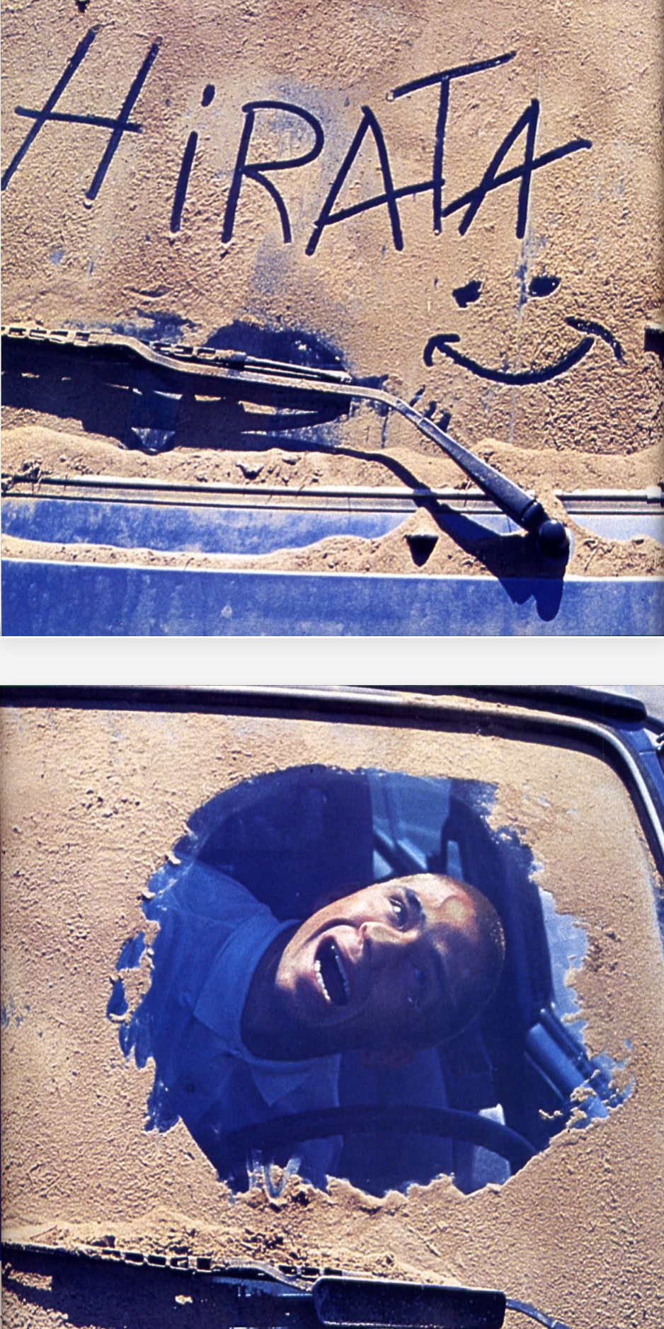
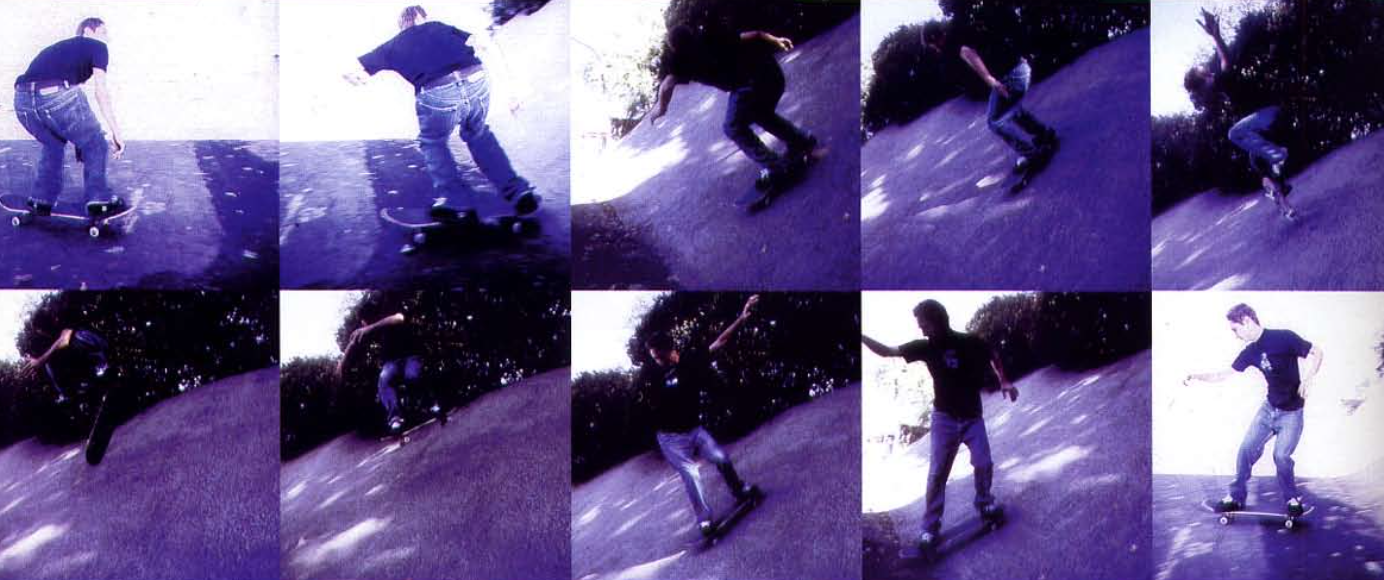
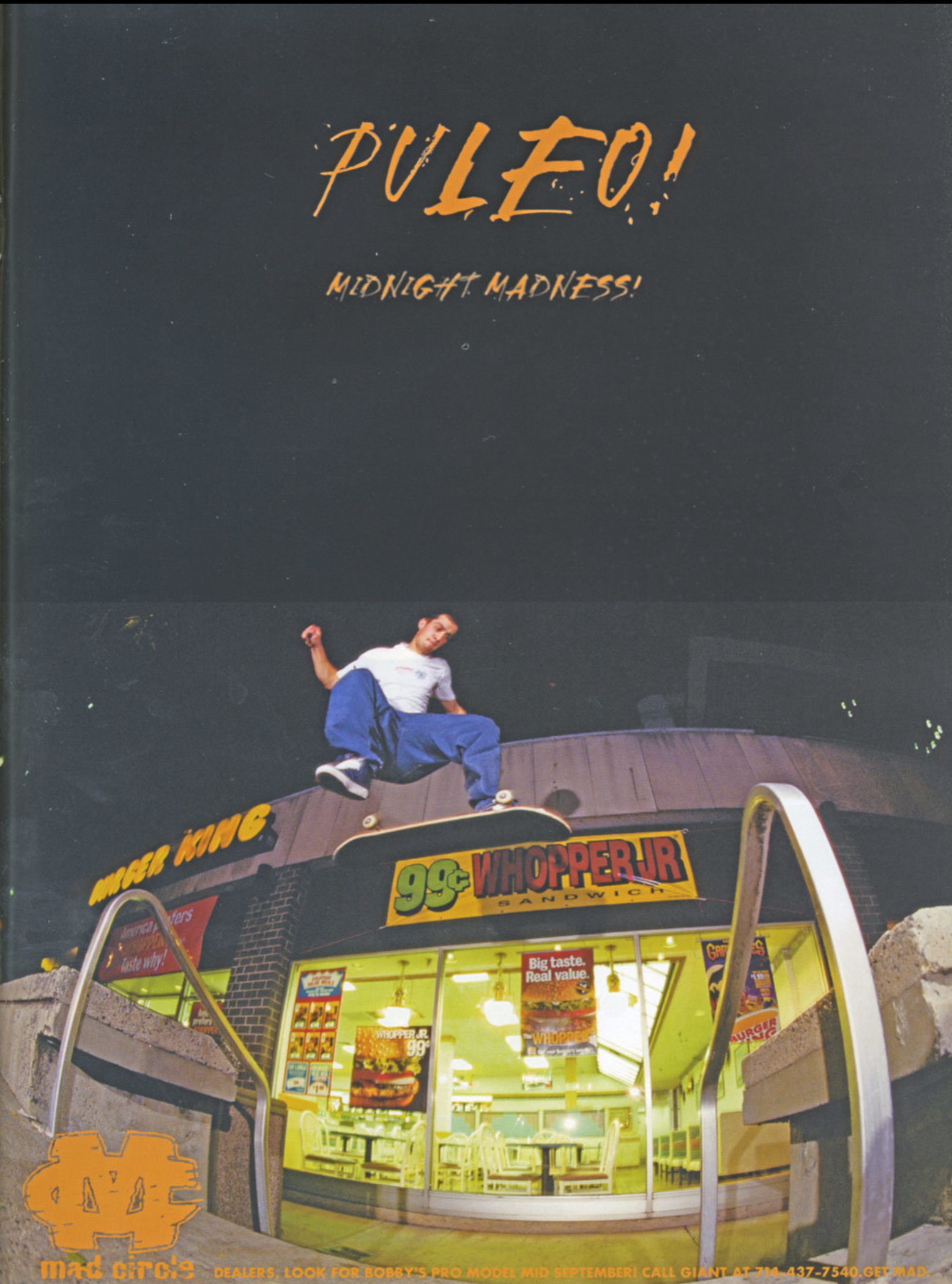
As mentioned in my first stage of planning, childlike humour was one aspect of my inspirations that I identified. Specifically, the photo of the guy with his face pressed against the car window, which I inspired the shoot below.
Here are three other final versions (second and third included in magazine). I added the motion lines to match the action in the sports photos and to add emphasis on how much movement is involved in skating.
To reflect, I found sports photography to be the most challenging because it requires way more planning than I had initially released due to lots of external factors such as weather. I was also having problems with my camera during the first day of shooting which meant I could only use 1 photo with the actual models. Nonetheless, I love the aesthetic and composition of the sports ones and the evident theme of nature converging with the sport.
I found composition to be my weakness when it comes to fashion photography, in my magazine I left a lot of unnecessary space because I was envisioning how it would be laid out in a magazine where they will usually leave the editors lots of space to type in.
The advertising shoot was very technical and took a lot of patience (adjusting the string holding the board up) but my results were exactly how I had envisioned it.
Throughout the process I found that I have a lot to learn in my post production. Michele described it as "how you would edit when the photo is really bad" which I fully agree with because most of my photography has come from my phone which I then tried editing to look like they were taken film. Essentially, this is my style and how it came about. I will work on shifting this style and not over editing when the photo is already good.