In The Studio
Magazine Covers
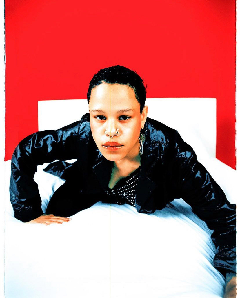
These magazine covers were shown during our first lesson where I began researching and reflecting on different aspects which I find inspiring. I'm aiming to incorporate these inspiring aspects into my own magazine cover.
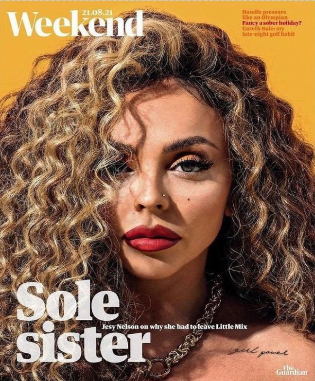
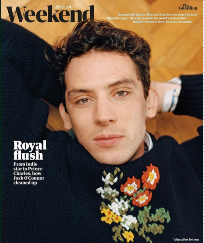
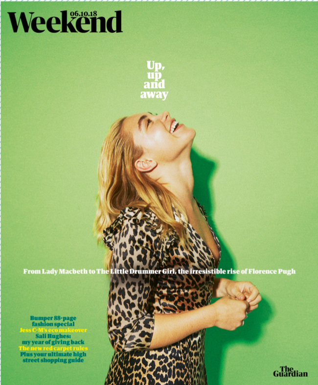
Both first examples include very close-up portraits whereas the third example takes more use of the background which for me is more visually appealing.
For my magazine cover I would like to make use of a colourful background in contrast with the outfit of the model. I also like the idea of the model not looking straight into the camera which brings more attention to the text and content of the magazine.
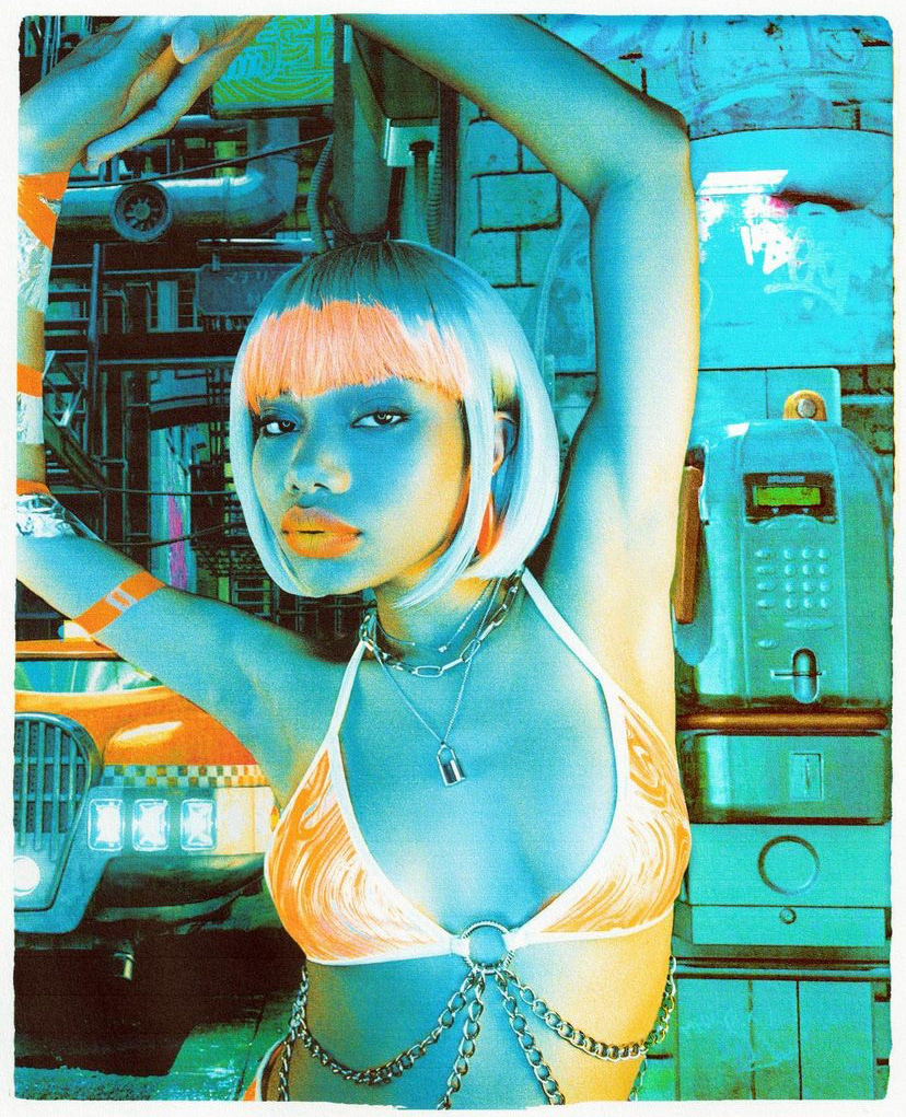
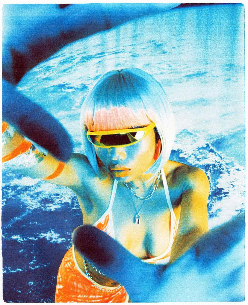
I find these shots very inspiring and appealing because of the unique choice of colours, grain and scanned effect. I believe I would be able to achieve something similar by overlaying my photo with an image of a scanned paper. The edges are also rounded off in an unsymmetrical way to replicate the look of torn paper.
Week 2 Lesson Notes
Exposure - Exposure is the amount of light that reaches the camera sensor/ Film and it determines how light or dark an image is.
Exposure - ISO - (International Organization for Standardisation) ISO, represents the film or sensor’s sensitivity to the light.
Exposure –Aperture - the opening through which light passes through the lens to enter the camera. Its size can be modified to control how much light reaches the sensor.
Exposure – Shutter speed - Shutter speed refers to how long the shutter stays open for.
Exposure – Depth of Field - the distance between the nearest and the farthest objects that are in acceptably sharp focus in an image.
Exposure – Motion Blur - the apparent streaking of moving objects in a photograph.
Exposure – Noise - In low-light situations where the sensor is being over-volted (ISO being pushed), each pixel has very little light wave fluctuation to report before being amplified.
Big Brother Magazine was a "silly" skateboard magazine which published from 1992 until 2004 and features lots of fisheye photography which is commonly used for skateboarding. I am drawn to the effect the fisheye lense creates because multiple aspects in an action shot can be captured more vividly.
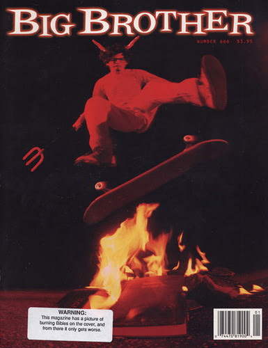
This magazine cover takes use of the fisheye lense to capture the fire in a way where it looks much bigger. Placing the fire in the central point of the frame with the skateboarder further away, the photographer was able to create the illusion of the fire being much bigger.
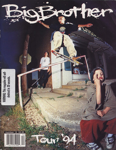
This cover has multiple subjects in a very action packed shot. This makes the photo more enjoyable for the viewer because there is more to analyse.
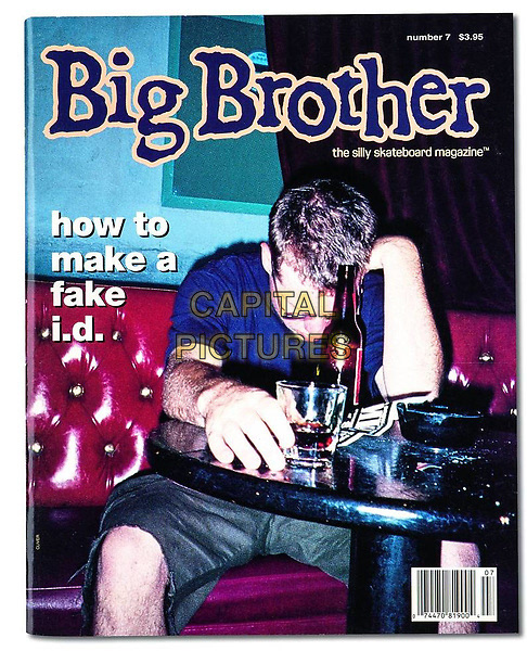
This cover is without a fisheye lense and uses low light flash photography which creates a more exposing image of a man drinking alcohol. The magazine features an article about "how to make a fake i.d." which gives an idea of the type of magazine Big Brother was. Big Brother magazine staff writer Jeff Tremaine went on to produce the famous TV series "Jackass" which integrates the silliness of the magazine, skateboarding culture and stunts. "The show debuted on October 1, 2000. After the second episode had aired MTV gained its highest Sunday ratings in its history, drawing 2.4 million viewers".
Week 3 Lesson Notes
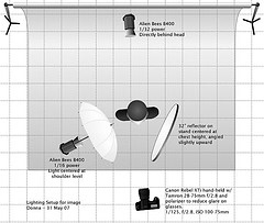
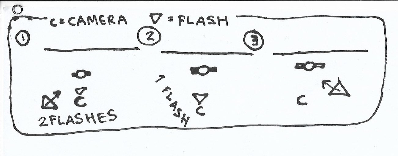
Lighting Diagram - lighting diagrams show the gear used to light a scene and how many lights were used. They show where the lights were set and how they were directed, relative to the subject.
Example:
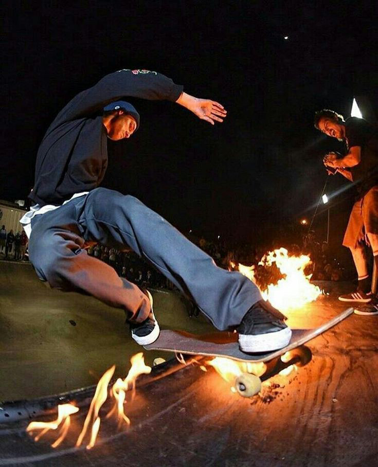
In this photo I believe the lighting diagram would include the camera in front of the subject using a singular flash with the fire and lights on the side railing coming above from the right side.
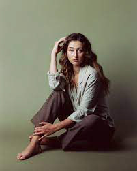
In this photo I believe the photographer is using two flashes at the back from each direction, with the right facing (on the left) flash producing stronger lighting. It's also possible there is only light coming from the left hand side.
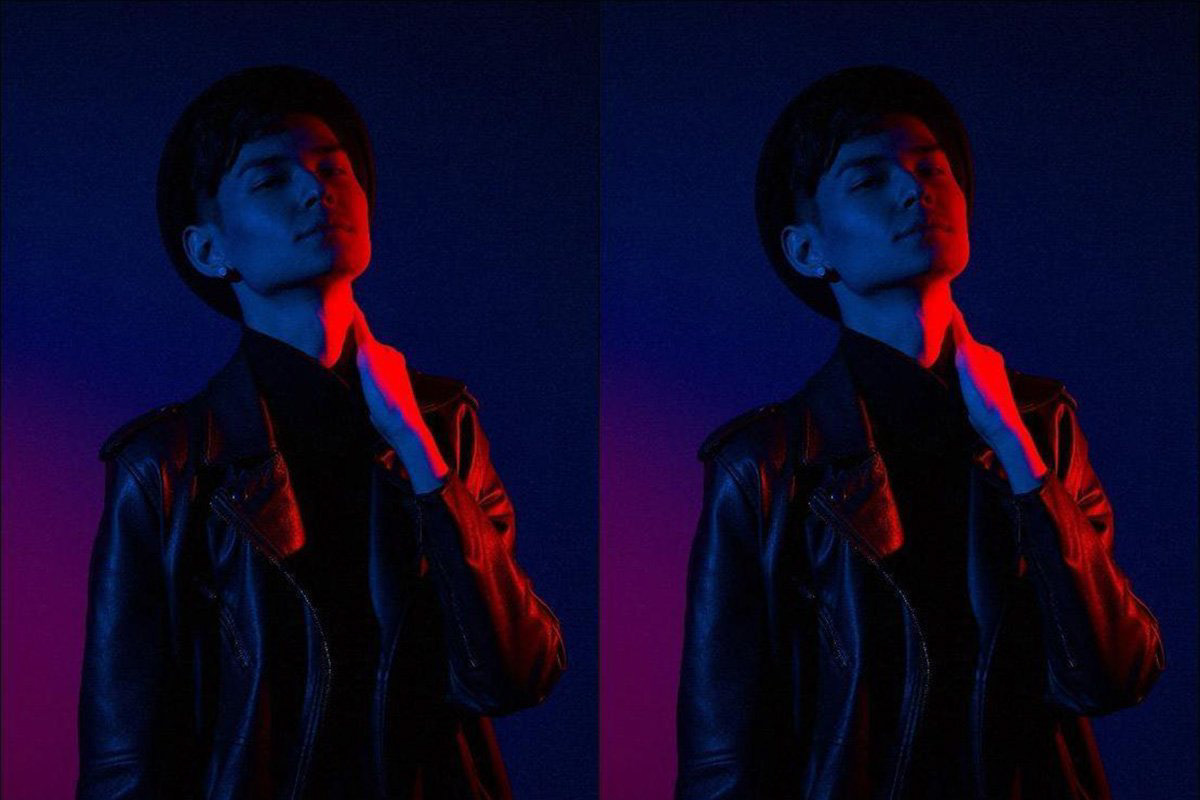
I believe this setup has two lights coming from each side; blue from the left and red from the right. They both seem to be set at very low light to achieve higher saturation.
Intensity of light formula = 1 / Distance(2)

I forgot to update my workbook so I lost the photos I used for reference in the making of my lighting diagrams but I've attached them below.
Gels and Tethering
Gels - plastic see-through colourful piece of plastic.
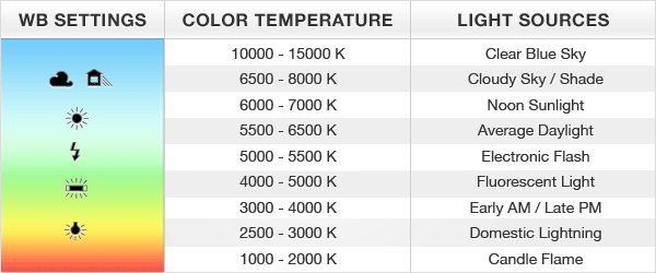
White balance - used to adjust the colour temperature (measured in Kelvin). You can find the white balance by using a grey card and analysing it while editing. (+ and - Blue and Orange)
Colour shifts and tints - Used to correct shifts in colour. (+ and - Green, - Green = Magenta)
ND and Diffusion - ND = Neutral density. It changes the intensity of the light. Diffusion diffuses the light. ND is measured in points (.3, .6 and .9 (stops of light)). Diffusion is already in soft boxes but can be added. For example, is you wanted to diffuse light from further away.