Advertising and Persuasion
I will be doing my shoot based on El Monde fashion magazine in the style of a fashion / documentary shoot. To begin my project I will do research on 4 different photographer which inspire me, study their style and extract guiding points which will be carried into my actual shoot.
Research: Inspirations
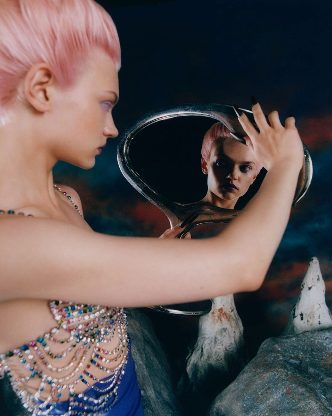
Photographer 1: Elizaveta Porodina
- Vogue China Cover x Zoom
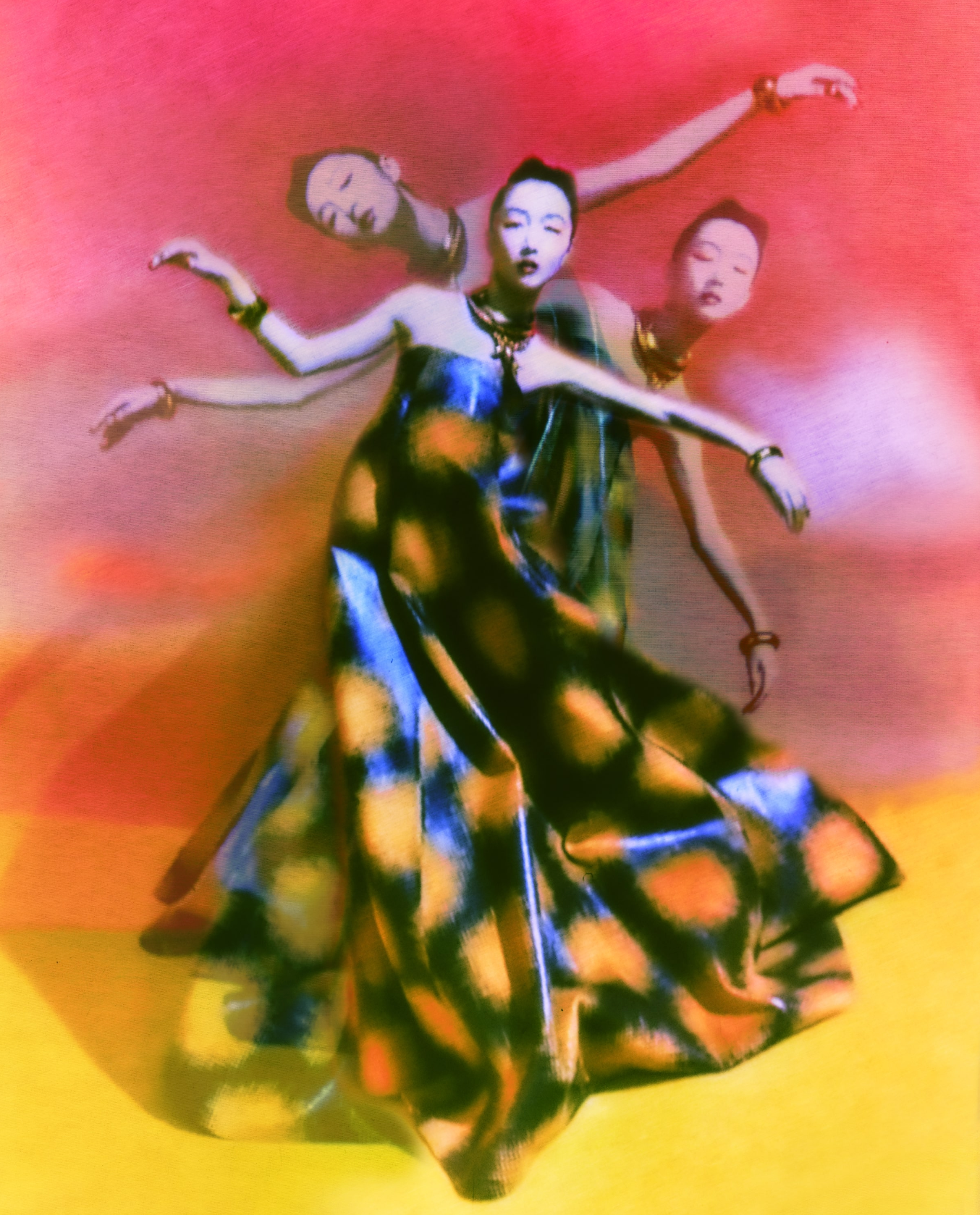
- Selected Works
(furthest ot the right) - Motion Blur effect - make use of these!

The Moscow born studied clinical psychologist plays with melancholic symbolism, sets connotations, sometimes ambiguous, sometimes honest and obvious – her range widely varying between cinematic, fashion and almost documentary imagery. Whether in dramatic black and white or vividly colored artworks, the Munich based photographer is a master of dark romanticism.
1. A short text about where the photographer or photoshoot is from.
- Born in Moscow.
- Studied Clinical Psychology in Munich in 2000.
- Vogue China Cover x Zoom and selected works.
2. How does the photographer work? I.E., do they work with fashion or music?
- Fashion and Fine Art.
3. Where is their work featured, or where or who do they work for?
- Represented worldwide by Concrete Rep Limited.
- Projects and publications include Adobe, BMW Mini, Condé Nast, Luis Vuitton, Elle, Numéro, and Stern. Exhibitions include Das Bilderbuch der Elizaveta Porodina, Ostlicht Vienna, Kadavar Berlin, FOAM Photography Museum, Dark Iconography, Bikini Diaries, Berlin, and FORUM 047: Elizaveta Porodina – Smoke & Mirrors, Münchner Stadtmuseum.
- Her clients include Dior, Carolina Herrera, Jo Malone, Moncler, Vogue, among others.
How is the image made?
- Image seems to be made using a medium format film camera and finalised in post production by layering multiple images with distortion and painting.
1. What camera do you think is used? (35mm, Medium format? What type of lens?)
- My guess is Medium format with a 50mm lense, I wasn't able to find any information on what camera gear she uses.
2. Is it a studio image or shot on location?
- Studio
3. Was a flash used or natural lighting?
- Flash
4. Is it a film or a digital image? If so, how is this expressed in the image?
- Either film of digital edited in the style of film. This is expressed through grain, smooth / flowy motion blurs, and intentional film-like defects.
5. What models are in the image, and how are they posed?
- Female model posed sideways with light hitting her from the front.
6. How is the image composed? What about the composition makes it striking?
- Her facing the light from the side adds shadow and more depth behind her, allowing the second alternate persona to smoothly enter from the exposed side.
7. Is the image very clear, or is it slightly out of focus? How is the image graded?
- It is slightly out of focus and blurry which makes it more ambiguous and fine art like.
1. What tones are in the image? (i.e. heavy even-tones? high contrast?)
- High contrast
2. What sort of colour is it? (i.e., highly saturated or unsaturated? warm or cool tones?)
- Blue highlights, green shadows with a dark red background.
3. Is the image very clean, or is it edited to appear older?
- Edited to appear older.
4. Is there any kind of texture to the image that makes it unique?
- The scratches on the background are very irregular and unpredictable.
- The motion blur does not feel like a natural motion.
Self-reflection
1. Talk here about how the image caught your eye and how you will use all of the points above to improve your work.
- The image caught my eye because I am interested in the process of adding fine art to my photography and adding different types of distortion to make the photo either more ambiguous or to emphasise of a message I'm trying to communicate. Elizaveta does the really effectively to the point where the whole photo looks like it's been painted apart from the subject, which is still conveyed very ambiguously.
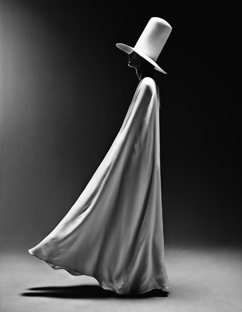
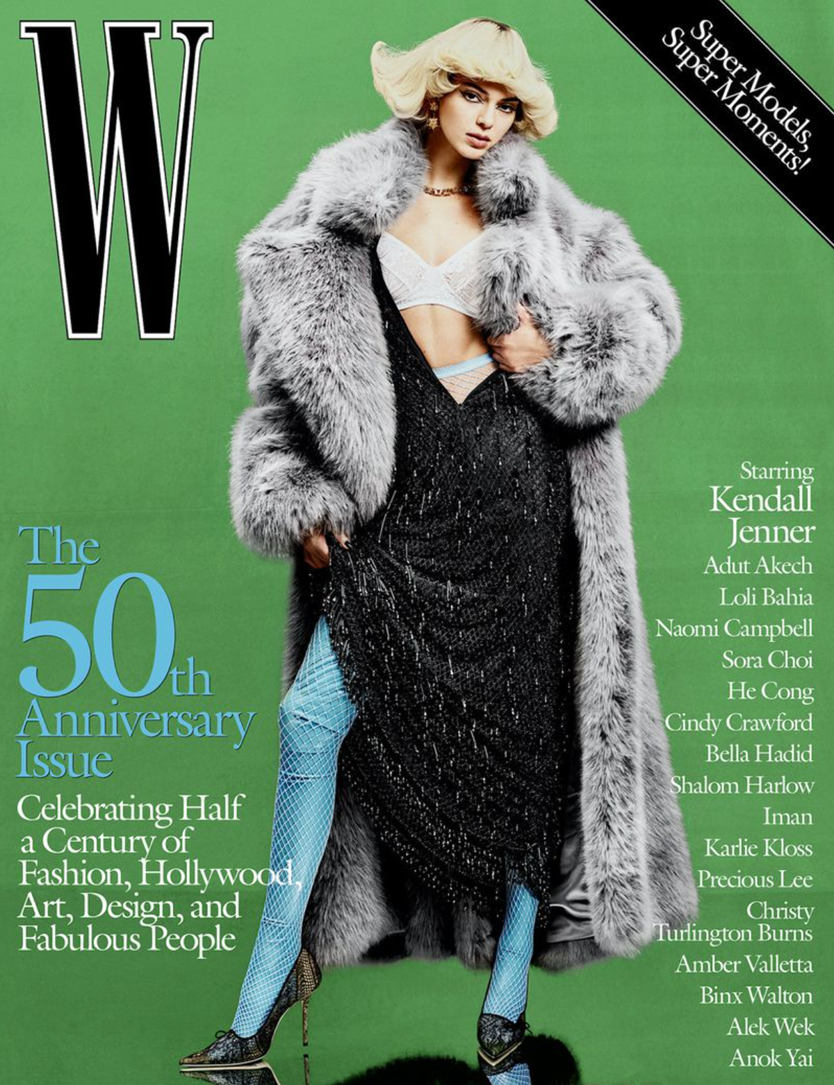
Photographer 2: Rafael Pavarotti
" Photographer Rafael Pavarotti was born in Brazil’s Amazon rainforest in 1993. His earliest photographs were made in collaboration with his young friends, who pooled their money to purchase film shot along the beaches and around the abandoned buildings of their locale. At 16, Pavarotti left his remote hometown, committed to establishing a professional practice in the urban centers of fashion and media.
Pavarotti attributes the rich and vibrant color palette of his photographs to the everyday sights of his upbringing. His work is often characterized by its fusion of vivid tones with bold compositional arrangements, revealing fashion as sculptural adornment.
Pavarotti is passionate about addressing the imbalance of Black representation in fashion and broader historical narratives. Expressing his ambition to help under-represented populations of today find equitable representation in the future, Pavarotti has said, “much of what I do today is for the next generations to come, and those who are not yet born.” "
source: https://models.com/people/rafael-pavarotti
- W Magazine Vol. IV 2022 The Anniversary Issue
1. A short text about where the photographer or photoshoot is from.
- W Magazine Vol. IV 2022 The Anniversary Issue
2. How does the photographer work? I.E., do they work with fashion or music?
- Mainly work within fashion.
3. Where is their work featured, or where or who do they work for?
- A lot of mainstream fashion magazines
How is the image made?
1. What camera do you think is used? (35mm, Medium format? What type of lens?)
- Medium format 50mm prime lens (very flat look)
2. Is it a studio image or shot on location?
- Studio
3. Was a flash used or natural lighting?
- I would guess 4 flashes were used. I think a diffuser was also use to avoid shadows on the face.
4. Is it a film or a digital image? If so, how is this expressed in the image?
- Film, there's a grainy feel with subtle film hues and deep blacks.
5. What models are in the image, and how are they posed?
- 1 model posing straight on with head slightly tilted.
6. How is the image composed? What about the composition makes it striking?
- The model is centered in the image, making it perfect for a magazine cover by creating space around the model for text.
7. Is the image very clear, or is it slightly out of focus?
- Clear
How is the image graded?
1. What tones are in the image? (i.e. heavy even-tones? high contrast?)
- Very subtle warm tones with high contrast.
2. What sort of colour is it? (i.e., highly saturated or unsaturated? warm or cool tones?)
- Highly saturated with subtle unsaturated skin tone.
3. Is the image very clean, or is it edited to appear older?
- Edited to appear older.
4. Is there any kind of texture to the image that makes it unique?
- Although more subtle than my previous analysis, this image has very smooth, oil pastel-like texture which goes well with the grain of the film.
Self-reflection
1. Talk here about how the image caught your eye and how you will use all of the points above to improve your work.
- The image mainly caught my eye because of the colours which compliment each other very well. There's not too much colour except for the background which makes the model pop out more. Therefore I will aim for my model to wear dark coloured clothing which will contrast to the background.
- Another aspect I will take away from this image in the positioning of the model: centered with head slightly tilted.
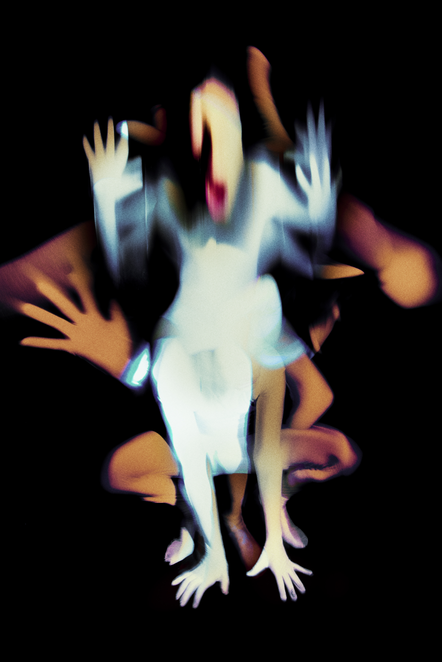
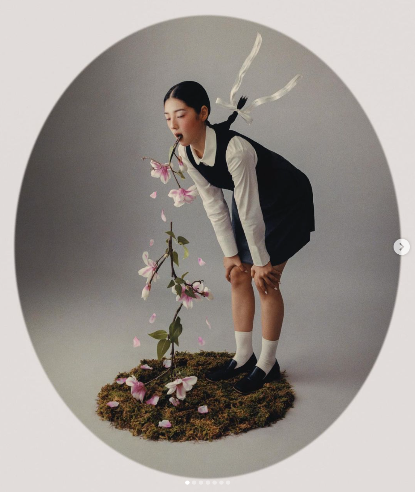
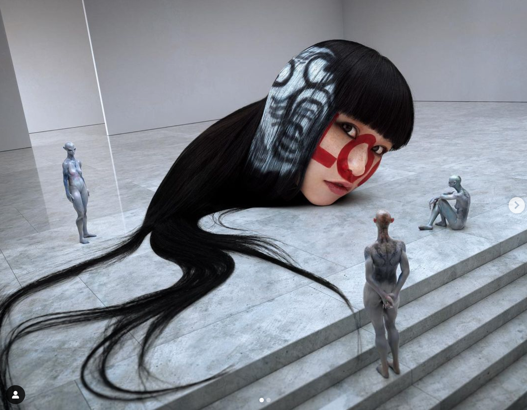
Photographer 3: Cho Gi-Seok

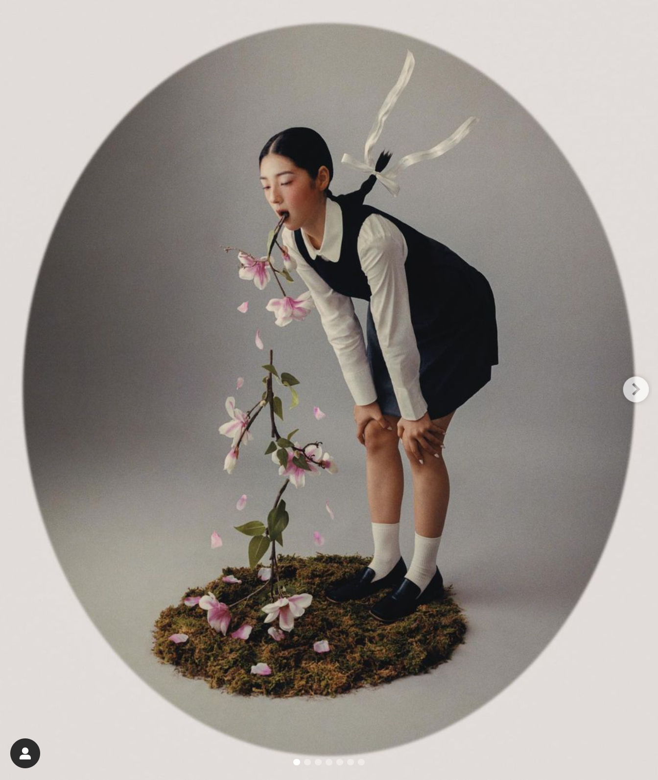
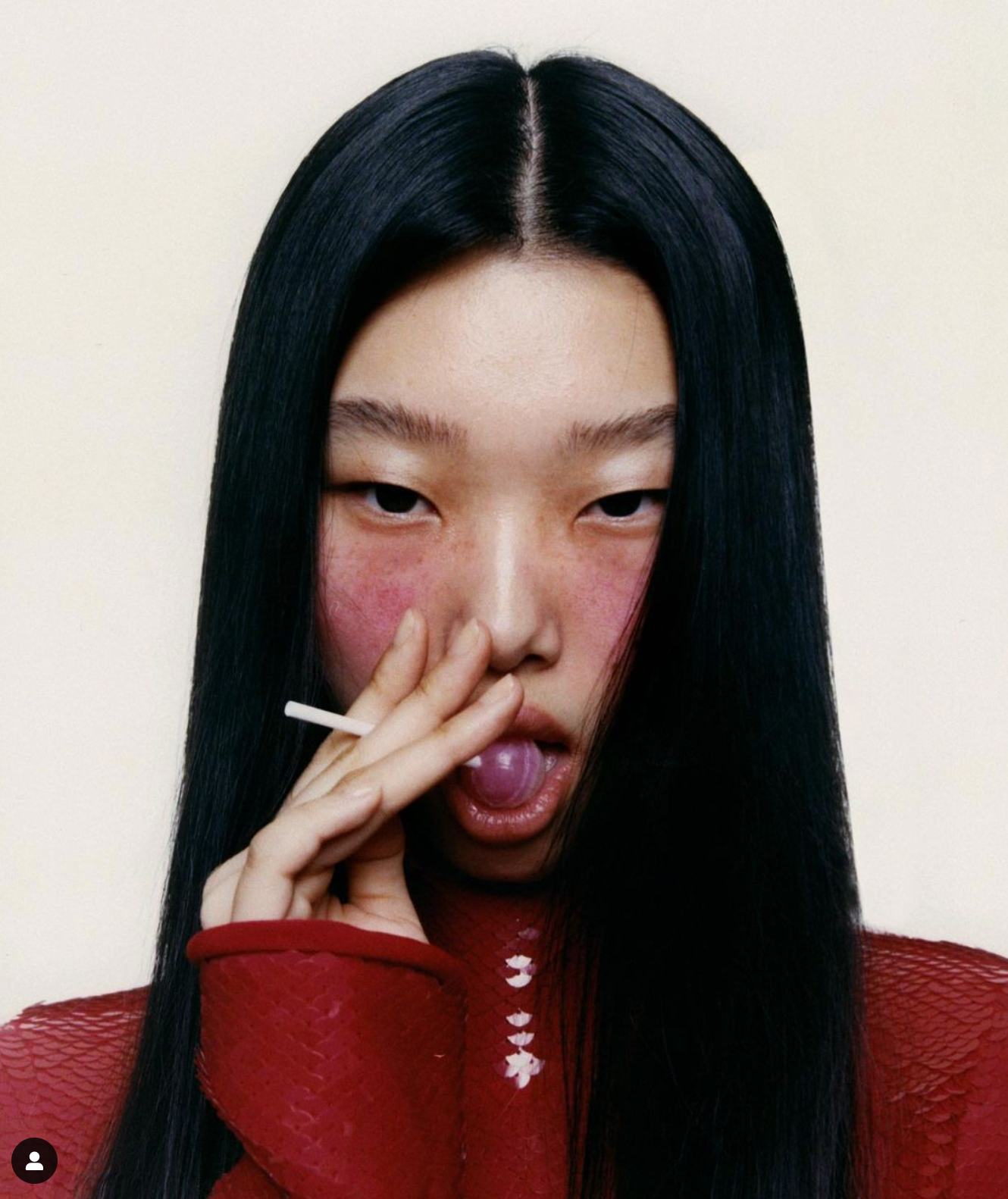
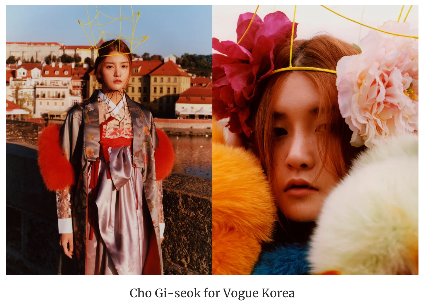
1. A short text about where the photographer or photoshoot is from.
- Cho Gi-Seok is an independent young photographer from Seoul, South Korea that has worked with many large fashion brands and held many solo exhibitions.
“When I was young, I wanted to be an art director. In order to do that, I thought that I could become a better art director if I could do all the fields. So with graphic design, I liked making things by hand, so then I also began to explore set design. After that, I started to work as an art director, and then I started taking pictures naturally, because I wanted to create my own images, and I wanted to work through all these processes.”
2. How does the photographer work? I.E., do they work with fashion or music?
- Fashion and music through digital photography.
3. Where is their work featured, or where or who do they work for?
- Kinfolk
- Vogue Korea
- Adidas
How is the image made?
- Digital photography and lots of post production
1. What camera do you think is used? (35mm, Medium format? What type of lens?)
Digital, 80mm
2. Is it a studio image or shot on location?
- Studio
3. Was a flash used or natural lighting?
- I would guess 4 flashes were used. I think a diffuser was also use to avoid shadows on the face.
4. Is it a film or a digital image? If so, how is this expressed in the image?
- Digital image which is expressed through the clear-cut sharpness of detail along with the smooth rendered textures done in post production.
5. What models are in the image, and how are they posed?
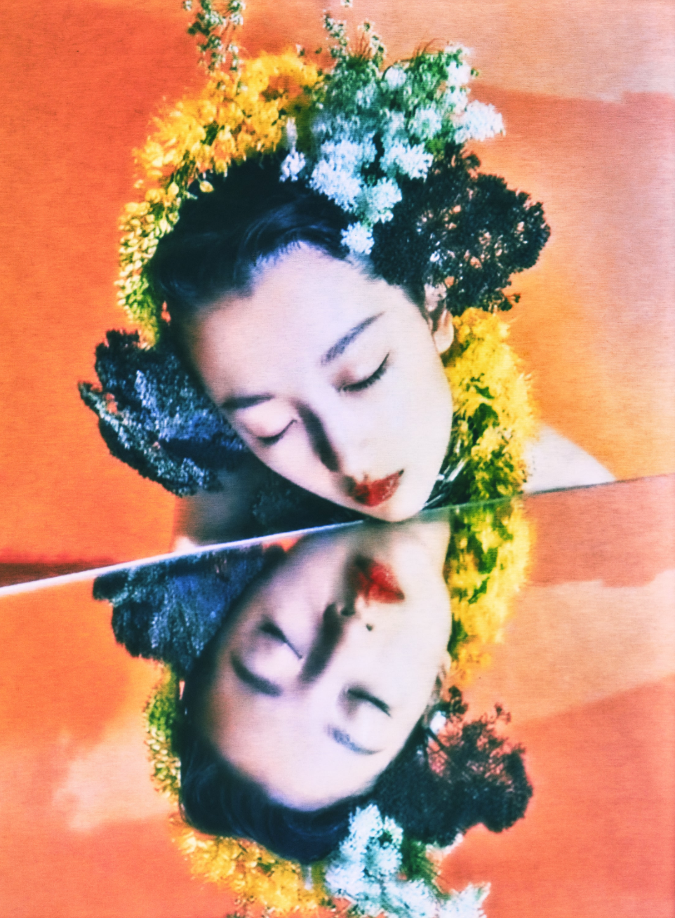
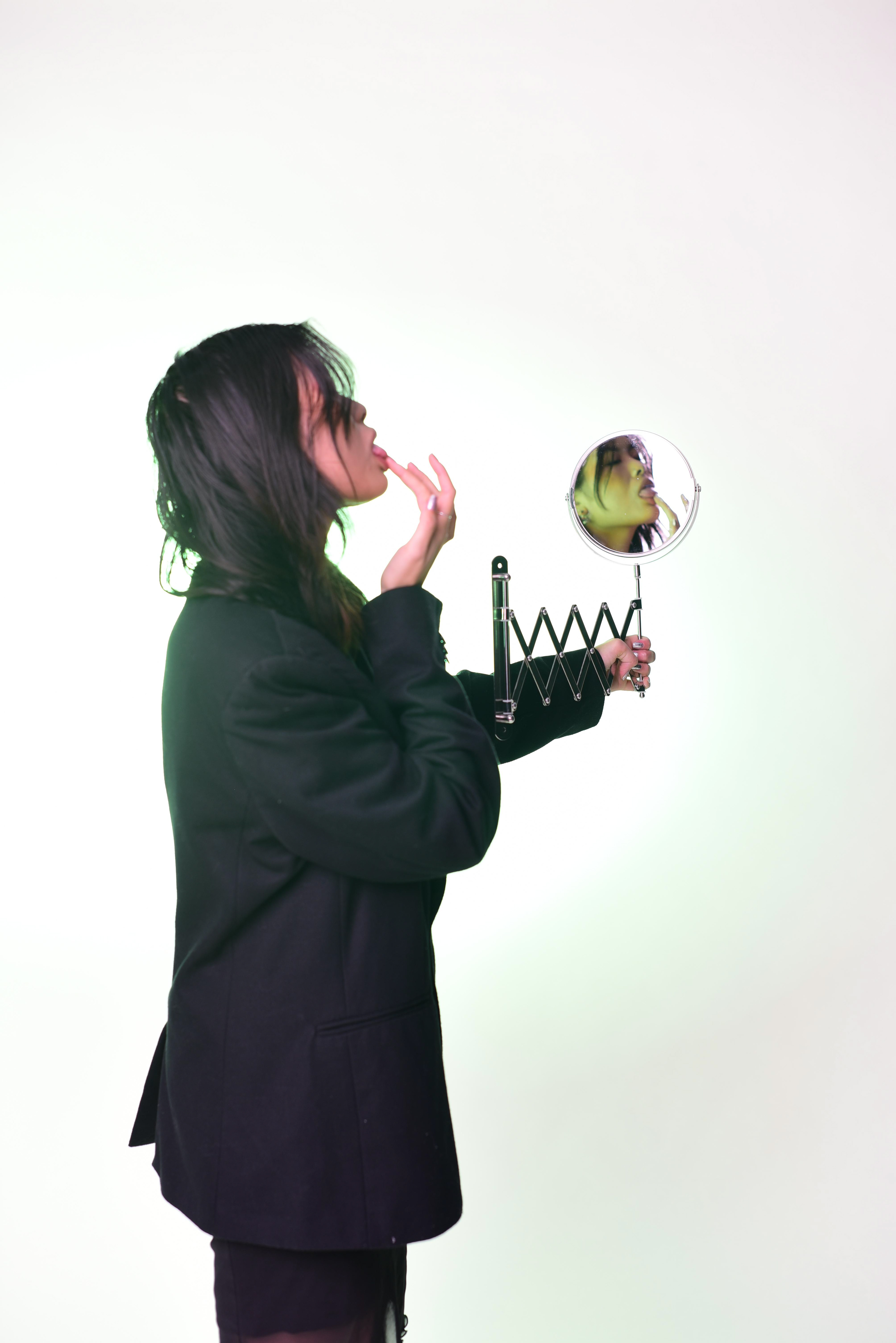
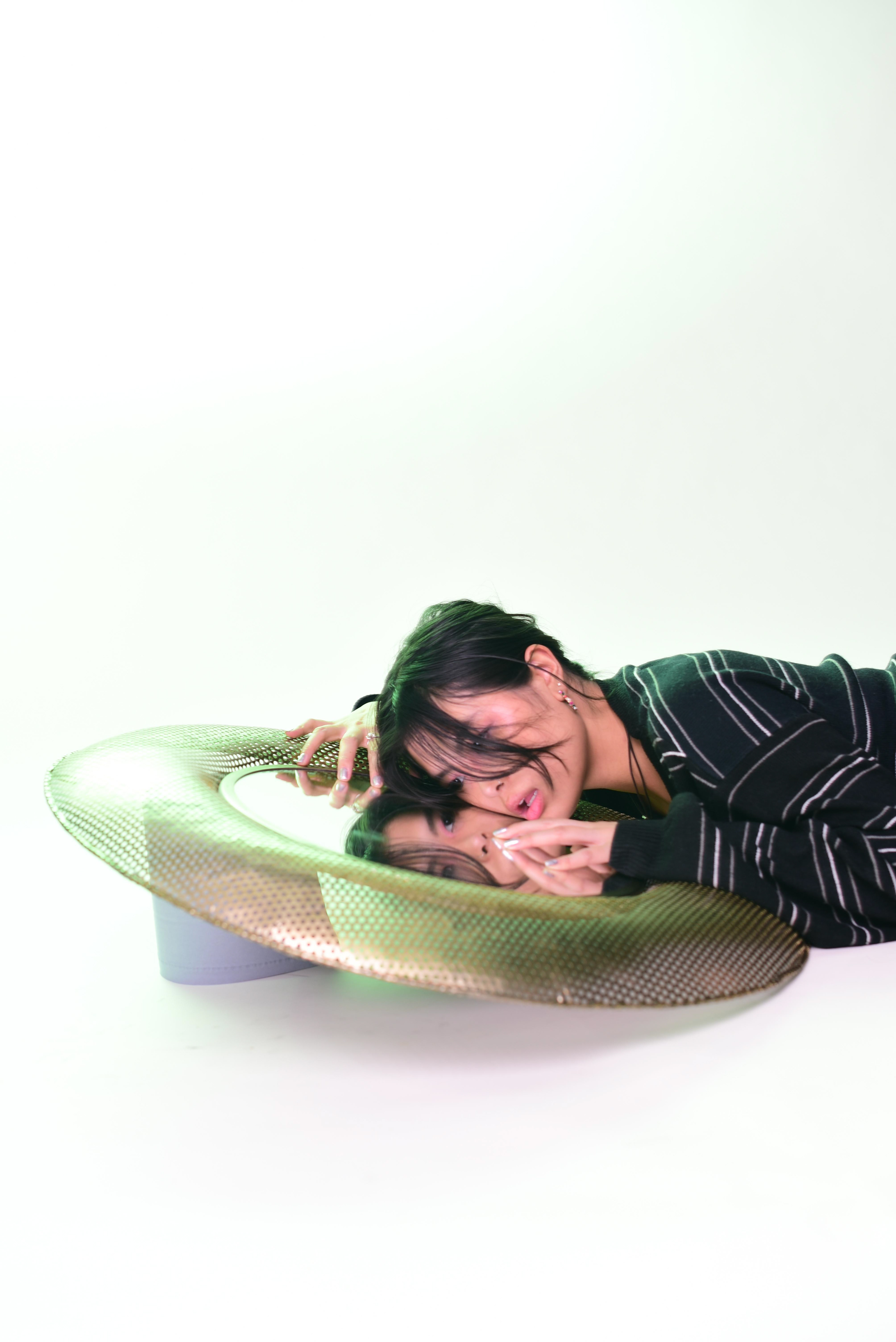
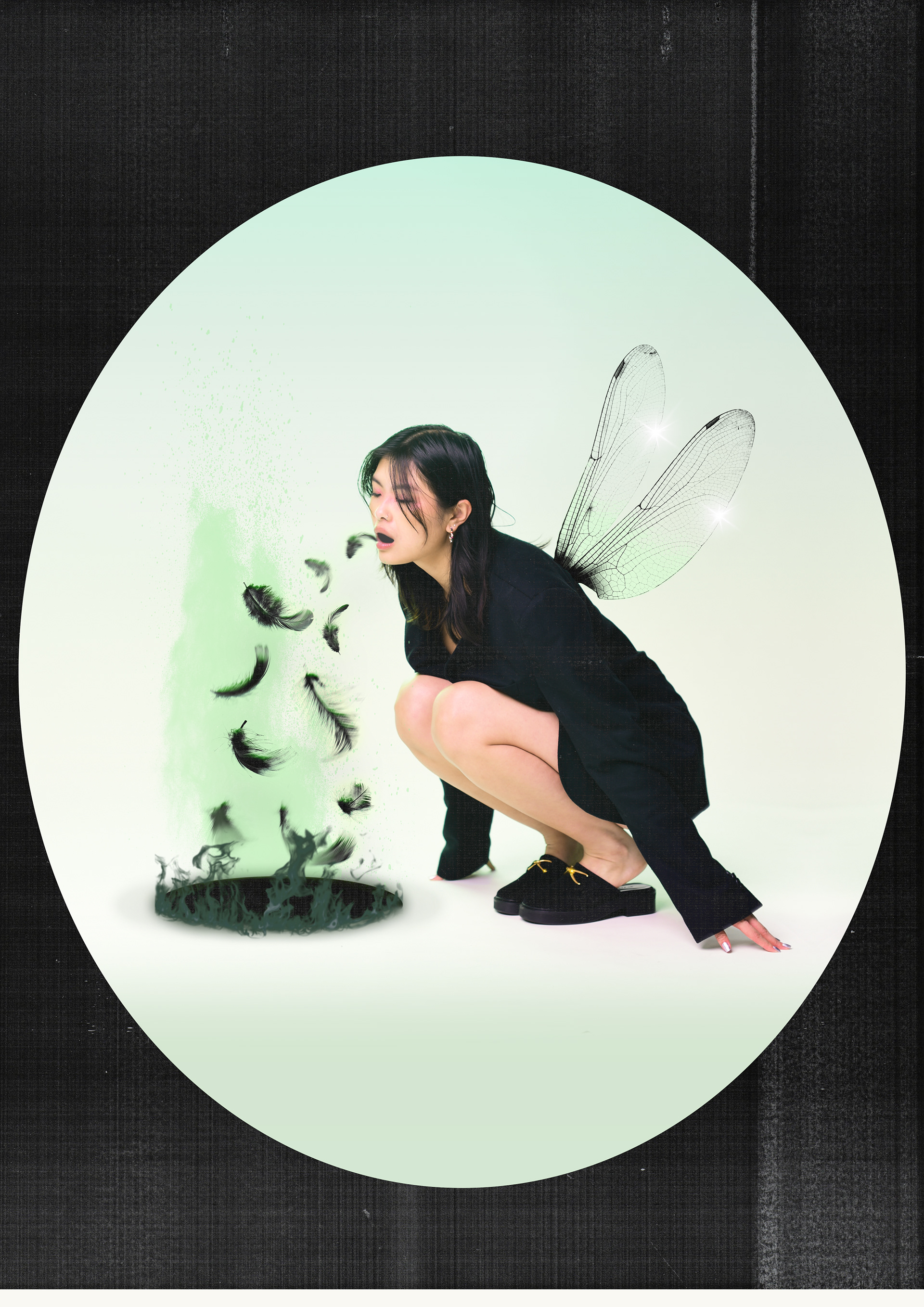
1. Single model crouched over mirror looking at herself
2. Single model bent over with her hands on her knees with her mouth open to allow flowers to be edited in during post production.
3. Single model headshot facing the camera straight on.
6. How is the image composed? What about the composition makes it striking?
- I find the symmetry very striking
7. Is the image very clear, or is it slightly out of focus?
- Clear
How is the image graded?
1. What tones are in the image? (i.e. heavy even-tones? high contrast?)
1. Cold tones, strong blacks and heavy contrast
2. Vintage warm tones, heavy blacks and strong contrast
3. Neutral warmth with heavy blacks.
2. What sort of colour is it? (i.e., highly saturated or unsaturated? warm or cool tones?)
- All models have saturated and various different tones around the eyes done using make up and possibly enhanced in post production.
3. Is the image very clean, or is it edited to appear older?
- Super duper clean apart from image 2 which has more of a vintage feel to it with the frame and subtle warmth.
4. Is there any kind of texture to the image that makes it unique?
- I would say everything in all images just looks a lot smoother.
Self-reflection
1. Talk here about how the image caught your eye and how you will use all of the points above to improve your work.
- Bring a mirror into the shoot
- Use slight tints rather than heavy saturation
- Apply makeup around eyes of the model.
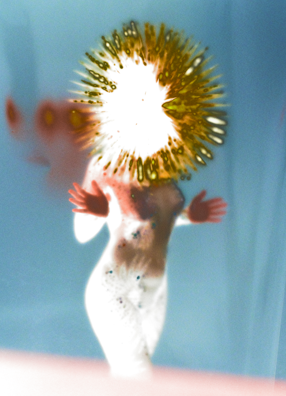
Photographer 4: Vicki King
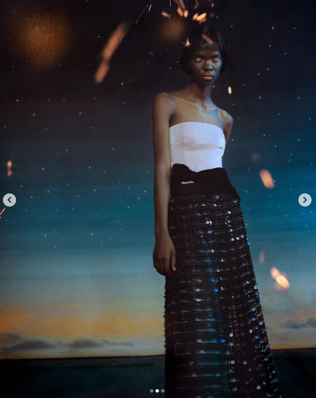
1. A short text about where the photographer or photoshoot is from.
Vicki King is an artist from the middle of England, now living and working in London. Vicki earned a 1st class degree in photography at London College of Communication in 2012, becoming fascinated by photography’s ability to create a space that lies somewhere between reality and fiction. She is inspired by nature, our emotional connection to the world around us and the hyperreal - creating images that aim to exist in this liminal inbetween, infused by fine details of colour, light and texture.
Since graduating she has spent her time working on personal projects and commissions for publications and brands such as Vogue Poland, Modern Weekly China, Nike, Kenzo, SSAW, Givenchy.
2. How does the photographer work? I.E., do they work with fashion or music?
Mainly Fashion.
3. Where is their work featured, or where or who do they work for?
Vogue Poland, Modern Weekly China, Nike, Kenzo, SSAW, Givenchy.
How is the image made?
- Digital photography and lots of post production
1. What camera do you think is used? (35mm, Medium format? What type of lens?)
Digital, 50mm
2. Is it a studio image or shot on location?
- Studio
3. Was a flash used or natural lighting?
- I would guess 2 flashes were used. I think one of them would have a blue tint on it for the highlights.
4. Is it a film or a digital image? If so, how is this expressed in the image?
- Digital image which is expressed through the clear-cut sharpness of detail along with the smooth rendered textures done in post production.
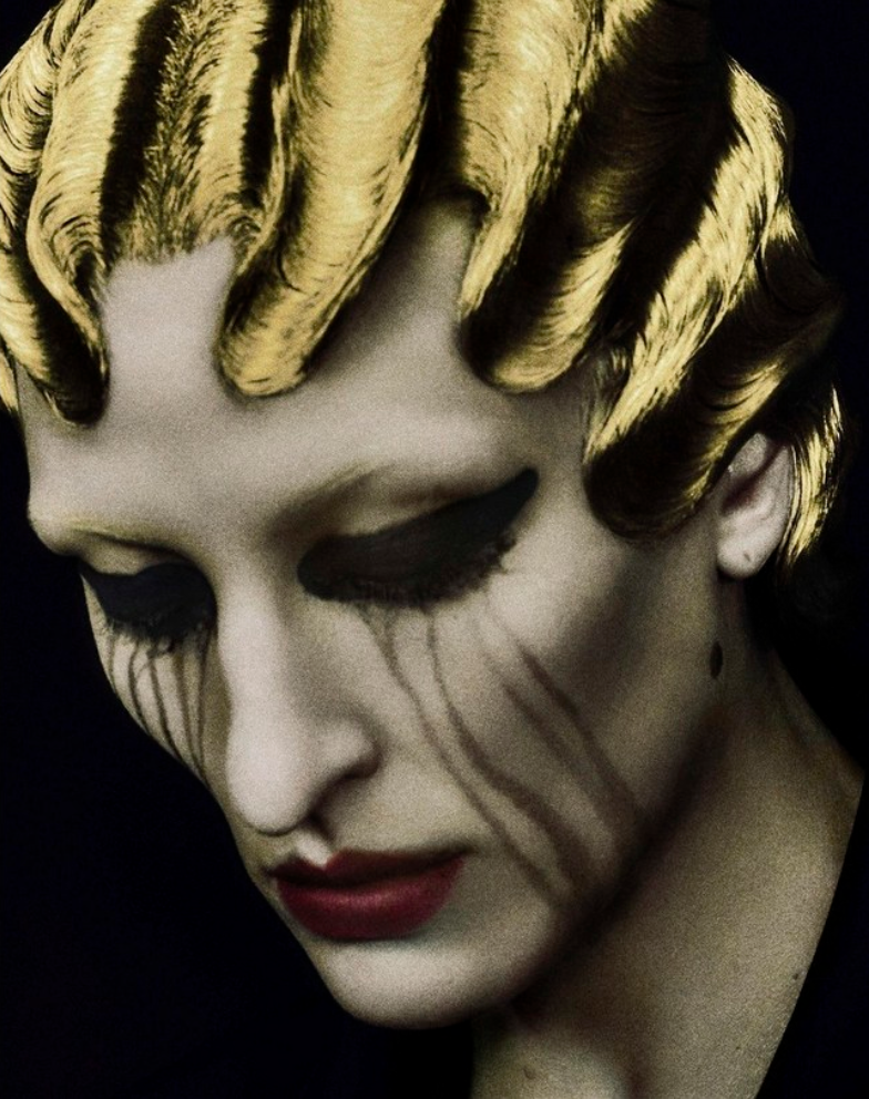
5. What models are in the image, and how are they posed?
Standing up with one arm behind her back looking down.
6. How is the image composed? What about the composition makes it striking?
- Model is positioned to the right side of the image allowing more attention to be drawn to the background which I find is the main striking element of this photo.
7. Is the image very clear, or is it slightly out of focus?
- Clear
How is the image graded?
1. What tones are in the image? (i.e. heavy even-tones? high contrast?)
Both warm and light tones with a subtle contrast.
2. What sort of colour is it? (i.e., highly saturated or unsaturated? warm or cool tones?)
Mainly blue with orange tint in the horizon and "sparks".
3. Is the image very clean, or is it edited to appear older?
- Edited to blue the lines between reality and fiction. I would say it's quite outlandish.
4. Is there any kind of texture to the image that makes it unique?
The sparks added around the head of the model are quite hard to make sense of which makes it a very interesting photo.
Self-reflection
1. Talk here about how the image caught your eye and how you will use all of the points above to improve your work.
- Experiment with additional effects, inspired by the spark.
- Blur the lines between reality and fiction.
ADDITIONAL INSPIRATION (instagram)
https://www.instagram.com/lisajarvis_stylist/
https://www.instagram.com/p/CjYO9c5NVDL/
https://www.instagram.com/isamayaffrench/
https://www.instagram.com/charlie__chops/
https://www.instagram.com/elizavetaporodina/
REFERENCES
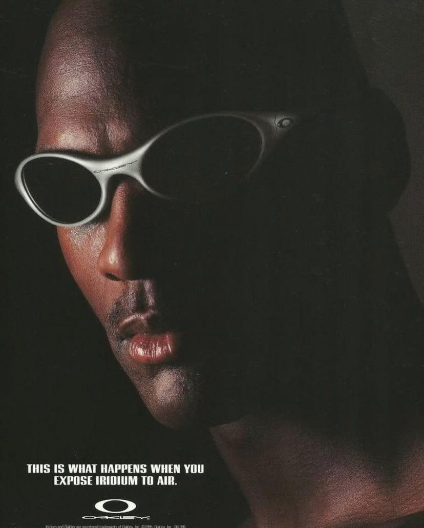
1. Oakley Glasses Aesthetic - going to find a pair to use for my shoot.
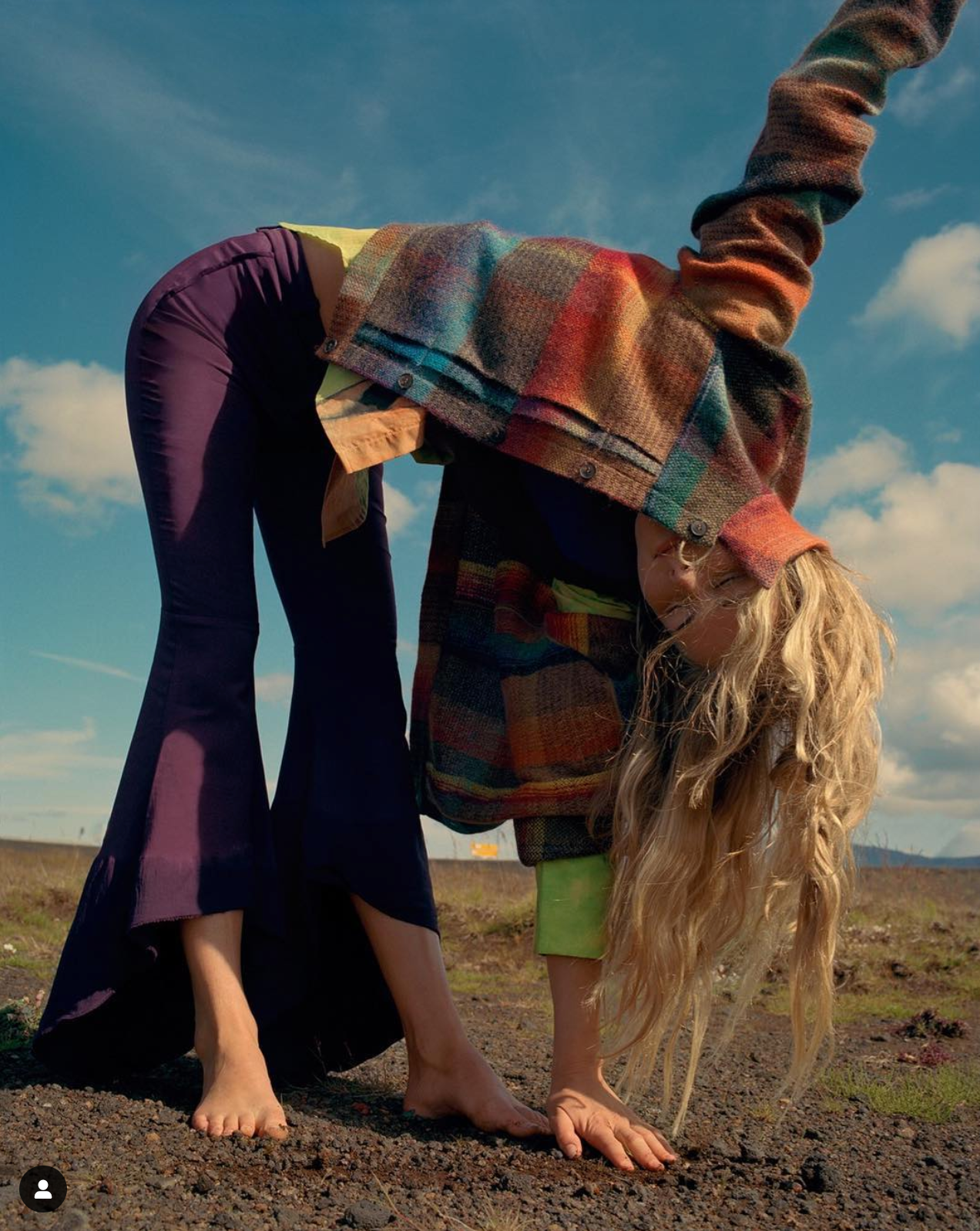
2. Vicki King - I will attempt instructing my model to do abstract poses such as this one during my shoot.
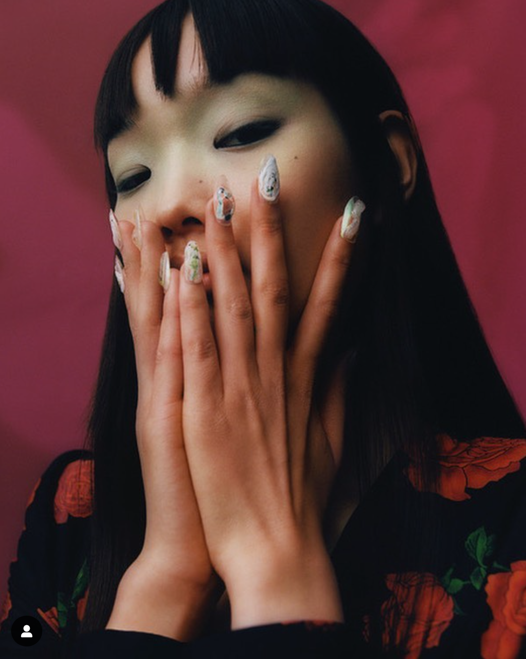
3. Felicity Ingram - I like this pose as well and my model will have styled nails as well. This photograph is also my makeup reference.
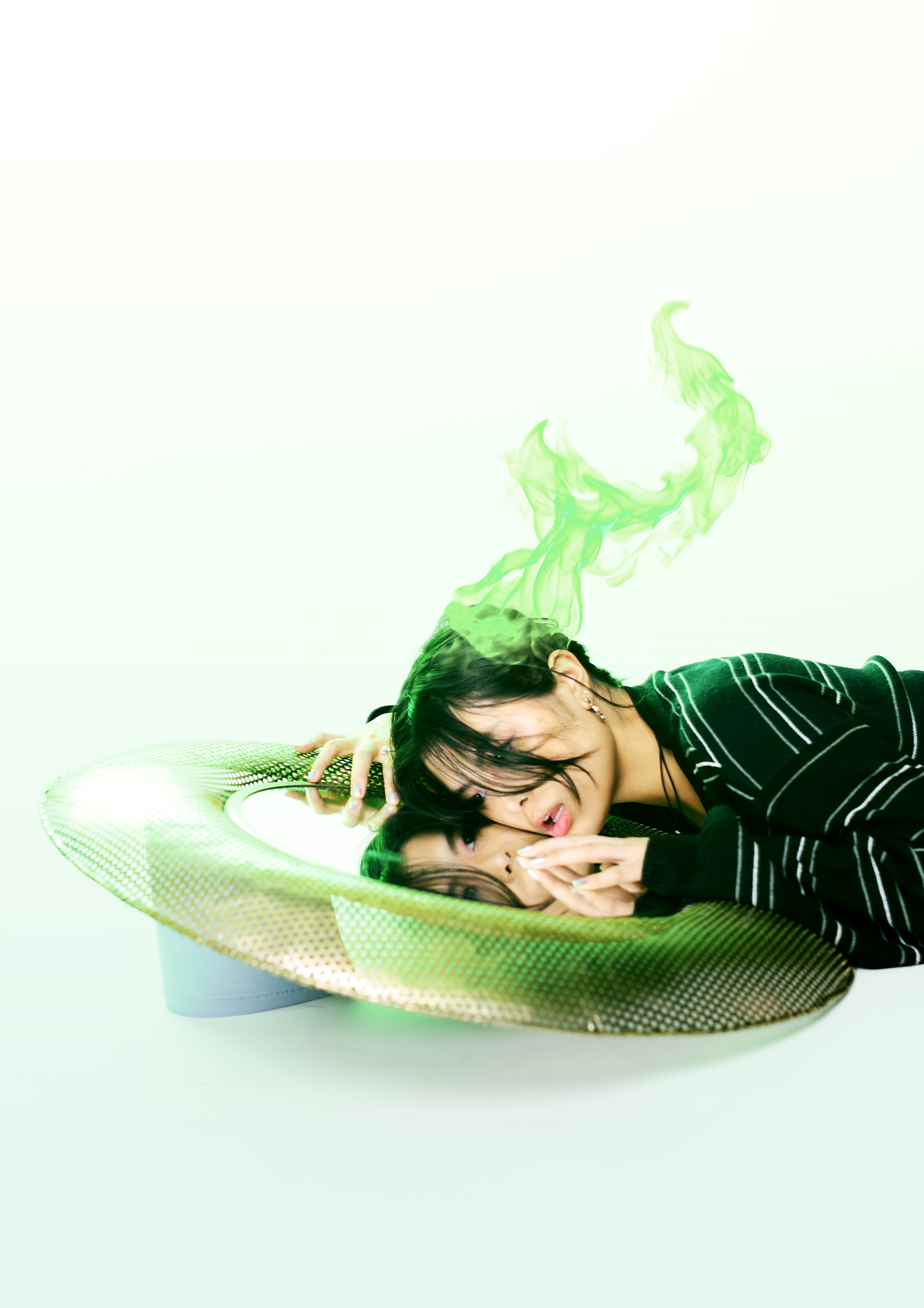
1. Mirror reference
2. 조기석 Cho Gi-Seok - I will atempt to recreate this concept with flowers.
3. Charlie Chops - I will bring a large sheet of paper to recreate this concept using my flowers and stuff found in the environment nearby. Edit: this concept ended up not being replicated due to it not really fitting the theme of fairies.
LOOK 1
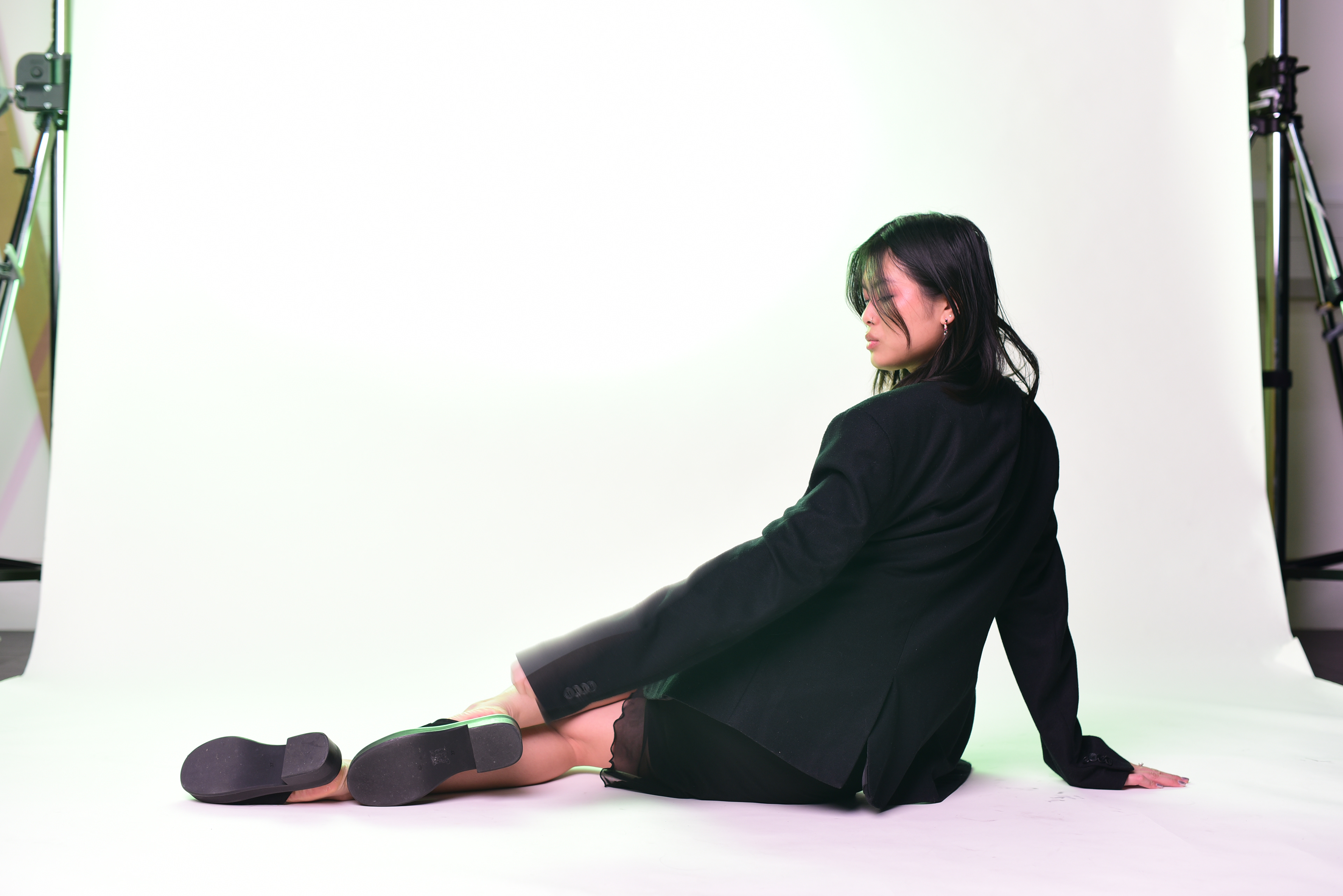
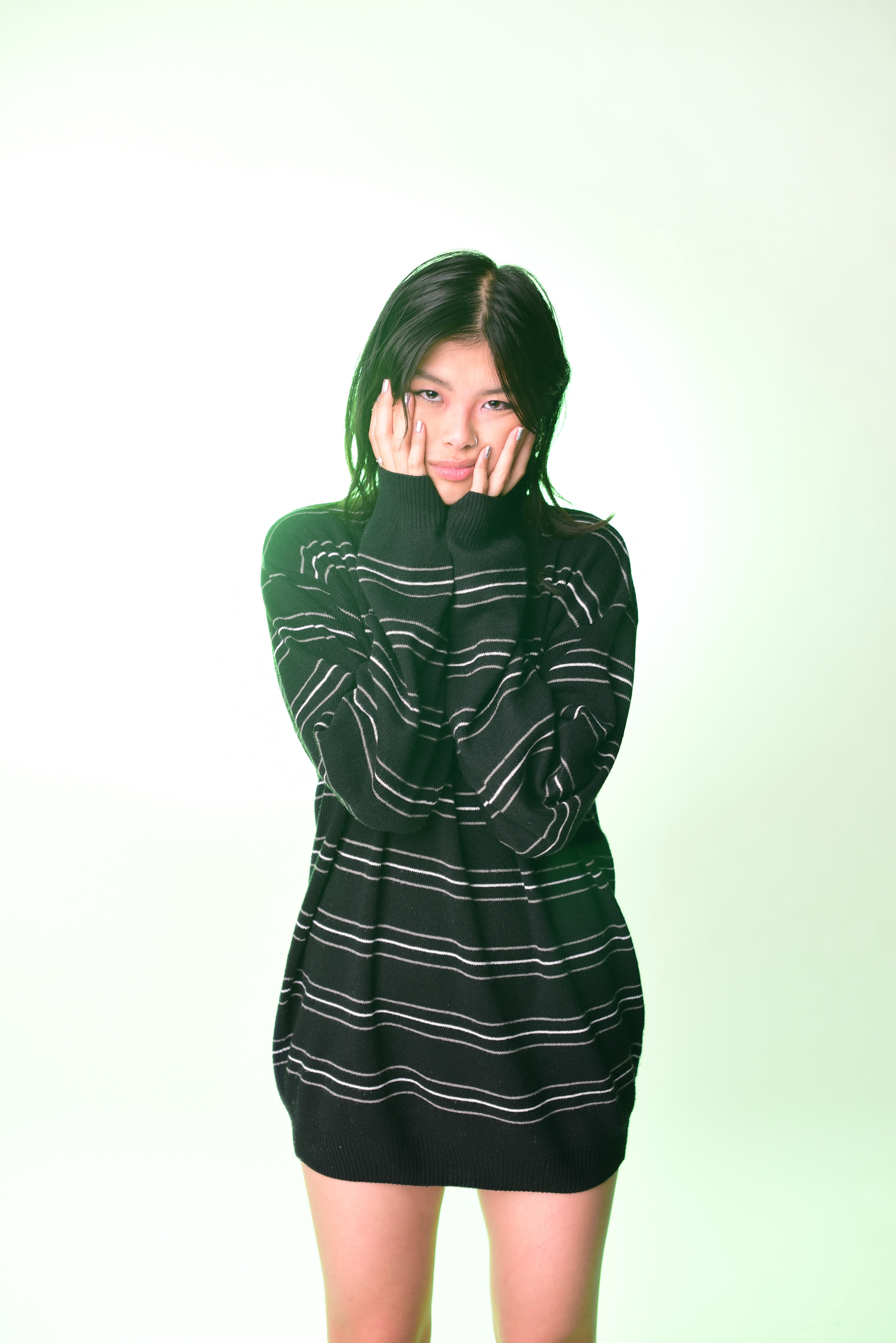
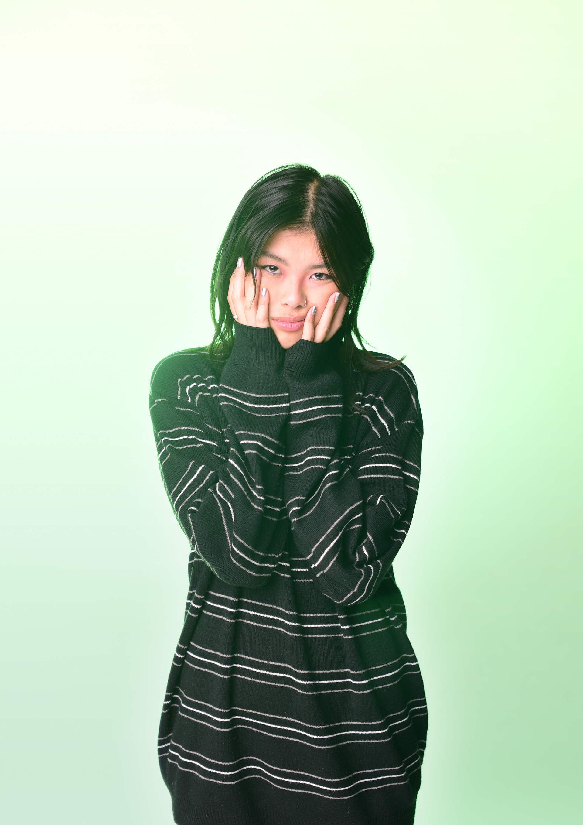
Model is advised to wear subtle tones clothing matching the colours of fall; mainly black with hints of grey, brown and/or green.
We are going for a “fairycore” aesthetic due to the nature environment and city background.

(Bottom left) - will be using this pose.
LOOK 2
MODEL REFERENCE

PROPS
1. Black T-shirt ✅
2. Green Dress ✅
3. Various Black Tops ✅
4. Mirror ✅
5. Flowers
6. Bubble Machine / Stick and strings
7. Oakley Glasses ✅
8. Large Sheet of paper with hole in the middle
9. Speaker to play music while shooting ✅
10. White scarf ✅
11. Green fur hat
12. Gloves
13. Bag of make up ✅
EQUIPMENT
FIRST RENT (NOVEMBER) for location shoot
1. Canon EOS-1D C
2. Canon 50mm f/1.2 L Lens
3. Samyang 8mm T 3.8 Lens
SECOND RENT (DECEMBER 1) for studio shoot
1. Nikon D3500
2. Nikon 50mm Lens
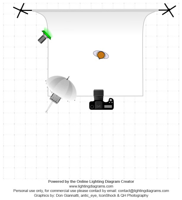
LIGHTING DIAGRAM
White backdrop with green tinted modelling light and a large flash with a umbrella diffuser. I will use this setup in my studio shoot.
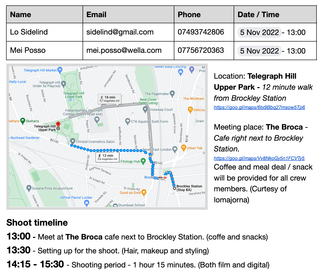
CALLSHEET
This call sheet was made for my first shoot for which I rented the Canon 1D but unfortunately it was raining during that weekend which meant the shoot couldn't go through. Because of this I booked the studio out instead as I was approaching the deadline and needed more controlled conditions.
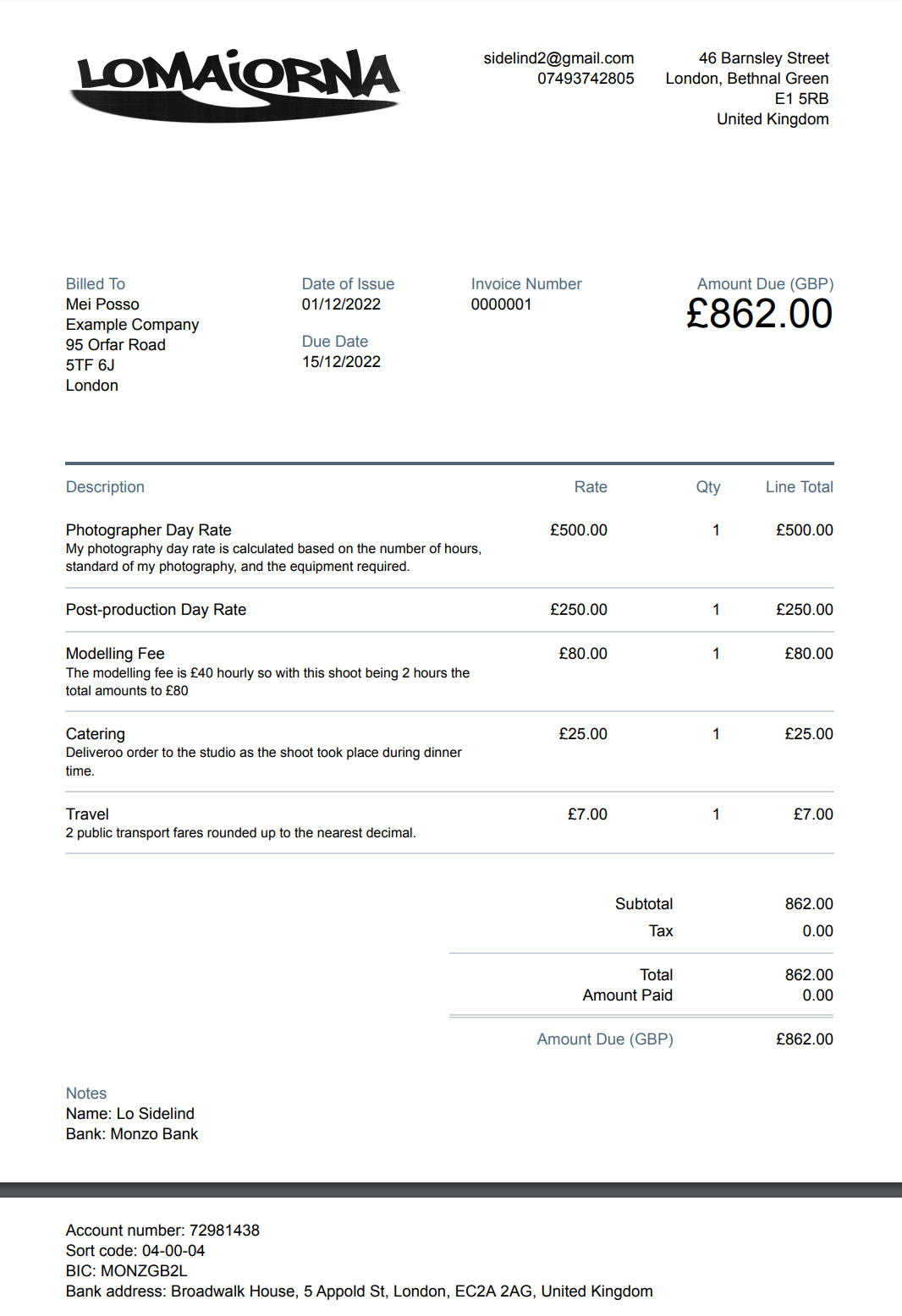
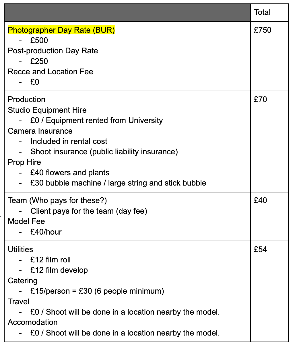
INVOICE ESTIMATE
The total cost for my shoot is estimated to be 914 pounds.
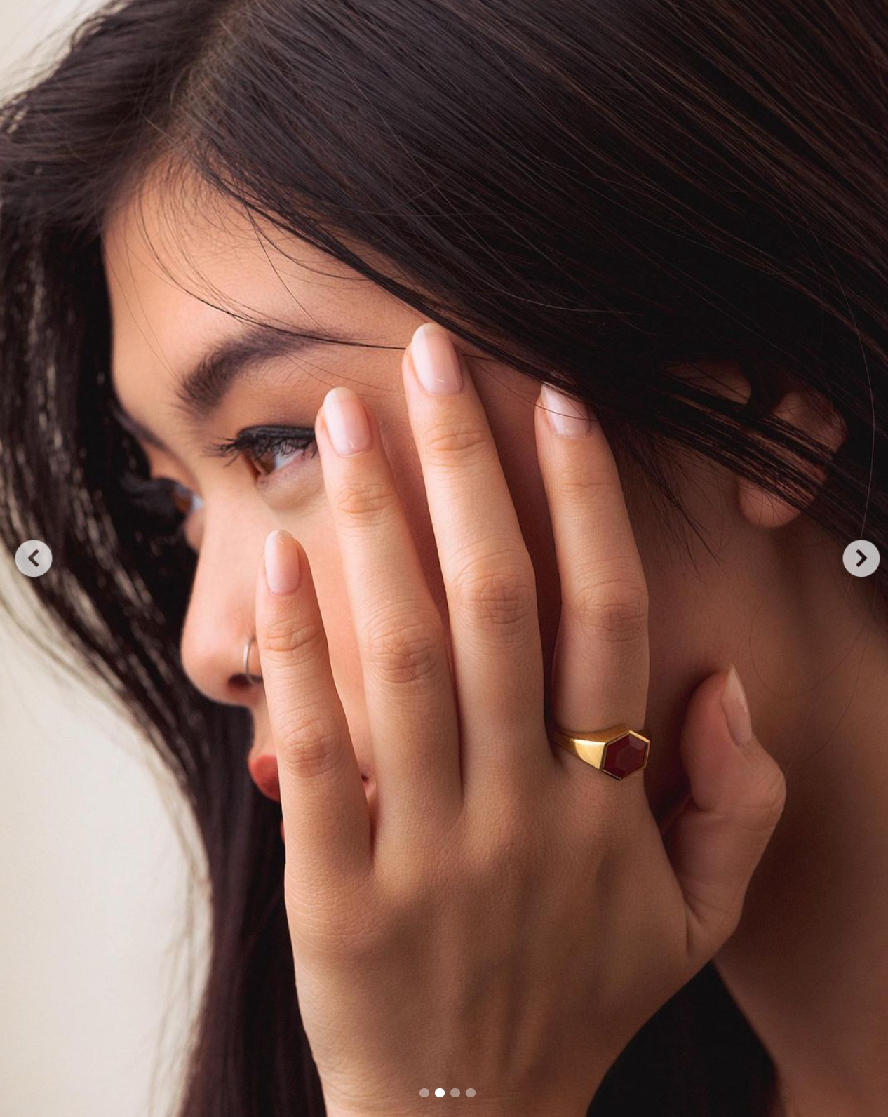
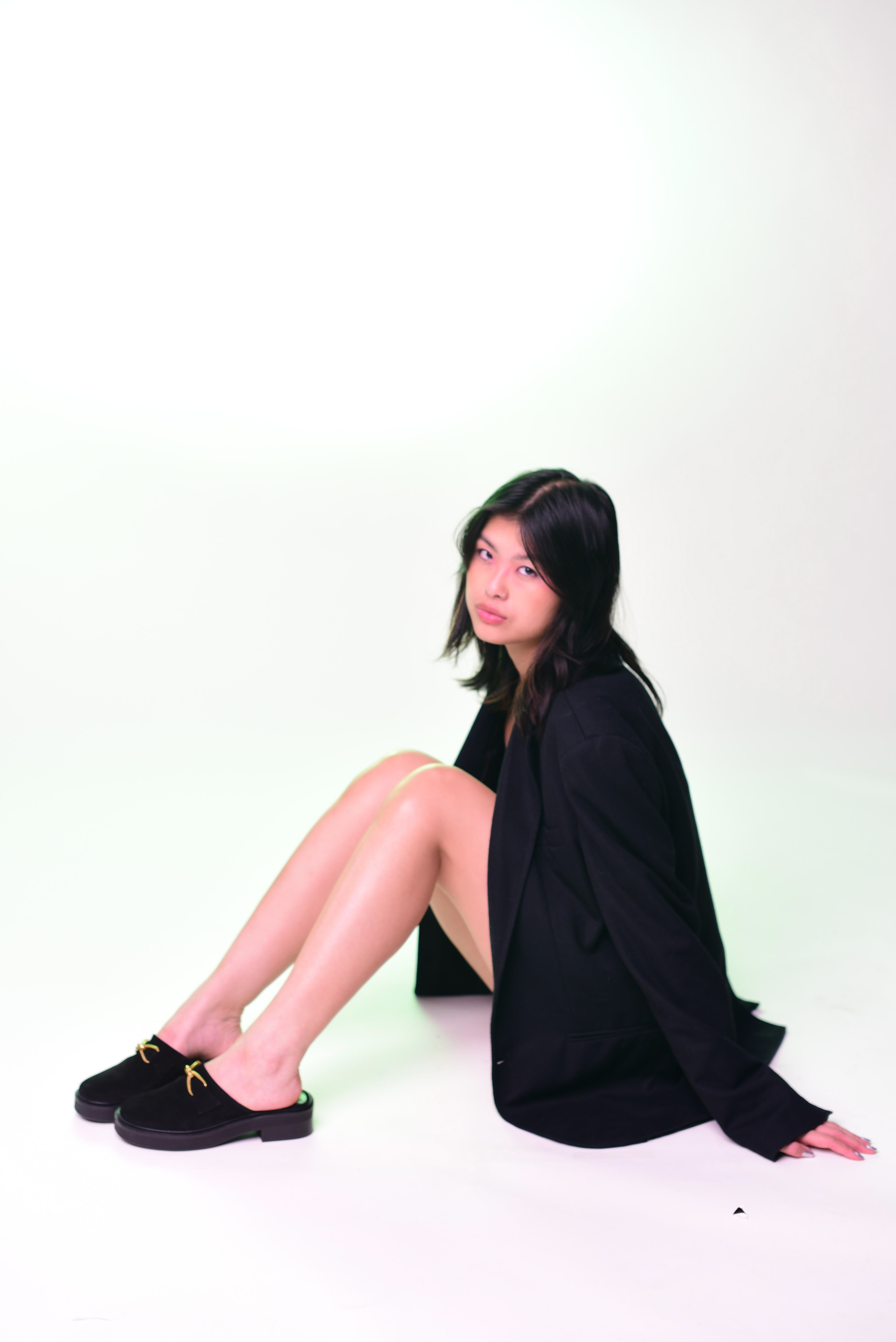
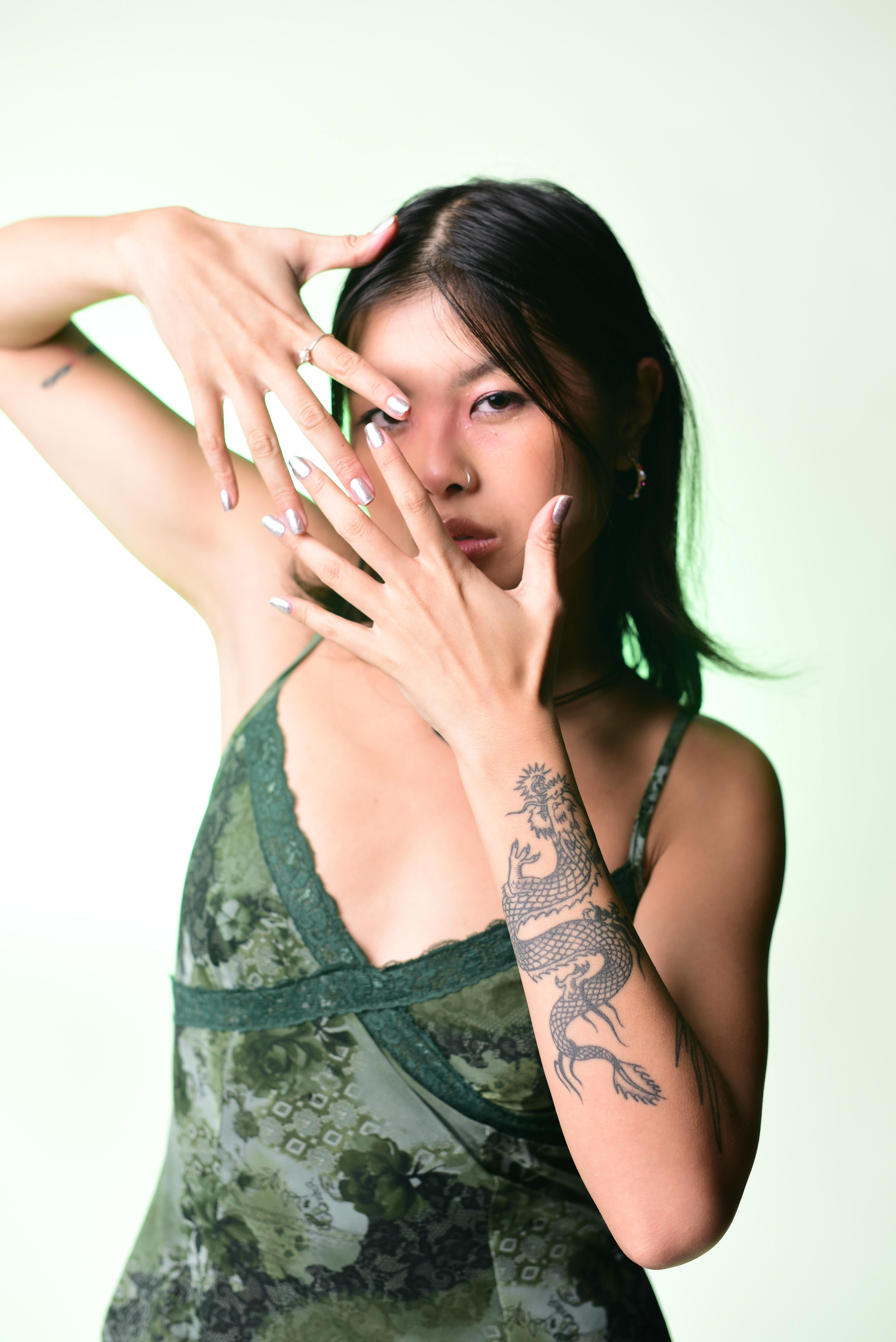
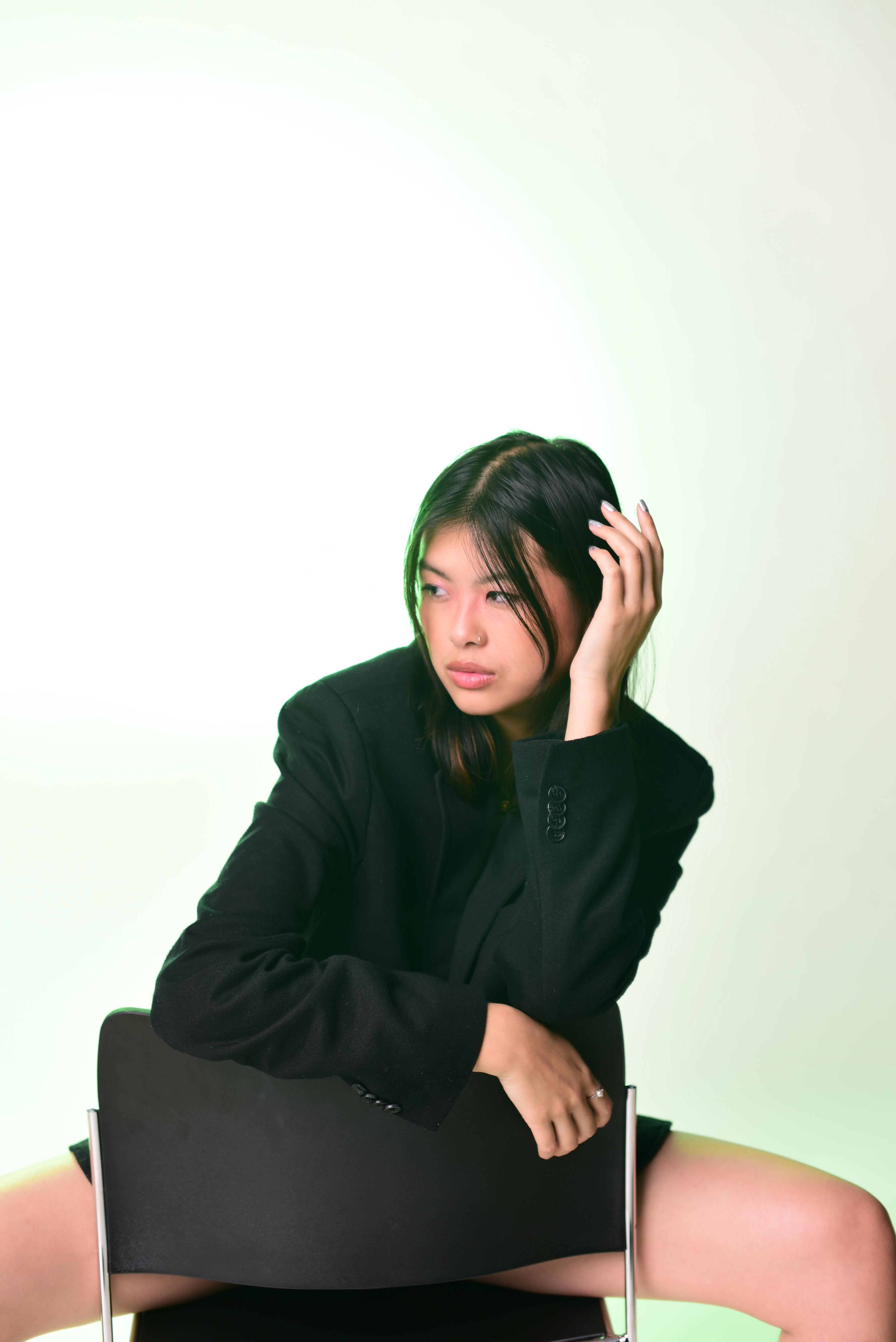
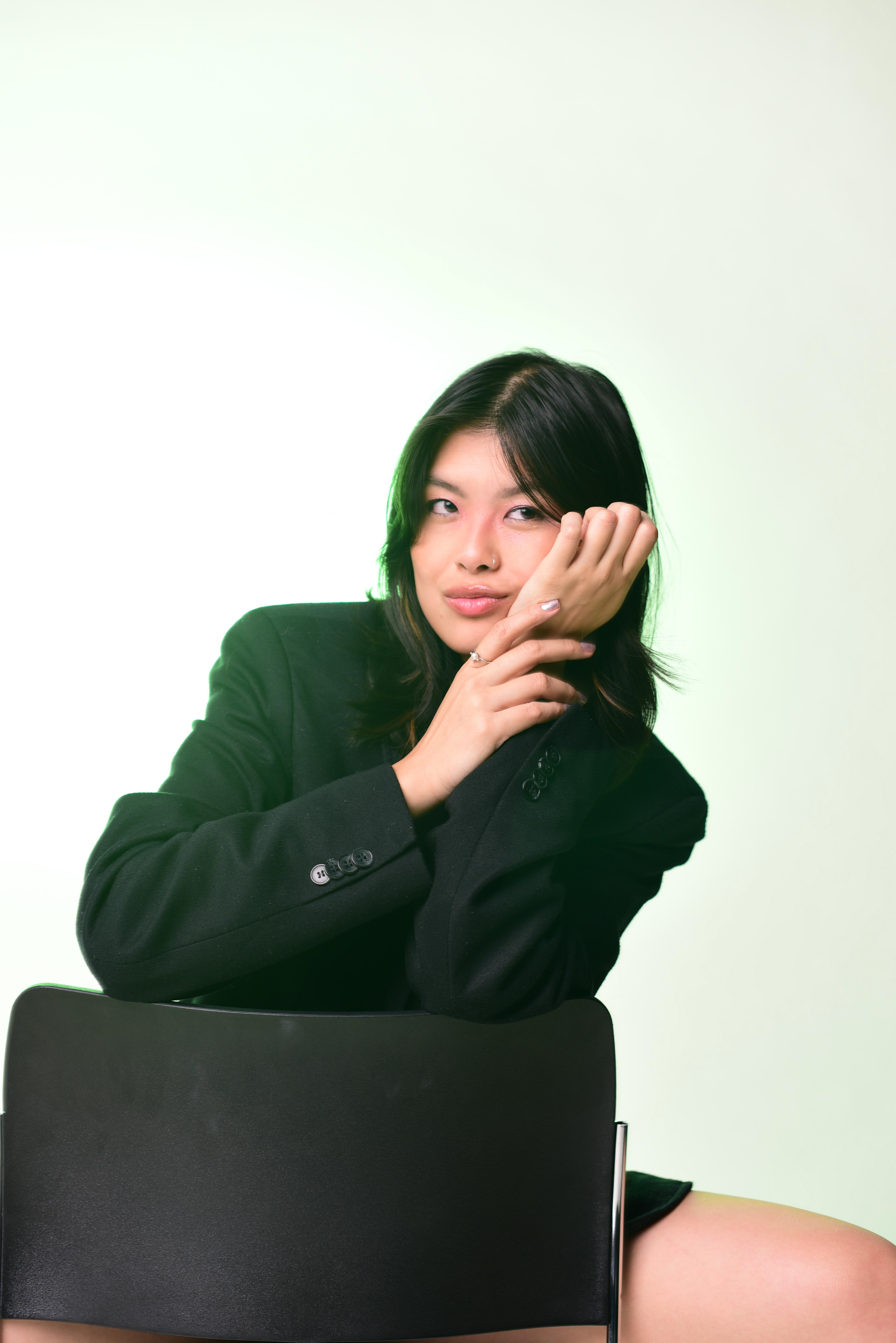
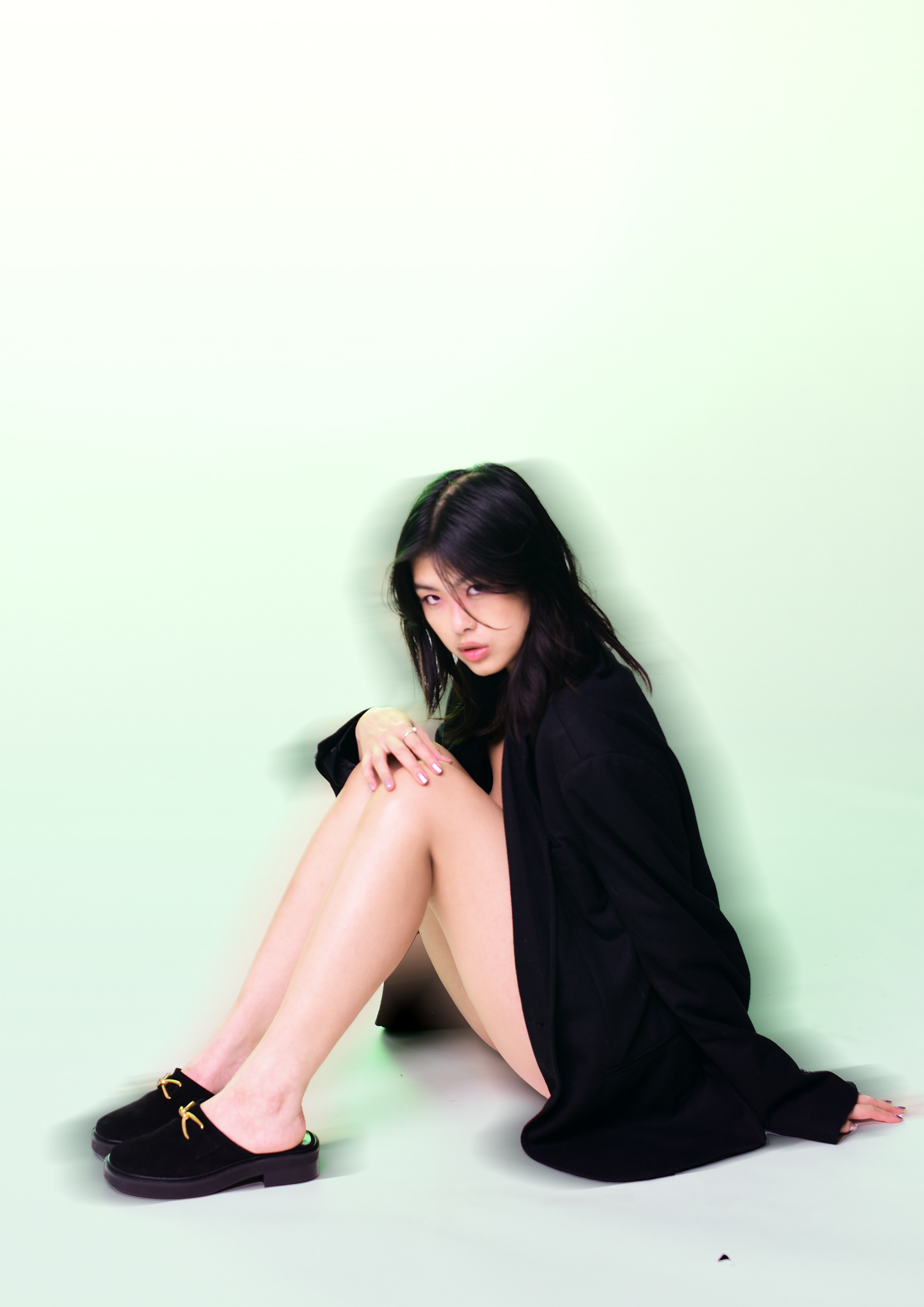
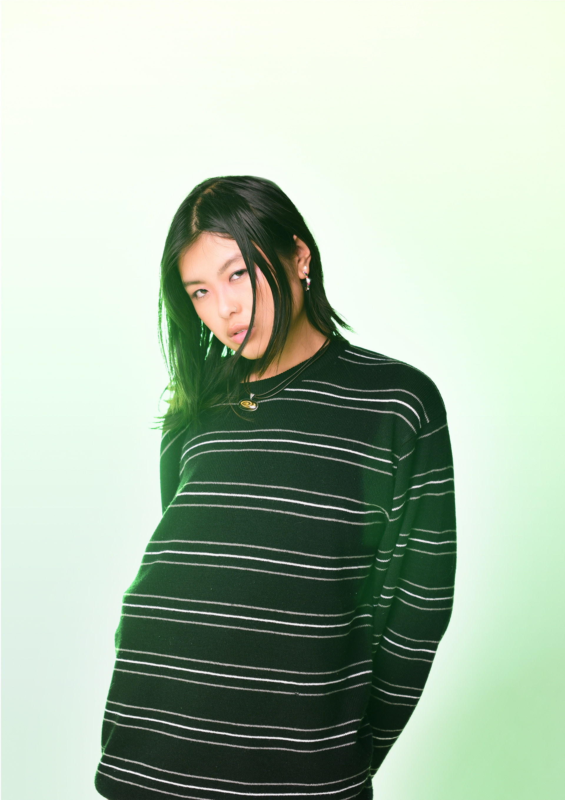
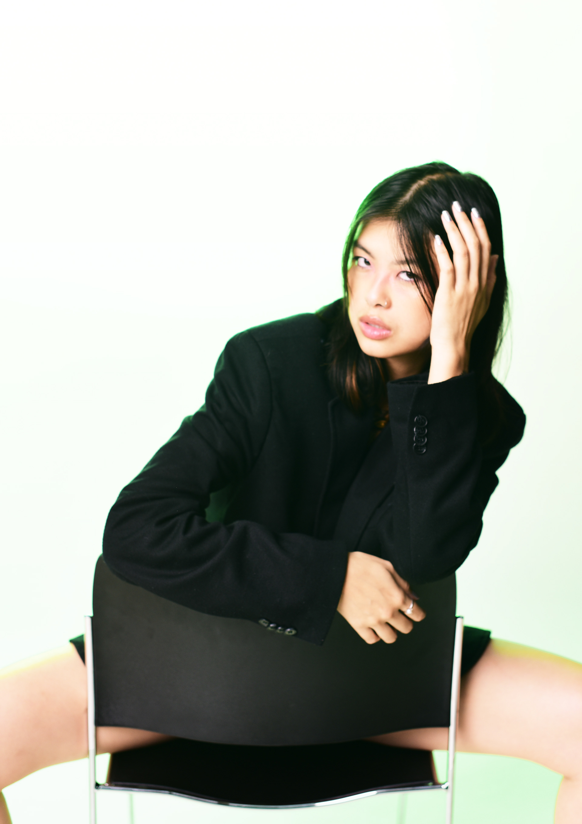
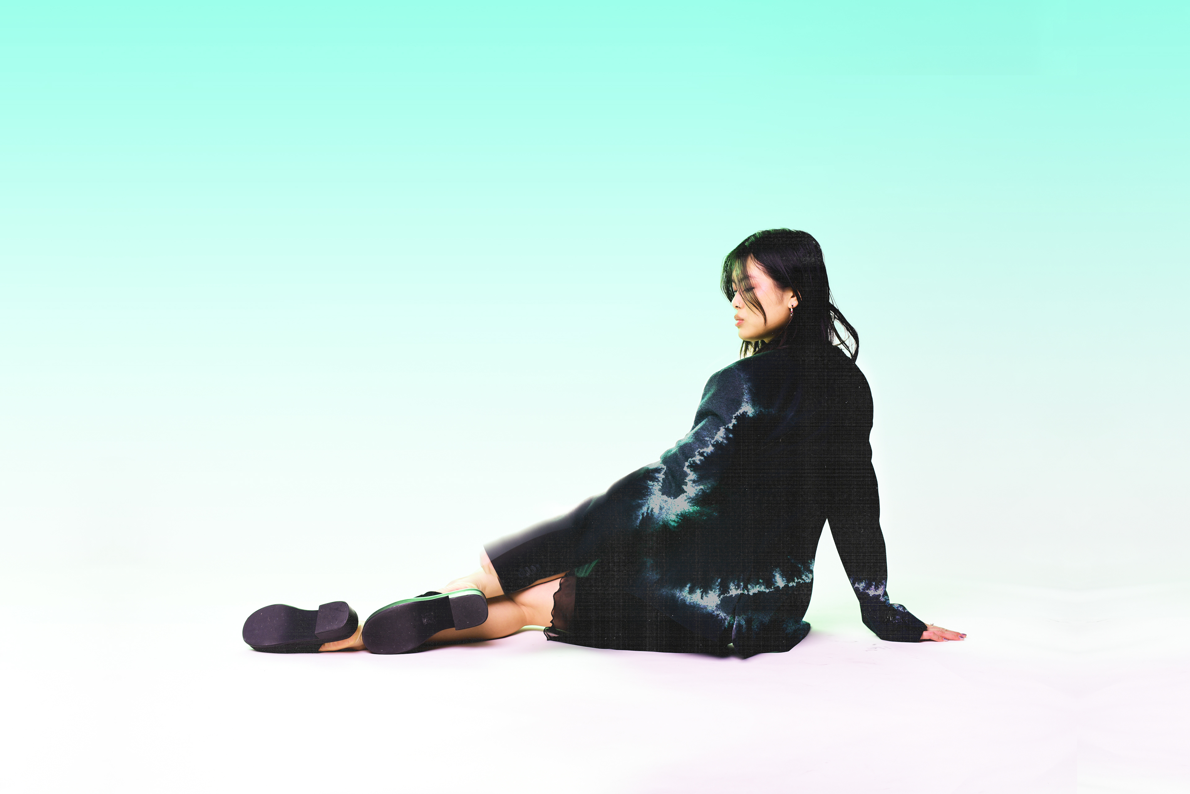
For this shoot I used a Nikon D3500 which I was very unfamiliar with prior to the shoot so I was kind of figuring it out as I went along. Some of the photos are a bit out of focus cause the owner has adjusted the viewfinder to suit her eyesight, something I figured out a few minutes into the shoot. However, I was still having problems with focusing.
Nonetheless, I was really happy with the green highlights achieved with the modelling light and the overall compositions.
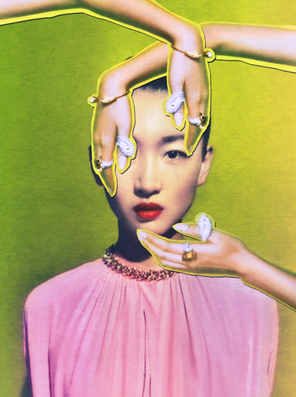
FINAL EDITS
This was my main edit which I put the most time into in order to match the theme of fairies. I wanted to incorporate a lot of symbolism into my main photograph so I made this edit inspired by Cho Gi-Seok.
FINAL INVOICE