ADVERTISING AND NARRATIVE
UNIT BRIEF
Deliverables
• 15 separate images in Jpg, PDF and RAW
• Digital Workbook
• 15 separate images in Jpg, PDF and RAW
• Digital Workbook
You will be required to make 15 independent images of your own creation which correspond to the workshops.
• Fill Flash x 3
style: documentary photography
where: brick lane / bethnal green
who: people in public (approach)
inspiration: chardchakaj (3 photos in 1)
equipment: Canon G7X + built-in flash
• Dramatic use of Flash x 3
style: studio portrait photography / rembrandt
where: home studio (1x softbox)
who: Mei Posso
inspiration: Elizabeth
equipment:
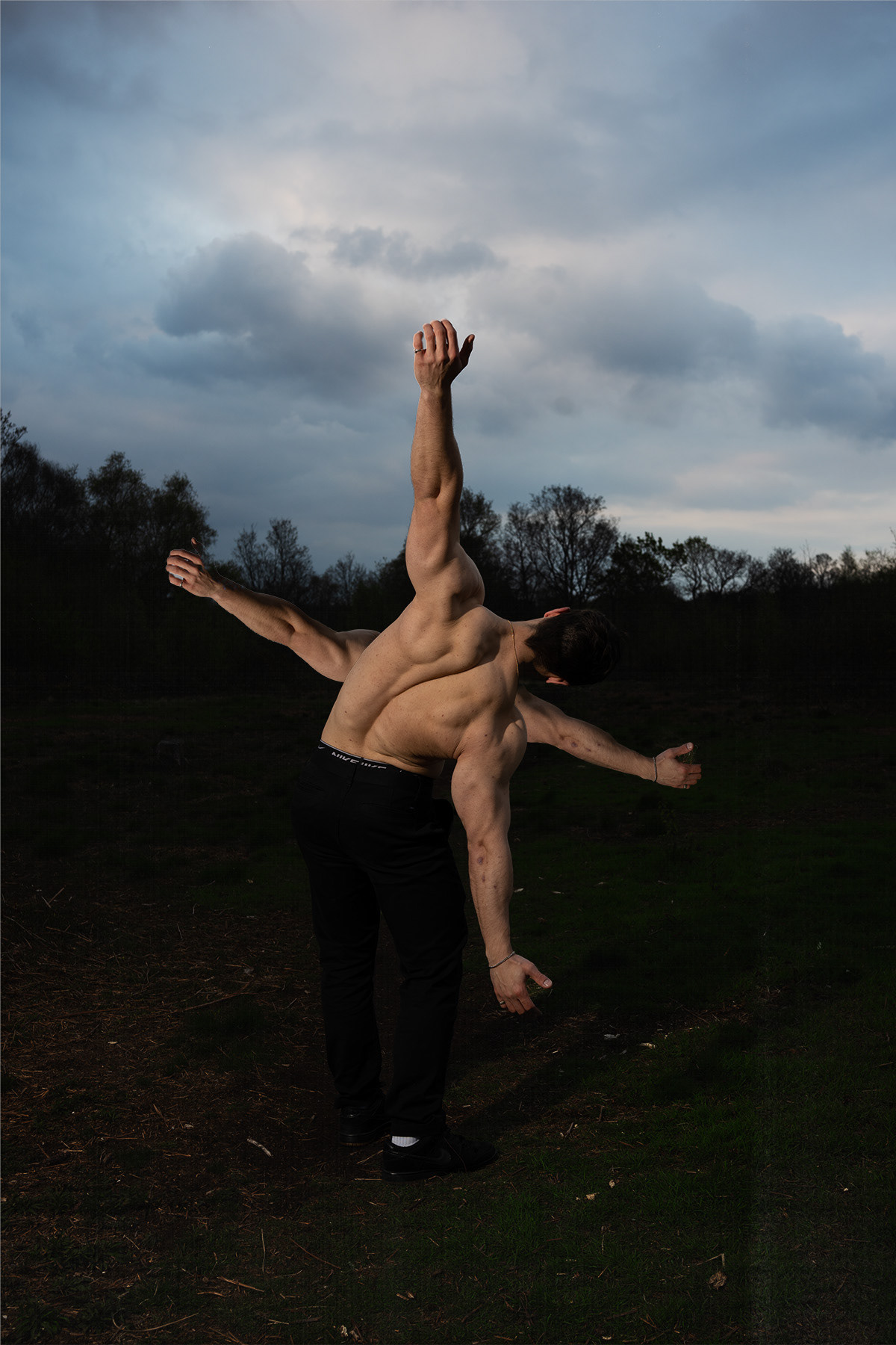
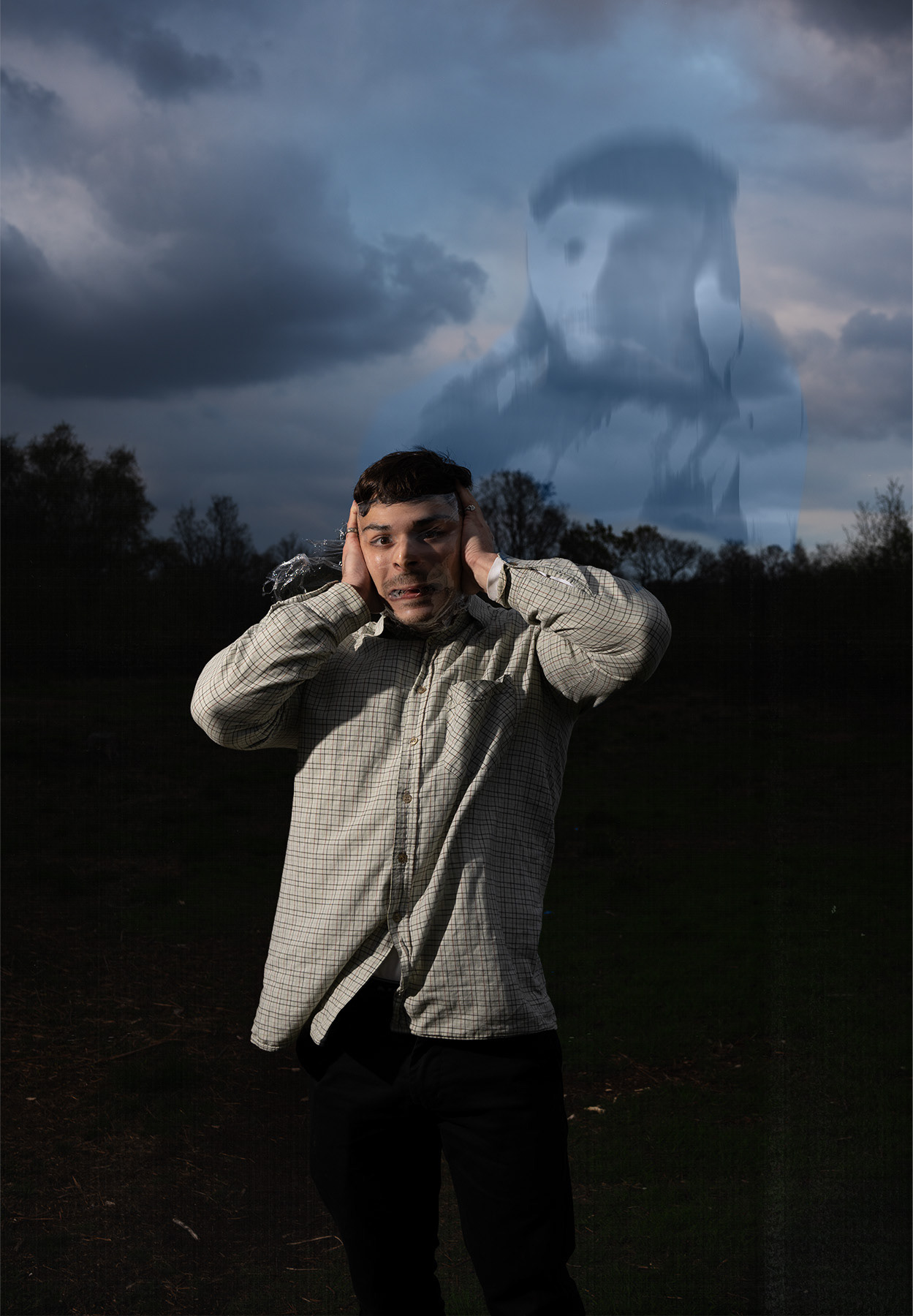
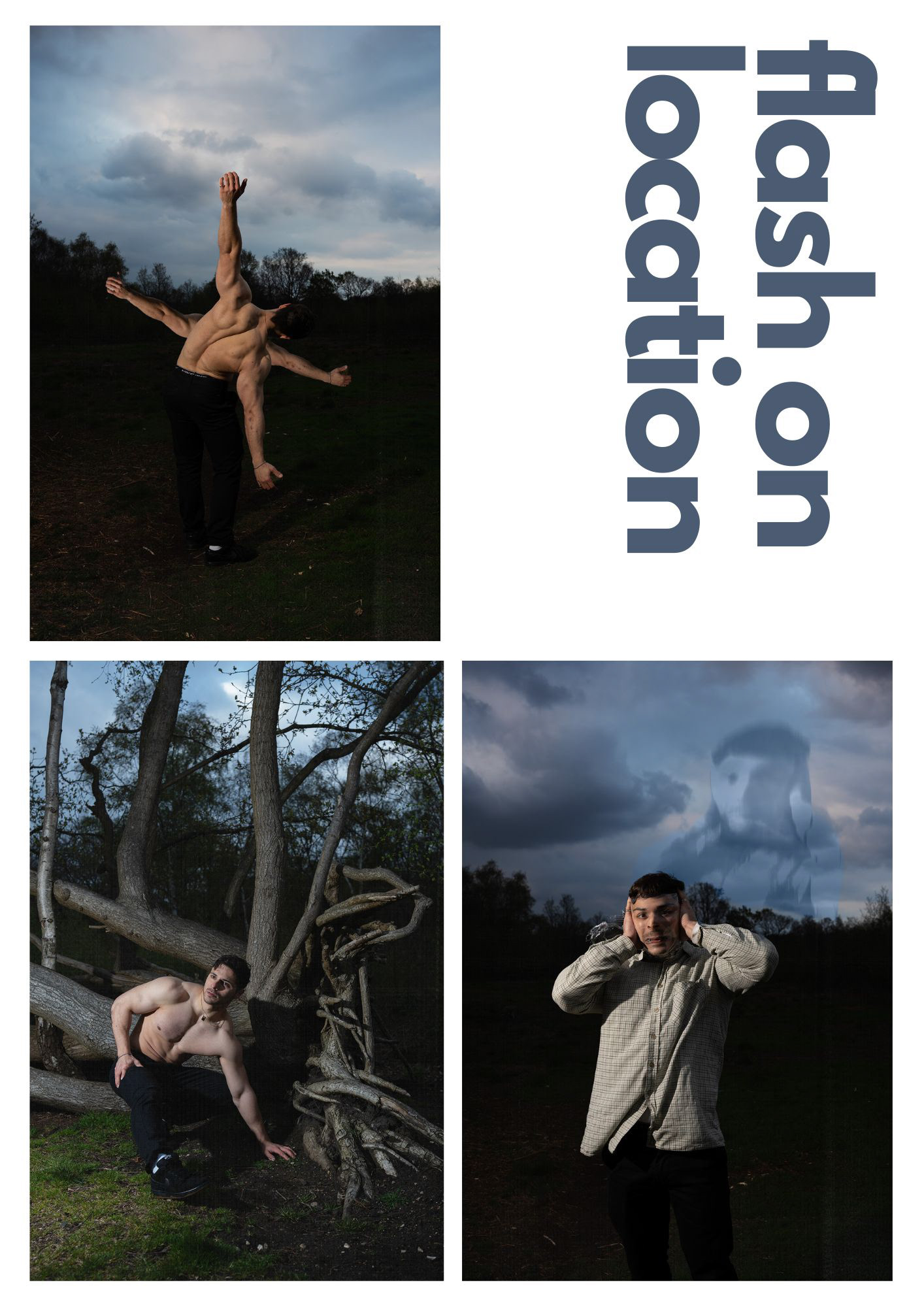
• Flash on Location x 3
style:
where:
who:
inspiration:
equipment:
• Portrait on a landscape x 3
style:
where:
who:
inspiration:
equipment:
• Landscape Image x 3
style:
where:
who:
inspiration:
equipment:
RESEARCH
● Use the research guide on Aula to analyse at least 5 photographers who sell prints and explain why you are drawn to their work and how you can syntheses their work into your own.
● Full project development, including previsualises, lighting plans, shoot plans and ongoing diary posts.
● Evidence of testing.
INSPIRATION
Ask how other photographers have used:
● Lighting
● Composition
● Casting of models
● Colour grading
● Sequencing of images
● Use of photographic techniques and equipment
● And look for inspiration outside of photography too
Ask how other photographers have used:
● Lighting
● Composition
● Casting of models
● Colour grading
● Sequencing of images
● Use of photographic techniques and equipment
● And look for inspiration outside of photography too
PLAN
● Pre-visualise your images using the layout provided
● Lighting diagram
● Equipment List
● Props being used
● Mood board
● List all external professionals participating in the form of a Call Sheet
● An estimate for the job
● A final invoice for the job
● Lighting diagram
● Equipment List
● Props being used
● Mood board
● List all external professionals participating in the form of a Call Sheet
● An estimate for the job
● A final invoice for the job
ANALYSIS
● What worked?
● What didn’t work?
● What would you do differently next time?
● What worked?
● What didn’t work?
● What would you do differently next time?
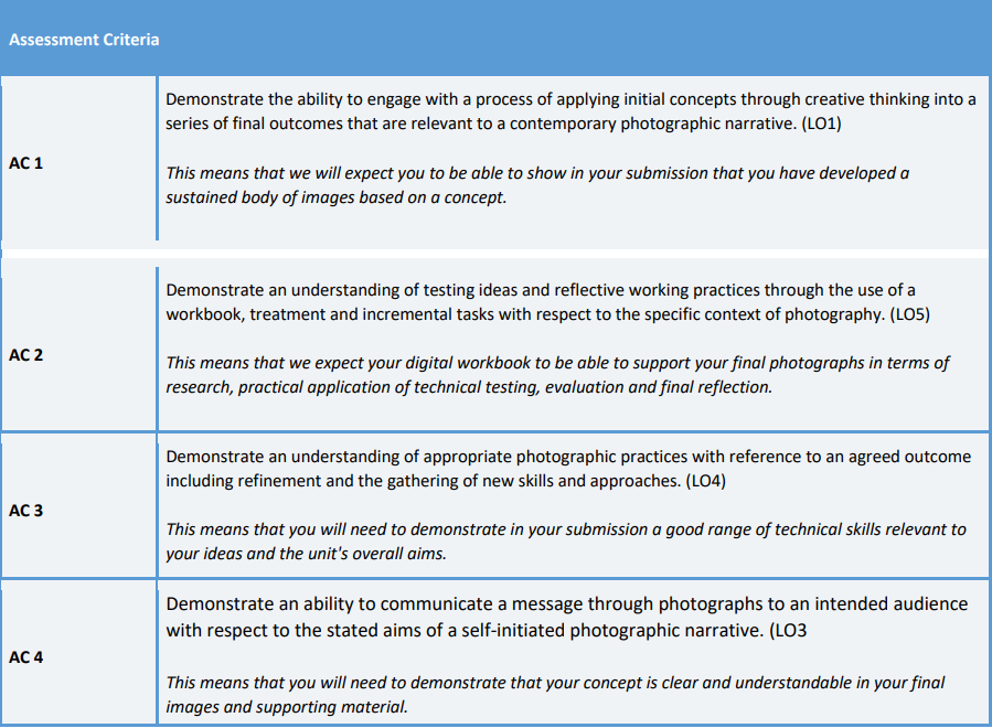
The Five Principles underpin the Mindsets and Skill Sets Manifesto and are the foundation upon which all course curriculum frameworks and unit specifications are based.
The relevant Principles as stated below have been mapped against the Learning
Outcomes relevant to each course unit and at each level (see Programme Specifications for full description of the Five Principles):
Outcomes relevant to each course unit and at each level (see Programme Specifications for full description of the Five Principles):
1. Cultivate / Where the individual thrives.
2. Collaborate / Where disciplines combine and evolve.
3. Integrate / Where education engages industry.
4. Advocate / Where purpose meets practice.
5. Originate / Where enquiry informs creativity.
2. Collaborate / Where disciplines combine and evolve.
3. Integrate / Where education engages industry.
4. Advocate / Where purpose meets practice.
5. Originate / Where enquiry informs creativity.
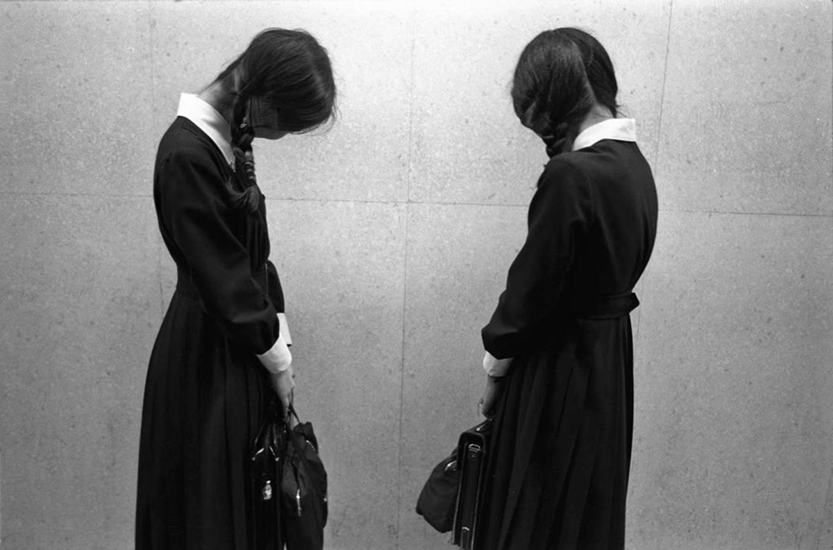
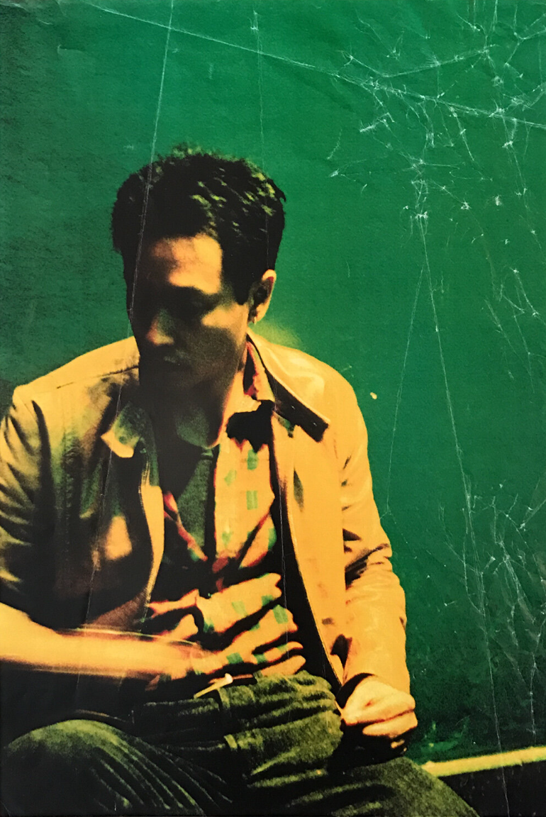
TYPES OF FLASH EXAMPLES
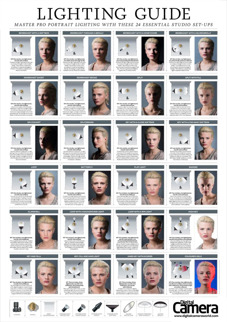
FILL FLASH

5 PHOTOGRAPHERS
Use the research guide on Aula to analyse at least 5 photographers who sell prints and explain why you are drawn to their work and how you can syntheses their work into your own.
This unit I aim to thoroughly conduct research on 5 photographers to establishing what their photographs mean to me personally and what themes are conveyed to me as the viewer. I believe following my inspirations without having a preconceived idea of what to photograph will lead me outside my comfort zone creatively.
I believe by doing this I will push myself further as a photographer by expanding outside what I already know and also exploring new areas which may excite and reignite my creativity.
GREG GIRARD
RINEKE DIJKSTRA

"Rineke Dijkstra (b. 1959), one of the most highly regarded Dutch artists, received international recognition in the early 90's for her eloquent portrait series of teenagers and young adults. The exploration of identity remains central to her powerful images of adolescents, clubbers, soldiers, emigrants, schoolchildren or toreadors. Dijkstra often accompanies her models over years to enable an emotional relationship and trust which lead to a specific intimacy and naturalness in her photographs and films. In both moving and still images, Dijkstra's images evidence an intense concentration."
‘As an artist, Dijkstra has a patience and sympathy for the people in her pictures, an ability to look carefully at them and to represent what she finds; she shows us their complexities without sentiment and without minimizing the uncertainty, even the traumas they may face. And what she finds are not moral lessons [...] Instead, what we see when we take the time to look at her pictures are the imperfections and the particular grace she finds in ordinary people, especially in the young. Because of their size and their intimacy, her pictures present these moments of insight, glances at what is beautiful and vulnerable, and ask that we see, remember and understand - even that we cherish these moments, because they will disappear.’
Sandra S. Phillips, Twenty Years of Looking at People in Rineke Dijkstra: A Retrospective, Guggenheim Museum Publications, 2012
source: https://www.maxhetzler.com/artists/rineke-dijkstra
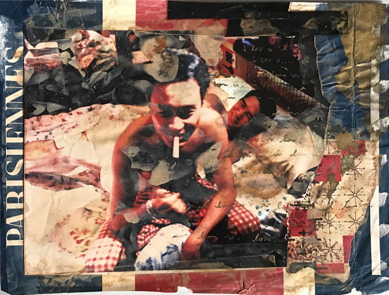
COURSE WORKSHOPS / INSPO / SHOOTS
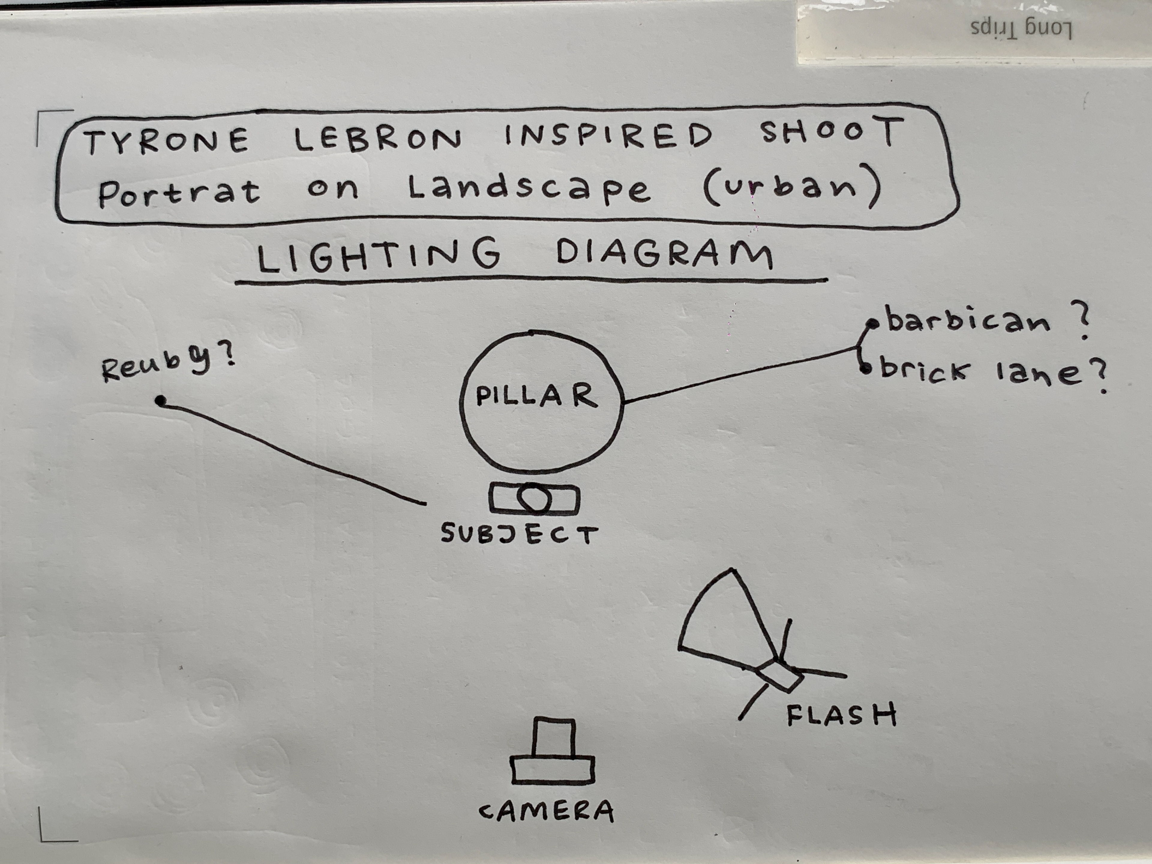
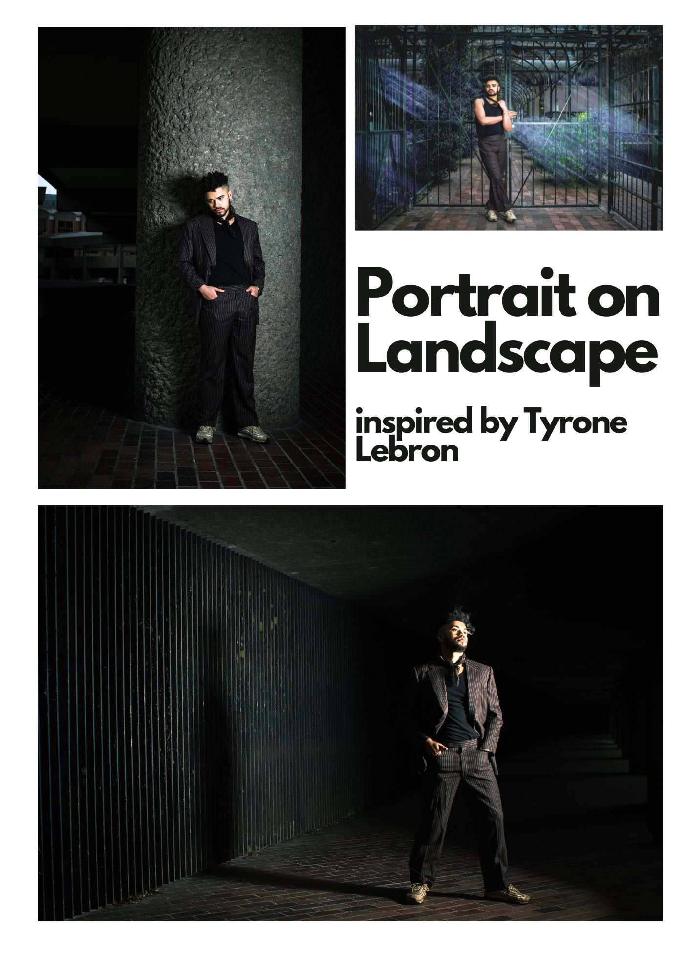
PORTRAIT ON LANDSCAPE

TYRONE LEBRON
"The street photographer capturing London with his uniquely candid vision"
Strongly influenced by his own home city, Tyrone began filming documentaries at an early age (his first one was aired on MTV when he was only 18) and he has since gone on to shoot editorials and campaigns for brands like Louis Vuitton, Loewe, Supreme and Nike. Through his hazy, evocative portraits, Tyrone encapsulates the very essence of London – an ability he first demonstrated with his work for Mount Kimbie, creating the sun-stained, candid artwork for their debut album Crooks & Lovers as well as directing the band’s first three videos. Whether shooting in dim light or bright sunshine, Tyrone’s work captures glimpses of daydreams, young love and late-night bus journeys home, shedding light on the fleeting, romantic moments in a busy big-city life.
source: https://www.dazeddigital.com/photography/article/16361/1/tyrone-lebon
I found these images whilst browsing through Burberry's instagram and was very drawn to them.
Context of the image
1. A short text about where the photographer or photoshoot is from.
Tyrone Lebron was born and raised in London and this specific photoshoot was done for a Burberry campaign.
2. How does the photographer work? I.E., do they work with fashion or music?
Tyone Lebron works within fashion, documentary, film and multiple different aspects of the creative scene in London - he is quite renowned.
3. Where is their work featured, or where or who do they work for?
Tyrone Lebron runs his own photography organisation called DoBeDo which facilitates exhibitions, publishes books, and hosts ‘Reely and Truly’ short film screenings.
He has also worked with multiple brands such as Miu Miu, Bottega Veneta, Calvin Klein, and Louis Vuitton.
How is the image made?
1. What camera do you think is used? (35mm, Medium format? What type of lens?)
I think the top 3 images were taken on a digital camera whilst the bottom one looks more like film.
"I'm a camera geek and part of my process is to use a range of cameras from a large format 10x8 plate camera to a grainy half frame. They each have a different feel, and because they each also have a different process, they each help make a different type of image. So the more, the better."
2. Is it a studio image or shot on location?
Location
3. Was a flash used or natural lighting?
Flash
4. Is it a film or a digital image? If so, how is this expressed in the image?
I think it's a mixture of both. The detail on the first three are so much sharper than the grainy ness of the bottom photo.
5. What models are in the image, and how are they posed?
There are different models in each image and the majority of them are posed face on, positioned very low down in the frame.
6. How is the image composed? What about the composition makes it striking?
The way the flash strikes the subject so harshly but fades away like a gradient almost makes the monument feel like its part of the subject. This makes the subject look very blended with the environment.
7. Is the image very clear, or is it slightly out of focus?
Very clear.
How is the image graded?
1. What tones are in the image? (i.e. heavy even tones? high contrast?)
Very even tones with high contrast.
2. What sort of colour is it? (i.e., highly saturated or unsaturated? Warm or cool tones?)
Mild saturation with warm tones.
3. Is the image very clean or edited to appear older?
I would say its quite clean.
4. Is there any texture to the image that makes it unique?
The texture of the monument juxtaposed to the subject wearing the burberry coat in a similar shade makes for a very interesting and coherent blend of textures.
Self-reflection
1. Talk here about how the image caught your eye and how you will use all the points above to improve your work.
- Experiment with different cameras and mediums. e.g. digital and film (if possible)
- Pose the subject in front of a pillar-like structure.
- Use interesting textures in the background.
- Harsh flash with dark background.
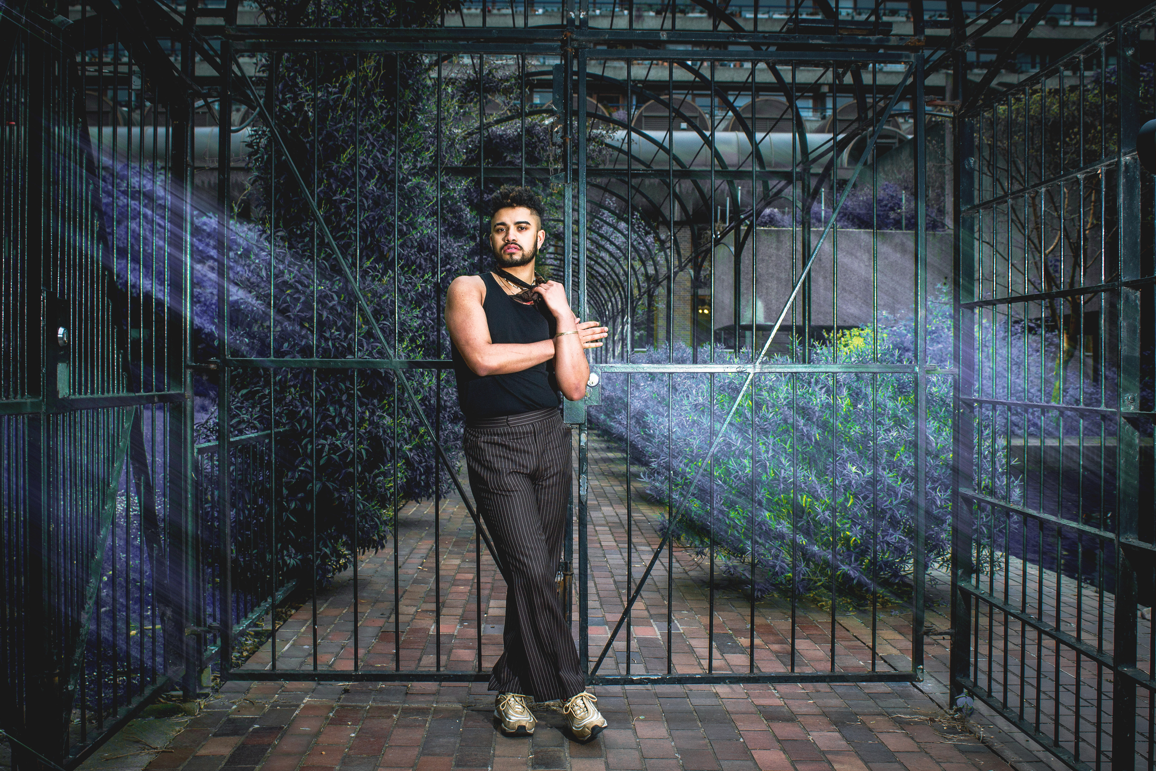
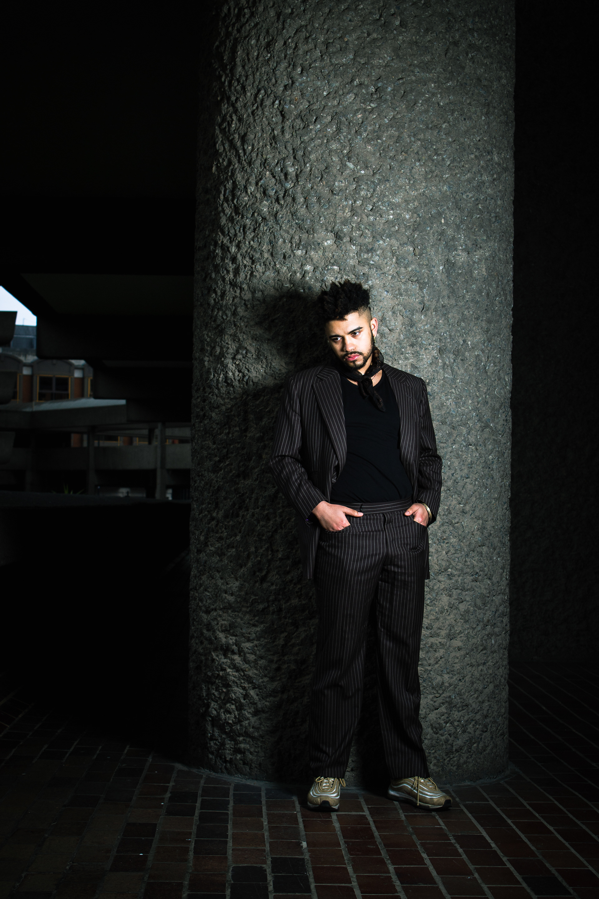
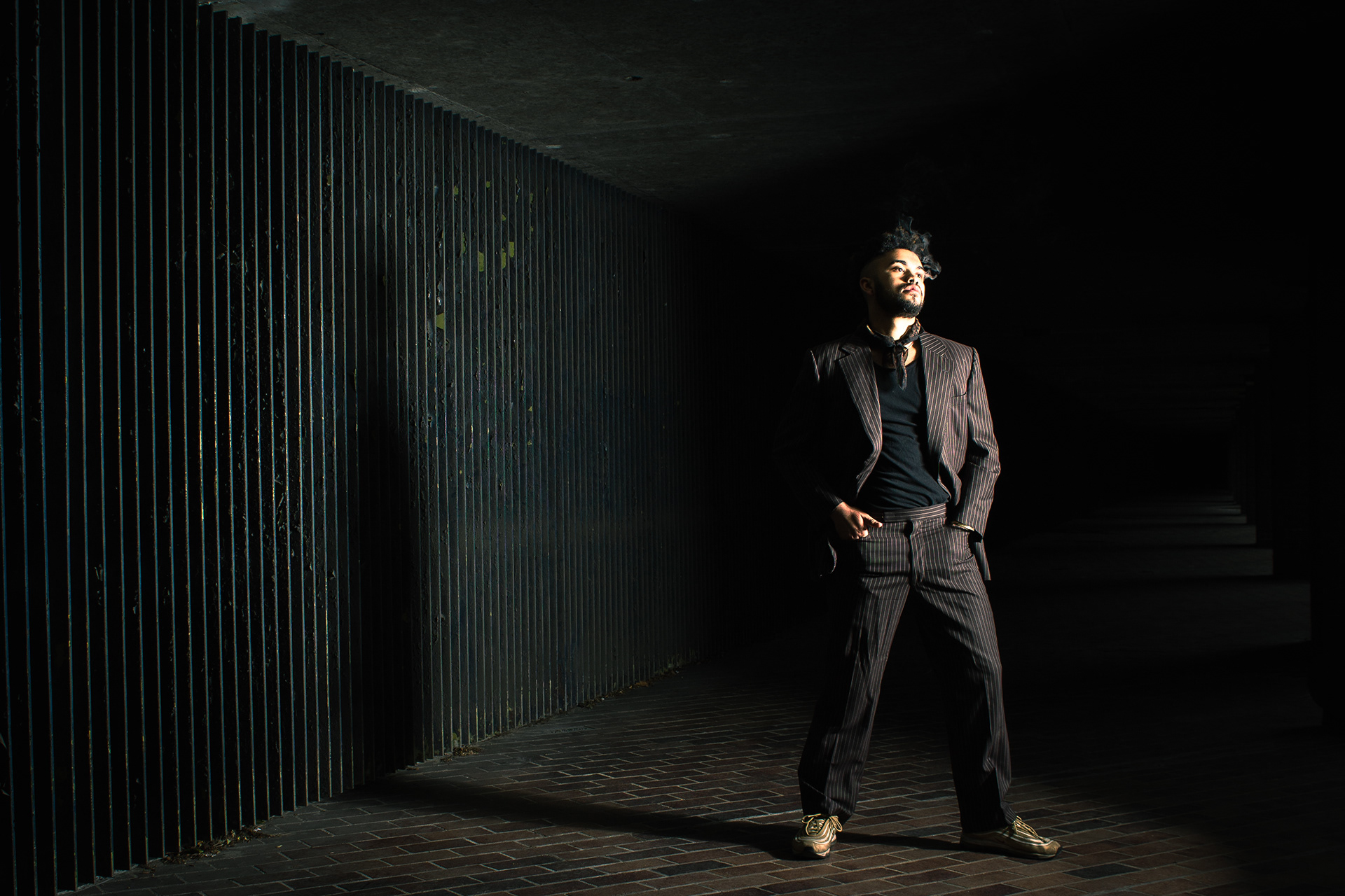
PLANNING
FINAL RESULTS
REFLECTION:
Overall, I was very happy with how the shoot went and how my final images turned out. I'm happy with the styling and different composition techniques used as well. I think I learned a lot from Tyrone Lebron which I was able to employ during and after my shoot in post-production.
To improve I would have liked to have spent more time in post production to play with the black space and add textures and/or light motion blur.
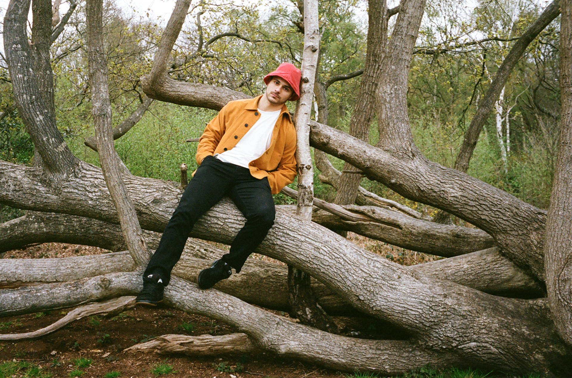
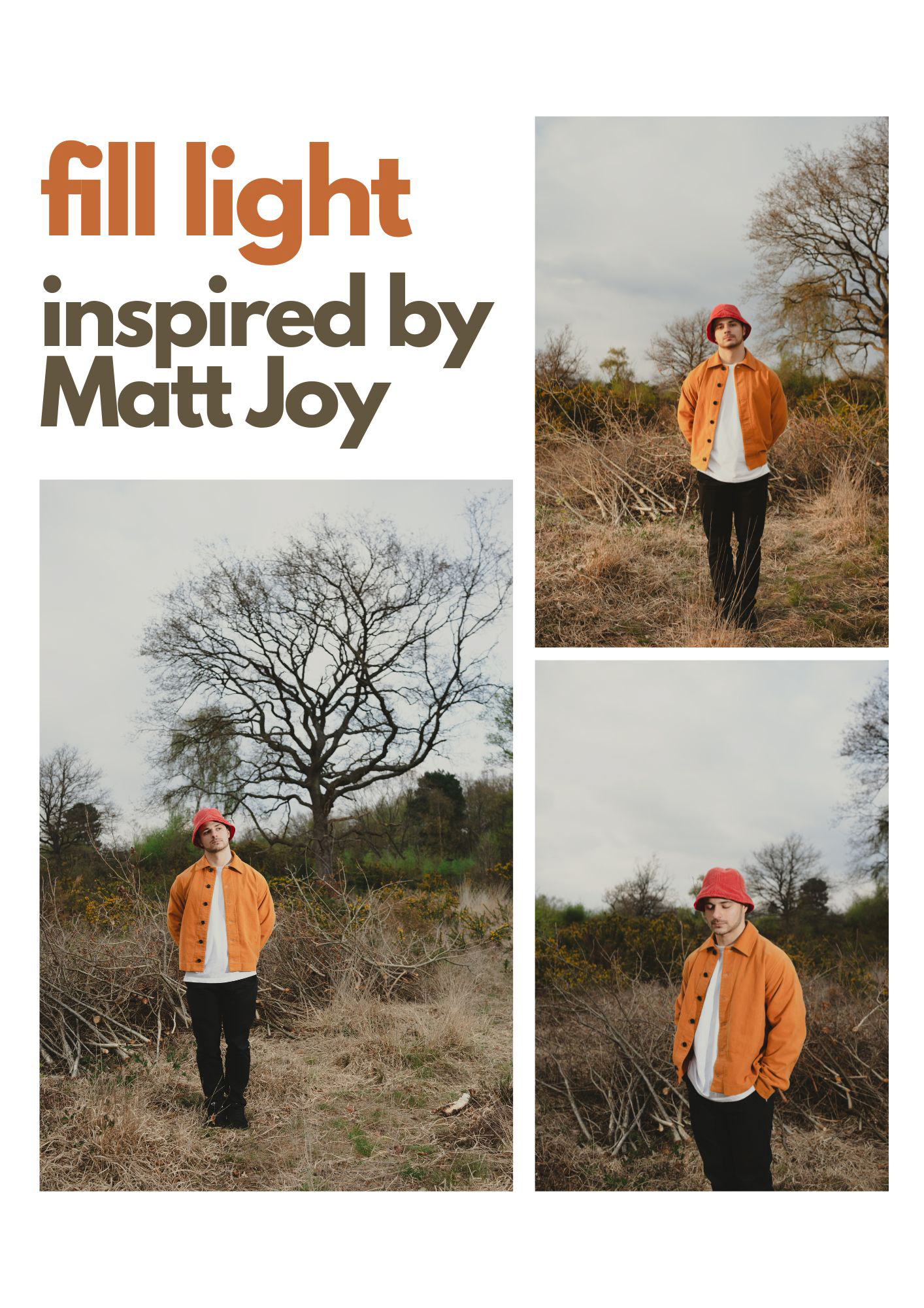
FILL FLASH
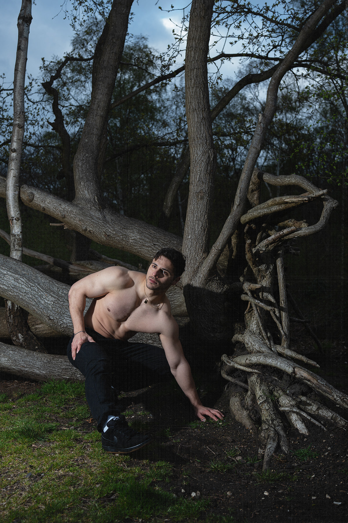
I unfortunately did not make any notes during the workshop on fill flash photography. I will be analysing the photography of Matt Joy to gain inspiration and knowledge on how to conduct my shoot.
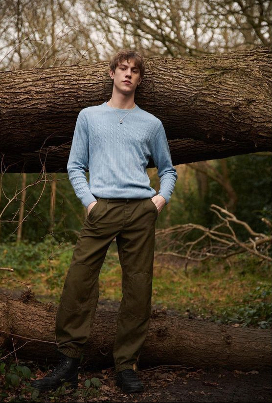
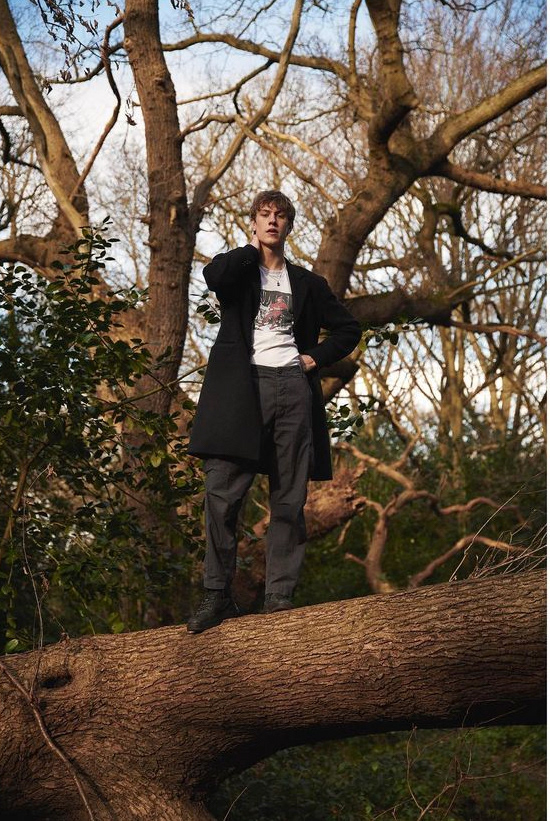
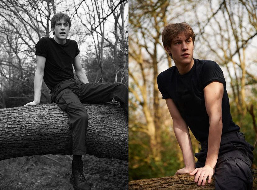
Matt is a London based fashion, portrait and documentary photographer.
Originally from Bradford, West Yorkshire, Matt’s love for photography began at the age of 16 after buying a second hand SLR camera with the money from his Saturday job. This one time hobby turned to a professional vocation after studying photography at Norwich University of the Arts, followed by 6 years in London assisting some of the industry’s most prominent fashion photographers.
Matt’s passion for photographing people is where it all started, and his style ranges from reportage documentary to fashion editorial; as long as there’s a person in the frame he’s happy.
Context of the image
1. A short text about where the photographer or photoshoot is from.
Matt Joy is a London based fashion, portrait and documentary photographer originally from Bradford. The shoot is from a project where he portrayed various artists in London. The model portrayed is a "south west London lad with a passion for music and sound production.".
2. How does the photographer work? I.E., do they work with fashion or music?
Matt Joy works within fashion, portraits and documentary photography.
3. Where is their work featured, or where or who do they work for?
The majority of his work is featured on various portfolio pages on Instagram and on his website, https://www.mattjoyphoto.com/
How is the image made?
1. What camera do you think is used? (35mm, Medium format? What type of lens?)
I think this was shot digitally.
2. Is it a studio image or shot on location?
Shot on location
3. Was a flash used or natural lighting?
Flash and natural lighting.
4. Is it a film or a digital image? If so, how is this expressed in the image?
Digital, I can tell my the high detail on the tree branches.
5. What models are in the image, and how are they posed?
The model is a London based sound producer and he's posed around a tree. Sometimes standing on it.
6. How is the image composed? What about the composition makes it striking?
The first image is my favourite one composition wise because the tree creates a perfect background for the portrait shot and almost works as a guiding line to remove any distractions behind the subject.
7. Is the image very clear, or is it slightly out of focus?
Clear.
How is the image graded?
1. What tones are in the image? (i.e. heavy even tones? high contrast?)
Very high contrast with lots of detail.
2. What sort of colour is it? (i.e., highly saturated or unsaturated? Warm or cool tones?)
One is black and white, the others are mildly saturated with warm tones.
3. Is the image very clean or edited to appear older?
Very clean.
4. Is there any texture to the image that makes it unique?
No
Self-reflection
1. Talk here about how the image caught your eye and how you will use all the points above to improve your work.
The first image caught my eye because of the colours in contrast to the natural environment. I went to do something similar where I style the subject in very colourful attire which contrasts to the raw natural tones of the forest. I'm not sure where to conduct this shoot yet but I will update my workbook to include more information.
PLANNING
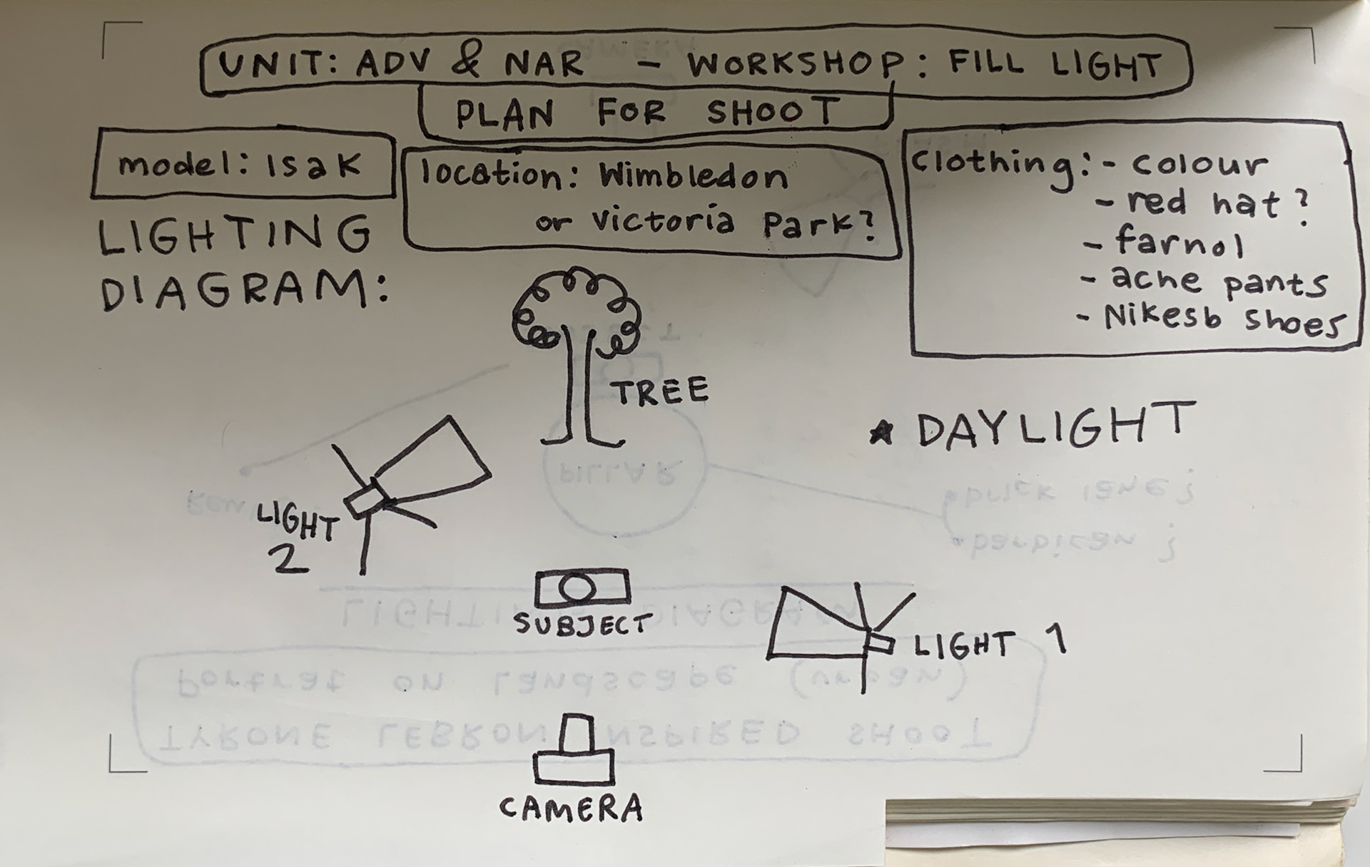
Some behind the scenes photos taken on Portra 400 35mm film.


FINAL RESULTS
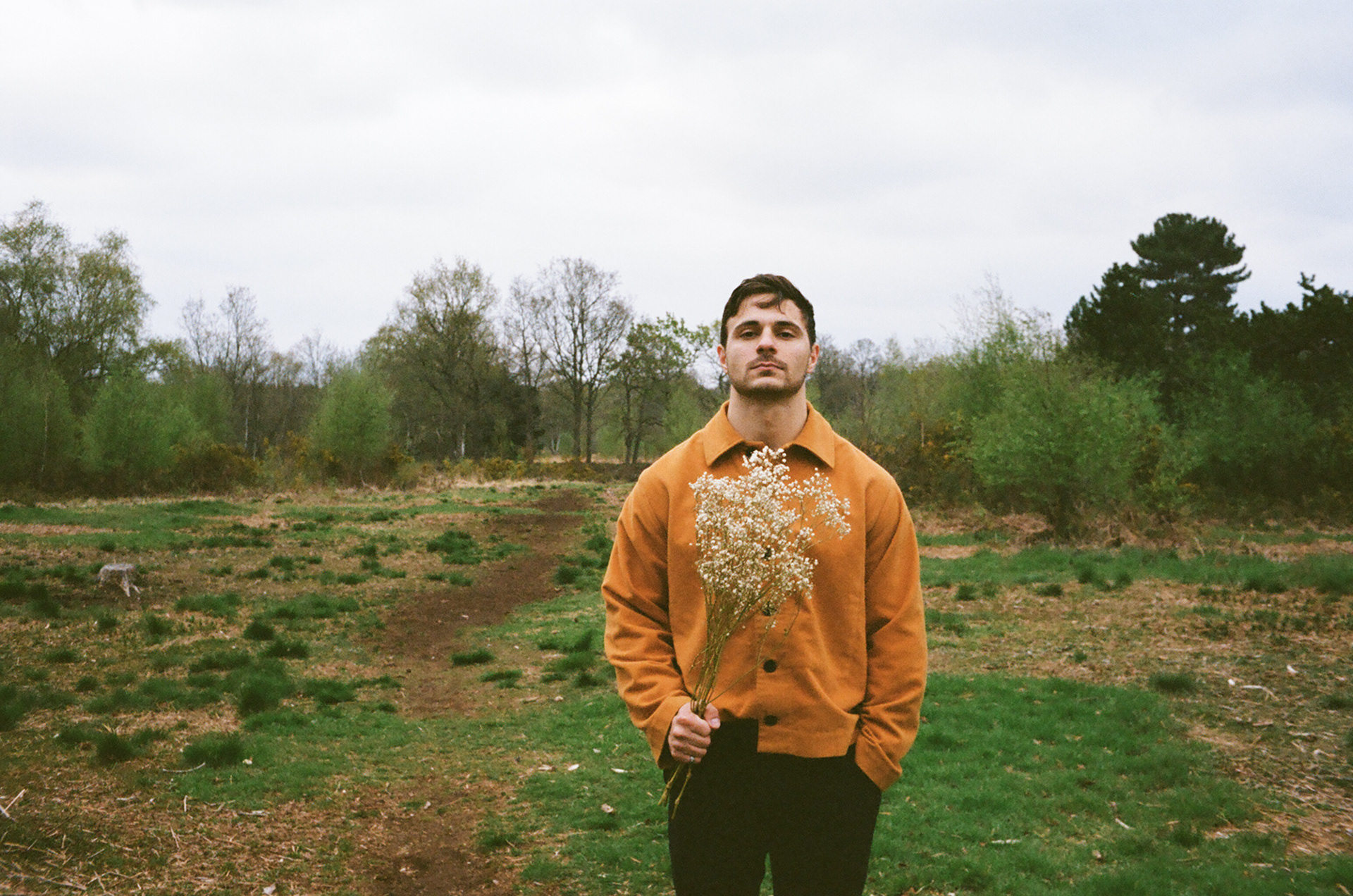
REFLECTION: Rather than casting the light on the tree I chose to lay down a bunch of branches found around the Wimbledon Commons which I instead cast my second light on. Overall, I'm very happy with the results, especially the colour of the jacket and how it blend in with the natural landscape.
To improve I would've like to style the shoot better by removing the hat, having a makeup artist on set and achieve more interesting compositions, playing with the guiding lines of trees.
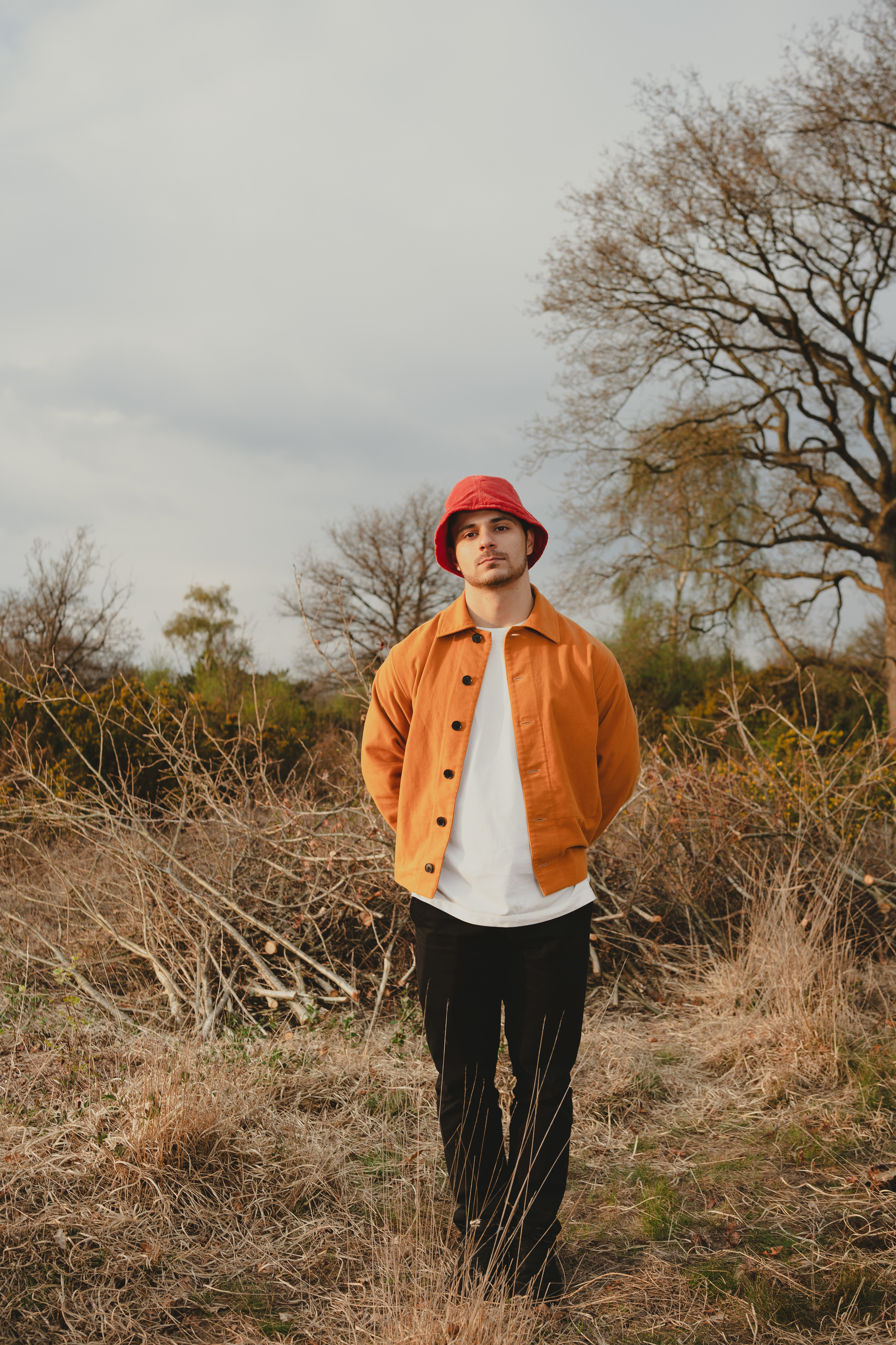
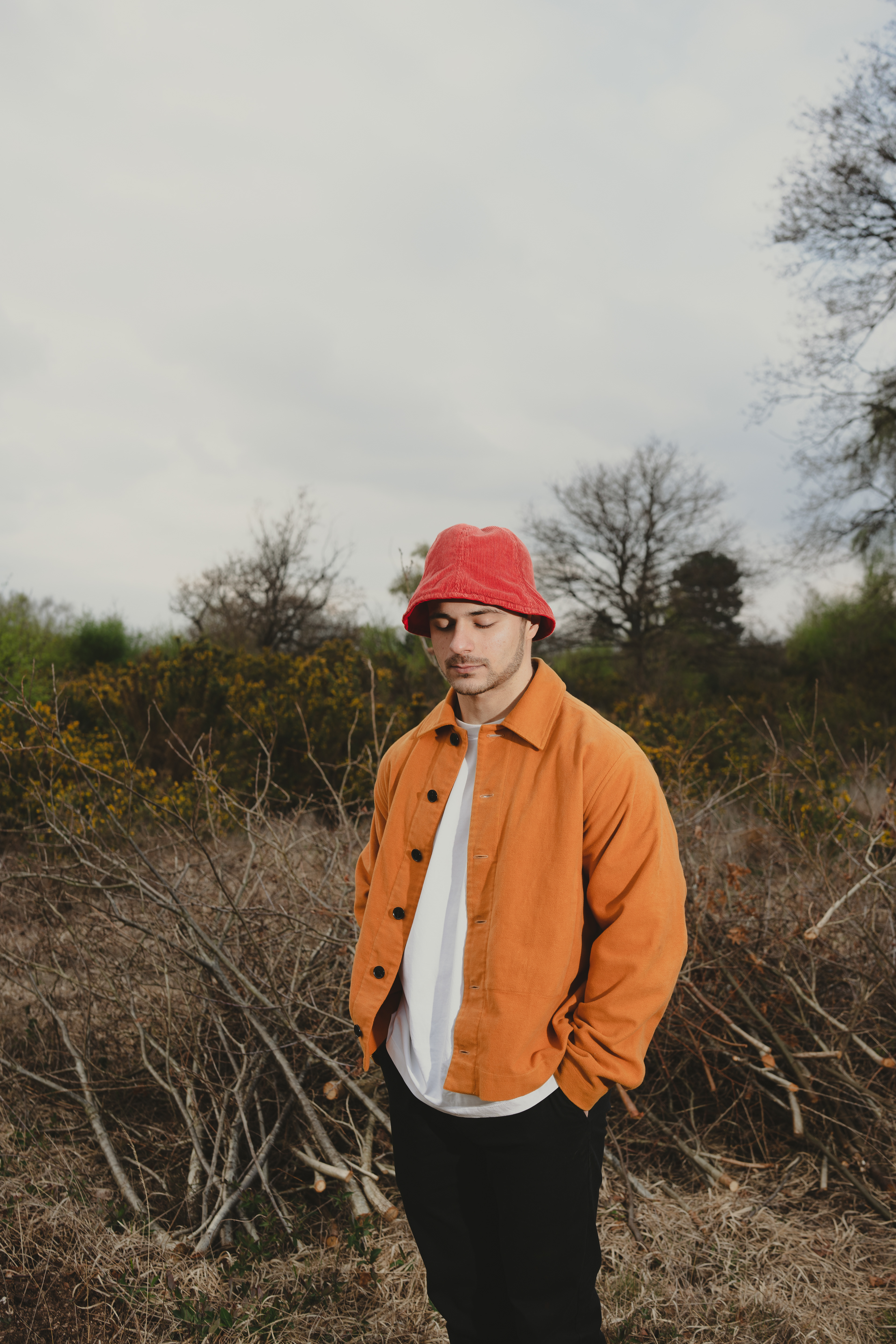
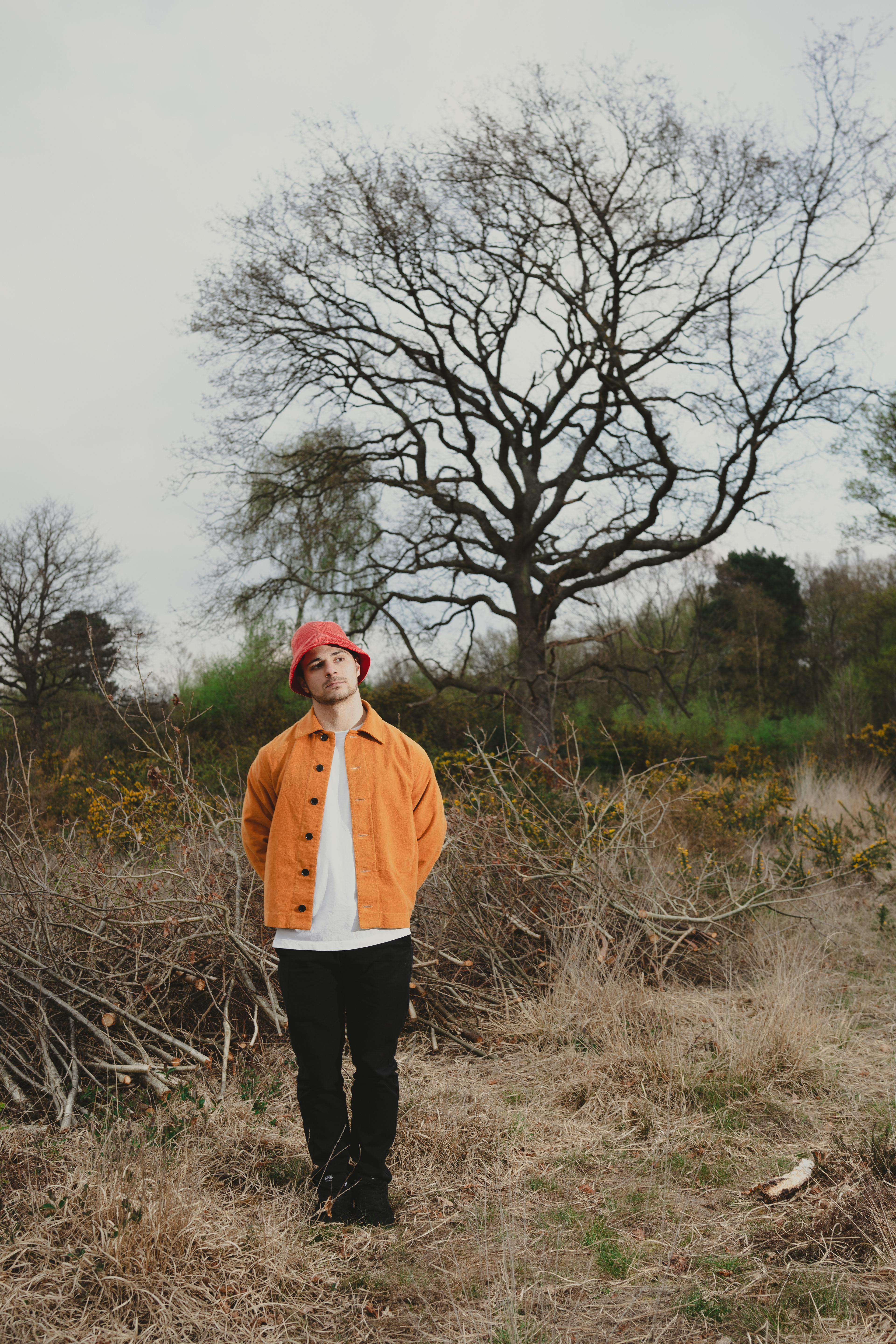
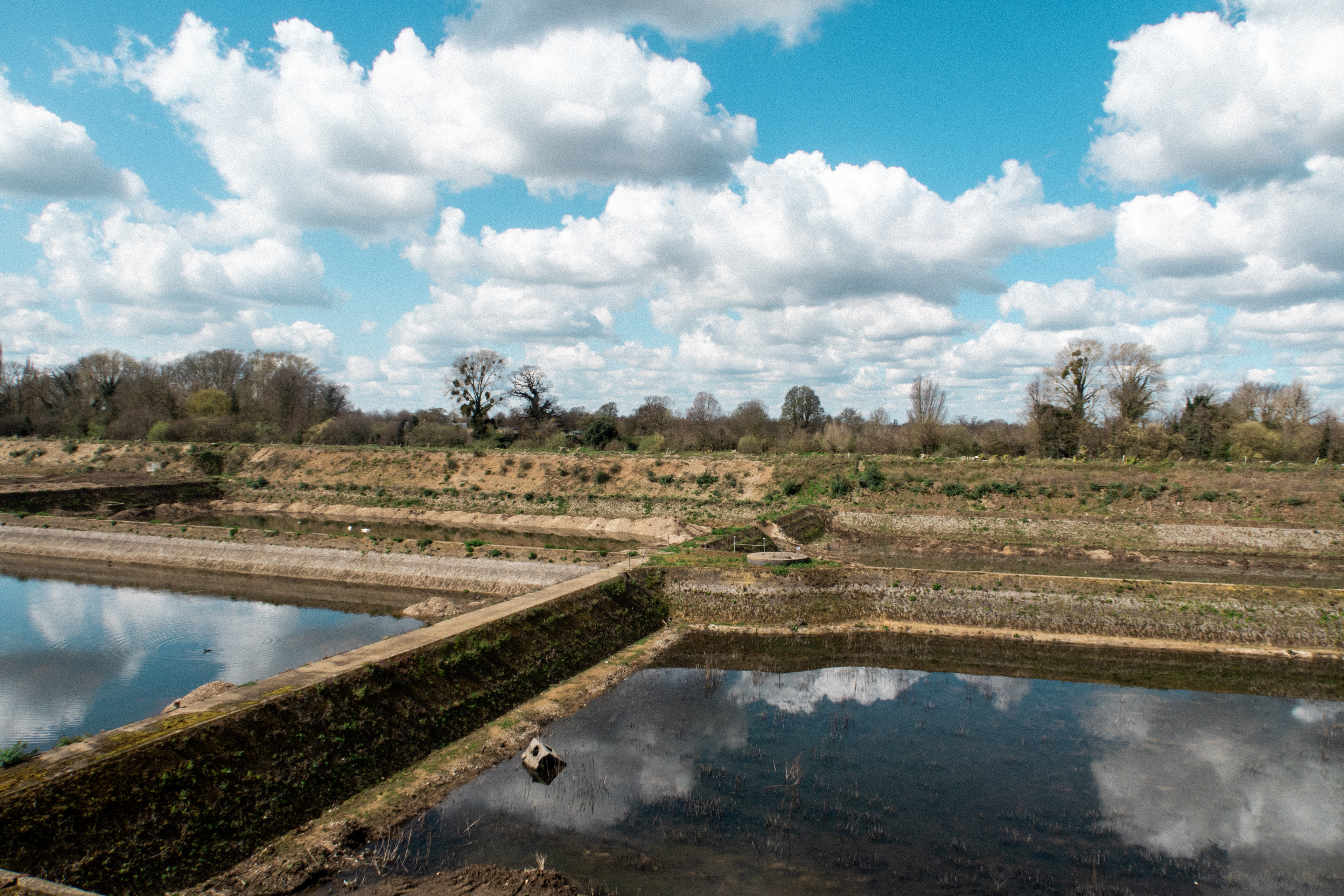
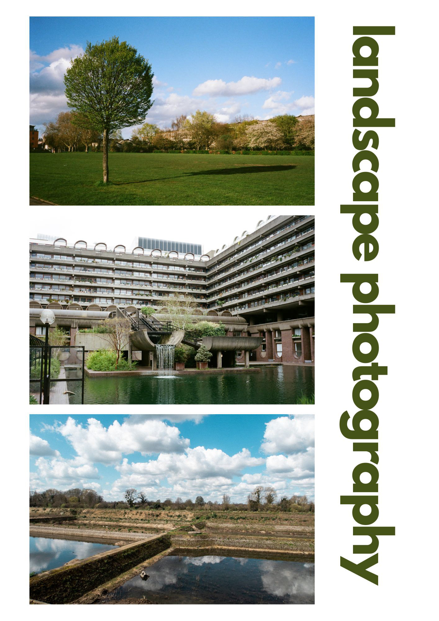
LANDSCAPE PHOTOGRAPHY
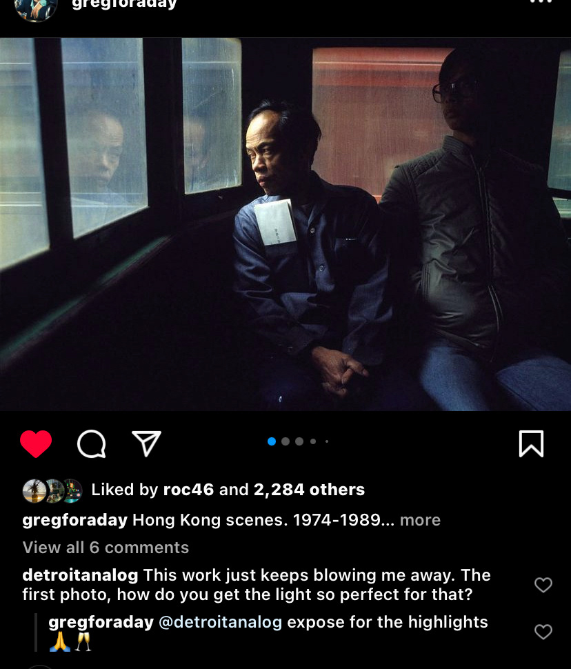
I unfortunately did not make any notes during the workshop on landscape photography as we were mainly looking at images rather than practical work. I will be analysing the landscape photography of Greg Girard and mainly looking at his effective use of film photography.

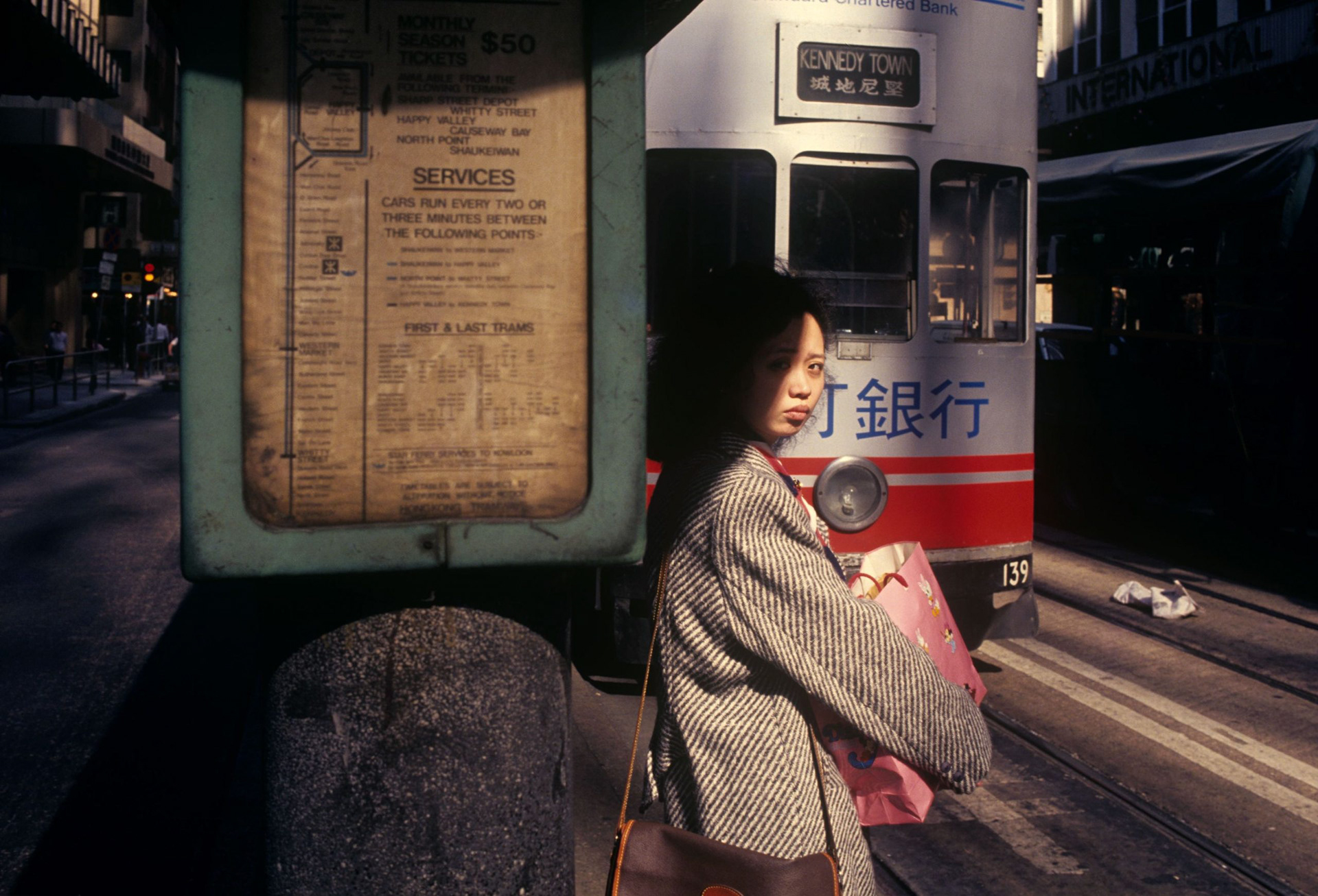
Greg Girard is a renowned landscape photographer whose work captures the essence of urban Asia in all its raw, gritty glory. His images portray the overlooked and hidden corners of cities, exposing the beauty and complexity of their landscapes.
In his iconic series "City of Darkness," Girard offers a fascinating perspective on the Kowloon Walled City in Hong Kong before its demolition. His photographs reveal the densely packed living conditions and narrow alleyways of the city, showcasing the inherent beauty in its seemingly chaotic urban landscape. Girard's use of light and shadow creates a sense of depth and dimension, emphasizing the intricate details and textures of the environment.
Similarly, in "Phantom Shanghai," Girard captures the disappearing architecture and landscapes of the city, showcasing the contrast between the old-world charm of Shanghai's historical buildings and the modern skyscrapers that now dominate its skyline. His images highlight the beauty of the city's traditional architecture, capturing its intricate details and ornate structures. At the same time, they also reveal the dramatic transformation of the city's landscape and the challenges that come with rapid modernization.
Overall, Greg Girard's work in landscape photography offers a unique and captivating perspective on urban Asia, showcasing the beauty and complexity of its landscapes. His photographs reveal the nuances and intricacies of these urban environments, showcasing the beauty and humanity that exists in even the most chaotic and overlooked corners of the city.
Below are some information I found based on going through his instagram.
Below are some additional sources of inspiration:

Greg Girard (born 1955) is a Canadian photographer living in Shanghai since 1998. His
work looks at the physical and social transformations taking place in China and Asia. He divides his time between photographing on assignment for publications such as National Geographic, Time, Fortune, The New York Times Magazine, and others, and pursuing his personal work. While living in Hong Kong between 1983 and 1998 he published “City of Darkness”, co-authored by Ian Lambot, a document of the final years of the Kowloon Walled City. His second book, “Phantom Shanghai” (Magenta, 2007), with an introduction by novelist William Gibson, looks at the homes, streets, shops, buildings and neighborhoods that will not survive the vision that city has for itself. The Independent Newspaper (U.K.) cited Greg Girard’s “Phantom Shanghai” as one of the top ten photography books. Included in the list is Robert Frank’s “The Americans”, “The Devil’s Playground” by Nan Goldin, and “Beneath the Roses” by Gregory Crewdson. His work was recently acquired in a major purchase by the Canadian Museum of Contemporary Photography.
source: https://ocula.com/artists/greg-girard/
MAIN THEMES: Individuality, youth, lifestyle, culture, environmental, poverty, travel, nightlife, portraits etc.
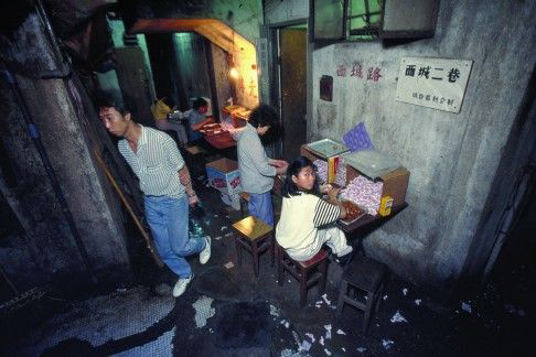
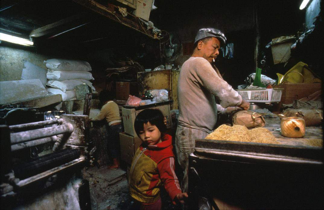
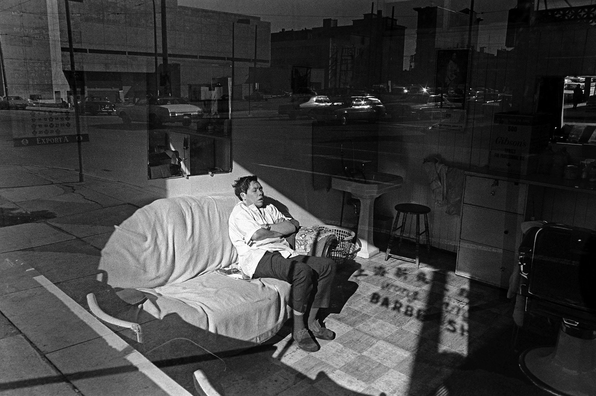
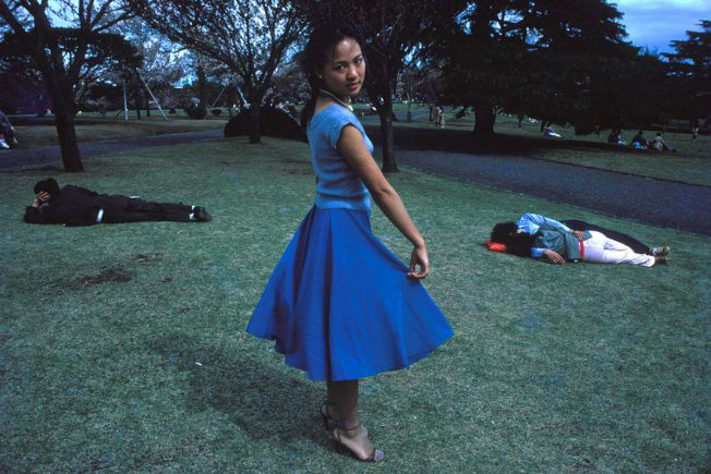
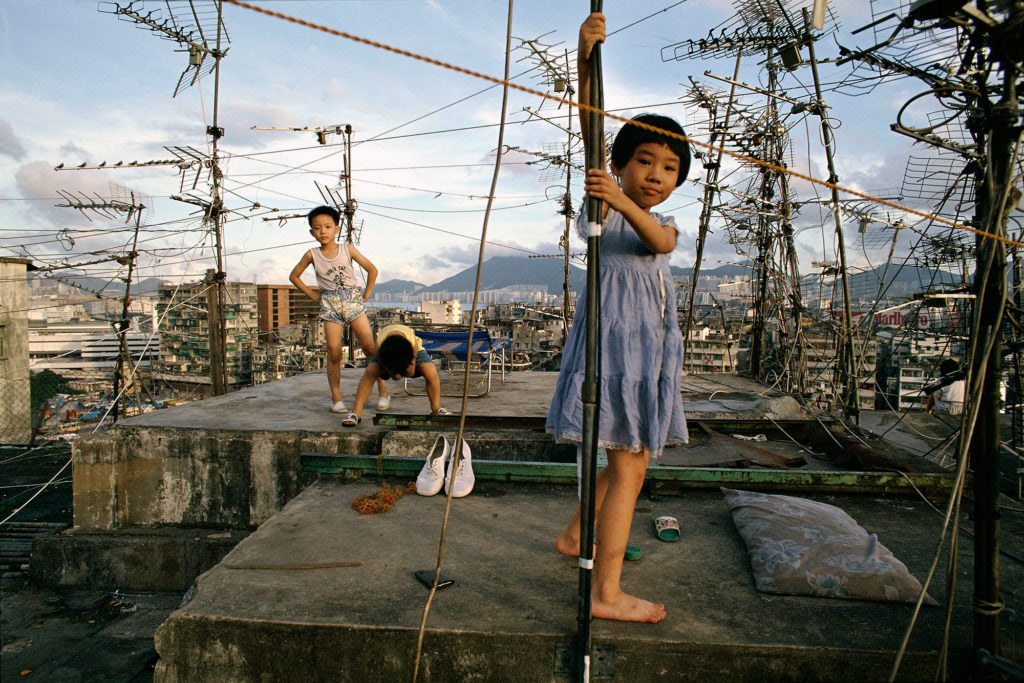
ABOVE: Numbered from top-left to bottom-right (1-8) these are my favourite photographs by Greg Girard.
BELOW: Screenshots taken from Girard's book, "City of Darkness" (1993) featuring Greg Girards photography and Ian Lambot's writing.
Greg Girard has been one of my main sources of inspiration ever since I first discovered his photographic work conducted in a subsection of Hong Kong known as the Kowloon Walled City. This was published in the form of a book in 1993 (while he was living in Hong Kong as a foreign reporter) and ended up becoming a valuable document of time as the city was demolished a few years later.
For me, Girard captures a bonafide perspective mainly due to finding areas which most people would stay away from. For example, a lot of his work is done at night in areas ridden by crime and/or poverty. For the viewer, this offers an interesting insight into different cultures and lifestyles. Interestingly, Girard's work in focused on the east and western parts of the world which naturally provides a raw contrast in cultures as his style remains the same throughout.
in photos (2,3 and 8)
3 images to analyse
Context of the image
1. A short text about where the photographer or photoshoot is from.
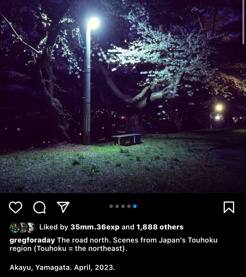
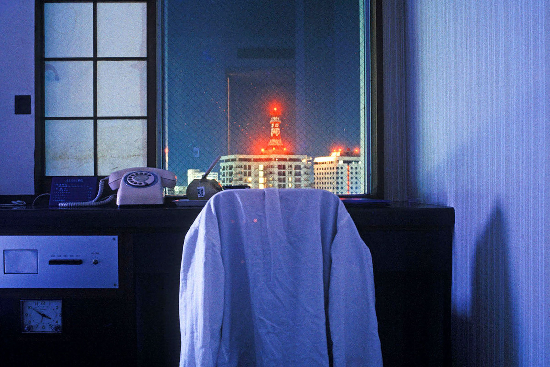
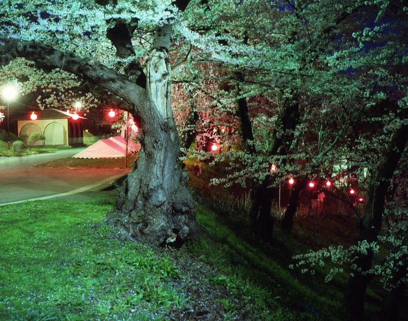
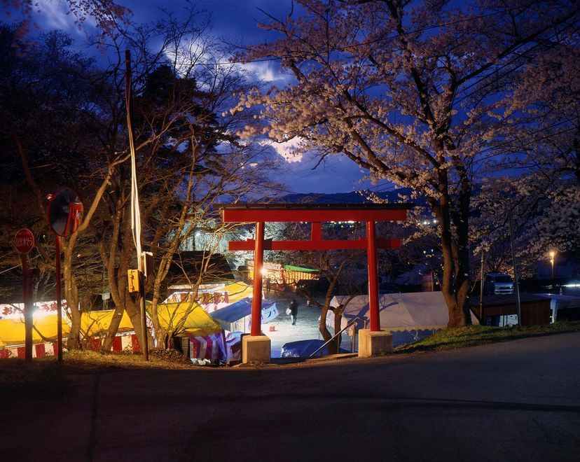
Greg Girard is a Canadian photographer with a background living in Asia. The photos I've chosen were taken in Akayu, Yamagata. April, 2023.
2. How does the photographer work? I.E., do they work with fashion or music?
Started off as a photojournalist and now works independently.
3. Where is their work featured, or where or who do they work for?
Greg Girard works freelance and his work has been displayed in multiple exhibitions. This one was on display at monte clark gallery in Vancouver where he is from.
How is the image made?
1. What camera do you think is used? (35mm, Medium format? What type of lens?)
35mm colour reversal film.
2. Is it a studio image or shot on location?
On location.
3. Was a flash used or natural lighting?
Natural lighting and street lightings.
4. Is it a film or a digital image? If so, how is this expressed in the image?
It's a film image.
5. What models are in the image, and how are they posed?
There are no models.
6. How is the image composed? What about the composition makes it striking?
For me it's the use of artificial street lights juxtaposed to the natural lighting from the sky.
7. Is the image very clear, or is it slightly out of focus?
Very clear.
How is the image graded?
1. What tones are in the image? (i.e. heavy even tones? high contrast?)
High contrast
2. What sort of colour is it? (i.e., highly saturated or unsaturated? Warm or cool tones?)
Highly saturated with cool tones.
3. Is the image very clean or edited to appear older?
No
4. Is there any texture to the image that makes it unique?
No
Self-reflection
1. Talk here about how the image caught your eye and how you will use all the points above to improve your work.
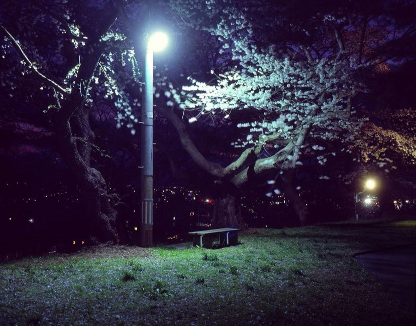
- Focus on trees around london. Try finding one's near street lights preferably.
- Add cool tones and experiment with contrast and saturation.
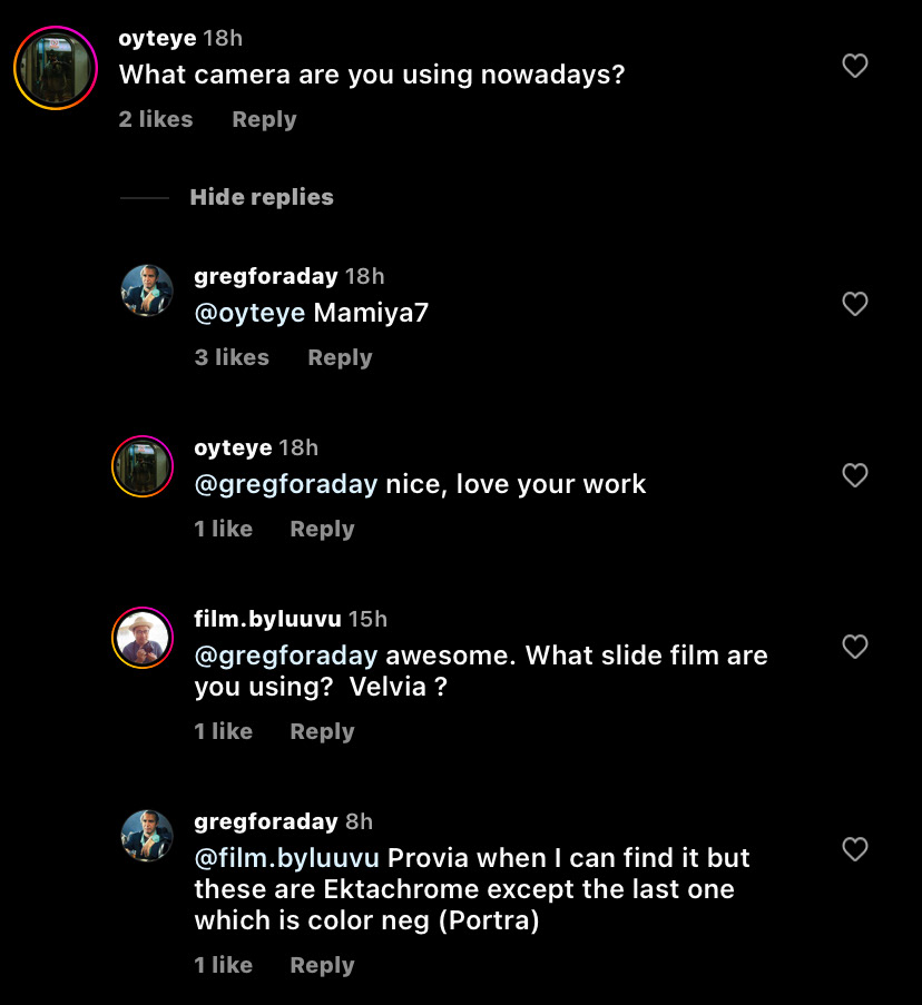
- Shoot on film. Preferably colour reversal film such as Ektachrome.
- Expose camera to the highlights and try get dark shadows.
- Shoot early in the morning or late at night. Not essential.
FINAL RESULTS
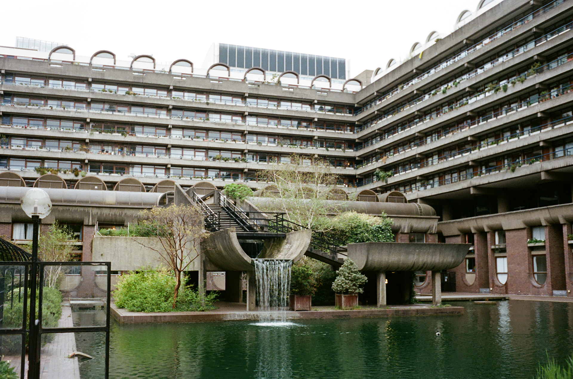
Barbican shot on Portra 400 film.
Weavers Fields in East London shot on Portra 400.
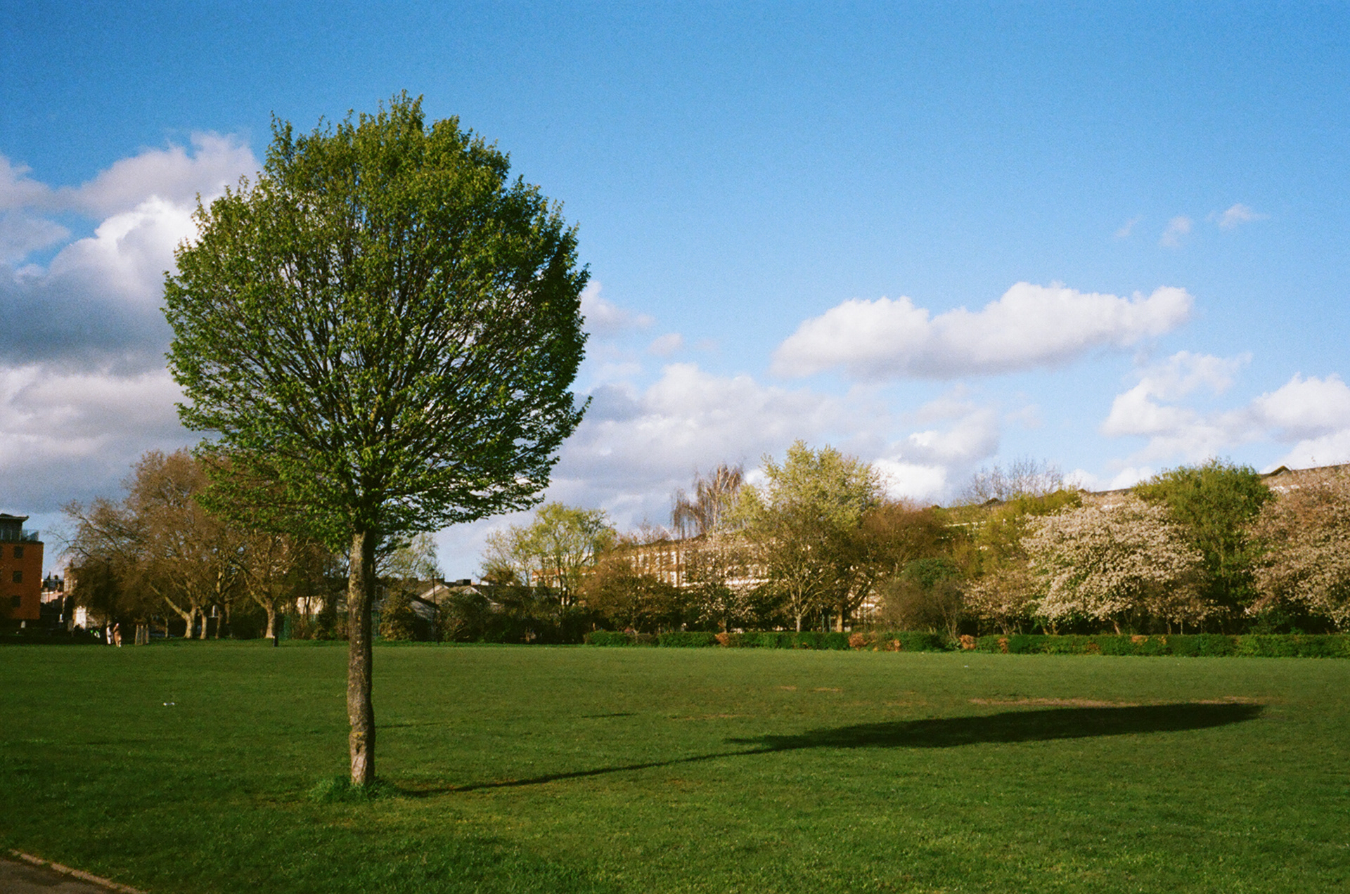
Surbiton shot on Canon G7X.
REFLECTION:
Reflecting back on my landscape photography I'm not quite satisfied with my final images. Like many others, I struggled finding natural landscape in London that haven't been photographed thousands of times. Furthermore, I found it challenging to replicate the mood of Greg Girard's images as most of them are shot in Asia where both the natural and urban landscape is very different.
To improve, I would go to Holland Park and shoot film on my larger Nikon film camera with zoom lense and a tripod. Unfortunately, I left my landscape images to do last and therefore didn't have time to take these opportunities.
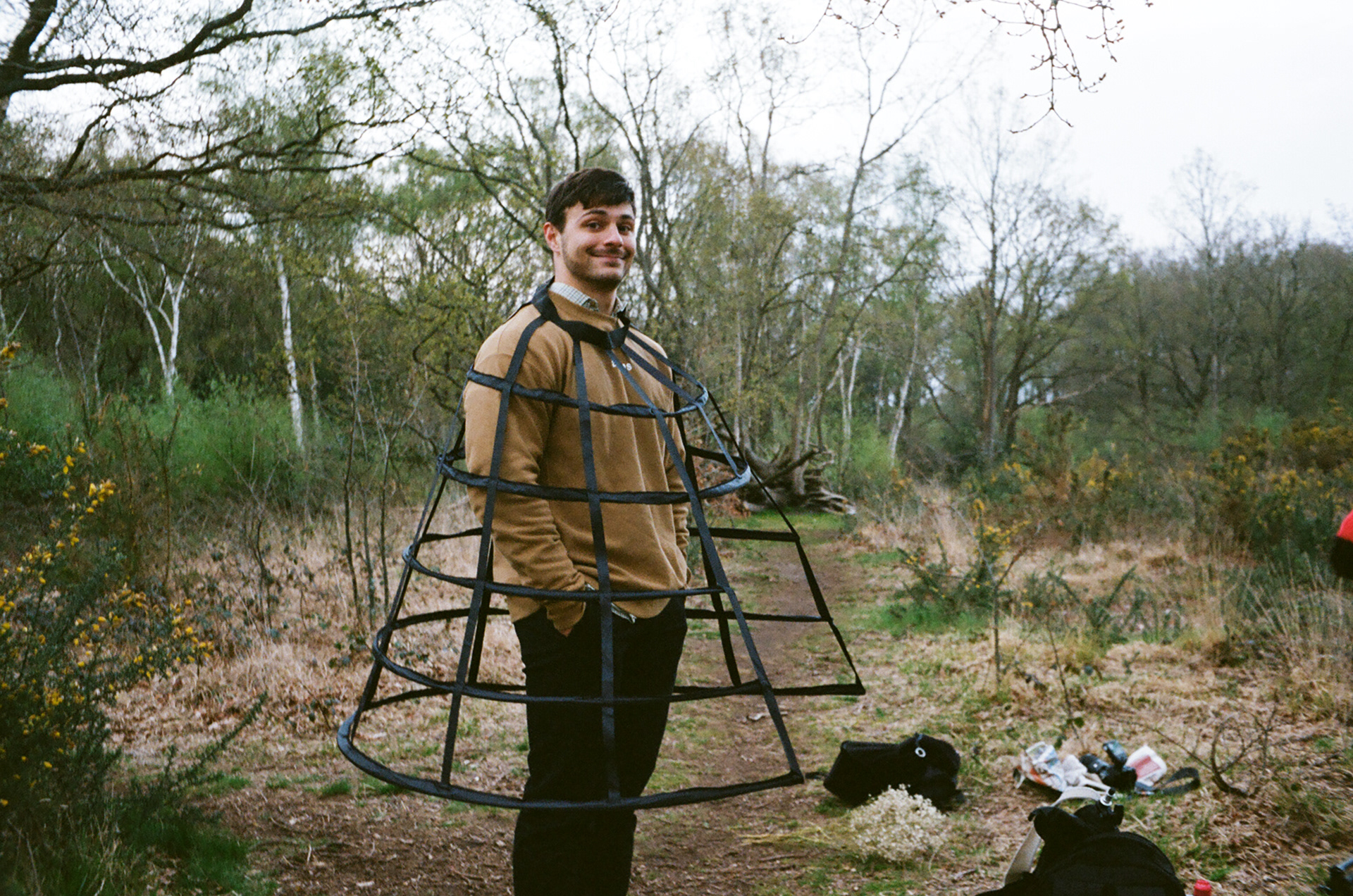
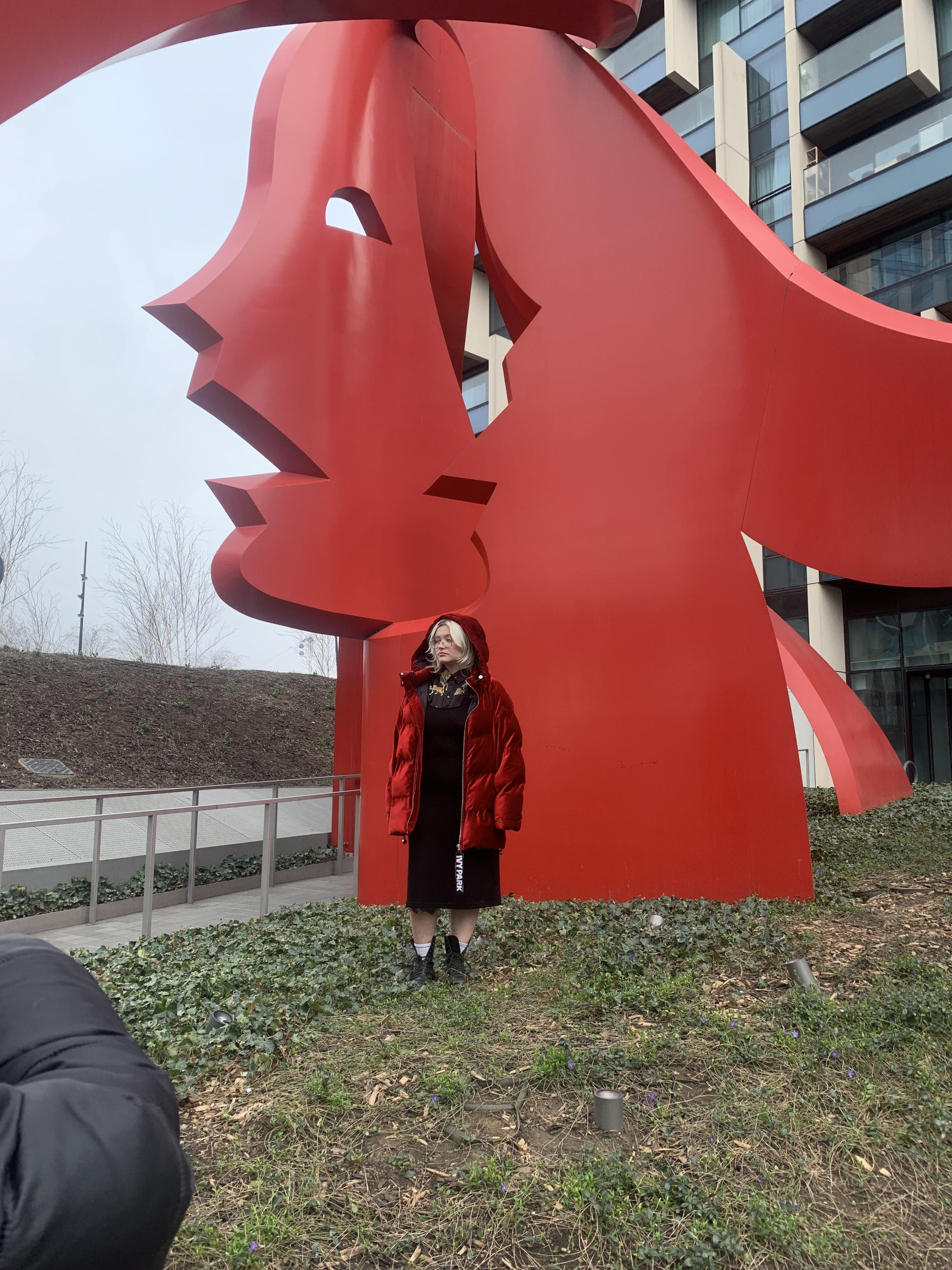
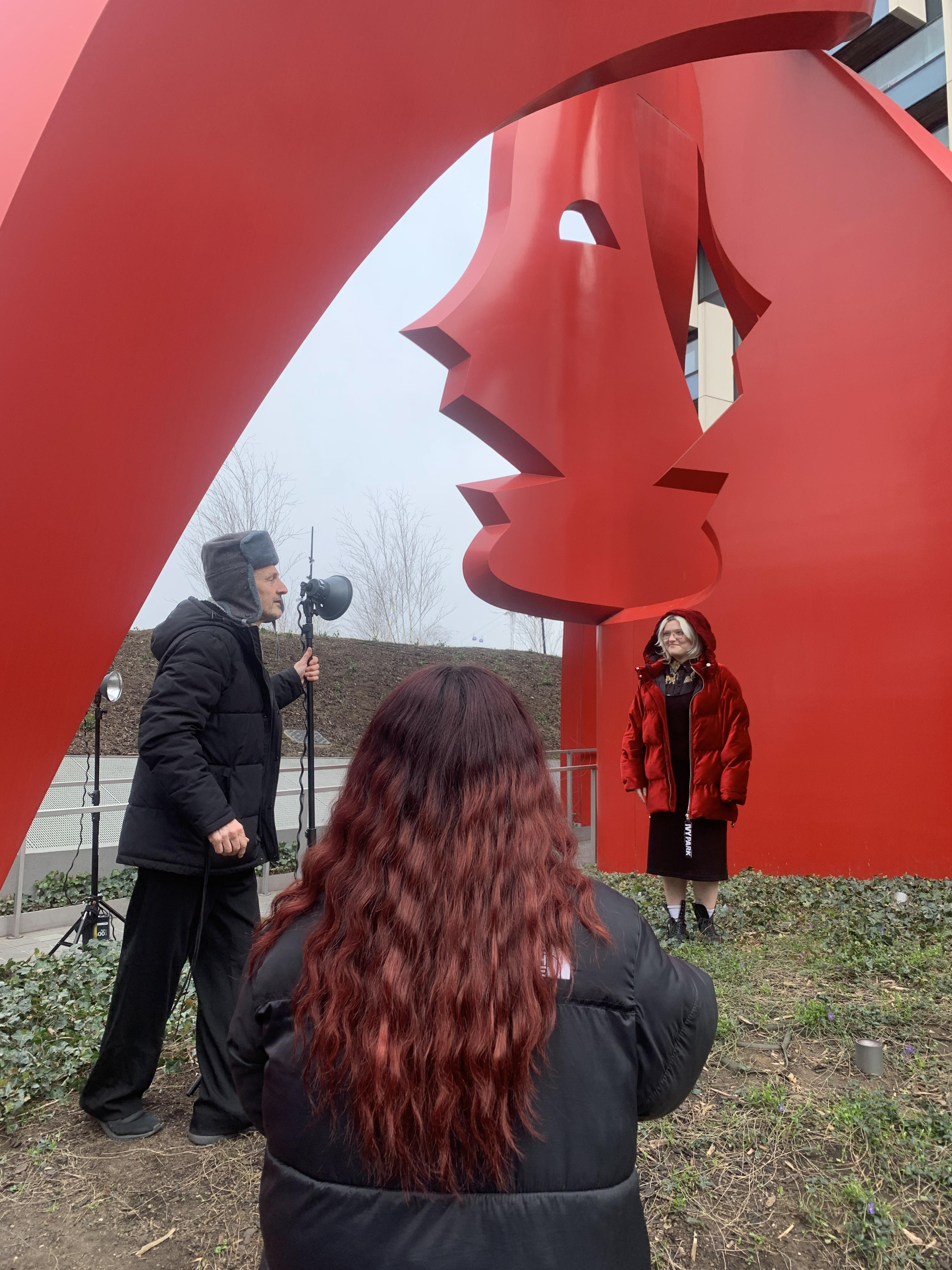
24/02/2023 - Environmental - Flash on location
Michelle workshop notes
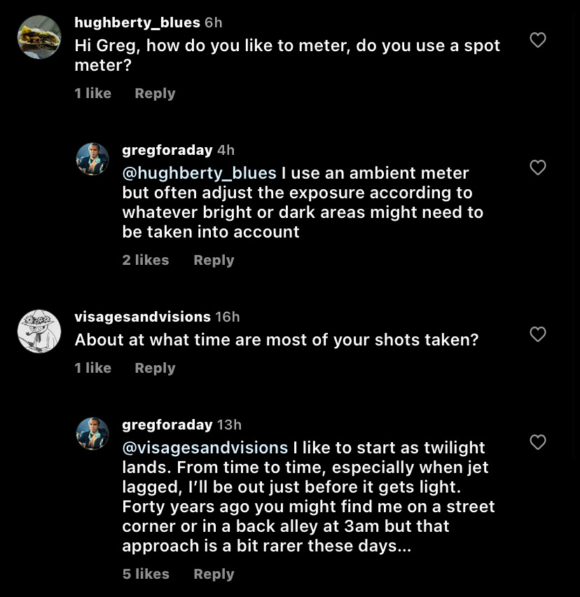
1. FRAMING: Analyse surroundings - where is the sun? are there any guiding lines? where is shade coming from?
2. Lighting assistant takes light meter reading - press button and get reading of shadows.
3. Camera operator adjusts settings accordingly - shutter speed, aperture & ISO. After readings of shadows have been given you need to underexpose it to include clouds / sky (4 stops below reading)
4. Camera operator takes a test shot - the subject should be silhouetted by the sky.
5. Lights are then added to compensate for the subject - point flash in direction of subject - adjust flash power accordingly.
6. Camera operator takes another test shot - subject should be lit up in focus.
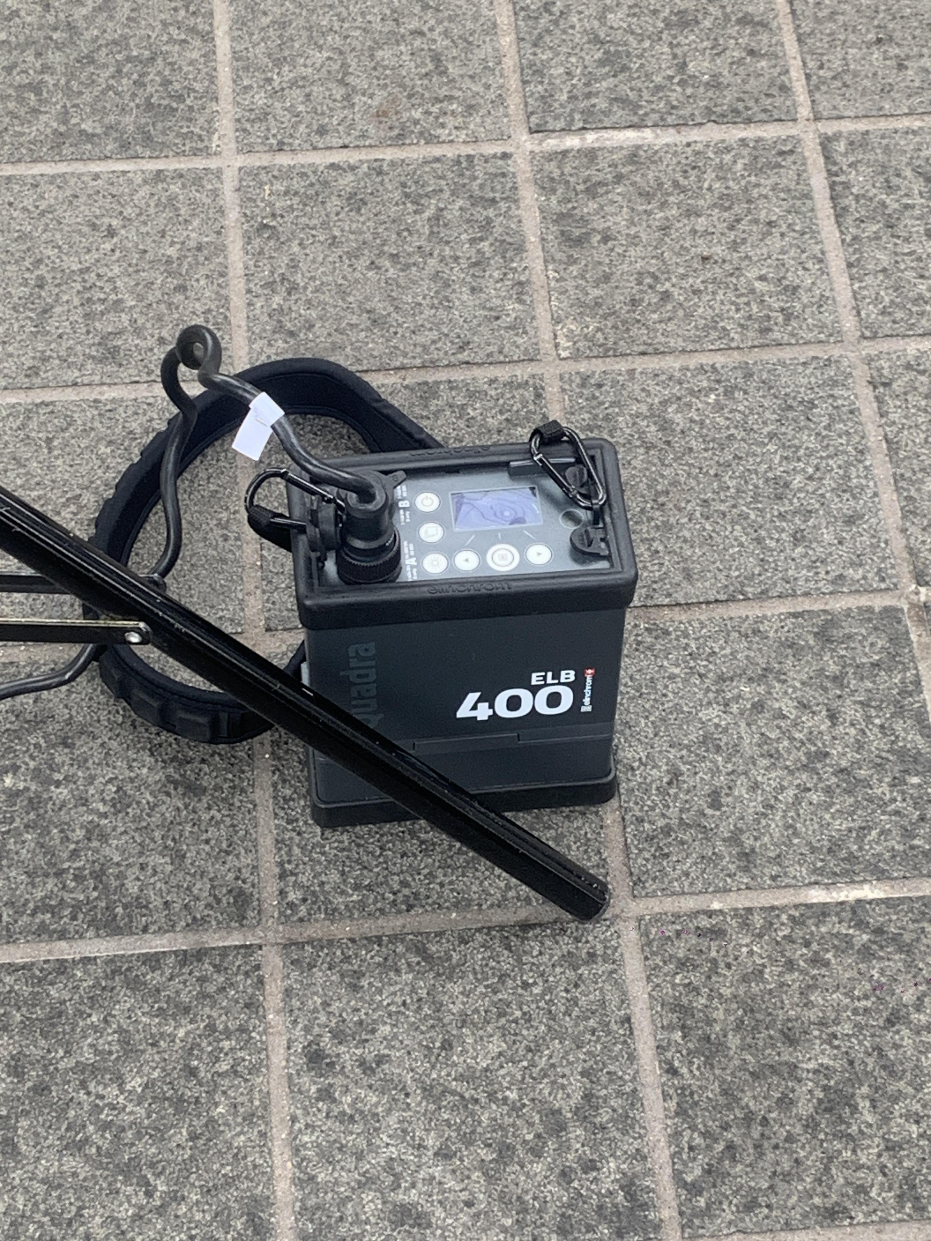
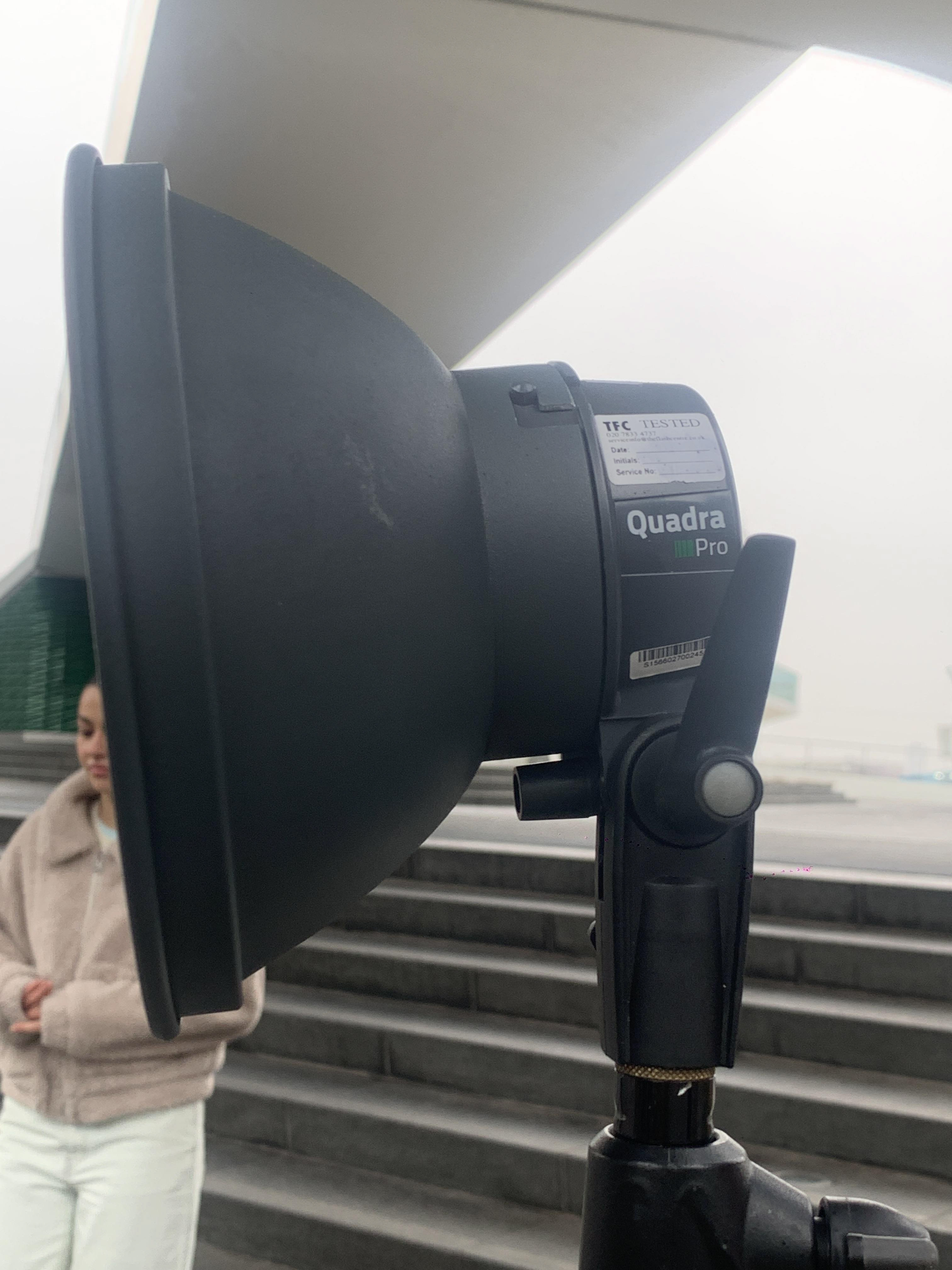
Below: 2x ELB 400 portable flash units used in order to fill in subject from both angles.
Below: 2x lovely assistant lighting operators; Vince & Michelle.
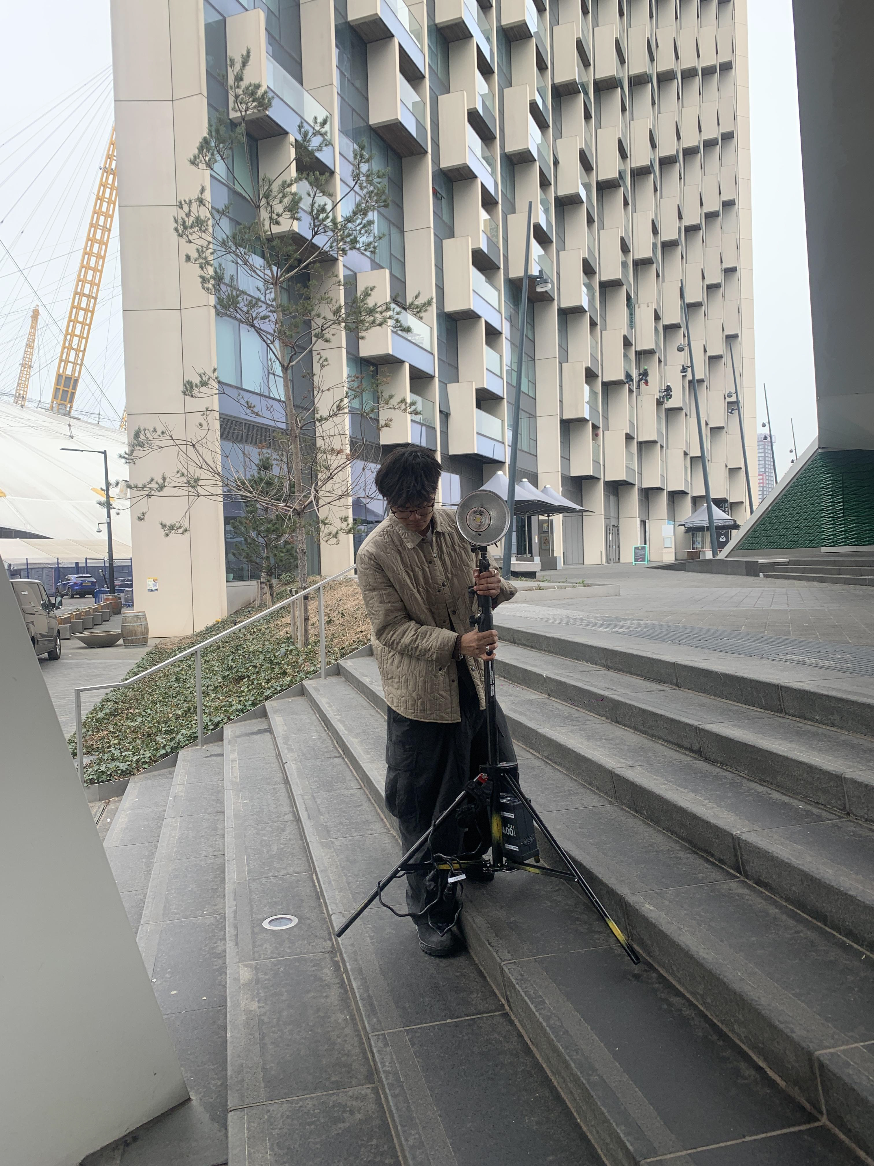

Below: Photos showing positioning of model and setup of both flashes.
TESTING
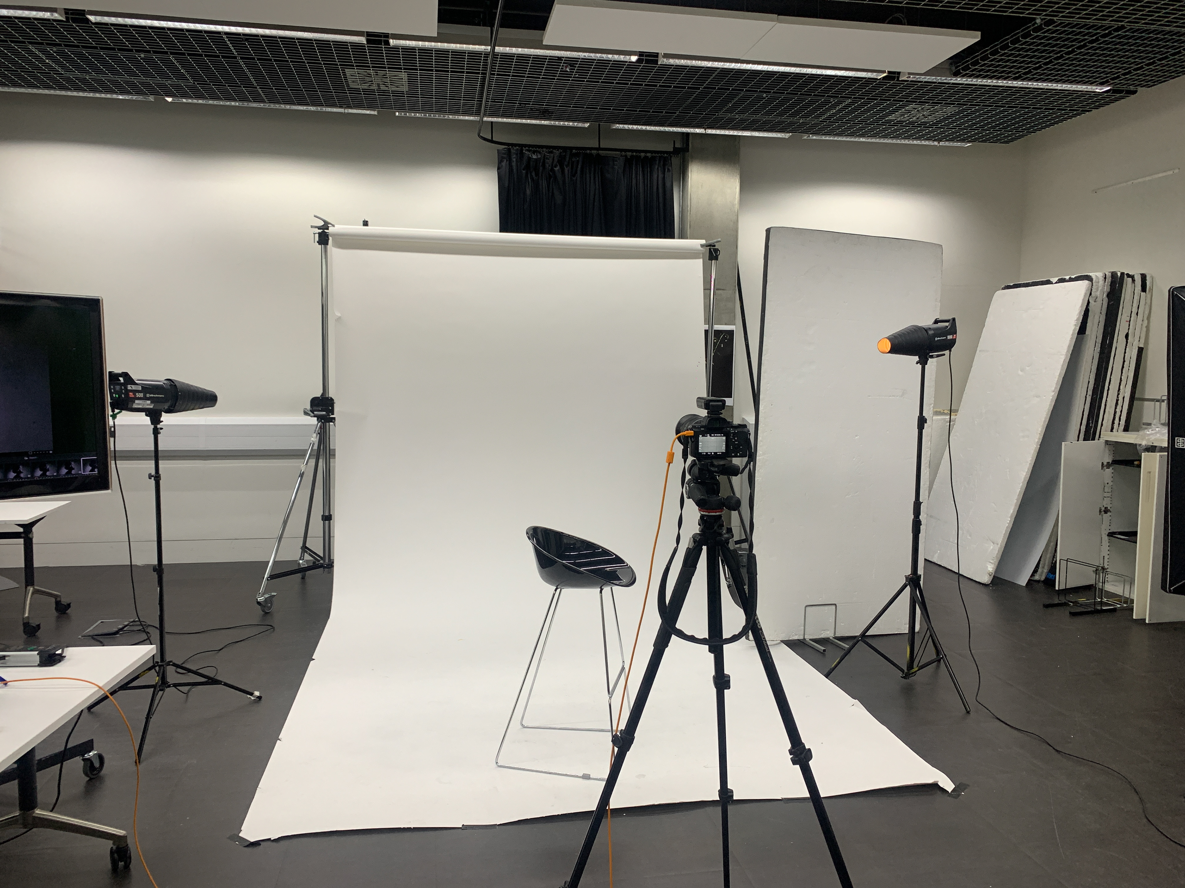
3/03/2023 - Studio - Fashion Photography on Boat
Below: Shoot setup used for photos shown below - Canon 5D & handheld soft box with umbrella.
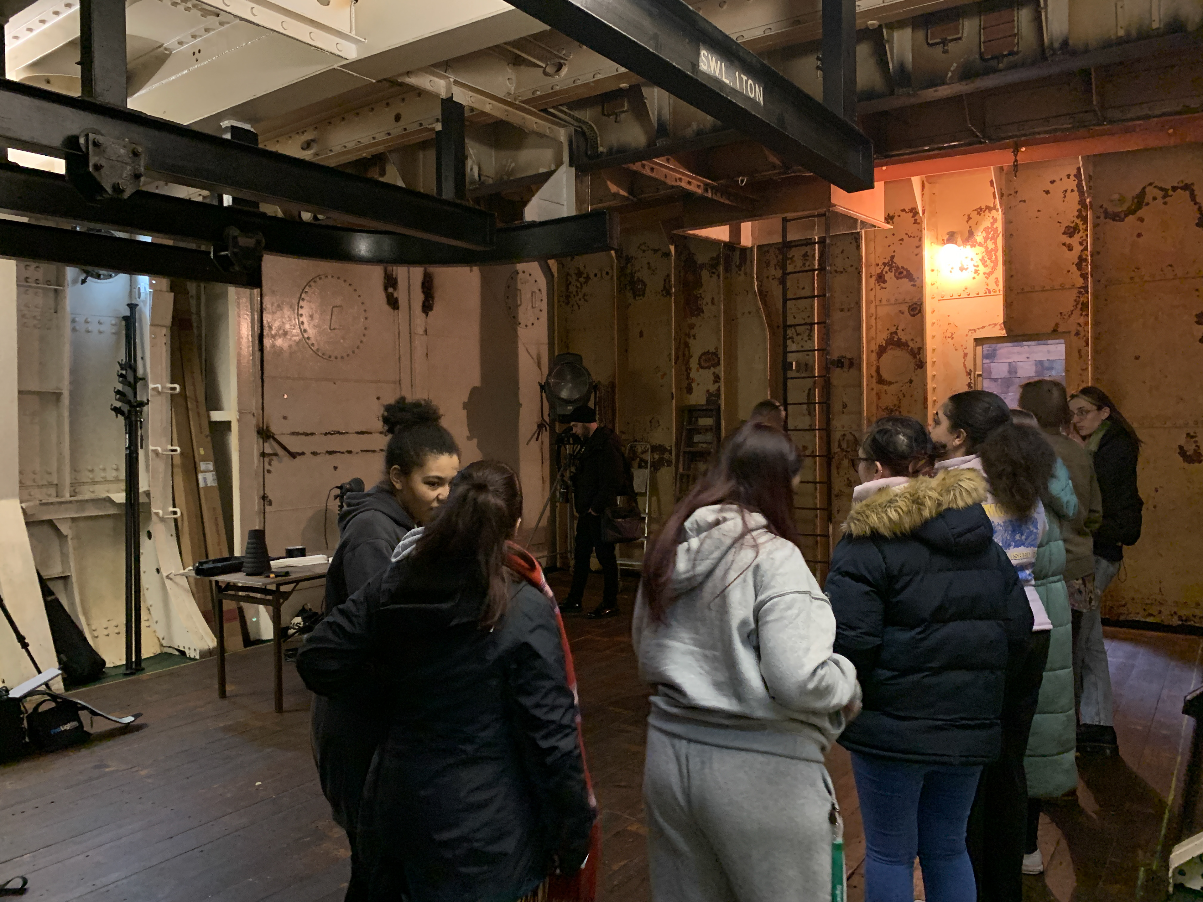
Below: RAW image taken in Michelle's boat.
Below: Final image post-production.

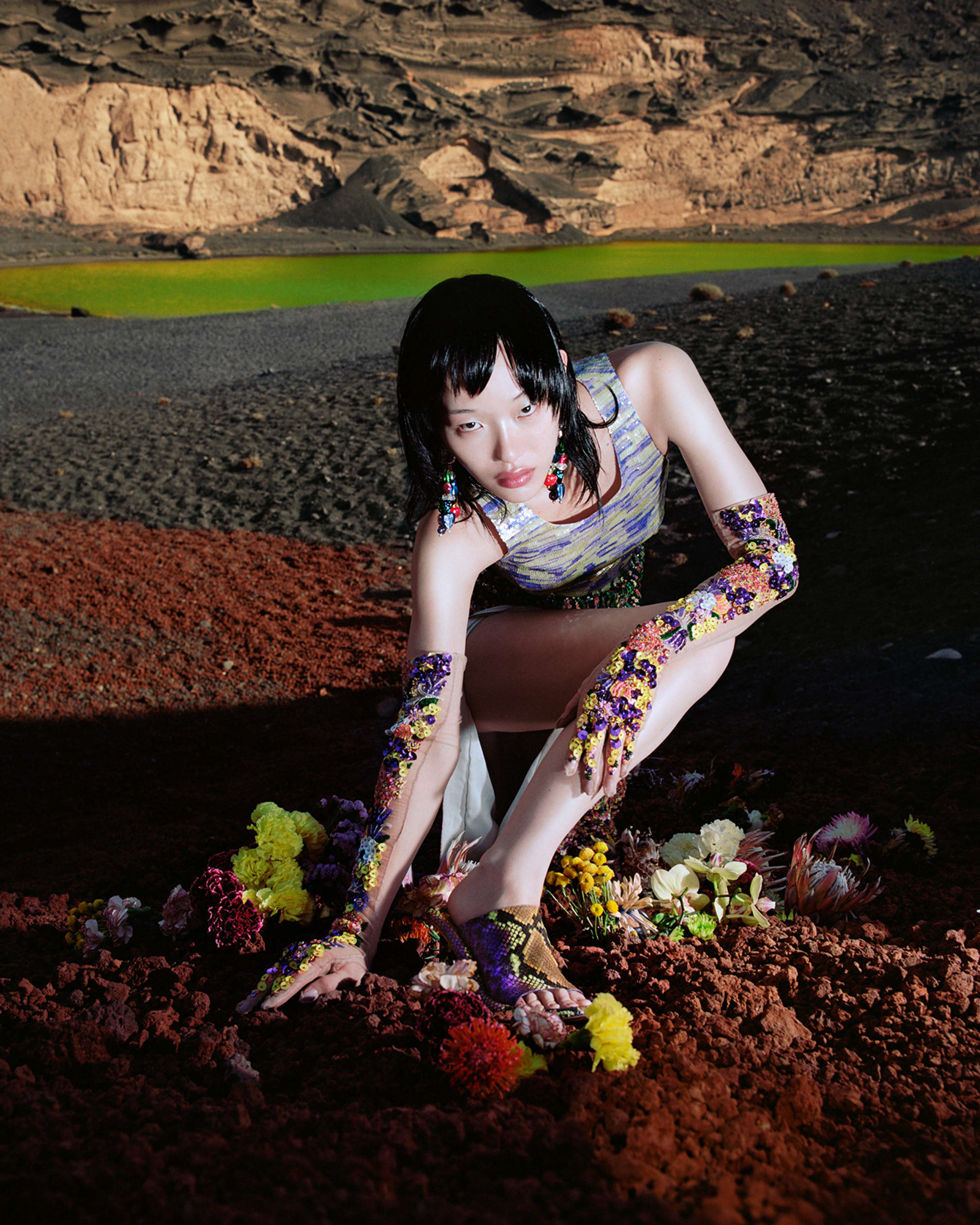
Harley Weir is a London-based photographer known for her unique and unconventional approach to fashion and portrait photography. Her work often features intimate and raw imagery that challenges conventional beauty standards and captures the essence of her subjects.
Some of Harley Weir's most notable works include her editorial and advertising campaigns for brands such as Balenciaga, Calvin Klein, and Gucci. She is also known for her personal projects, which often explore themes related to identity, gender, and sexuality.
In terms of her photographic style, Harley Weir often works with natural lighting and a muted color palette, giving her images a dreamy and atmospheric quality. She frequently incorporates elements of surrealism and abstraction into her work, playing with scale, texture, and form to create striking and memorable images.
Harley Weir’s photography has become synonymous with a way-of-seeing that is empathetic and true, approaching bodies, nature and materials with a tenderness that feels transcendent. Across commercial and editorial work, photography and filmmaking, the London-born artist has traced a visual atmosphere that has left an indelible impression, one imbued with a highly-attuned sense of colour and composition. An imagemaker who constantly subverts the expected, Weir has greatly influenced ideas of how a woman’s gaze might be engaged with, reshaped and made new in our current era.
source: https://www.artpartner.com/artists/film-print/harley-weir/bio/
"Floral Art Studio, Cereus Nights, collaborate with photographer Harley Weir to create imagery for Ambush's latest Campaign."
"Models interact with sculptures and florals created by the studio, within the futuristic landscape of Lanzarote."
- A short text about where the photographer or photoshoot is from.
◉ Harley Weir is born in London and the photo shoot I used was a collaboration between her, Floral Art Studio and Cereus Nights for Ambush.
- How does the photographer work? I.E., do they work with fashion or music?
◉ Combination of personal work and commercial work mainly in fashion.
- Where is their work featured, or where or who do they work for?
◉ Harley Weir has worked with lots of major brands including Balenciaga, Céline, Stella McCartney and Jacquemus.
◉ Weir has published five books: ‘Homes and Paintings’ with Loose Joints, 2016 and 2017; ‘Function’ with Baron, 2018; ‘Louis Vuitton Fashion Eye Iran’, 2018; and ‘Father’ with IDEA Books, 2019.
◉ They have appeared in magazines such as Vogue Italia, L’Uomo Vogue, American Vogue, The Face, Re-Edition, Self-Service, W Magazine, Dazed, Pop, Marfa Journal, British Vogue, T Magazine, i-D, AnOther, System and M Le Monde; her brand collaborations across print and film have included Balenciaga, Gucci, Isabel Marant, Marc Jacobs, Blumarine, Ambush, Versace, Proenza Schouler, Salvatore Ferragamo, Courrèges, Missoni, Dior, as well as projects spotlighting her home city’s design talents such as Wales Bonner, Simone Rocha and Charlotte Knowles.
- How is the image made?
◉ Image is shoot on location digitally, using flash, multiple fashion accessories and adjustments to hues.
- What camera do you think is used? (35mm, Medium format? What type of lens?)
◉ Digital camera with 50mm prime lense. I say this cause the photographer seems to be quite close to the subject, who still appears flat.
- Is it a studio image or shot on location? ◉ Location
- Was a flash used or natural lighting? ◉ Natural Lighting & Flash
- Is it a film or a digital image? If so, how is this expressed in the image?
◉ Digital - I can tell because the texture of the skin is not blotchy - lack of film grain - high dynamic range - no magenta skin tone.
It is possible that this was shoot on film and rendered digitally. However, based on my knowledge I conclude it's digital.
- How is the image composed? What about the composition makes it striking?
◉ Model is crouched down in a very interesting position. Both arms and legs are positioned at the same angle, perhaps used a guiding lines towards the subjects face and/or to symbolise a connection between the subject and nature.
7. Is the image very clear, or is it slightly out of focus? How is the image graded?
◉ Subject is in focus and the background is slightly blurred but still in focus enough for the viewer to identify and analyse.
1. What tones are in the image? (i.e. heavy even-tones? high contrast?)
◉ High contrast with very dark shadows.
2. What sort of colour is it? (i.e., highly saturated or unsaturated? warm or cool tones?)
◉ Dark red tint on shadows - warm tones - hues altered e.g. water = blue > green.
3. Is the image very clean, or is it edited to appear older?
◉ It's very clean but the colour hues have been altered to appear more abstract.
4. Is there any kind of texture to the image that makes it unique?
◉ There is a clash of multiple textures such as the rock surfaces on the foreground and background, the leather boots, fashion accessories on arms & ground, the shirt and flowers.
◉ It's unique because flowers and the fashion accessories are embody life and colour whereas the rock and surroundings are inanimate and more colour neutral.
◉ The subject is also posed within the area of red rocks, allowing the grey rocks to lead the way into the background. This structure plays with rule of thirds and also may highlight the theme of life and colour as the model is in the centre of life / colour.
Self-reflection
1. Talk here about how the image caught your eye and how you will use all of the points above to improve your work.
1. Talk here about how the image caught your eye and how you will use all of the points above to improve your work.
- The image caught my eye mainly because of the lighting and strong shadows. I believe this is mainly due to the model fully facing the light source, allowing them to absorb all the lighting. The unique texture and hues is another takeaway.
★ Subject fully facing lighting source to creative dark shadows.
★ Adjustment to hues / playing with textures.
FINAL RESULTS
REFLECTION: Overall I was very happy with these images. My goal was to replicate Harley Weir's "way-of-seeing that is empathetic and true, approaching bodies, nature and materials with a tenderness that feels transcendent.". My model was perfect for this and I'm happy with the styling and lighting.
To improve I would've liked to spend more time in post-production to add more movement and texture.
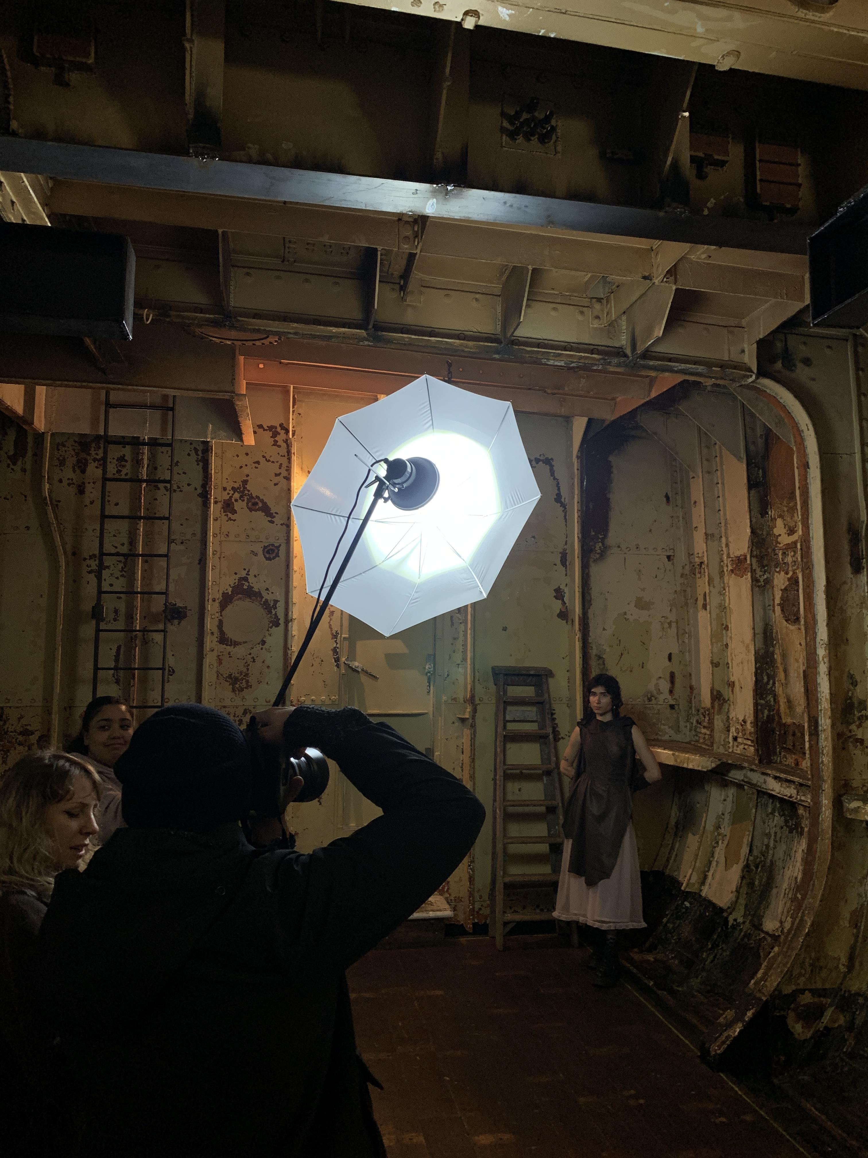
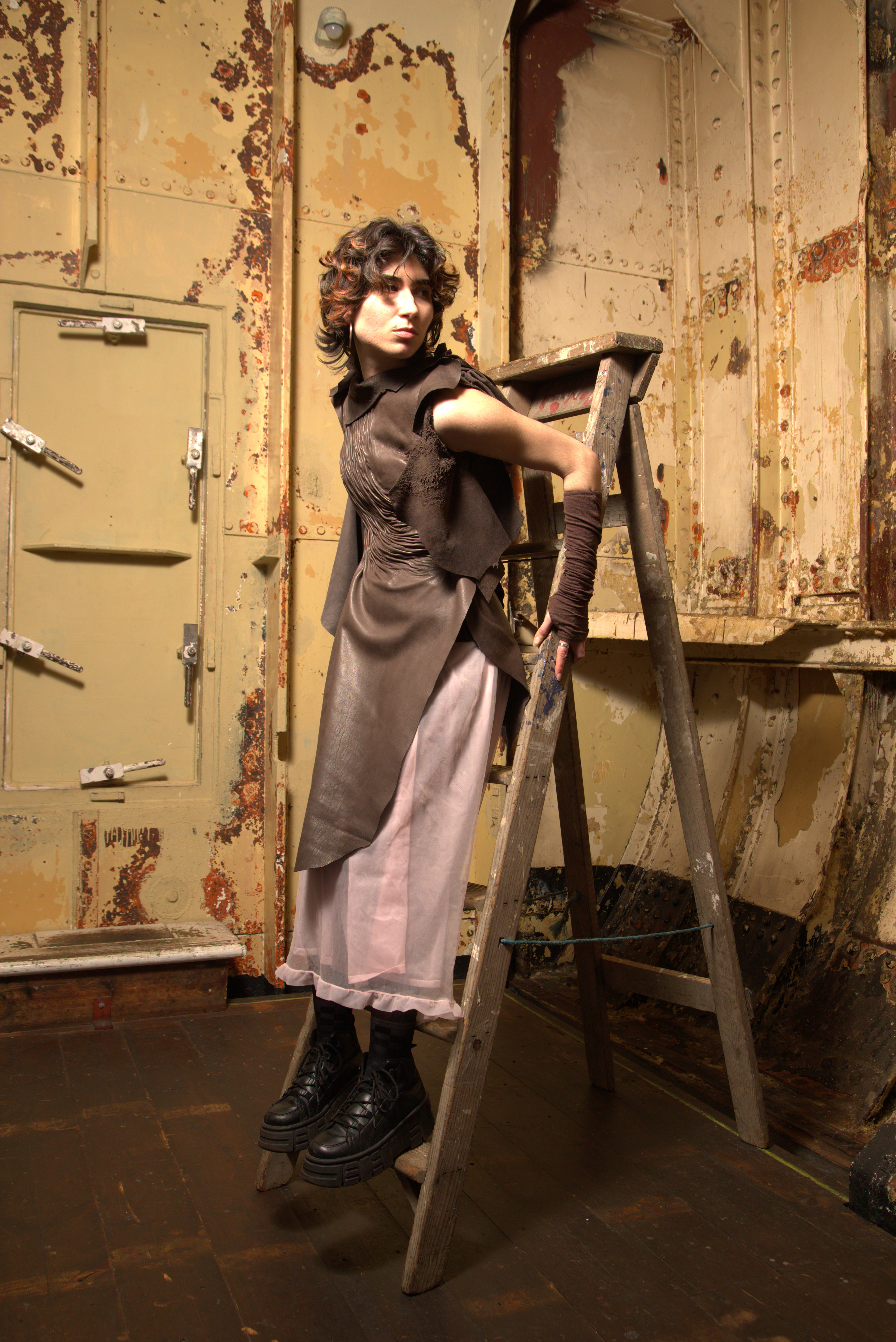
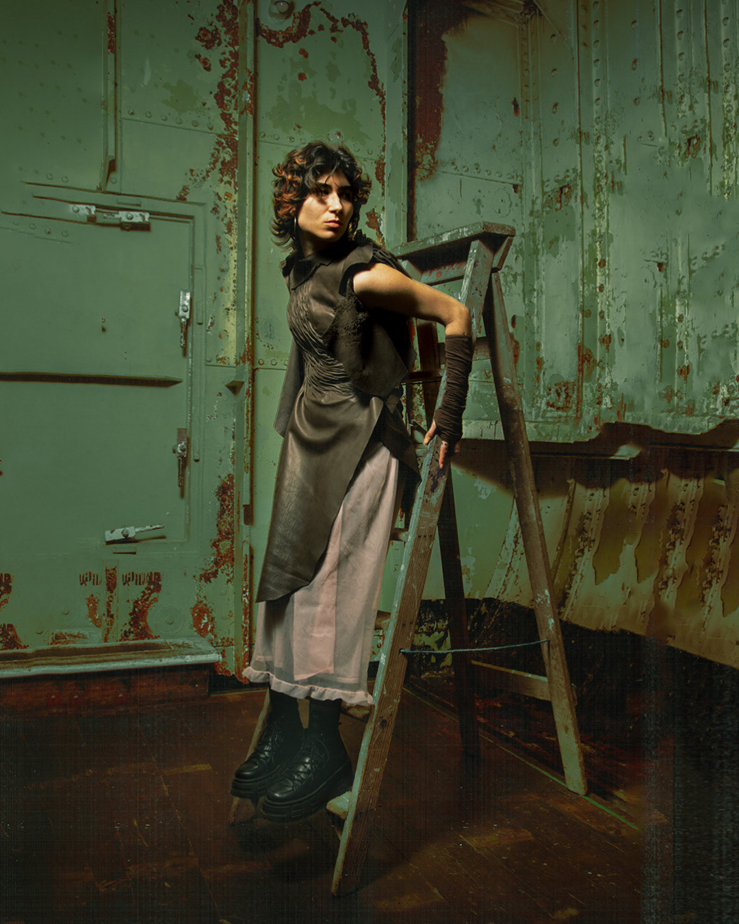
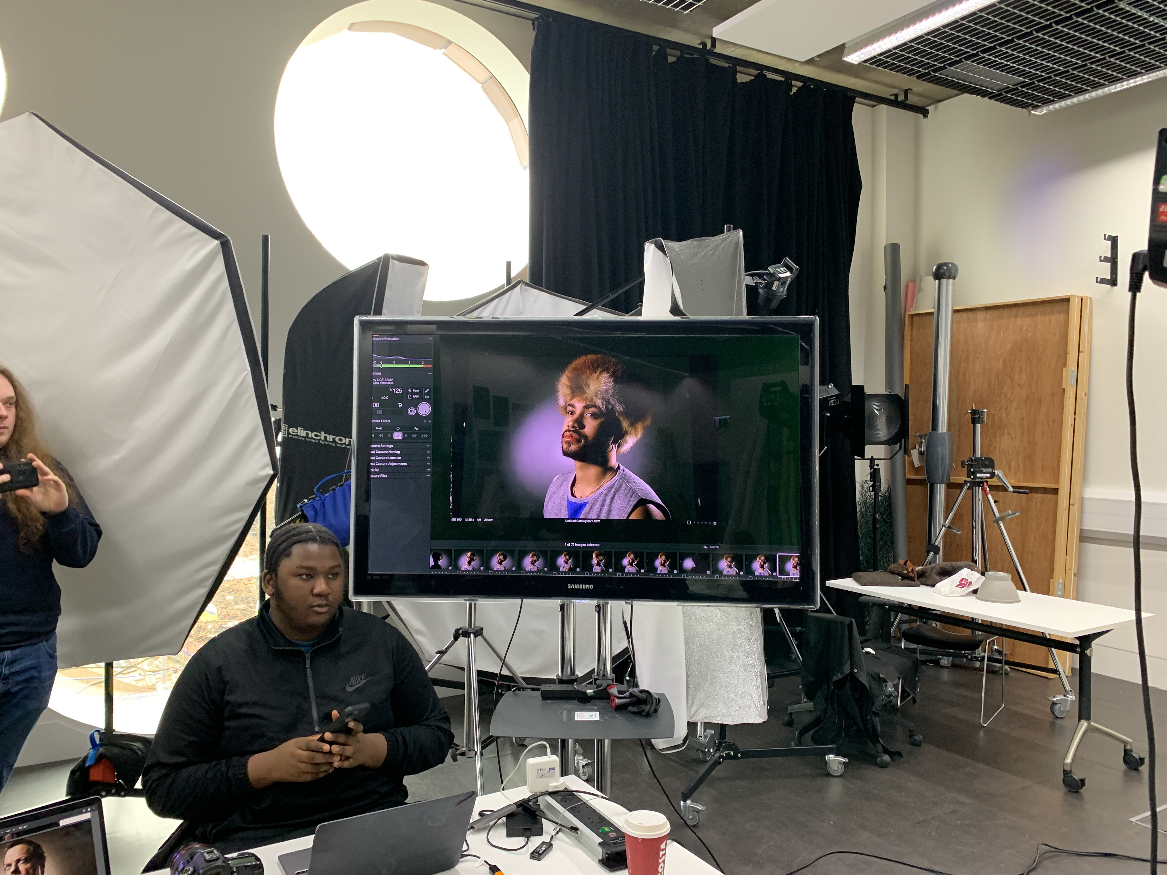
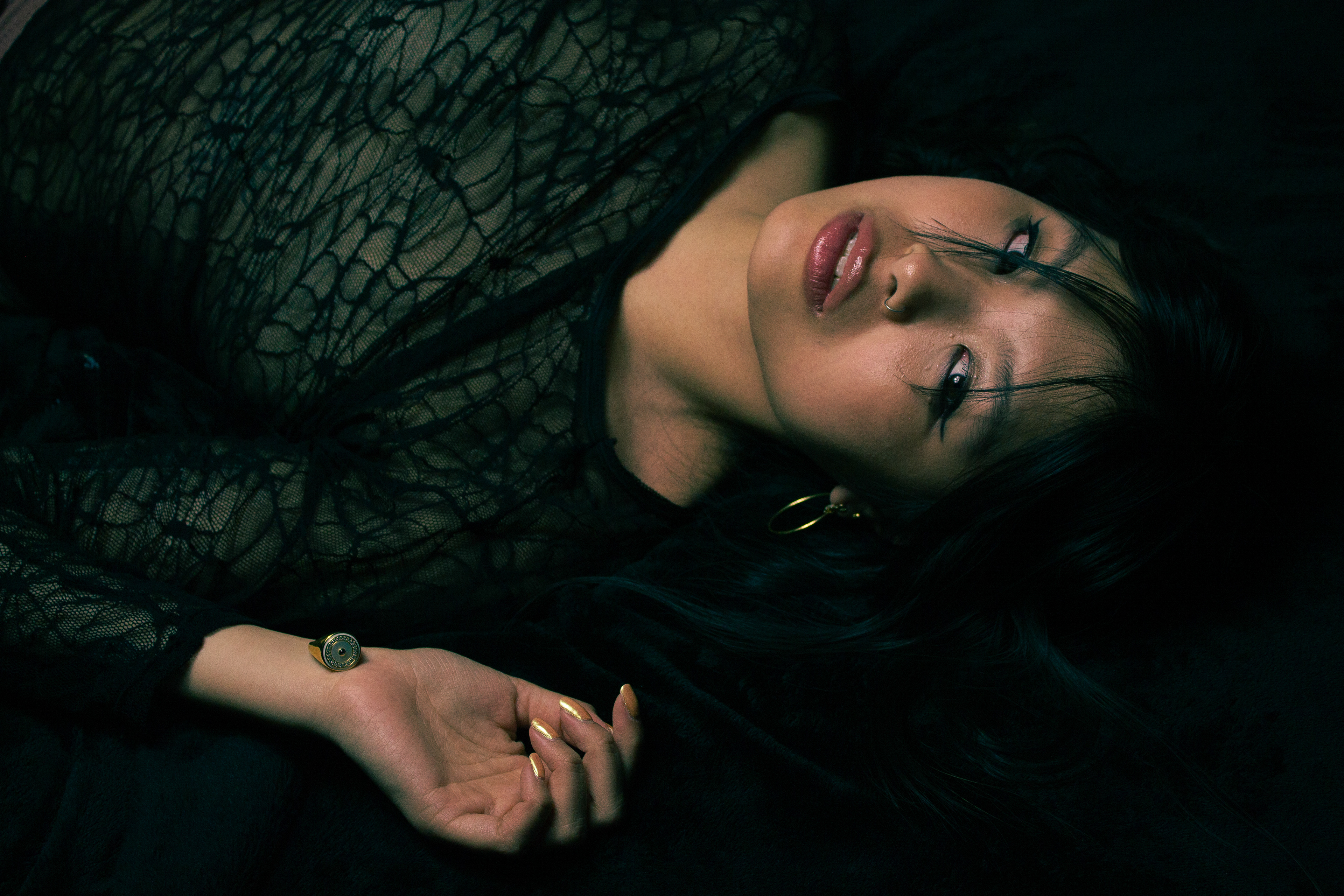
31/03/2023 - Studio - Dramatic use of flash
This Friday Michelle held an interactive workshop teaching us how to replicate different photos shown to us in our initial brief for the unit. This was a great opportunity to learn but also have complete creative control over what we want to alter.
Below: Camera setup using a Sony A7sii shooting at ISO 100, 1/125 & f9.0.
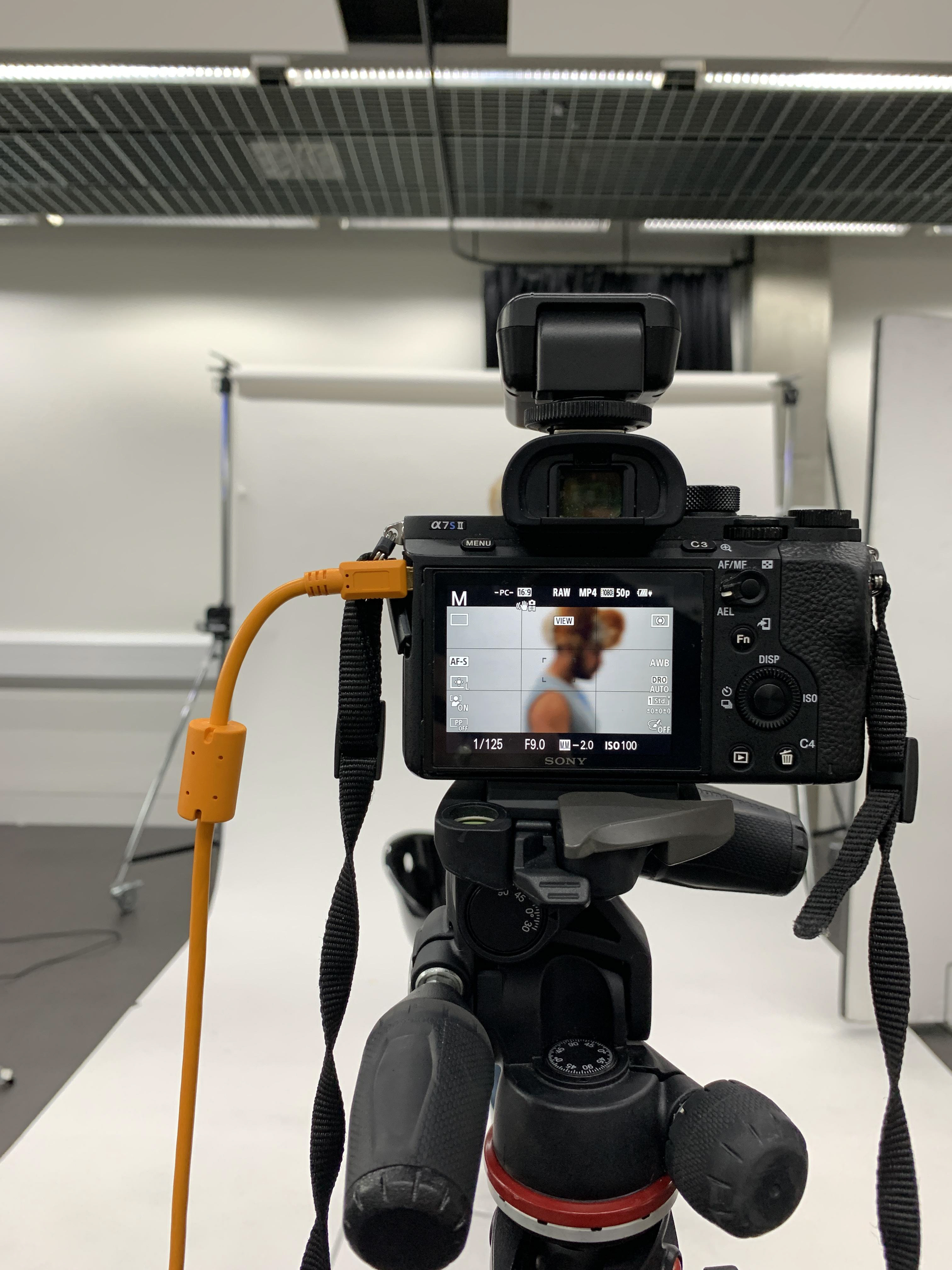
Below: Lighting setup used for dramatic lighting.
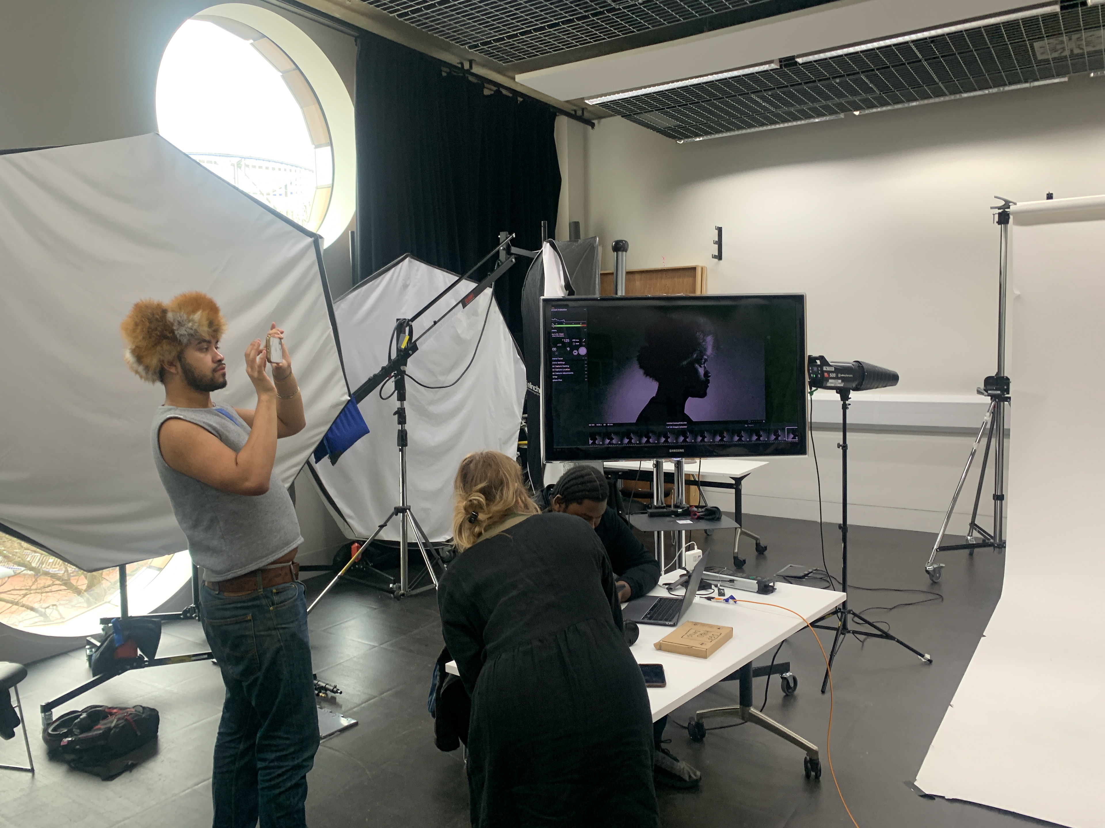
Below: Reference image used for one of the tasks.
Upon analysing the photo we could reach an initial conclusion on the following:
- There is two sources of light.
- Subject is probably standing with his arms behind his back.
- Subject is facing the flash and turning head at a 45 degree angle.
- 1 Flash with snoot attached aimed on the backdrop.
- 2nd Flash on the subject from a 45 degree angle, coming in from above the subject.
Below: The first test shot which we were quite happy with. After this we covered some of the flash to remove light from the neck area as this was not the case in our reference photo.

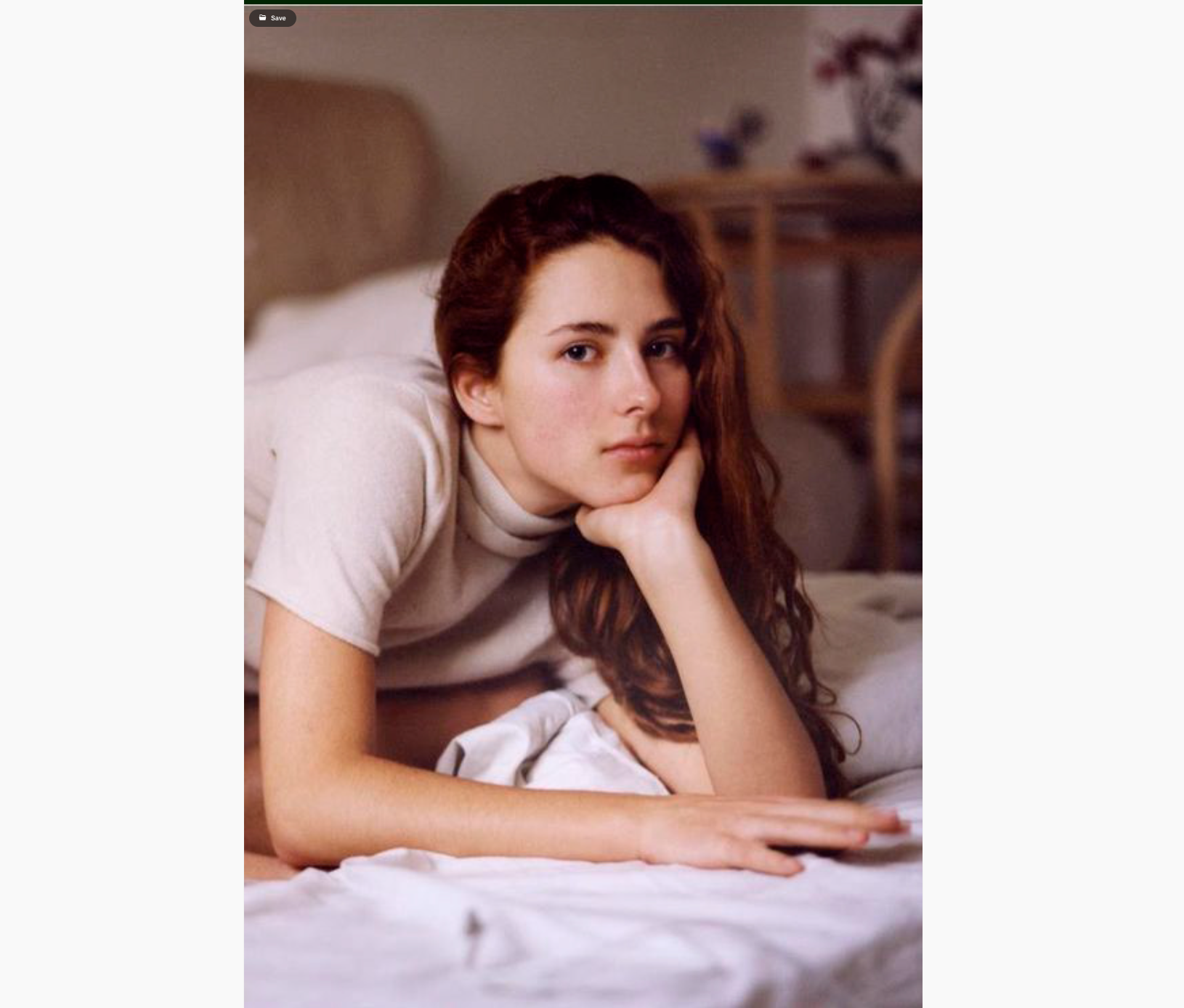
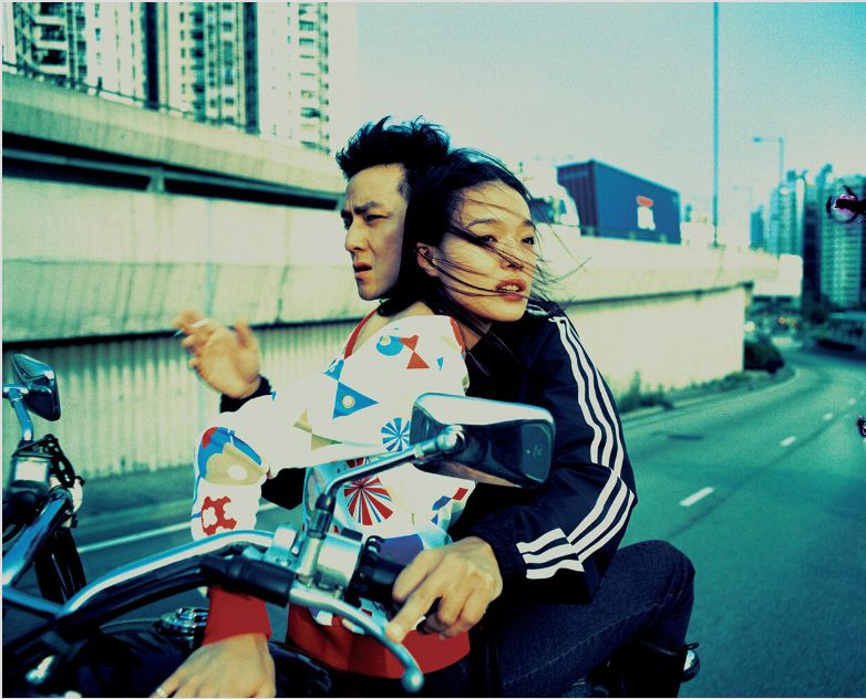
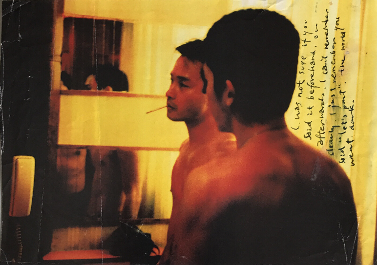
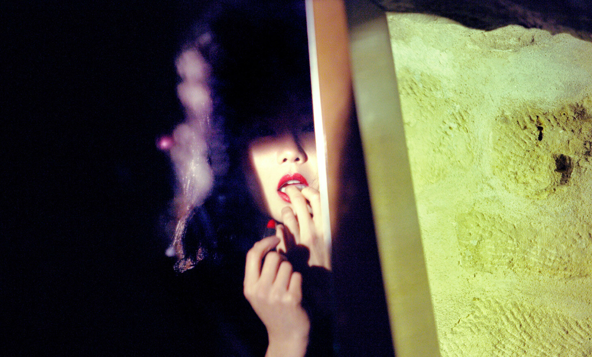
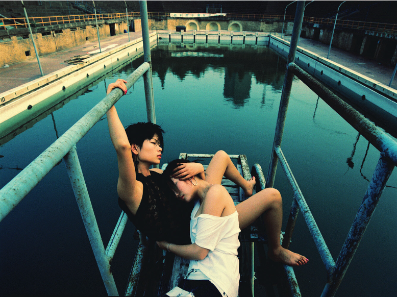
"Wing Shya is a Master when it comes to capturing or amplifying particular human emotions and atmospheres. He pictures the tactile tension that exists between lovers: togetherness, intimacy or the hint of the erotic about to unfold. Or he frames the extreme opposite: the deep longing for love and connection, loneliness and isolation. Either way, there often is a sense of time being suspended. As if reality is slowing down and standing still in time. There is a strong sense of waiting. Something dramatic is about to happen.
This quality might stem from when he worked on film sets with Wong Kar Wai when he was only able to shoot seconds before or after scenes. The mood created in these moments, which Wing Shya managed to pin down so skillfully, became his signature style."

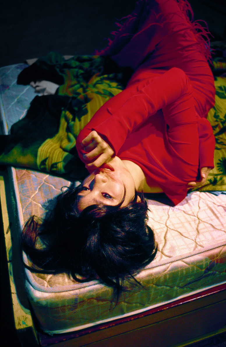
Context of the image
1. A short text about where the photographer or photoshoot is from.
Wing Shya is known for his work within film, art and fashion. Born in Hong Kong 1964, Shya returned to Hong Kong following his fine art studies at Emily Carr Institute in Canada and founded the award-winning design studio, Shya-la-la Workshop. In 1997, appointed as the exclusive photographer and graphic designer; Shya began his collaboration with the renowned movie director, Wong Kar-Wai on Happy Together, continued then on In the Mood for Love, Eros and 2046.
The series "Happy Together" is a collection of Wing Shya's various work and was displayed as an exhibition at the Blue Lotus Gallery in 2020 during lockdown.
2. How does the photographer work? I.E., do they work with fashion or music?
Wing Shya has a backround working film, art but carries a very cinematic feel across all his work, mainly due to his having worked with Wong Kar-Wai and his influence.
3. Where is their work featured, or where or who do they work for?
He is based out of Hong Kong. Their work is featured in many exhibitions, own his own studio where he is the director and has worked with many brands such as i-D (UK), Vogue Italia, 32c (Berlin), Numèro (France) and TIME Style and Design (US). His clientele includes Louis Vuitton, Maison Martin Margiela, Converse, Gap, Pepsi, A Bathing Ape, Nike, Adidas, Rolex, Swarovsky and L'Oréal. .
How is the image made?
1. What camera do you think is used? (35mm, Medium format? What type of lens?)
I wasn't able to find much information online but by analysing the details of the photo I would say it's either medium format or digital with a 35mm lense. I say this because the photos have such high details which would be hard to capture on 35mm film. The colours are very reminiscent of medium format.
2. Is it a studio image or shot on location?
There is a mixture of both but the image I have chosen seems to be on location.
3. Was a flash used or natural lighting?
I can see there are two flashes used.
4. Is it a film or a digital image? If so, how is this expressed in the image?
I would say film due to the high contrast, accurate skin tones and deep shadows. It's also hard to say as a lot of the images have been manipulated
5. What models are in the image, and how are they posed?
The model is laying down on a mattress with her hand in a "thinking" position whilst looking up at the ceiling.
6. How is the image composed? What about the composition makes it striking?
The way the model is laying upside down from the point of the viewer cause it puts you in a thinking state similar to the one displayed.
7. Is the image very clear, or is it slightly out of focus?
The image is slightly out of focus which gives it a more cinematic film-like feel.
How is the image graded?
1. What tones are in the image? (i.e. heavy even tones? high contrast?)
Wing Shya is known for taking an experimental approach that embraces imperfection, he specialises in expressive, romantic, high contrast and often deliberately blurry images that exude personality and drama. This can be seen in the image I've chosen.
2. What sort of colour is it? (i.e., highly saturated or unsaturated? Warm or cool tones?)
Heavily saturated with lots of warm tones. There are also some cool tones added by what seems to be a blue light cast on the far end of the bed and her lower body.
3. Is the image very clean or edited to appear older?
The image is definitely edited to appear older. There is evidence of the photographer using this technique in the other photos such as the wrinkled paper effect.
4. Is there any texture to the image that makes it unique?
The texture on the mattress are quite unique. Furthermore, the way the blue light adds a glow to the feathers of her dress make for a very interesting ethereal feel.
Self-reflection
1. Talk here about how the image caught your eye and how you will use all the points above to improve your work.
Having lived in Asia for the majority of my life I was very drawn to the images to begin with because of the way he portrays Asian cityscapes by including ideas of romance and hope makes it very bittersweet and interesting - like movies without an overly happy ending. I love the composition and out of focusness.
- Model positioning on bed.
- Filler light for background.
- Embrace the imperfections.

FINAL RESULTS
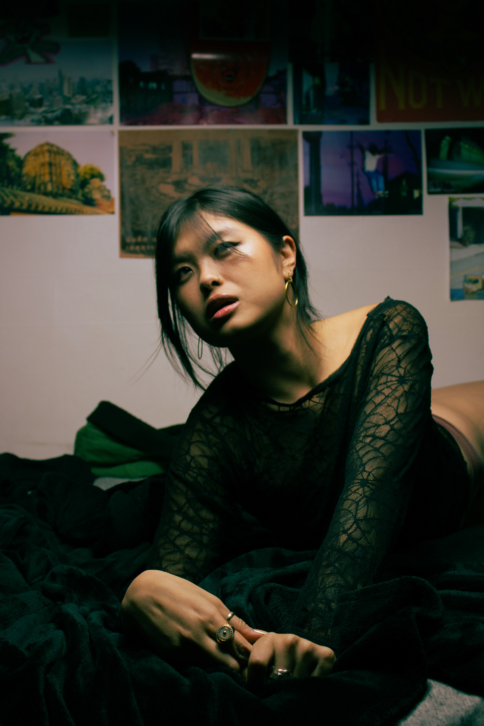
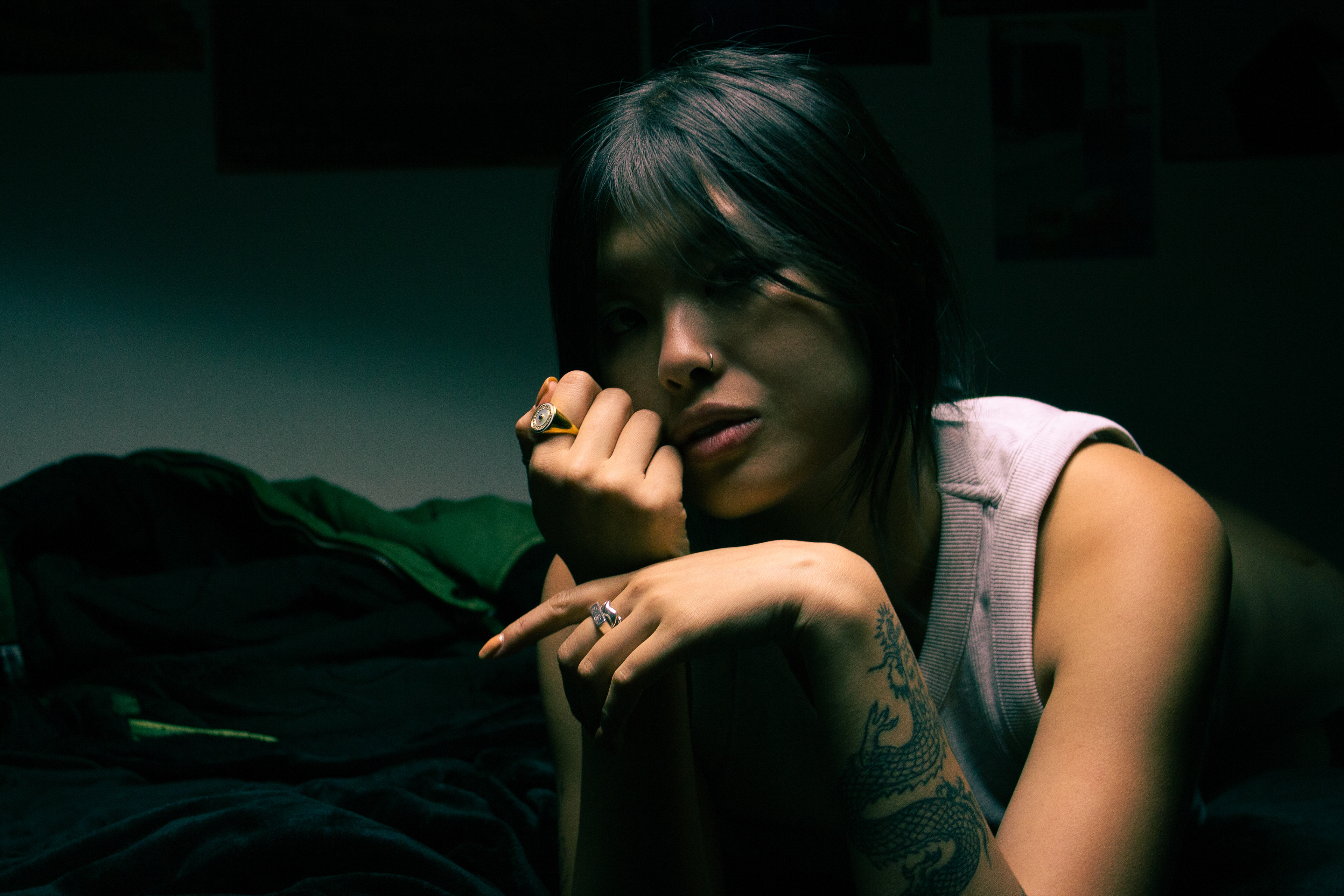
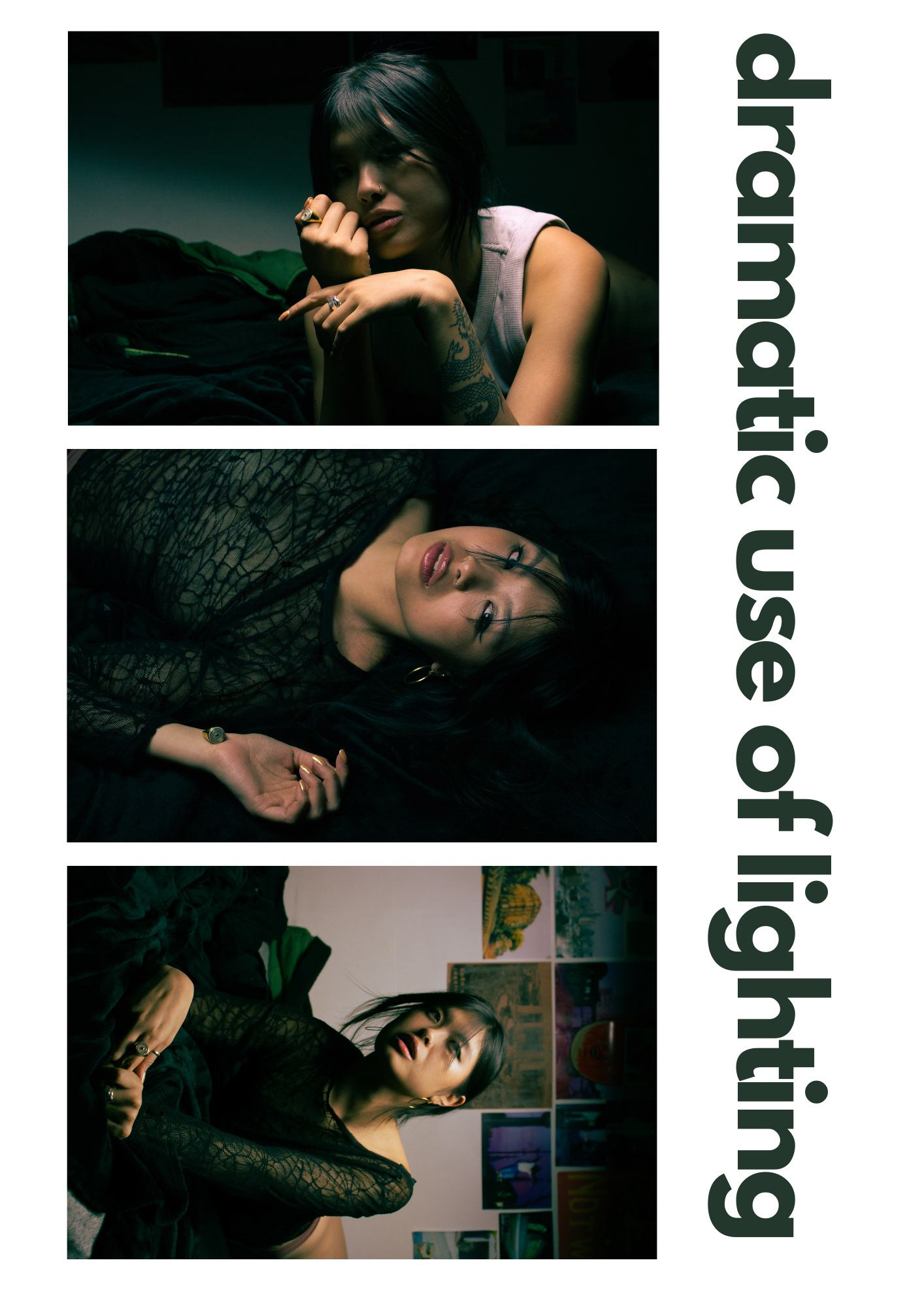
REFLECTION: I'm very happy with these images and feel like this was my best attempt at replicating the work of my inspiration.
To improve I would've spent more time in post production to replicate the look of film and make it more cinematic.
INDEPENDENT TEST-SHOOTS
16/02/2023 - Location - Landscape portrait
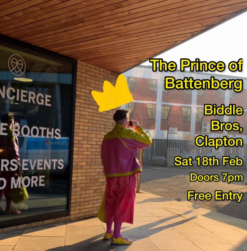
Below: Final image taken of Ben Murphie aka The Prince of Battenburg near London Fields. As a very bright personality and artists I wanted to use light as a symbol of yearning for something better in the world.
- I tried using the guiding lines of the building to centre my subject.
- Subject facing the light (freedom) and radiating into the outdoors (the world and its potential) with his shadow (past) creeping under the building (a constructed world).
- Shooting on a Canon G7X at ISO 125, 1/125 & f8.0 and edited in Lightroom & Photoshop.
The photo has also been edited in post-production to remove a by passer in the background. However, the shadow still remains to communicate the difference between an artist other people. Some take the light in their stride and cast nothing but a shadow into the world.
Below: Image was used as promotional material prior to one of his scheduled shows.